
4.5: Giffen Goods
- Last updated
- Save as PDF
- Page ID
- 58454

Demand curves are derived by doing comparative statics on the consumer’s optimization problem: Change price, ceteris paribus, and track optimal consumption of a good.
In introductory economics courses around the world, demand is always drawn downward sloping so that as price rises, ceteris paribus, quantity demanded falls. Economists have long been intrigued, however, by a perplexing possibility: quantity demanded rising as price rises. An upward sloping demand curve! Can this happen? Yes, but it is quite rare and it took decades to figure it out.
We begin with a definition: Giffen goods are goods that have upward sloping demand curves. Giffen’s connection to this counter intuitive demand relationshipprice rises and you want to buy more?is controversial.
Giffen and the Irish Potato Famine
The Great Irish Famine took place during 1845-1848.
To put the disaster in proper perspective, the famine killed at least 12 percent of the population over a three-year period. Another 6-8 percent migrated to other countries. In terms of the percentage of population affected, the 1845-48 famine is one of the largest ever recorded. Other famines have killed more people in total because the affected populations were larger, not the percentage of exposure. For instance, the 30 million or more people who perished in the Chinese famine of 1958-62 were 5 percent or 6 percent of the population. (Rosen, 1999, p. S303)
Why did so many people die? This is a difficult question to answer comprehensively. The economics of famine are complicated. The proximate answer is that the Irish ate a lot of potatoes and a potato blight destroyed the food source. Rosen (1999, p. S303) says this:
As difficult as it is to imagine today, on the eve of the famine, per capita consumption of potatoes is reliably estimated to have averaged 9 pounds (40-50 potatoes) per person per day (Bourke 1993). Diets were astonishingly concentrated on potatoes, especially in rural areas. Grain was grown in rural Ireland but was either sent to towns or exported abroad.
When blight wiped out the potato crop, why didn’t the Irish eat something else or just import food? This is hard to understand. Books have been written on the subject. The Biblio sheet in GiffenGoods.xls has references. In fact, Amartya Sen won a Nobel Prize in Economics for his work on famine. It turns out that it is not simply a matter of too little foodamazingly, food can be just a few miles away and yet many people can be starving!
But our focus is on Giffen goods and the story picks up decades after the famine. Although there is no evidence that he ever said anything close to "price increase led to higher quantity demanded," Sir Robert Giffen (1837–1910) is credited with using the behavior of potato prices and quantities to state the claim that quantity demanded rose as prices rose.
Figure 4.13 shows Irish potato prices before, during and after the famine. Although consumption fell when price spiked in 1847 to more than double the 1846 price, somehow the legend grew that quantity demanded increased as prices rose in this time period. Thus, the Irish potato became the canonical example of a Giffen goodeven though there is no evidence that price and quantity moved in the same direction.
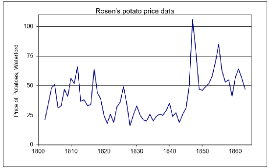
Figure 4.13: Potato price in Waterford, Ireland.
Source: OptimalChoice.xls!OptimalChoice
Economists began arguing over whether or not quantity demanded rose as the price spiked and, even if it did not, whether it was theoretically possible. It would take decades of contentious debate before the matter was settled.
Two Common Mistakes in the Giffen Debate
Before explaining how we could, in theory, get a Giffen good, we need to clear up two mistakes in thinking about Giffen goods. Both mistakes involve violating the strict ceteris paribus requirement that underlies a demand curve. The first mistake has a long history in econometrics and the second is easily corrected once we remember that we must hold everything else constant.
Estimating demand from observed prices and quantities is quite difficult. It turns out that plotting price and quantity data over time and fitting a line is no way to estimate a demand curve.
Suppose that the observed quantity of potatoes sold and consumed really had increased as the price spiked in 1847. Would that have been a good way to support the Giffen good claim? Absolutely not.
The problem is that the price and quantity data in different time periods do not fulfill the ceteris paribus requirement. It is true that price and quantity changed over time, but presumably so did other factors that affect demand and supply.
STEP Open the Excel workbook GiffenGoods.xls read the Intro sheet, then go to the ID sheet and read it carefully. Make sure to click the buttons and think about the charts that are displayed.
This sheet walks you through a simple example and shows why fitting a line to observed market price and quantity data is a really bad move. The heart of the confusion lies in the inability to extract the individual supply and demand curves that produce the observed data. This is called the identification problem.
So, even if it is true that we see prices and quantities moving together, that is not a demonstration of Giffen behavior.
The second mistake is less easy to forgive. No complicated issues of estimation are involved. We simply forget that demand requires that the ceteris paribus condition hold. Suppose you notice that a particular brand of jeans has become increasingly popular and suddenly more people want it as its price rises. Have we discovered a Giffen good?
Absolutely not. We are violating the crucial ceteris paribus part of the definition of a demand curve by failing to hold constant everything except a change in price. In this case, the increased popularity of a particular brand is a shock to the demand curve, shifting it right. This is not a Giffen good because we are not working with a single, fixed demand curve. Instead, as in the second chart in the ID sheet, changes in demand are driving new equilibrium price–quantity combinations.
Having seen two common mistakes in trying to understand and show Giffen behavior, both involving violation of the strict ceteris paribus condition, the natural question then is: Can true Giffen goods, ones that meet the specific requirements of a demand function, exist? The answer is yes.
Giffen Goods in Theory
The left graph in Figure 4.14 shows the canonical graph of the Theory of Consumer Behavior displaying a Giffen good, while the right shows its associated upward sloping demand curve. Notice that the indifference curves require a little tweaking and somewhat odd placement to make \(x_1\) be a Giffen good. Remember that indifference curves cannot cross, but they do not have to be similarly shaped and equally separated. For \(x_1\) to be Giffen, point 2 in Figure 4.14 has to lie to the left of point 1 so that the decrease in \(p_1\) leads to a decrease in optimal \(x_1\).
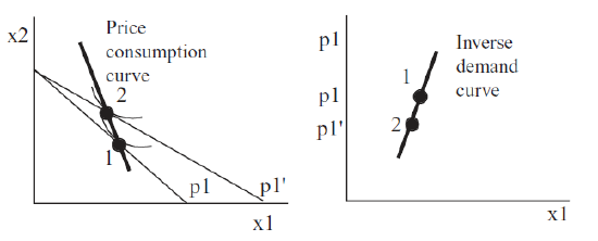 Figure 4.14: A Giffen good.
Do not be confused by the decrease in \(x_1\). Quantity demanded fell, but so did price. Thus, we have a positive relationship between price and quantity demanded (they are moving together) and an upward sloping demand curve. This is a Giffen good.
To be crystal clear, it is not the fact that optimal \(x_1\) decreased that tells us we have a Giffen good, but that it decreased as price fell. If we started at point 2 and raised the price, the budget constraint would swing in, and we would move to point 1, with an increase in optimal \(x_1\). We would have Giffenness because \(x_1\) rose as \(p_1\) increased, We would be traveling up the upward sloping demand curve.
A version of Figure 4.14 is depicted in every microeconomics book that discusses Giffen goods and, make no mistake, this is a canonical graph in micro theory. But dead graphs on a printed page (or computer screen) force the reader to reconstruct individual elements and can be difficult to disentangle. With Excel at our disposal, we can walk through a numerical example to gain complete mastery of the concept of Giffenness.
STEP Proceed to the Optimal1 sheet and look at the utility function.
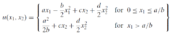
The sheet models a Giffen good. The utility function is admittedly quite complicated, but a simple functional form like Cobb-Douglas or quasilinear is never going to produce Giffenness.
The U1 sheet shows that this functional form meets the requirements of well-behaved preferences. The coefficients have been set to values that do not violate the axioms of revealed preference in the range we are working in. The indifference curves, for example, will never intersect.
Another example of a utility function that exhibits Giffen behavior is \(U=ax_1+\ln{x_1}+\frac{x_2^2}{2}\). This is implemented in the Optimal2 sheet. We will use the Optimal1 sheet here and save the Optimal2 sheet for Q&A work. These are just two of the many functional forms that meet the requirements of well-behaved utility that could exhibit Giffen behavior.
The Optimal1 sheet opens with \(x_1\) = 44 and \(x_2\) = 11. A single indifference curve is displayed and it does not have the curvature we have been used to seeing. Recall that perfect substitutes are straight lines, so we can infer that this utility function is expressing preferences with a high degree of substitutability between the two goods.
Without running Solver, we know this is the optimal solution because the MRS equals the price ratio.
STEP It is hard to see that the budget line is just touching the indifference curve, but if you click the  button, you will see that the tangency condition is clearly met.
Since we are working on Giffen behavior, we want to explore the effects of a change in price on the quantity demanded. We will increase the price of \(x_1\) and see how the consumer responds. Before we do, think through what will happen. How will the constraint change and where must the new tangency point lie if \(x_1\) is a Giffen good?
STEP Change \(p_1\) to 1.1. What happens?
The budget line pivots around the y intercept. It may look like a parallel shift, but it really is not.
STEP Click the  button to see that the price increase has, as expected, rotated the budget line in.
The 44,11 initial optimal bundle is no longer affordable. The consumer must re-optimize.
STEP Run Solver. What happens?
Figure 4.15 shows the result. Optimal consumption of good 2 has collapsed from 11 to around 1.5 and the consumer now wants to buy 48.6 units of good 1, which is more than the initial amount of 44.
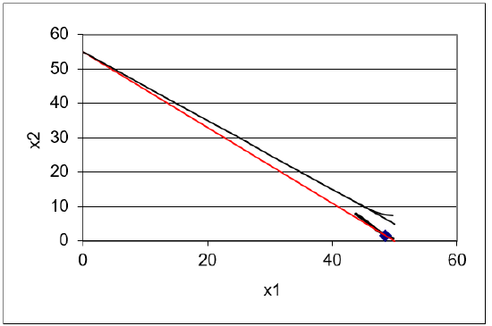
Figure 4.15: A numerical example of Giffen behavior.
Source: GiffenGoods.xls!Optimal1
This is amazing! The price of good 1 went up by 10 cents (from 1 to 1.1) and the optimal amount of good 1 increased by 4.6 units (from 44 to 48.6). Price rose, ceteris paribus, and so did quantity demanded!
This is a concrete, numerical example of a Giffen good. We can use the Comparative Statics Wizard to explore more carefully the demand curve resulting from this bizarre utility function.
STEP Use the Comparative Statics Wizard to trace the demand curve from 0.1 to 3. Set cell B16 to 0.1, then apply 300 (yes, 300) shocks by increments of 0.01 with the CSWiz add-in. Finally, create a graph of the inverse demand curve, \(p_1\) as a function of \(x_1 \mbox{*}\).
Your results should look like Figure 4.16, which is also in the CS1 sheet. That is certainly a strange looking demand curve. It is Giffen in a range. In other words, a Giffen good is not intrinsically and everywhere a Giffen good. Giffenness is a local phenomenon. The demand curve pictured in Figure 4.16 has three different behaviors. As price rises from zero, quantity demanded falls. This continues until a price of about 70 cents. From there, penny increases lead to increased consumption of good 1. In this range, \(x_1\) is a Giffen good. There is a third region, at prices such as $2 and $3, where the good is not Giffen.
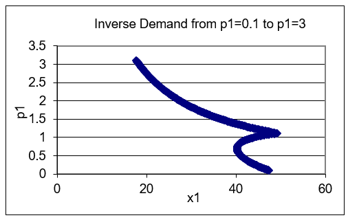
Figure 4.16: The inverse demand curve for \(x_1\).
Source: GiffenGoods.xls!CS1
So, this example has shown that Giffen goods are not only possible, they can be modeled by the Theory of Consumer Behavior. We now know that there are utility functions that reflect well-behaved preferences that generate Giffen behavior.
Giffen Goods in Theory and Practice
A Giffen good is a strange creature in economics. The phenomenon of quantity demanded rising as price increases was first purportedly sighted during the Irish potato famine and named after Sir Robert Giffen, even though there is no evidence that Giffen actually claimed seeing quantity demanded rise as prices rose, ceteris paribus.
Certainly there are utility functions that give rise to Giffen goods. Certainly individual consumers may have well-behaved preferences that yield Giffen behavior. But has a Giffen good ever been spotted? Do Giffen goods exist in the real world in the sense that a market demand curve is upward sloping? This is the subject of much debate. Ceteris paribus is a difficult requirement to meet.
The actual sighting of a Giffen good in the real world remains contentious. We know for sure that the original example, potatoes during the Great Irish Famine, was flawed and there is little evidence that it was a Giffen good. The Biblio sheet has a few references that can start you learning more about the history of Giffen goods in economics.
The next section gives an even deeper explanation for Giffen goods. It establishes the specific conditions needed for Giffenness to occur.
Exercises
- Use the results in the CS1 sheet to find the price range for which we see Giffen behavior. Report your answer and describe your procedure.
- Use the Optimal1 sheet utility function and parameter values to find the optimal solution via analytical methods. Show your work. Note that \(x_1 < \frac{a}{b}\),so the utility function is
\(U = ax_1 - \frac{b}{2}x_1^2 + cx_2 + \frac{d}{2}x_2^2\)
- Use Word’s Drawing Tools to reproduce Figure 4.14, depicting \(x_1\) as a Giffen good, but use a \(p_1\) increase (instead of a decrease).
References
The epigraph comes from page 2436 of Neal Kumar Katyal, "Deterrence’s Difficulty," Michigan Law Review, Vol. 95, No. 8. (August, 1997), pp. 2385–2476, repository.law.umich.edu/mlr/vol95/iss8/3/.
The Biblio sheet in GiffenGoods.xls has a list of references on Giffen goods. Scroll down to see suggested readings on the Irish potato famine, the history of Giffen goods in economics, and modern-day efforts at finding Giffen goods. Click on a link if anything catches your eye and seems worth exploring.