
17.1: Supply and Demand
- Last updated
- Save as PDF
- Page ID
- 58528

We begin our analysis of the market system by making an obvious, but necessary point: A market demand (or supply) curve is the sum of individual demand (or supply) curves.
STEP Open the Excel workbook SupplyDemand.xls, read the Intro sheet, then go to the SummingD sheet.
The sheet has three consumers, with three different utility functions and different incomes. We assume the consumers face the same prices for goods 1 and 2. We set \(p_2 = 10\), but leave \(p_1\) as a variable to derive the individual demand curve for each consumer.
STEP Confirm, by clicking on a few cells in the range B18:D22, that the formulas in these cells represent the individual demand curves for each consumer. Notice that the graphs below the data represent the individual demand (\(x_1 \mbox{*} = f(p_1)\)) and inverse demand (\(p_1 = f(x_1 \mbox{*})\)) curves.
Given individual demands, market demand can be found by simply summing the optimal quantity demanded at each price.
STEP Confirm, by examining the formula in cell E18, that market demand has been computed by adding the individual demands at \(p_1 = 1\). The same, of course, holds true for the other points on the market demand curve.
Because we often display demand schedules as inverse demand curves, with price on the y axis, the red arrow (see your screen and Figure 17.1) shows that market demand is the result of a horizontal summation. At \(p_1 = 5\), we read off each of the individual quantities demanded and add them together to obtain the market quantity demanded of 24.3 units.
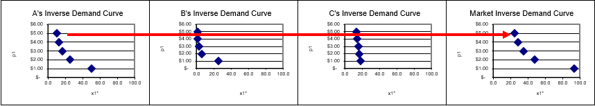
Figure 17.1: Horizontal summation to get market demand.
Source: SupplyDemand.xls!SummingD.
Supply works just like demand. We add individual supply curves (horizontally if we are working with inverse supply curves) to get the market supply curve. Because individual supply curves are P above AVC, we know that the market supply curve is simply the sum of the marginal costs above minimum AVC of all the firms producing the particular good or service sold in this market.
So the way it works is that each of the individual buyers and sellers optimizes to decide how much to buy or sell at any given price. The Theory of Consumer Behavior and the Theory of the Firm are the sources of individual demand and supply.
Once we have the many individual demand and supply curves, we add them up. So market demand and supply are composed of the sum of many individual pieces. Some consumers want a lot of the product at a given price, while others want less (or maybe none at all), but they all get added together to form market demand. The same is true for supply.
Initial Solution
The next step is obvious: market supply and demand are combined to generate an equilibrium solution that determines the quantity produced and consumed. This equilibrium solution is the market’s answer to society’s resource allocation problem.
The simple story is that price adjusts, responding to surpluses and shortages, until it settles down at its equilibrium level, where quantity demanded equals quantity supplied. This is the intersection of the two curves.
It is confusing, but true that in the supply and demand model, price and quantity are endogenous variables. How can price be endogenousdon’t consumers and PC firms take the price as given? Yes, they do and for individual buyers and sellers, price is exogenous, but, for the system as a whole, price is endogenous.
At the individual agent level, price is given and cannot be controlled by the agent so it is exogenous. But we are now at a different level. We are allowing forces of supply and demand to move the price until it settles down. Thus, at the level of the market, we say price is endogenous because it is determined by forces within the system.
It is worth repeating that equilibrium means no tendency to change. When applied to the model of supply and demand, equilibrium means that price (and therefore quantity demanded and supplied) has no tendency to change. A price that does have a tendency to change (because there is a surplus or shortage) is a disequilibrium price.
We can put these ideas in the same framework that we used to solve optimization problems. There are two ways to find the equilibrium solution and they yield the same answer:
- Analytical methods using algebra: conventional paper and pencil.
- Numerical methods using a computer: for example, Excel’s Solver.
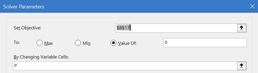
STEP Proceed to the EquilibriumSolution sheet to see how the supply and demand model has been implemented in Excel.
The information has been organized into three main areas: endogenous variables, exogenous variables, and an equilibrium condition. Excel’s Solver will be used to find the values of the endogenous variables that meet the equilibrium condition.
As usual, green represents exogenous variables, the coefficients on the demand and supply curves.
Although price and quantity are both endogenous variables, price is bolded to indicate that the model will be solved by finding the equilibrium price and then the equilibrium quantity (demanded and supplied) is determined. This is similar to the approach we took with monopoly where we maximized profits by choosing q, then found P from the demand curve.
Finally, the equilibrium condition is represented by the difference between quantity demanded and supplied.
On opening, the price is too high. At \(P=125\), quantity demanded (\(Q_d\)) is 112.5 and \(Q_s\) is about 173. Thus, have a surplus (\(Q_d < Q_s\)) and, therefore, price is pushed down (as firms seek to unload unsold inventory).
STEP Use the scroll bar next to the price cell to set the price below the intersection of supply and demand. The dashed line (representing the current price) responds to changes in the price cell (B12).
Notice how the quantity demanded and supplied cells also change as you manipulate the price, which makes the equilibrium condition cell (B17) change.
With P below the intersection, the market experiences a shortage (\(Q_d > Q_s\)) and price is pushed up. The force in the market model is the pressure generated by surpluses (excess supply) or shortages (excess demand).
Obviously, the equilibrium price is found where supply and demand intersect. At this price, there is no tendency to change. The forces of supply and demand are balanced. We can find this price by adjusting the price manually and keeping our eye on the chart or by using Excel’s Solver.
STEP Open Solver.
The Solver dialog box appears, as shown in Figure 17.2. Notice that the objective is not to Max or Min, but to set an equilibrium condition equal to zero. Notice also that P, price, is being used to drive the market to equilibrium and there are no constraints.
Source: SupplyDemand.xls!EquilibriumSolution.
STEP Click Solve to find the equilibrium solution.
The chart makes it easy to see that Solver is correct. At \(P = 100\), \(Q_d = Q_s = 125\). Without a surplus or shortage, there is no tendency for the price to change and we have found the equilibrium resting point.
The equilibrium quantity, 125 units, is the market’s answer to society’s resource allocation problem. It says that we should send enough resources from the scarce, finite amount of inputs available to produce 125 units of this product.
We envision a supply and demand diagram for every product and the equilibrium quantity, in each market, is the market’s answer to how much we should have of each commodity.
The analytical approach is easier than the math we applied for optimization problems because there is no derivative or Lagrangean. All we need to do is find the intersection of supply and demand.
Given either market supply and demand curves \(Q = f(P)\) or inverse supply and demand functions, \(P = f(Q)\), we find the equilibrium solution by setting supply and demand equal to each other.
The inverse functions in the Excel workbook are: \[P=350-2Q_d\] \[P=35+0.52Q_s\]
Setting the inverse functions equal to each other, we replace the \(Q_d\) and \(Q_s\) with \(Q_e\) because we are finding the value that lies on both of the curves: \[350-2Q_e=35+0.52Q_e\] \[385=2.52Q_e\] \[Q_e=\frac{315}{2.52}=125\]
Substituting this solution into either inverse function yields \(P_e = 100\).
We can also easily flip the inverse functions, solving for Q in terms of P, to obtain the demand and supply functions: \[P=350-2Q_d \rightarrow 2Q_d=350 - P \rightarrow Q_d = 175 - \frac{1}{2}P\] \[P=35+0.52Q_s \rightarrow 0.52Q_s=P - 35 \rightarrow Q_s=\frac{1}{0.52}P -\frac{35}{0.52}\]
If we set demand equal to supply, using \(P_e\) to denote the common value we seek, we find the equilibrium price: \[175 - \frac{1}{2}P_e = \frac{1}{0.52}P_e -\frac{35}{0.52}\] \[175 +\frac{35}{0.52} = \frac{1.26}{0.52}P_e\] \[P_e=\frac{175 +\frac{35}{0.52}}{\frac{1.26}{0.52}}=100\] Plugging this equilibrium price into either function gives \(Q_e = 125\).
This work shows something obvious, but worth making clear: we can use \(P=f(Q)\) functions to find \(Q_e\), then \(P_e\) or we can use \(Q=f(P)\) functions to find \(P_e\), then \(Q_e\). We get the same result either way since we are merely flipping the axes.
If you think using supply and demand functions (\(Q=f(P)\)) to get \(P_e\) and then \(Q_e\) is more faithful to what is going on in the market, you are a Marshallian for that is exactly how he saw markets functioning. And that is why P is on the y axisso the reader sees it fluctuate up and down until it settles down to its equilibrium value.
We finish our work on the initial solution by pointing out that it is not surprising that numerical methods, using Solver, agree with the analytical approach. Given supply and demand for this product, we know that the market equilibrium solution would call for producing 125 units. The market system would, therefore, allocate the labor and capital needed to make this amount.
Elasticity
We can compute the price elasticity of demand and supply at the equilibrium price (the point elasticity) by applying our usual formula, \(\frac{dQ}{dP}\frac{P}{Q}\). This time, we must use the demand and supply curves, \(Q=f(P)\).
STEP Click the  button to see the calculation.
Although it has text wrapped around it, the number displayed for the price elasticity of demand is based on this part of the formula: \((-1/d1_)*(P/Qd)\). With \(Q_d = \frac{d_0}{d_1} - \frac{1}{d_1}P\), it is easy to see that \(\frac{dQ}{dP}=-\frac{1}{d_1}\) and then we multiply by \(\frac{P}{Q}\). Likewise, the price elasticity of supply is the slope of the supply function times the \(\frac{P}{Q}\) ratio.
At the equilibrium price and quantity, demand is much more price inelastic than supply. This does not matter right now, but it will in future work.
STEP With \(P = 100\), click on the price scroll bar and watch the price elasticities. Keep clicking until you set \(P=125\).
As you increase price, the elasticities change. Even though the slopes are constant, the supply and demand elasticities change because the \(\frac{P}{Q}\) ratio is changing. Multiplying the slope by a price-quantity coordinate produces a percentage change measure of responsiveness.
The price elasticity of demand at \(P=125\) is \(- 0.56\) means that a 1% increase in the price leads only to a 0.56% decrease in the quantity demanded. This means demand is not very responsive since the percentage change in quantity is less than the percentage change in the price. Notice, however, the demand is more responsive at \(P=125\) than it was at \(P_e=100\).
We will see in future applications of the supply and demand model that the price elasticities play crucial roles. For now, remember that slope and elasticity are not the same and that the price elasticity tells us how responsive quantity demanded or supplied is to a change in the price.
Long Run Equilibrium
Another concept at play in the model of supply and demand is that of long run equilibrium.
In the long run (when there are no fixed factors of production), a competitive market has another adjustment to make. In addition to responding to pressure from surpluses and shortages, the market will respond to the presence of non-zero profits.
The story is simple. Excess profits (economic profits greater than zero) will lead to the entry of more firms. This will shift the inverse supply curve right, lowering the price until all excess profits are competed away.
If the long run price is too low, firms suffering negative profits will exit, shifting the inverse supply curve left and raising prices. Thus, a long run competitive equilibrium has to look like Figure 17.3.
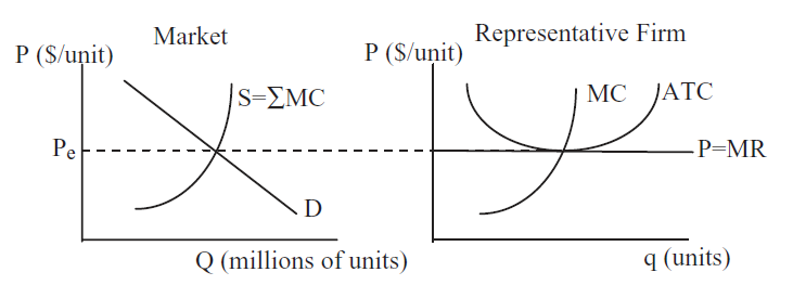 Figure 17.3: Long run equilibrium.
The left panel in Figure 17.3 shows supply and demand in the market as a whole, while the right panel depicts a single firm that is just one of the many firms in this perfectly competitive industry. The two graphs have the same y axis, but the scale of the x axis is different. A single firm can only produce a few units (q), but "millions" (an arbitrary number chosen just as an example) are bought and sold in the market (uppercase Q for emphasis). The idea is that there are many firms, each producing small amounts of the same output. In the aggregate, they make "millions" of units, but one individual firm produces only a tiny amount of the total.
Notice how the market demand curve is downward sloping, but the firm’s demand curve is horizontal. This is the classic price taking environment in which a PC firm operates. Notice also that the market supply curve is the sum of the individual firm MC curves because individual firm supply is MC where \(P>AVC\). We could chop off the bottom of the market supply curve (below \(P_e\)), but that would be confusing.
In essence, the long run adjustment process endogenizes the number of firms. This means that forces within the model determine the number of firms in an industry. This is not true in the short run, where the number of firms is assumed fixed (although they can shutdown if \(P<AVC\)) and the only adjustment is that market surpluses and shortages are eliminated by price movements.
Notice that the long run equilibrium price meets two equilibrium conditions:
- Quantity demanded equals quantity supplied so there is no surplus or shortage in the market.
- Economic profits are zero so there is no incentive for entry or desire to exit.
Long run equilibrium is even more fanciful and unrealistic than our abstract models of the consumer and firm. There has never been and never will be a market in long run equilibrium. Its primary purpose is as an indicator of where a market is heading.
The long run equilibrium model tells us that even though we are at an equilibrium with no surplus or shortage (such as with \(P_e=100\) in the Excel workbook), further adjustments will be made depending on the profit position of the firms. If profits are positive, entry will increase supply and lower price; while negative profits will lead to exit, decreased supply and higher prices.
In the Excel workbook, we do not know if the market is in long run equilibrium when \(P_e=100\) because we do not have a representative firm with its cost curves so we can determine its profits.
A key takeaway is that, like price, the number of firms is endogenous in the long run because there are forces in the model that determine its value. No one sets the number of firms. The interaction of buyers and sellers is generating the number of firms as an equilibrium outcome.
Comparative Statics
Comparative statics analysis with the supply and demand equilibrium model is familiar. Most introductory economics courses emphasize shifts in supply and demand. Here is a quick review, with special emphasis on equilibrium as an answer to society’s resource allocation problem.
A change in any variable that affects supply or demand, other than price, causes a shift in the inverse supply or demand curve. A change in price causes a movement along stationary supply and demand curves. An increase in demand or supply means a rightward shift in inverse demand or supply.
For demand, the shift factors are income, prices of other goods related in consumption (i.e., complements and substitutes), tastes, consumers’ expectations about future prices, and the number of buyers. The usual shift factors for supply include input prices, technology, firms’ expectations, and the number of sellers.
As usual, comparative statics analysis consists of finding the initial solution, applying the shock, determining the new solution, and comparing the initial to the new solution. In the case of supply and demand, we want to make statements about the changes in equilibrium price and quantity. \(P_e\) and \(Q_e\) are the endogenous variables in the equilibrium model and we track how they respond to shocks.
For example, new technology lowered costs, What would that do to equilibrium price and quantity? We can use the EquilibriumModel sheet to see what happens.
STEP Make sure \(P=100\) so the market is in equilibrium, then click on the s0 slider to lower the inverse supply curve intercept to 15.
The graph updates as you change the s0 and a new, red inverse supply curve appears. The original, black line remains as a benchmark, but there is only one demand and supply at any point in time.
At \(P=100\), there is a surplus. We need to find the new equilibrium solution.
STEP Run Solver to find the new \(P_e\) and \(Q_e\).
Figure 17.4 shows the result. The equilibrium price falls (from $100/unit to roughly $84/unit) and the equilibrium quantity rises from (from 125 to about 133 units).
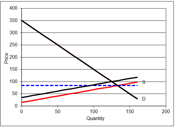
Figure 17.4: Comparative statics with the supply and demand model.
Source: SupplyDemand.xls!EquilibriumSolution.
The decentralized market system has generated a new answer to society’s resource allocation problem. Ceteris paribus, if a product enjoys a productivity increase from a new technology, making it cheaper to produce the product, the system will produce more of it.
This response makes common sense, but it is absolutely critical to understand that the increase in output is not decreed from on high. It is bubbling up from belowoutput rises because supply shifts and market forces lower prices and raise output.
We do not examine the equilibration process from the initial to the new solution when doing comparative statics analysis. We might directly converge to the new equilibrium, with price falling gradually until \(Q_d=Q_s\). Or, price might collapse, falling below the equilibrium price, then rising above it, and so on. This would be oscillatory convergence.
With comparative statics, however, the focus is entirely on comparing the new to the initial solution. We may, in fact, be interested in the path to the new equilibrium, but that would take us into comparative dynamicsa topic for advanced microeconomics.
Applying Supply and Demand
To escape the usual trap of thinking of supply and demand in purely graphical terms, we apply the model to a real world example. We avoid graphs completely and focus on the mechanics and logic of supply and demand.
The market system uses supply and demand for outputs and inputs. This example focuses on labor, but there are many applications of supply and demand for capitalperhaps the stock market is the most prominent.
Consider that most fans of American football would not know the second highest paid position in the NFL. Everyone knows quarterbacks are the highest paid, but what position is second? Are star running backs, wide receivers, or maybe linebackers then next highest paid? No, the answer is left tackles www.spotrac.com/nfl/positional/.
In The Blind Side: Evolution of a Game (2006), Michael Lewis explains that free agency, allowing players to sell their services to the highest bidder, radically altered the pay structure of the NFL. How did this happen? Supply and demand.
First, Lewis (p. 33) explains, there is little supply for the left tackle position.
The ideal left tackle was big, but a lot of people were big. What set him apart were his more subtle specifications. He was wide in the ass and massive in the thighs: the girth of his lower body lessened the likelihood that Lawrence Taylor, or his successors, would run right over him. He had long arms: pass rushers tried to get in tight to the blocker’s body, then spin off it, and long arms helped to keep them at bay. He had giant hands, so that when he grabbed ahold of you, it meant something.
But size alone couldn’t cope with the threat to the quarterback’s blind side, because that threat was also fast. The ideal left tackle also had great feet. Incredibly nimble and quick feet. Quick enough feet, ideally, that the idea of racing him in a five-yard dash made the team’s running backs uneasy. He had the body control of a ballerina and the agility of a basketball player. The combination was just incredibly rare. And so, ultimately, very expensive.
In addition to low supply, there is high demand. The left tackle is charged with protecting the quarterback’s blind side, the direction from which defensive ends and blitzing linebackers come shooting in, causing sacks, fumbles, and worst of all, injuries. Because the quarterback is the team’s most prized asset, the left tackle position is a highly sought-after bodyguard.
But even more surprising than the fact that blind side tackles are the second highest paid players in the NFL is that this was not always the case. Lewis reports that for many years, linemen were low paid, as shown in Figure 17.5.
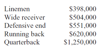
Figure 17.5: NFL salaries in 1990, before free agency.
Source: Lewis, p. 227.
So, why do blind side tackles make so much money today? NFL players did not enjoy free agency until the 1993 season. Up to that time, players were drafted or signed by teams and could move only by being traded.
Then the players’ union and team owners signed a contract that enabled free agency for players so they could move wherever they wanted. In return, the players agreed to a salary cap that was a percentage of league-wide team revenue. Free agency meant that a player could sell himself to the highest bidderin other words, the market would operate to establish player salaries.
At first, everyone was shocked. Teams spent unheard of amounts on unknown linemen. Players that most fans never heard of made millions. Then a starting left tackle for the Bills, Will Wolford, announced his deal: $7.65 million over three years to play for the Colts. No one had ever paid so much money for a mere lineman. Not only that, his contract stipulated that Wolford was guaranteed to be the highest paid player on offense for as long as he was on the team.
The NFL threatened to invalidate the outlandish contract. In the end, the contract was allowed, but the commissioner decreed that such terms in a contract could not be used again.
Lewis, pp. 227–228 (emphasis added), explains what had happened:
The curious thing about this market revaluation is that nothing had changed in the game to make the left tackle position more valuable. Lawrence Taylor had been around since 1981. Bill Walsh’s passing game had long since swept across the league. Passing attempts per game reached a new peak and remained there. There had been no meaningful change in strategy, or rules, or the threat posed by the defense to quarterbacks’ health in ten years. There was no new data to enable NFL front offices to value left tacklesor any offensive linemenmore precisely. The only thing that happened is that the market was allowed to function. And the market assigned a radically higher value to the left tackle than had the old pre-market football culture.
Economics students around the world study supply and demand, but they think it is a graph. It is so much more than an X. It is a model that explains how pressures from buyers and sellers are balanced. This example shows that markets value commodities by reflecting the underlying demand and supply conditions. Blind side tackles are worth a lot of money in the NFL. Before markets were used, they were grossly underpaid. There were no statistics for linemen like yards rushing or field goal percentage so they could not differentiate themselves. The market system, however, expressing the desires of general managers and reflecting the true importance of the blind side tackle, correctly values the position.
Markets are neither moral nor caring. They are a way to consolidate information from disparate sources. Prices are high when everyone wants something or there is very little of it available. For blind side tackles, with both forces at work, the market system was a bonanza.
Supply and Demand and Resource Allocation
This introduction to the market system via partial equilibrium showed how an individual market settles down to its equilibrium solution. Much of this material is familiar because most introductory economics courses emphasize supply and demand analysis.
There are two fundamental concepts, however, that are critical in gaining a deep understanding of supply and demand.
- Supply and demand curves do not materialize out of thin air. They are the result of comparative statics analyses on consumer and firm optimization problems. In other words, supply and demand must be interpreted as the reduced-form solutions from utility- and profit-maximizing agents. Figure 17.6 drives this point home by adding representative consumer and firm graphs to supply and demand.
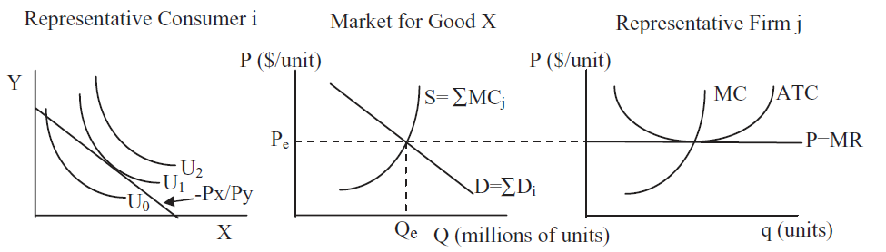 Figure 17.6: An overall view of supply and demand.
The notation in Figure 17.6 is awkward because we are combining consumer and firm theories which have their own individual histories. Thus, X in the left panel is the number of units of the same good that is produced by the firm in the right panel with label "q (units)." Likewise, P in the middle and right panels equals \(P_x\) in the left panel. Notational awkwardness notwithstanding, it is true that consumers generate demand for every good and service and the sum of individual demands is market demand. The same holds for supply and firms. Figure 17.6 is a great way to put it all together.
- Supply and demand is a resource allocation mechanism. It is the equilibrium quantity that is of greatest importance in the supply and demand model because this is the market’s answer to society’s resource allocation problem. The price is the variable that drives a market to equilibrium, but it is \(Q_e\) that represents how much of society’s scarce resources are to be allocated to the production of each commodity, according to the market system.
A picture of this is in the Intro sheet. Now that you have finished this section, take another look at it and walk through it carefully.
Introductory economics students are taught supply and demand, but they do not understand that the market demand and supply curves are reduced forms from individual optimization problems. Deriving demand and supply is a bright line separating introductory from intermediate courses.
In addition, introductory courses stress price and equilibration (surpluses and shortages) as students learn the basics of supply and demand. Unfortunately, this means students miss the fundamental point: the equilibrium quantity is the decentralized, market system’s answer to how much of society’s scarce resources should be devoted to this particular commodity. There are graphs like Figure 17.6 for every good or service allocated by the market.
While the graphics in the Intro sheet emphasize the importance of \(Q_e\), Figure 17.7 offers another way to explain what supply and demand is really all about. Filling in the mountain of society’s finite resources with a checkerboard pattern conveys that the factors of production are individually owned and controlled. Each square represents the resources controlled by each person. Every person owns a tiny piece of the mountain and decides what do with that labor and capital.
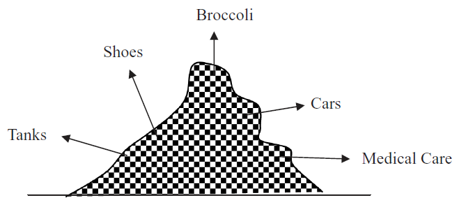 17.7: Individual ownership of resources.
Every product allocated by the market system has a supply and demand that attracts individual resources owners. Out of this cacophony of interactions, an equilibrium is found and resources flow to the production of an amazing variety of goods and services. This is the truly fascinating aspect of supply and demand. Each agent is self-interested and thinking only of their own gain, but the outcome of the market system establishes a pattern that answers the question of how to use scarce resources.
Of course, the checkerboard pattern in Figure 17.7 makes it seem like everyone controls equal shares, yet there is no question that some people own more resources than others. Inequality in the distribution of resources can be a serious obstacle facing the market system. It will not work well if resources are grossly unequally distributed.
This leads to another common misconception regarding equilibrium and desirability. Can we conclude, by virtue of the fact that the market is in equilibrium, that the market system has correctly solved society’s optimization problem? Absolutely not. Equilibrium does not automatically equal optimal. The next section tackles this issue.
Exercises
STEP Click the  button in the EquilibriumSolution sheet to set the coefficients to their initial values.
- Use the scroll bar in cell C7 of the EquilibriumSolution sheet to set the intercept of the inverse demand curve to 375. Use Excel’s Solver to find the equilibrium solution. Take a picture of the answer and paste it in your Word document.
- Solve the equilibrium model with \(d_0 = 375\) via analytical methods. Show your work, using Word’s Equation Editor as needed.
- Because the intercept increased compared with the initial values of the parameters, we know there has been an increase in demand. How has the market responded to this shock? Is the market’s response reasonable?
References
The epigraph is from page 111 of Judy Klein, "The Method of Diagrams and the Black Arts of Inductive Economics," published in Ingrid Hahne Rima, Measurement, Quantification and Economic Analysis: Numeracy in Economics (1995). As mentioned in section 4.3’s References, credit for drawing supply and demand curves is usually given to Jenkin in 1870 and then Marshall in 1890 made the diagrams popular. Klein reviews precursors and how graphs evolved and came to be so important in economics.
The basic questions about resource use that must be answered by society can be traced to Paul Samuelson’s dominant Introductory Economics textbook (first published in 1948) and Frank Knight’s The Economic Organization (1933). "Samuelson boiled Knight’s five functions down to three: i) What commodities shall be produced and in what quantities?, ii) How shall they be produced?, and iii) For whom are they to be produced? ’These three questions,’ Samuelson adds, paraphrasing Knight, ’are fundamental and common to all economies.’" See Ross B. Emmett, "Frank H. Knight and The Economic Organization," Michigan State University Working Paper No. 0405–01, p. 16, papers.ssrn.com/sol3/papers.cfm?abstract_id=922531.
Michael Lewis’ book, The Blind Side: The Evolution of a Game was a huge hit in 2006. It was made into a movie in 2009, winning a Best Picture nomination and the Academy Award for Best Actress for Sandra Bullock.