Let us now investigate the interplay between economic theories on the one hand and data on the other. We will develop two examples. The first will be based upon the data on house prices, the second upon a new data set.
House prices – theory
Remember from Chapter 1 that a theory is a logical argument regarding economic relationships. A theory of house prices would propose that the price of housing depends upon a number of elements in the economy. In particular, if borrowing costs are low then buyers are able to afford the interest costs on larger borrowings. This in turn might mean they are willing to pay higher prices. Conversely, if borrowing rates are higher. Consequently, the borrowing rate, or mortgage rate, is a variable for an economic model of house prices. A second variable might be available space for development: If space in a given metropolitan area is tight then the land value will reflect this, and consequently the higher land price should be reflected in higher house prices. A third variable would be the business climate: If there is a high volume of high-value business transacted in a given area then buildings will be more in demand, and that in turn should be reflected in higher prices. For example, both business and residential properties are more highly priced in San Francisco and New York than in Moncton, New Brunswick. A fourth variable might be environmental attractiveness: Vancouver may be more enticing than other towns in Canada. A fifth variable might be the climate.
House prices – evidence
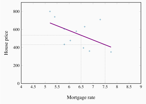
These and other variables could form the basis of a theory of house prices. A model of house prices, as explained in Chapter 1, focuses upon what we would consider to be the most important subset of these variables. In the limit, we could have an extremely simple model that specified a dependence between the price of housing and the mortgage rate alone. To test such a simple model we need data on house prices and mortgage rates. The final column of Table 2.1 contains data on the 5-year fixed-rate mortgage for the period in question. Since our simple model proposes that prices depend (primarily) upon mortgage rates, in Figure 2.3 we plot the house price series on the vertical axis, and the mortgage rate on the horizontal axis, for each year from 2001 to 2011. As before, each point (shown as a '+') represents a pair of price and mortgage rate values.
The resulting plot (called a scatter diagram) suggests that there is a negative relationship between these two variables. That is, higher prices are correlated with lower mortgage rates. Such a correlation is consistent with our theory of house prices, and so we might conclude that changes in mortgage rates cause changes in house prices. Or at least the data suggest that we should not reject the idea that such causation is in the data.
House prices – inference
To summarize the relationship between these variables, the pattern suggests that a straight line through the scatter plot would provide a reasonably good description of the relationship between these variables. Obviously it is important to define the most appropriate line – one that 'fits' the data well. The line we have drawn through the data points is informative, because it relates the two variables in a quantitative manner. It is called a regression line. It predicts that, on average, if the mortgage rate increases, the price of housing will respond in the downward direction. This particular line states that a one point change in the mortgage rate will move prices in the opposing direction by $105,000. This is easily verified by considering the dollar value corresponding to say a mortgage value of 6.5, and then the value corresponding to a mortgage value of 7.5. Projecting vertically to the regression line from each of these points on the horizontal axis, and from there across to the vertical axis will produce a change in price of $105,000.
Note that the line is not at all a 'perfect' fit. For example, the mortgage rate declined between 2008 and 2009, but the price declined also – contrary to our theory. The model is not a perfect predictor; it states that on average a change in the magnitude of the x-axis variable leads to a change of a specific amount in the magnitude of the y-axis variable.
In this instance the slope of the line is given by -105,000/1, which is the vertical distance divided by the corresponding horizontal distance. Since the line is straight, this slope is unchanging.
Regression line: representation of the average relationship between two variables in a scatter diagram.
Road fatalities – theory, evidence and inference
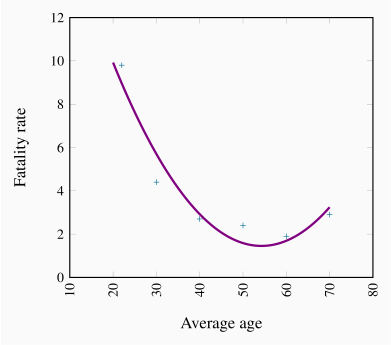
Table 2.3 contains data on annual road fatalities per 100,000 drivers for various age groups. In the background, we have a theory, proposing that driver fatalities depend upon the age of the driver, the quality of roads and signage, speed limits, the age of the automobile stock and perhaps some other variables. Our model focuses upon a subset of these variables, and in order to present the example in graphical terms we specify fatalities as being dependent upon a single variable – age of driver.
Table 2.3 Non-linearity: Driver fatality rates Canada, 2009
| Age of driver |
Fatality rate |
| |
per 100,000 drivers |
| 20-24 |
9.8 |
| 25-34 |
4.4 |
| 35-44 |
2.7 |
| 45-54 |
2.4 |
| 55-64 |
1.9 |
| 65+ |
2.9 |
Source: Transport Canada, Canadian motor vehicle traffic collision statistics, 2009.
The scatter diagram is presented in Figure 2.4. Two aspects of this plot stand out. First, there is an exceedingly steep decline in the fatality rate when we go from the youngest age group to the next two age groups. The decline in fatalities between the youngest and second youngest groups is about 20 points, whereas the decline between the third and fourth age groups is less than 2 points. This suggests that behaviour is not the same throughout the age distribution. Second, we notice that fatalities increase for the oldest age group, perhaps indicating that the oldest drivers are not as good as middle-aged drivers.
These two features suggest that the relationship between fatalities and age differs across the age spectrum. Accordingly, a straightline would not be an accurate way of representing the behaviours in these data. A straight line through the plot implies that a given change in age should have a similar impact on fatalities, no matter the age group. Accordingly we have an example of a non-linear relationship. Such a non-linear relationship might be represented by the curve going through the plot. Clearly the slope of this line varies as we move from one age category to another.