We established in the previous chapter that, in deciding upon a profit-maximizing output, any firm should produce up to the point where the additional cost equals the additional revenue from a unit of output. What distinguishes the supply decision for a monopolist from the supply decision of the perfect competitor is that the monopolist faces a downward sloping demand. A monopolist is the sole supplier and therefore must meet the full market demand. This means that if more output is produced, the price must fall. We will illustrate the choice of a profit maximizing output using first a marginal-cost/marginal-revenue approach; then a supply/demand approach.
Marginal revenue and marginal cost
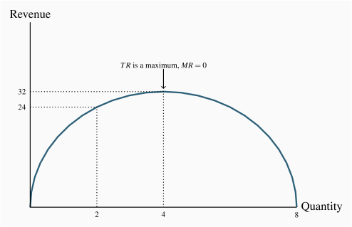
Table 10.1 displays price and quantity values for a demand curve in columns 1 and 2. Column 3 contains the sales revenue generated at each output. It is the product of price and quantity. Since the price denotes the revenue per unit, it is sometimes referred to as average revenue. The total revenue (TR) reaches a maximum at $32, where 4 units of output are produced. A greater output necessitates a lower price on every unit sold, and in this case revenue falls if the fifth unit is brought to the market. Even though the fifth unit sells for a positive price, the price on the other 4 units is now lower and the net effect is to reduce total revenue. This pattern reflects what we examined in Chapter 4: As price is lowered from the highest possible value of $14 (where 1 unit is demanded) and the corresponding quantity increases, revenue rises, peaks, and ultimately falls as output increases. In Chapter 4 we explained that this maximum revenue point occurs where the price elasticity is unity (-1), at the midpoint of a linear demand curve.
Table 10.1 A profit maximizing monopolist
| Quantity |
Price |
Total |
Marginal |
Marginal |
Total |
Profit |
| (Q) |
(P) |
revenue (TR) |
revenue (MR) |
cost (MC) |
cost (TC) |
|
| 0 |
16 |
|
|
|
|
|
| 1 |
14 |
14 |
14 |
2 |
2 |
12 |
| 2 |
12 |
24 |
10 |
3 |
5 |
19 |
| 3 |
10 |
30 |
6 |
4 |
9 |
21 |
| 4 |
8 |
32 |
2 |
5 |
14 |
18 |
| 5 |
6 |
30 |
-2 |
6 |
20 |
10 |
| 6 |
4 |
24 |
-6 |
7 |
27 |
-3 |
| 7 |
2 |
14 |
-10 |
8 |
35 |
-21 |
Related to the total revenue function is the marginal revenue function. It is the addition to total revenue due to the sale of one more unit of the commodity.
Marginal revenue is the change in total revenue due to selling one more unit of the good.
Average revenue is the price per unit sold.
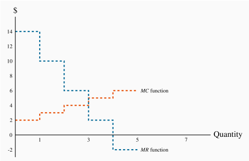
The MR in this example is defined in the fourth column of Table 10.1. When the quantity sold increases from 1 unit to 2 units total revenue increases from $14 to $24. Therefore the marginal revenue associated with the second unit of output is $10. When a third unit is sold TR increases to $30 and therefore the MR of the third unit is $6. As output increases the MR declines and eventually becomes negative – at the point where the TR is a maximum: If TR begins to decline then the additional revenue is by definition negative.
The MR function is plotted in Figure 10.4. It becomes negative when output increases from 4 to 5 units.
The optimal output
This producer has a marginal cost structure given in the fifth column of the table, and this too is plotted in Figure 10.4. Our profit maximizing rule from Chapter 8 states that it is optimal to produce a greater output as long as the additional revenue exceeds the additional cost of production on the next unit of output. In perfectly competitive markets the additional revenue is given by the fixed price for the individual producer, whereas for the monopolist the additional revenue is the marginal revenue. Consequently as long as MR exceeds MC for the next unit a greater output is profitable, but once MC exceeds MR the production of additional units should cease.
From Table 10.1 and Figure 10.4 it is clear that the optimal output is at 3 units. The third unit itself yields a profit of 2$, the difference between MR ($6) and MC ($4). A fourth unit however would reduce profit by $3, because the MR ($2) is less than the MC ($5). What price should the producer charge? The price, as always, is given by the demand function. At a quantity sold of 3 units, the corresponding price is $10, yielding total revenue of $30.
Profit is the difference between total revenue and total cost. In Chapter 8 we computed total cost as the average cost times the number of units produced. It can also be computed as the sum of costs associated with each unit produced: The first unit costs $2, the second $3 and the third $4. The total cost of producing 3 units is the sum of these dollar values: 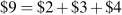 . The profit-maximizing output therefore yields a profit of $21 (
 ).
).
Supply and demand
When illustrating market behaviour it is convenient to describe behaviour by simple linear supply and demand functions that are continuous, rather than the 'step' functions used in the preceding example. As explained in Chapter 5, in using continuous curves to represent a market we implicitly assume that a unit of output can be broken into subunits. In the example above we assumed that sales always involve one whole unit of the product being sold. In fact many goods can be sold in fractional units: Gasoline can be sold in fractions of a litre; fruits and vegetables can be sold in fractions of a kilogram, and so forth. Table 10.2 below furnishes the data for our analysis.
Table 10.2 Discrete quantities
| Price |
Quantity |
Total |
Total |
Profit |
| |
demanded |
revenue |
cost |
|
| 12 |
0 |
0 |
0 |
0 |
| 11 |
2 |
22 |
1 |
21 |
| 10 |
4 |
40 |
4 |
36 |
| 9 |
6 |
54 |
9 |
45 |
| 8 |
8 |
64 |
16 |
48 |
| 7 |
10 |
70 |
25 |
45 |
| 6 |
12 |
72 |
36 |
36 |
| 5 |
14 |
70 |
49 |
21 |
| 4 |
16 |
64 |
64 |
0 |
| 3 |
18 |
54 |
81 |
-27 |
| 2 |
20 |
40 |
100 |
-60 |
| 1 |
22 |
22 |
121 |
-99 |
| 0 |
24 |
0 |
144 |
-144 |
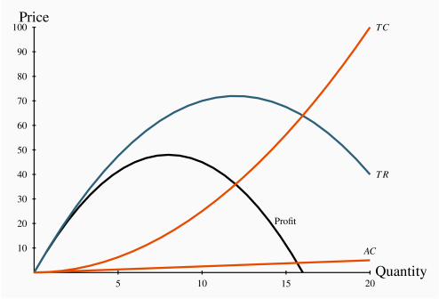
The first two columns define the demand curve. Total revenue is the product of price and quantity and given in column 3. The cost data are given in column 4, and profit – the difference between total revenue and total cost is in the final column. Profit is maximized where the difference between revenue and cost is greatest; in this case where the output is 8 units. At lower or higher outputs profit is less. Figure 10.5 contains the curves defining total revenue (TR), total cost (TC) and profit. These functions can be obtained by mapping all of the revenue-quantity combinations, the cost-quantity combinations, and the profit-quantity combinations as a series of points, and joining these points to form the smooth functions displayed. The vertical axis is measured in dollars, the horizontal axis in units of output. Graphically, profit is maximized where the dollar difference between TR and TC is greatest; that is at the output where the vertical distance between the two curves is greatest. This difference, which is also defined by the profit curve, occurs at a value of 8 units, corresponding to the outcome in Table 10.2.
At any quantity less than this output, profit would rise with additional output. This is because, from a less-than-optimal output, the additional revenue from increased sales exceeds the increased cost associated with producing those units: Stated differently, the marginal revenue would exceed the marginal cost. Conversely, outputs greater than the optimum result in a MR less than the associated MC. Accordingly, since outputs where MR>MC are too low, and outputs where MR<MC are too high, the optimum must be where the MR=MC. Hence, the equality between MR and MC is implied in this diagram at the output where the difference between TR and TC is greatest.
Note finally that total revenue is maximized where the TR curve reaches a peak. In this example that occurs at a value of 12 units of output. This is to be anticipated, as we learned in Chapter 4, because the midpoint of the demand schedule in Table 10.2 occurs at that value.
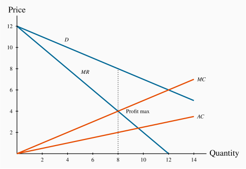
Figure 10.6 displays the demand curve for the market, the MR curve, and the monopolist's MC and AC curves. Consider first the marginal revenue curve. In contrast to the previous example, where only whole or integer units could be sold, in this example units can be sold in fractional amounts, and the MR curve must reflect this. To determine the position of the MR curve, note that with a straight-line demand curve total revenue is a maximum at the midpoint of the demand curve. Any increase in output results in reduced revenue: Stated differently, the marginal revenue becomes negative at that output. Up to that output the MR is positive, as illustrated in Figure 10.3. Accordingly, the MR curve must intersect the quantity axis midway between zero and the horizontal-axis intercept of the demand curve. Geometrically, since the MR intersects the quantity axis half way to the horizontal intercept of the demand curve, it must have a slope that is twice the slope of the demand curve.
By observing the data in columns 1 and 2 of the table, the demand curve intercepts are  , and from above discussion the MR curve has intercepts
  . The AC is obtained by dividing TC by output in Table 10.2, and the MC can be also calculated as the change in total cost divided by the change in output from Table 10.2. The result of these calculations is displayed in Figure 10.6.
The profit maximizing output is 8 units, where MC=MR. The price at which 8 units can be sold is read from the demand curve, or the first column in Table 10.2. It is $8. And, as expected, this price-quantity combination maximizes profit. Table 10.2 indicates that profit is maximized at $48, at q=8.
Demand elasticity and marginal revenue
We have shown above that the MR curve cuts the horizontal axis at a quantity where the elasticity of demand is unity. We know from Chapter 4 that demand is elastic at points on the demand curve above this unit-elastic point. Furthermore, since the intersection of MR and MC must be at a positive dollar value (MC cannot be negative), then it must be the case that the profit maximizing price for a monopolist always lies on the elastic segment of the demand curve.
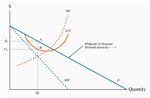
A general graphical representation
In Figure 10.7 we generalize the graphical representation of the monopoly profit maximizing output by allowing the MC and ATC curves to be nonlinear. The optimal output is at  , where MR=MC, and the price
  sustains that output. With the average cost known, profit per unit is AB, and therefore total profit is this margin multiplied by the number of units sold, .
Total profit is therefore 
Note that the monopolist may not always make a profit. Losses could result in Figure 10.7 if average costs were to rise so that the ATC were everywhere above the demand curve, or if the demand curve shifted down to being everywhere below the ATC curve. In the longer term the monopolist would have to either reduce costs or perhaps stimulate demand through advertising if she wanted to continue in operation.