How does all of our preceding discussion play out when it comes to the income distribution? That is, when we examine the incomes of all individuals or households in the economy, how equally or unequally are they distributed?
The study of inequality is a critical part of economic analysis. It recognizes that income differences that are in some sense 'too large' are not good for society. Inordinately large differences can reflect poverty and foster social exclusion and crime. Economic growth that is concentrated in the hands of the few can increase social tensions, and these can have economic as well as social or psychological costs. Crime is one reflection of the divide between 'haves' and 'have-nots'. It is economically costly; but so too is child poverty. Impoverished children rarely achieve their social or economic potential and this is a loss both to the individual and society at large.
In this section we will first describe a subset of the basic statistical tools that economists use to measure inequality. Second, we will examine how income inequality has evolved in recent decades. We shall see that, while the picture is complex, market income inequality has indeed increased in Canada. Third, we shall investigate some of the proposed reasons for the observed increase in inequality. Finally we will examine if the government offsets the inequality that arises from the marketplace through its taxation and redistribution policies.
It is to be emphasized that income inequality is just one proximate measure of the distribution of wellbeing. The extent of poverty is another such measure. Income is not synonymous with happiness but, that being said, income inequality can be computed reliably, and it provides a good measure of households' control over economic resources.
Theory and measurement
Let us rank the market incomes of all households in the economy from poor to rich, and categorize this ordering into different quantiles or groups. With five such quantiles the shares are called quintiles. The richest group forms the highest quintile, while the poorest group forms the lowest quintile. Such a representation is given in Table 13.2. The first numerical column displays the income in each quintile as a percentage of total income. If we wanted a finer breakdown, we could opt for decile (ten), or even vintile (twenty) shares, rather than quintile shares. These data can be graphed in a variety of ways. Since the data are in share, or percentage, form, we can compare, in a meaningful manner, distributions from economies that have different average income levels.
Table 13.2 Quintile shares of total family income in Canada, 2011
| |
Quintile share of total income |
Cumulative share |
| First quintile |
4.1 |
4.1 |
| Second quintile |
9.6 |
13.7 |
| Third quintile |
15.3 |
29.0 |
| Fourth quintile |
23.8 |
52.8 |
| Fifth quintile |
47.2 |
100.0 |
| Total |
100 |
|
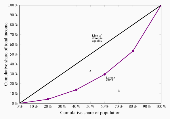
Source: Statistics Canada, CANSIM Matrix 2020405. These combinations are represented by the circles in the figure.
An informative way of presenting these data graphically is to plot the cumulative share of income against the cumulative share of the population. This is given in the final column, and also presented graphically in Figure 13.3. The bottom quintile has 4.1% of total income. The bottom two quintiles together have 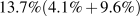 , and so forth. By joining the coordinate pairs represented by the circles, a Lorenz curve is obtained. Relative to the diagonal line it is a measure of how unequally incomes are distributed: If everyone had the same income, each 20% of the population would have 20% of total income and by joining the points for such a distribution we would get a straight diagonal line joining the corners of the box. In consequence, if the Lorenz curve is further from the line of equality the distribution is less equal than if the Lorenz curve is close to the line of equality.
Lorenz curve describes the cumulative percentage of the income distribution going to different quantiles of the population.
This suggests that the area A relative to the area (A + B) forms a measure of inequality in the income distribution. This fraction obviously lies between zero and one, and it is called the Gini index. A larger value of the Gini index indicates that inequality is greater. We will not delve into the mathematical formula underlying the Gini, but for this set of numbers its value is 0.4.
Gini index: a measure of how far the Lorenz curve lies from the line of equality. Its maximum value is one; its minimum value is zero.
The Gini index is what is termed summary index of inequality – it encompasses a lot of information in one number. There exist very many other such summary statistics.
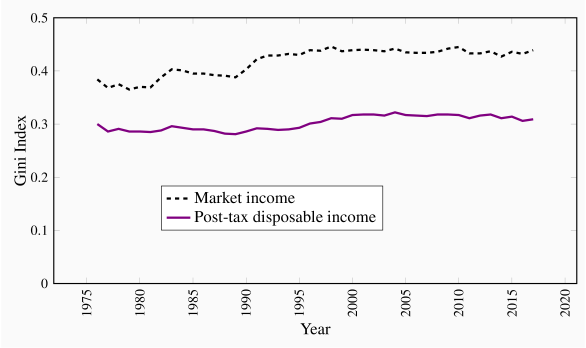
It is important to recognize that very different Gini index values emerge for a given economy by using different income definitions of the variable going into the calculations. For example, the quintile shares of the earnings of individuals rather than the incomes of households could be very different. Similarly, the shares of income post tax and post transfers will differ from their shares on a pre-tax, pre-transfer basis.
Figure 13.4 contains Gini index values for two different definitions of income from 1976 to 2011. The upper line represents the Gini index values for households where the income measure is market income; the lower line defines the Gini values when income is defined as post-tax and post-transfer incomes. The latter income measure deducts taxes paid and adds income such as Employment Insurance or Social Assistance benefits. Two messages emerge from this graphic: The first is that the distribution of market incomes displays more inequality than the distribution of incomes after the government has intervened. In the latter case incomes are more equally distributed than in the former. The second message to emerge is that inequality increased over time – the Gini values are larger in the years after approximately 2000 than in the earlier years, although the increase in market income inequality is greater than the increase in income inequality based on a 'post-government' measure of income.
This is a very brief description of recent events. It is also possible to analyze inequality among women and men, for example, as well as among individuals and households. But the essential message remains clear: Definitions are important; in particular the distinction between incomes generated in the market place and incomes after the government has intervened through its tax and transfer policies.
Application Box 13.2 The very rich
McMaster University Professor Michael Veall and his colleague Emmanuel Saez, from University of California, Berkeley, have examined the evolution of the top end of the Canadian earnings distribution in the twentieth century. Using individual earnings from a database built upon tax returns, they show how the share of the very top of the distribution declined in the nineteen thirties and forties, remained fairly stable in the decades following World War II, and then increased from the eighties to the present time. The increase in share is particularly strong for the top 1% and even stronger for the top one tenth of the top 1%. These changes are driven primarily by changes in earnings, not on stock options awarded to high-level corporate employees. The authors conclude that the change in this region of the distribution is attributable to changes in social norms. Whereas, in the nineteen eighties, it was expected that a top executive would earn perhaps a half million dollars, the 'norm' has become several million dollars in the present day. Such high remuneration became a focal point of public discussion after so many banks in the United States in 2008 and 2009 required government loans and support in order to avoid collapse. It also motivated the many 'occupy' movements of 2011 and 2012, and the US presidential race in 2019.
Saez, E. and M. Veall. "The evolution of high incomes in Canada, 1920-2000." Department of Economics research paper, McMaster University, March 2003.
In the international context, Canada is neither a strongly egalitarian economy nor one characterized by great income inequality. OECD data indicate that the economies with the lowest Gini index values are the Czech and Slovak republics and Iceland, with values in the neighborhood of 0.25 based on a post-government measure of income. Canada has a Gini index of .31, the US a value of .38 and at the upper end are economies such as Mexico and Chile with values of .47 (https://data.oecd.org/inequality/income-inequality.htm).
Economic forces
The increase in inequality of earnings in the market place in Canada has been reflected in many other developed economies – to a greater degree in the US and to a lesser extent in some European economies. Economists have devoted much energy to studying why, and as a result there are several accepted reasons.
Younger workers and those with lower skill levels have faired poorly in the last three decades. Globalization and out-sourcing have put pressure on low-end wages. In effect the workers in the lower tail of the distribution are increasingly competing with workers from low-wage less-developed economies. While this is a plausible causation, the critics of the perspective point out that wages at the bottom have fallen not only for those workers who compete with overseas workers in manufacturing, but also in the domestic services sector right across the economy. Obviously the workers at McDonalds have not the same competition from low-wage economies as workers who assemble toys.
A competing perspective is that it is technological change that has enabled some workers to do better than others. In explaining why high wage workers in many economies have seen their wages increase, whereas low-wage workers have seen a relative decline, the technological change hypothesis proposes that the form of recent technological change is critical: Change has been such as to require other complementary skills and education in order to benefit from it. For example, the introduction of computer-aided design technology is a benefit to workers who are already skilled and earning a high wage: Existing high skills and technological change are complementary. Such technological change is therefore different from the type underlying the production line. Automation in the early twentieth century in Henry Ford's plants improved the wages of lower skilled workers. But in the modern economy it is the highly skilled rather than the low skilled that benefit most from innovation.
A third perspective is that key institutional changes manifested themselves in the eighties and nineties, and these had independent impacts on the distribution. In particular, declines in the extent of unionization and changes in the minimum wage had significant impacts on earnings in the middle and bottom of the distribution: If unionization declines or the minimum wage fails to keep up with inflation, these workers will suffer. An alternative 'institutional' player is the government: In Canada the federal government became slightly less supportive, or 'generous', with its array of programs that form Canada's social safety net in the nineteen nineties. This tightening goes some way to explaining the modest inequality increase in the post-government income distribution in Figure 13.3 at this time. Nonetheless, most Canadian provincial governments increased the legal minimum wage in the first decade of the new millennium by substantially more than the rate of inflation. This meant that the economy's low-income workers did not fall further behind.
We conclude this overview of distributional issues by pointing out that we have not analyzed the distribution of wealth. Wealth too represents purchasing power, and it is wealth rather than income flows that primarily distinguishes Warren Buffet, Mark Zuckerberg and Bill Gates from the rest of us mortals. A detailed treatment of wealth inequality is beyond the scope of this book. We describe briefly, in the final section, the recent contribution of Thomas Piketty to the inequality debate.