
2.3: Avoiding the Use of Color Alone to Convey Meaning and Algorithms That Help
- Page ID
- 51887

You should avoid the use of color alone to convey meaning in order to help user’s with colorblindness. Color blindness comes in various states. Protanopia results from insensitivity to red light, which causes confusion in discerning greens, reds or yellows. Deuteranopia results from insensitivity to green light, which causes confusion in discerning green, red and yellows. It is the most common form of color-blindness, often referred to as red-green colorblindness. Tritanopia results from an insensitivity to blue light, which causes confusion in discerning greens and blues. Achromatopsia or Monochromacy is rare, but results in a person not being able to see color at all, only black, white and shades of gray. Wordwide, approximately 8% of men and 0.5% of women have a color deficiency. There are a greater number of white (Caucasian) people with color blindness, such as in Scandanavia where 10-11% of men have color blindness.
Avoid Color Coding Text, Only, To Indicate Importance:
Below is an example of what you should not do. You would not want to state in your course schedule that the dates listed in red are quiz dates, and then only color code the text to represent those days.
| Week | Date | Topic |
|---|---|---|
| 1 | January 17 | Orientation to Blackboard Learn |
| January 19 | APA Style Manual | |
| 2 | January 24 | Exploring CSU Library Resources Online, Literature Services |
| January 26 | Refreshing Writing Skills | |
| 3 | January 31 | Using Images and Media |
| February 2 | Presenting a Professional Image | |
| 4 | February 7 | Public Appearances |
| February 9 | Communication in the Health Care Setting | |
| 5 | February 14 | Resolving Conflicts |
You could fix this problem by saying the dates listed in red with the asterisk beside them are days you will have a quiz over the previous topics. The asterisk has come to be known as a designator of required fields on internet forms, for screen reader users. Thus, it could be used here to designate important dates in a schedule.
| Week | Date | Topic |
|---|---|---|
| 1 | January 17 | Orientation to Blackboard Learn |
| January 19 | APA Style Manual | |
| 2 | January 24 * | Exploring CSU Library Resources Online, Literature Services |
| January 26 | Refreshing Writing Skills | |
| 3 | January 31 * | Using Images and Media |
| February 2 | Presenting a Professional Image | |
| 4 | February 7 | Public Appearances |
| February 9 * | Communication in the Health Care Setting | |
| 5 | February 14 | Resolving Conflicts |
Inherent Color Conveying Meaning, What Do You Do?
Sometimes you need to present information that inherently has color coding that represents meaning. The following example is from Vischeck’s website. On the left, the photomicrograph shows how fluorescent staining of a cell renders a blue, green and red image where the colors represent different structures within a cell. The image to the right of it, shows how someone with red/green color blindness (deuteranopia) would see the colors. The greens and reds show as yellows and the boundary between them is lost.
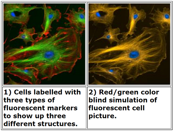
Vischeck’s website used to have a way to upload an image like this to run through their Daltonizing algorithm. The algorithm increases contrast between the green and red areas, and shifts the hue of the red toward a blue or grayish color. This helps differentiate the structures of the cell. There is an example of the same image of the cell run through their Daltonizing algorithm on the right, below. Unfortunately, no one can load an image to be run through the Daltonizing algorithm at this time. There are other resources you can recommend to colorblind students that may help them see difference between colors.
Resources to Help Daltonize Images for Colorblind Audience:
Google Chrome browser has an extension which will simulate what an image or page looks like to a person with various types of colorblindness and has a Daltonization algorithm to convert a page or image for people with colorblindness to see differences between colors. Daltonize.org has information about Chrome Daltonize! extension. Within Chrome, add the extension from this link to Chrome Daltonize!
Below is a captioned movie tutorial overview of using Chrome Daltonize! extension. Unfortunately, it doesn’t seem to work on pages that are behind password protection.
An interactive or media element has been excluded from this version of the text. You can view it online here: https://pressbooks.ulib.csuohio.edu/accessibility/?p=74
Designers who use Photoshop CC 2017 also have access to colorblind simulation for protanopia and deuteranopia. You can access these tools by:
- Clicking on the View menu
- Selecting Proof Setup
- Then, select Color Blindness – Protonopia-Type or Color Blindness – Deuteranopia Type
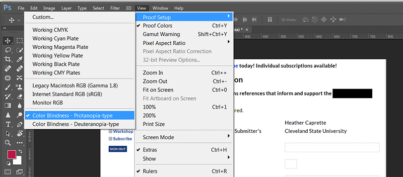
The following movie demonstrates the use of Photoshop’s colorblind simulators when looking at a form. The form, unfortunately, was designed so that the color red alone indicated required fields! See what someone with protanopia or deuteranopia would see when viewing this form. They are left guessing which fields are required. Best practice would be to place an asterisk before each required form field label and let the user know that the asterisk designates a required field.
An interactive or media element has been excluded from this version of the text. You can view it online here: https://pressbooks.ulib.csuohio.edu/accessibility/?p=74