
3.2: Formatting Font for Readability and Accessibility in Blackboard Learn
- Page ID
- 51899

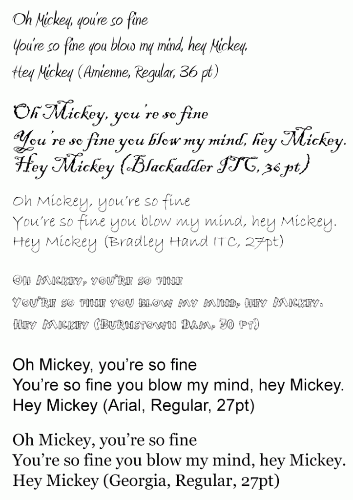
In the module on Word, we learned that font family, font size, line height, and the contrast of the font against its background all effect the accessibility and readability for the sighted, as well as those with vision difficulties. It’s best to pick font families with a good mid-weight stroke thickness, good space between letters, and medium sized x-heights. An x-height is the height of the lower case letter x within the font family. Avoid the use of fancy fonts, scripts and those with thin strokes. Sans-serif fonts work better for body text on screen, rather than fonts with serifs. Examples of good sans-serif fonts to use are Arial, Verdana, Tahoma, Myriad Web Pro, Trebuchet, or Roboto. Serif font families with good stroke weight and spacing for online display are Georgia, Times New Roman, and Times. The image below shows a comparison between font families. The upper four fonts, Amienne, Blackadder ITC, Bradley Hand ITC, and Burnstown Dam, have thinness to their strokes, or jagged appearance to the serifs which makes them hard to read on screen. The bottom two fonts, Arial and Georgia, have more evenness to the width of their strokes, and the strokes are straighter, making them easier to read on screen.
If you write text from scratch, with no copying and pasting from Word, into Blackboard’s content editor’s WYSIWYG mode, you’ll see options to set the text type to Paragraph, Heading, Subheading 1, and Subheading 2. These are OK, but you may not like the size of the text they produce. You’ll also see options to set the font family and its size. The sizes listed, such as Arial Size 3 (12pt), are a bit misleading because the HTML generated behind the WYSIWYG interface sets font sizes in the descriptive keyword units xx-small, x-small, small, medium, large, x-large, and xx-large, not point (pt). These units are OK because, if an end user sets her/his browser’s default font size to a larger setting, these will scale up, which will help people with low vision.
All font sizes should be specified in relative units that will scale up or down when a user changes her default font size in her browser. Other relative font size units include em, and percent (represented as %). The typical default browser font size is 16 pixels (px), but people with low vision will increase this default font size to help them read. One em is the height of the font you are using, usually thought of as the height of the upper case M within that font. So, if a user doesn’t change the default font size and the font size isn’t set in the code of an html document or a CSS file, 1em would be equal to 16 px. The percent (%) unit scales relative to the font size of a parent HTML element, or the default font size set in the browser. So, if a parent HTML element contains a font size of 16 px (pixels), font set to 125% would be 20 px heigh. Please view the following movie demonstration that shows how fonts set in em, rem and percent (%) scale with a change of the default browser font size, while fonts specified in pixels (px) and points (pt) don’t.
When you copy content from other sources, such as Word or from a website, you copy over styling code with it that may not help people with vision difficulties who choose to increase their default font size in their browser. Font sizes for content copied from Word usually end up as points (pt), and font sizes from content copied from websites can end up being in pixels (px). This can be seen after you copy the content into Blackboard’s content editor, by toggling into the HTML Code View. The font sizes in points and pixels should be converted to em or percent (%). The following chart, taken and modified from Reed Design, will show you equivalent em and percent (%) units for point (pt) and pixel (px) units that get copied into Blackboard from other sources, like Word documents. You can use this chart to convert your font sizes in Blackboard’s HTML Code View. If for example, you had a heading that was 18 pt, copied from Word, you would want to change it to 1.5 em. A 16 pt subheading, copied from Word, should be changed to 1.4 em. I’ve also added in where the fonts specified with descriptive keywords would fall. Please view the following movie tutorial demonstrating how to format text copied from Word into Blackboard Learn’s content editor for accessibility. This demonstration will also show you how to increase line-height between list items in HTML Code View, using inline styling. This increase of space between lines will help with readability also.
* IMPORTANT: Demonstration of how to format text copied from Word into Blackboard’s Content Editor for Accessibility
| Points | Pixels | Ems | Percent | Descriptive Keyword |
|---|---|---|---|---|
| 6pt | 8px | 0.5em | 50% | |
| 7pt | 9px | 0.55em | 55% | XX-Small |
| 7.5pt | 10px | 0.625em | 62.5% | X-Small |
| 8pt | 11px | 0.7em | 70% | |
| 9pt | 12px | 0.75em | 75% | |
| 10pt | 13px | 0.8em | 80% | Small |
| 10.5pt | 14px | 0.875em | 87.5% | |
| 11pt | 15px | 0.95em | 95% | |
| 12pt | 16px | 1em | 100% | Medium |
| 13pt | 17px | 1.05em | 105% | |
| 13.5pt | 18px | 1.125em | 112.5% | Large |
| 14pt | 19px | 1.2em | 120% | Larger |
| 14.5pt | 20px | 1.25em | 125% | |
| 15pt | 21px | 1.3em | 130% | |
| 16pt | 22px | 1.4em | 140% | |
| 17pt | 23px | 1.45em | 145% | |
| 18pt | 24px | 1.5em | 150% | X-Large |
| 20pt | 26px | 1.6em | 160% | |
| 22pt | 29px | 1.8em | 180% | |
| 24pt | 32px | 2em | 200% | XX-Large |
| 26pt | 35px | 2.2em | 220% | |
| 27pt | 36px | 2.25em | 225% | |
| 28pt | 37px | 2.3em | 230% | |
| 29pt | 38px | 2.35em | 235% | |
| 30pt | 40px | 2.45em | 245% | |
| 32pt | 42px | 2.55em | 255% | |
| 34pt | 45px | 2.75em | 275% | |
| 36pt | 48px | 3em | 300% |
Remember to Check Your Color Contrast
Color contrast for a normal body type that is 12 pt, or 16px, against its background would be 4.5:1. This will pass WCAG 2.0 level AA standard. If you really want to pass the AAA level, the best, you would want a contrast of 7:1 between the font color and its background. Use the free Colour Contrast Analyser from the Paciello Group’s website, that you learned about within the Word module, to help you determine if your color choices meet WCAG 2.0 Level AA. If you have a larger font, which would be 14 pt bold (19 px, or 1.2 em) or 18 pt (24 px or 1.5 em), the contrast ratio can be lower. In this case, it should be 3:1 or greater to meet level AA of WCAG 2.0 standards for contrast. If you would like to review the movie demonstration of Colour Contrast Analyser, you can replay it below.
Colour Contrast Analyser Video Introduction
An interactive or media element has been excluded from this version of the text. You can view it online here: https://pressbooks.ulib.csuohio.edu/accessibility/?p=228
Remember Not to Use Color Alone to Convey Meaning
Colour Contrast Analyser will also help you see your design as someone with one of the color blindnesses, as we learned in the module on Word accessibility. Often, we format important text with color alone, such as red, but this text doesn’t appear red to someone with protonopia or deuteranopia. When designating something as important, use an asterisk (*) or write the word “IMPORTANT” before the content that you want special emphasis put on. You can also enclose the text with the <strong> element to make it appear bold and give a strong semantic emphasis to it. The <em> element will give emphasis to text by making it appear italicized. Fortunately, Blackboard’s content editor will add a <strong> tag around words that you select and format with the editor’s “bold” button. It is the first button in the first row, with a bold capital letter T. Blackboard’s content editor also adds an <em> tag around words that you select and format with its “italic” button. This is the second button in the first row, with an italic letter T.
Another best practice is to make sure your links are underlined and use the underlining only on links. Blue, underlined text has been used as a default style for links from the early stages of the web. It’s best not to remove the underlines, even if you choose a different color for your linked text. This could cause a user to miss important content, and in a teaching and learning setting, could lower a student’s grade. I know first hand, because I was in a course that changed its link styling from underlined to non-underlined between modules and pages. Consistency in design is important for usability and accessibility!
Avoid Busy Background Images Behind Text
Placing text directly over a background image can hurt readability also, especially an image with great detail, many tonalities, and semi-transparent font. You can solve the problem by placing the text within a solid color box whose background contrasts sufficiently with the font color. This would be best. But, some designers have been able to blur background images that are photographs with enough contrast with the font, and put a drop shadow behind the font, or outline it in black to improve readability in this situation.
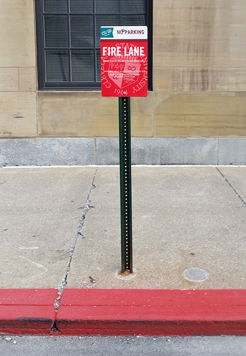
Below is an example of a sign that is difficult to read for people with good vision. The photograph’s been taken from approximately the position that a passenger riding in a car on the street in front of the sign would have. The designer has made a white CSU seal semi-transparent against a red background, and superimposed solid white text on top of the semi-transparent white seal. Though the very large “Fire Lane” is readable due to its size, the fine print about having your car cited, booted, and towed if you dare park there, isn’t readable. The white text message about the fire lane competes with the “Cleveland State University 1964” text of the seal for our attention.
Here is another example of text over an image, that helps solve the readability problem. The photograph is blurred and the dark grays provide contrast with the white “AACSB Accreditation matters” text, which has a drop shadow around it. The designer has also placed the AACSB International Challenge text message over a solid blue background and put the “Challenge” in all caps. The contrast ratio between the white font and the medium blue background is 4.7:1, which passes WCAG 2.0 color contrast level AA for regular text, and level AAA for large text. When the image is filtered for the various color blindnesses and cataracts, we see that the small “INTERNATIONAL” is the hardest text to read.