2.2: Creating Accessible Word Documents - Color Contrast for Accessibility
- Page ID
- 51886

Contrast is the difference in luminosity or tonal values between the foreground and background. In other words, the difference between the value of the foreground color, which is usually your font color, and the background color of the screen, Contrast is a property that helps us see and distinguish figure from ground.
Key Takeaway
WCAG 2.0 guidelines require a contrast ratio of 4.5:1 between the foreground color (text color) and background color to meet level AA, for standard font size, e.g. 12 pt font. Large print sizes, or large scale text can have a contrast ratio of 3:1. A large print size is considered 14 pt (approximately 18.66 px) bold, or 18 pt (24 px) or larger non-bold text.
There are lots of color contrast analysers available within various programs and as free downloads on the web. A stand alone application that will tell you whether your foreground and background color choices have enough contrast to meet WCAG 2.0 level AA or level AAA standards is called Colour Contrast Analyser. It is a free download from The Paciello Group’s website. This is a nifty tool and I recommend downloading and installing it! It contains an eye dropper for sampling colors on your computer screen, much like that of Adobe Photoshop’s color picker. You can keep the application on your desktop or set a short cut for it within your Start menu in Windows to have easy access to launching it. Colour Contrast Analyser will tell you the contrast ratio of your selected foreground and background colors, let you know if it passes WCAG 2.0 level AA and level AAA, and toggles into a mode that lets you see how people with different color blindnesses see your text against background. If your color choices don’t pass, there are sliders to adjust the red, green, and blue values to change the color to something that will pass, and suggested variations on the color. The hexidecimal color codes from the passing colors can be copied and used in Word or Blackboard Learn’s content editor. Hexidecimal code is typically how colors are designated in HTML. Hexidecimal code for color takes the format of an octothorpe (pound symbol) followed by six letters or numbers, two characters for red, two for green and two for blue. Hexidecimal code for white is #ffffff, and for black is #000000.
Colour Contrast Analyser also has a built in screen, web page, and file viewer that will allow you to see what the colors look like as a whole for people with various types of color blindness. This later simulation is available in the Windows version only. These simulated web pages for protanopia, deuteranopia and tritanopia can be saved as jpg (jpeg) files if you need to reference them later or share them with other designers and decision makers.
Colour Contrast Analyser Video Introduction
An interactive or media element has been excluded from this version of the text. You can view it online here: https://pressbooks.ulib.csuohio.edu/accessibility/?p=64
Colour Contrast Analyser
Download the free Colour Contrast Analyser application from The Paciello Group’s site (visit: https://developer.paciellogroup.com/...trastanalyser/)
Word has a built in accessibility checker that will sometimes catch contrast issues and sometimes not. The use of the Colour Contrast Analyser application can help you check, when you may have doubt about your choices.
Other tools for checking to see if you have adequate color contrast are WebAIM’s contrast checker page, and JuicyStudio Luminosity Colour Contrast Ratio Analyser. Both of these require you to know the hexidecimal color values, before arriving at the page. There is no eye dropper tool to sample the colors from a page open on your screen. You enter the known color values into their form and submit it to get results on pass or fail for WCAG 2.0 Level AA or AAA. WebAIM directs designers to install Colorzilla add-on for Firefox, or extension for Chrome, to figure out hexidecimal values of colors on a web page. Another free online color picker that will allow you to get hexidecimal color code, RGB and HSL values is located at http://htmlcolorcodes.com. WAVE will also analyze contrast ratios for all page elements at once. You simply enter the URL into their form to analyze a web page.
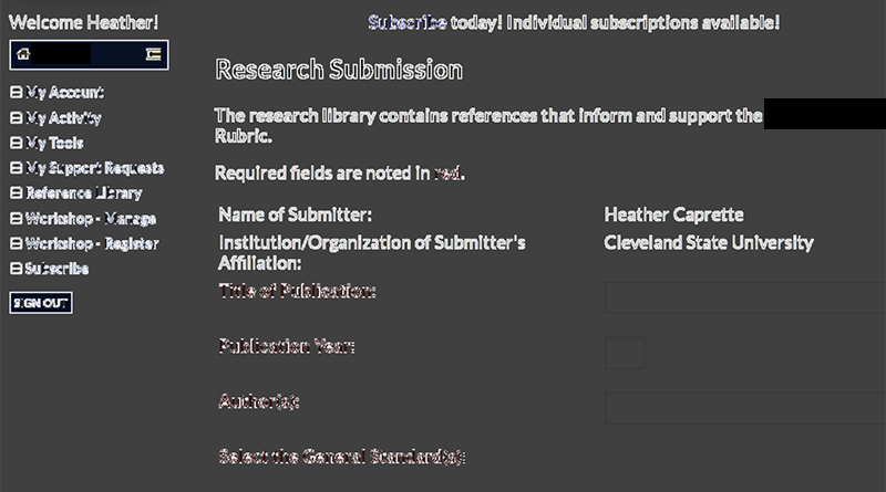
The Color Contrast Analyser developed by the North Carolina State University Office of Information Technology is available as a Chrome extension through Chrome Web Store. It will show contrast edges as a black and white screen. It’s a different way of looking at things. If you don’t see enough delineation between text, foreground symbols and their background, then you’ll need to increase the color contrast ratio. The example below shows the visual results of their processor. It is a form in which the required field labels are entered as red text. The red text shows as areas of less delineation.