
2.4: Formatting Font for Readability
- Page ID
- 51888

Your choice of font family, style, weight, size, color, and line-height can all affect its legibility and readability on screen. Legibility is the ability of someone to discern what is written. Capta text is often barely legible, as an example. Avoid the use of Script text, for legibility reasons. Readability is how easy or difficult it is to read the content. Readability is affected by not only your style of writing, but your choice of and formatting of text on the page. In Word, we’ll be formatting text with Word Styles primarily. But, we’ll talk about font properties that will help your readers, both with and without documented disabilities.
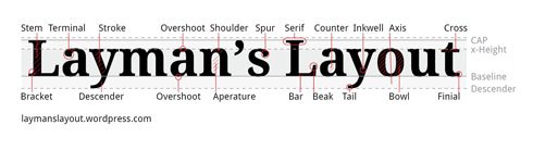
When selecting a font family for screen viewed text, you’ll want to select families and weights that have a substantial stroke thickness and medium sized x-heights. The x-height is the height of the lower case letter x within the font family. All the lower case letters within the font typically have the same height as the x height.
Sans-serif fonts, such as Arial, Verdana, Helvetica, Tahoma, Trebuchet MS, or Myriad Web Pro are good choices for body text. Though you want to pick fonts with substantial stroke thickness, it may be a good idea to avoid the use of a font that is designed primarily as bold, such as Arial Rounded MT Bold, because you are left with few options for formatting for importance. If you apply a Strong Style (bolding), to an already bold font, it makes the font so thick, it becomes difficult to read on screen.
If you are using a serif font family, Times New Roman, and Georgia are good selections. In general, serif font families work well for body type that is printed, and sans-serif families work well as body type presented on screen. When it comes to styling text, it’s a good idea to minimally use Italics (the emphasis style) because slanting the letters can effect their readability. Bolding (the strong style), also, should be used sparingly and be reserved for text you want to strongly emphasize. Selecting 12 point text or higher will help readers with vision difficulties. When a browser’s default font size is set to 16 px, 12 pt is approximately equal to that height. Line-height can make large blocks of body text or long lists easier to read. These paragraphs, on this page, have a line-height of 170% set within the HTML. In Word, you can select a multiple from the paragraph formatting options, such as 1.5, that will be one and a half the the line height of your font. Keep your Word documents in Word format, rather than converting them to PDFs with security restrictions, to help users who may need to download and manipulate font sizes and colors to help them perceive and understand the information presented. From the previous section, we saw how assistive technology applications like MAGic can manipulate a document to make it more accessible to those with low vision.
There are other properties of a document’s formatting that effect readability. It helps to group related content together by using headings above associated paragraphs. There should be separation of groups of related content by white space. Adding white space around images can help also. Line lengths should be reasonable. The avoidance of unnecessary distracting moving graphics or blinking images is important for those with cognitive difficulties related to focus, and for individuals with photosensitive epilepsy who may go into seizure because of a blinking object set at a frequency of 5 to 30 Hertz (flashes per second).