
14.3: Bivariate Analysis
- Page ID
- 26297

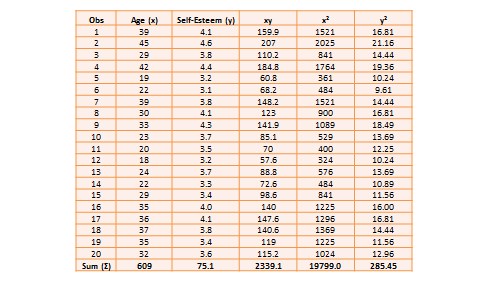
The two variables in this dataset are age ( ) and self-esteem (
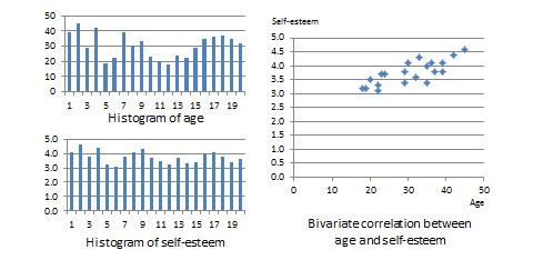
 ). Age is a ratio-scale variable, while self-esteem is an average score computed from a multi-item self-esteem scale measured using a 7-point Likert scale, ranging from ‘strongly disagree’ to ‘strongly agree’. The histogram of each variable is shown on the left side of Figure 14.3. The formula for calculating bivariate correlation is:
![\[ r_{xy} = \frac{\sum x_iy_i - n\bar{x} \bar{y} }{(n-1)s_x s_y } = \frac{n \sum x_i y_i - \sum x_i \sum y_i }{\sqrt{n \sum x_i^2 - (\sum x_i)^2} \sqrt{n \sum y_i^2 - (\sum y_i)^2}}\,, \]](https://usq.pressbooks.pub/app/uploads/quicklatex/quicklatex.com-c95aeca2c439df147618d8dfdf77ce33_l3.svg "Rendered by QuickLaTeX.com")
where  is the correlation,
  and
and  are the sample means of and , and
  and
and  are the standard deviations of and . Using the above formula, as shown in Table 14.1, the manually computed value of correlation between age and self-esteem is 0.79. This figure indicates that age has a strong positive correlation with self-esteem—i.e., self-esteem tends to increase with increasing age, and decrease with decreasing age. The same pattern can be seen when comparing the age and self-esteem histograms shown in Figure 14.3, where it appears that the top of the two histograms generally follow each other. Note here that the vertical axes in Figure 14.3 represent actual observation values, and not the frequency of observations as in Figure 14.1—hence, these are not frequency distributions, but rather histograms. The bivariate scatter plot in the right panel of Figure 14.3 is essentially a plot of self-esteem on the vertical axis, against age on the horizontal axis. This plot roughly resembles an upward sloping line—i.e., positive slope—which is also indicative of a positive correlation. If the two variables were negatively correlated, the scatter plot would slope down—i.e., negative slope—implying that an increase in age would be related to a decrease in self-esteem, and vice versa. If the two variables were uncorrelated, the scatter plot would approximate a horizontal line—i.e., zero slope—implying than an increase in age would have no systematic bearing on self-esteem.
![\[H_0:\quad r = 0 \]](https://usq.pressbooks.pub/app/uploads/quicklatex/quicklatex.com-74bb8e9e674477ba33a9eb751bfd254d_l3.svg "Rendered by QuickLaTeX.com")
![\[H_1:\quad r \neq 0 \]](https://usq.pressbooks.pub/app/uploads/quicklatex/quicklatex.com-2c503c3b40b7b1bac6532fde620ad460_l3.svg "Rendered by QuickLaTeX.com")
 is called the null hypotheses, and
  is called the alternative hypothesis—sometimes, also represented as
  . Although they may seem like two hypotheses, and actually represent a single hypothesis since they are direct opposites of one another. We are interested in testing rather than . Also note that is a non-directional hypotheses since it does not specify whether
  is greater than or less than zero. If we are testing for a positive correlation, directional hypotheses will be specified as
  ;
; 0" decoding="async" height="16" loading="lazy" src="https://usq.pressbooks.pub/app/uploa...92a18e6_l3.svg" title="Rendered by QuickLaTeX.com" width="78">. Significance testing of directional hypotheses is done using a one-tailed
 -test, while that for non-directional hypotheses is done using a two-tailed -test.
In statistical testing, the alternative hypothesis cannot be tested directly. Rather, it is tested indirectly by rejecting the null hypotheses with a certain level of probability. Statistical testing is always probabilistic, because we are never sure if our inferences, based on sample data, apply to the population, since our sample never equals the population. The probability that a statistical inference is caused by pure chance is called the  -value. The -value is compared with the significance level (
 ), which represents the maximum level of risk that we are willing to take that our inference is incorrect. For most statistical analysis, is set to 0.05. A -value less than
  indicates that we have enough statistical evidence to reject the null hypothesis, and thereby, indirectly accept the alternative hypothesis. If
 0.05" decoding="async" height="17" loading="lazy" src="https://usq.pressbooks.pub/app/uploa...a5aee31_l3.svg" title="Rendered by QuickLaTeX.com" width="65">, then we do not have adequate statistical evidence to reject the null hypothesis or accept the alternative hypothesis.
The easiest way to test for the above hypothesis is to look up critical values of from statistical tables available in any standard textbook on statistics, or on the Internet—most software programs also perform significance testing. The critical value of depends on our desired significance level (), the degrees of freedom (df), and whether the desired test is a one-tailed or two-tailed test. The degree of freedom is the number of values that can vary freely in any calculation of a statistic. In case of correlation, the df simply equals  , or for the data in Table 14.1, df is
  . There are two different statistical tables for one-tailed and two-tailed tests. In the two-tailed table, the critical value of for
  and df
 is 0.44. For our computed correlation of 0.79 to be significant, it must be larger than the critical value of 0.44 or less than
  . Since our computed value of 0.79 is greater than 0.44, we conclude that there is a significant correlation between age and self-esteem in our dataset, or in other words, the odds are less than 5% that this correlation is a chance occurrence. Therefore, we can reject the null hypotheses that
  , which is an indirect way of saying that the alternative hypothesis
 0" decoding="async" height="12" loading="lazy" src="https://usq.pressbooks.pub/app/uploa...5deba77_l3.svg" title="Rendered by QuickLaTeX.com" width="41"> is probably correct.
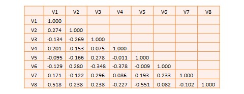
Most research studies involve more than two variables. If there are  variables, then we will have a total of
  possible correlations between these variables. Such correlations are easily computed using a software program like SPSS—rather than manually using the formula for correlation as we did in Table 14.1—and represented using a correlation matrix, as shown in Table 14.2. A correlation matrix is a matrix that lists the variable names along the first row and the first column, and depicts bivariate correlations between pairs of variables in the appropriate cell in the matrix. The values along the principal diagonal—from the top left to the bottom right corner—of this matrix are always 1, because any variable is always perfectly correlated with itself. Furthermore, since correlations are non-directional, the correlation between variables V1 and V2 is the same as that between V2 and V1. Hence, the lower triangular matrix (values below the principal diagonal) is a mirror reflection of the upper triangular matrix (values above the principal diagonal), and therefore, we often list only the lower triangular matrix for simplicity. If the correlations involve variables measured using interval scales, then these correlations are called Pearson product moment correlations.
Another useful way of presenting bivariate data is cross tabulation—often abbreviated to crosstab—or more formally, a contingency table. A crosstab is a table that describes the frequency or percentage of all combinations of two or more nominal or categorical variables. As an example, let us assume that we have the following observations of gender and grade for a sample of 20 students, as shown in Figure 14.3. Gender is a nominal variable (male/female or M/F), and grade is a categorical variable with three levels (A, B, and C). A simple cross tabulation of the data may display the joint distribution of gender and grades—i.e., how many students of each gender are in each grade category, as a raw frequency count or as a percentage—in a  matrix. This matrix will help us see if A, B, and C grades are equally distributed across male and female students. The crosstab data in Table 14.3 shows that the distribution of A grades is biased heavily toward female students: in a sample of 10 male and 10 female students, five female students received the A grade compared to only one male student. In contrast, the distribution of C grades is biased toward male students: three male students received a C grade, compared to only one female student. However, the distribution of B grades was somewhat uniform, with six male students and five female students. The last row and the last column of this table are called marginal totals because they indicate the totals across each category and displayed along the margins of the table.
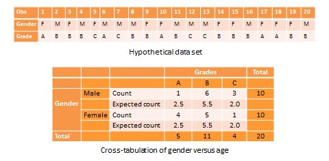
Although we can see a distinct pattern of grade distribution between male and female students in Table 14.3, is this pattern real or ‘statistically significant’? In other words, do the above frequency counts differ from what may be expected from pure chance? To answer this question, we should compute the expected count of observation in each cell of the  crosstab matrix. This is done by multiplying the marginal column total and the marginal row total for each cell, and dividing it by the total number of observations. For example, for the male/A grade cell, the expected count is
  . In other words, we were expecting 2.5 male students to receive an A grade, but in reality, only one student received the A grade. Whether this difference between expected and actual count is significant can be tested using a chi-square test. The chi-square statistic can be computed as the average difference between observed and expected counts across all cells. We can then compare this number to the critical value associated with a desired probability level
  and the degrees of freedom, which is simply
  , where
  and are the number of rows and columns respectively. In this example,
  . From standard chi-square tables in any statistics book, the critical chi-square value for
  and
and  is 5.99. The computed chi-square value—based on our observed data—is 1.00, which is less than the critical value. Hence, we must conclude that the observed grade pattern is not statistically different from the pattern that can be expected by pure chance.