
19.3: Types of Visual Aids
- Last updated
- Save as PDF
- Page ID
- 18795
In the past, transparencies displayed with overhead projectors, posters, and flip charts were common visual aids, but these have mostly been replaced with computer technology. For many people, the term “visual aids” for presentations or speeches is synonymous with PowerPoint (often long, dry, painful PowerPoint at that), but this is just one type of visual aid. You should consider all the available options to determine what will be most effective and appropriate for your presentation.
If you wear clothes that don't suit you, you're a fashion victim. You have to wear clothes that make you look better. ~ Vivienne Westwood
personal appearance
Some people chose to dress up as part of their presentation, and this can help set the tone of the speech or reinforce a specific point. A speaker may choose to wear a handmade sweater in a talk about knitting in order to inspire others to begin the hobby. Another speaker may opt for a firefighter's uniform in a speech about joining the local volunteer fire department in an effort to appeal to the respect most people have for people in uniform.
If you aren't dressing in relation to your topic, you should dress appropriately for your audience and venue. A presentation to a professional audience or at a professional conference would lend itself to appropriate business attire. If you are giving a presentation to your local Girl Scout troop, more casual clothing may be the best choice. Any time you are doing a demonstration, make sure you are dressed appropriately to give the demonstration. It is difficult for a speaker to show how to correctly put on a rock climbing harness if she is wearing a skirt the day of the presentation.
Beyond dressing appropriately for your audience and topic, the audience will make judgments about you even before your presentation begins. Your dress, mannerisms, the way you greet the audience when they are arriving, how you are introduced, and the first words out of your mouth all impact your credibility and ability to connect with your audience. Make sure you are calm and welcoming to your audience when they arrive and greet them in a professional manner. Your credibility and professionalism suffer when the audience arrives and you are busy scrambling around attempting to finish your preparations (Duarte, 2010).
objects and props
Objects and props, such as a bicycle helmet for a speech on bike safety or an actual sample of the product you are trying to sell, can greatly enhance your presentation. Seeing the actual item will often make it easier for your audience to understand your meaning and will help you connect with your audience on an emotional level. Props can be used as part of demonstrations (discussed below) or as a stand-alone item that you refer to in your speech.
There are several important considerations for using props in your presentation. If you have a large audience, showing the prop at the front of the venue may mean that audience members can't see the item. The alternative to this is to pass the item around, though Young and Travis (2008) advise caution in passing objects around during your speech, as most people will be seeing the object after you have moved on with your talk. Having your prop out of sync with your presentation, either as it is passed around disrupting your audience's attention or by having your prop visible when you aren't talking about it, is distracting to your audience and message. To make the most effective use of props in your presentation, carefully consider how the object will be visible to your entire audience when you are speaking about it, and make sure it is out of sight when you are not.


Demonstration
A demonstration can serve two different purposes in a speech. First, it can be used to “wow” the audience. Showing off the features of your new product, illustrating the catastrophic failure of a poorly tied climbing knot, or launching a cork across the room during a chemistry experiment are all ways of capturing the audience's attention. Demonstration should not be gimmicky, but should add value to your presentation. When done well, it can be the memorable moment from your speech, so make sure it reinforces the central message of your talk.
Demonstration can also be used to show how something is done. People have different learning styles, and a process demonstration can help visual learners better understand the concept being taught. Consider for a moment
the difference between reading the instructions on how to perform CPR, watching someone perform CPR, and trying CPR on the training dummy. As evidenced by the huge number of online videos illustrating how to do something, there is great value in watching while you learn a new task.
If your presentation includes a process where seeing will improve understanding, consider including a demonstration.
Because you have a limited time to present, make sure your demonstrations are succinct, well rehearsed, and visible to the entire audience. Be prepared for the demonstration to fail and have a back-up plan in place. It is better to move forward with your presentation than to fret with trying to get your demonstration perfect or fixed. However, if you are providing a demonstration of your new product, make sure it is as error free as possible. If you can't be positive the product will perform as expected, it is better to skip the demonstration.
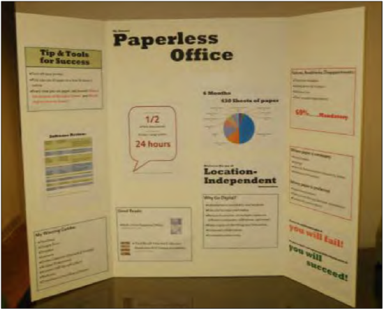
posters and flip charts
If you are presenting to a small audience, around a dozen people, you may choose to use a poster rather than PowerPoint. The focus of your poster should be to support your core message and can be left behind to remind those in attendance of your presentation after you have left. Posters should look professional (e.g., not handwritten), be visible to everyone in the room, and follow design rules covered later in this chapter. Before your presentation, you should ask whether posters must be hung or be free standing. For posters that will be hung from a wall, sturdy poster or matte boards will suffice. If your poster is going to be free standing or if you are going to use the same poster for multiple presentations, you should consider using a tri-fold display board.
Other text-based visual aids include white boards and flip charts. Both can be used to write or draw on during the presentation and should be used with several caveats. Writing during your presentation actually takes away from
your speaking time, so make sure to factor this into your speaking time. Speaking and writing at the same time can be tricky because the audience will have a difficult time processing what they are hearing when they are also trying to read what you write. Additionally, if you are writing, you need to be careful not to turn your back on your audience, which is makes it harder for them to hear you and for you to connect with your audience. Legible handwriting that can be seen at a distance is of prime importance, so using these kinds of visual aids should be limited to small audiences. While some speakers write and draw to highlight important points, this takes an enormous amount of skill and practice. For those with less developed skills, flip charts are best limited to situations where audience input is necessary for the direction or continuation of the presentation (Duarte, 2008).
The soul never thinks without a picture. ~ Aristotle
audio and video
A large amount of digitized audio and video is now available to be included and embedded in your presentation. Select short clips; Young and Travis (2008) recommend only 10- 20 seconds, but this will depend in part on the length of the presentation, the purpose of the presentation, and clip content and relevance. You should not have a presentation primarily composed of audio/video clips. Select only clips that reinforce the message or serve as an appropriate segue into your next topic.
When including audio or video in your speech, there are several technical considerations. It is important that the clip be properly cued to start at exactly where you want it to begin playing. It distracts from both your audience's attention and your credibility when you are fumbling with technology during a speech. It is also important that your file format can be played on the computer you are using. Since not all computers will play all file formats, be sure to test playability and audio volume before your presentation. Again, going back to providing a professional appearance from your first interaction with your audience, you should iron out the technical details before they enter the room. As with a demonstration, if your clip isn’t playing properly, move on rather than attempt to correct the issue. Fumbling with technology is a waste of your audience’s valuable time.
handouts
There are many schools of thought on the use of handouts during a presentation. The most common current practice is that the presenters provide a copy of their PowerPoint slides to the participants before or after the presentation. This is so common that some academic and professional conferences require presenters to submit their slides prior to the event, so copies of the slides can be made for each attendee. Despite this prevailing trend, you should avoid using your slides as handouts because they serve different purposes. Using your presentation slides as the handout both shortchanges your slides and fails as a handout.
Handouts are best used to supplement the content of your talk. If you are providing statistical data, your slide may only show the relevant statistic focusing on the conclusion you want your audience to draw. Your handout, on the other hand, can contain the full table of data. If you need to show a complex diagram or chart, a handout will be more legible than trying to cram all that information on a slide. Since you need to simplify the data to make it understandable on a slide, the handout can contain the evidence for your message in a way that is legible, detailed, complex, and shows respect for the audience's time and intelligence (Tufte, 2003).
You don’t need to include everything in your talk, and you don’t need to pack all your information into your slides. Write a handout document with as much detail as you want and keep the slides simple. Presenters often feel the need to display all the data and information they have so they will appear knowledgeable, informed, and thoroughly prepared. You can help ease this feeling by creating a handout with all of the detailed data you wish, which leaves your slides open to focus on your key message (Reynolds, 2008).
There are many true statements about complex topics that are too long to fit on a PowerPoint slide. ~ Edward Tufte
Crafting an appropriate handout will take additional time for the presenter, but doing so will result in a take-away document that will stand on its own and a slide show that focuses on effective visual content. Duarte (2008) and Tufte (2003) recommend handouts only for dense, detailed information. Reynolds (2008) expands on this idea, noting that your handout needs to be complete enough to stand in your place since you won't be there to present the information or answer questions.
When to distribute handouts is also heavily debated. So common is the practice of providing handouts at the beginning of a presentation that it may seem wrong to break the convention. It is important to understand, however, that if people have paper in front of them while you are speaking, their attention will be split between the handout, your other visual aids, and your words. To counter this, you might consider distributing handouts as they are needed during the presentation and allowing time for people to review them before continuing on (Vasile, 2004). This may not be a viable option for shorter presentations, and the interruption in the flow of the presentation may be hard to recover from. Unless having the documents in front of your audience is absolutely critical to the success of the presentation, handouts should be distributed at the end of the presentation.
slideware
Slideware is a generic term for the software used create and display slide shows such as Microsoft PowerPoint, Apple iWorks Keynote, Google Drive Presentation, Zoho Show and others. Composed of individual slides, collectively known as the slide deck, slideware is a de facto standard for presentation visual aids despite criticisms and complaints about the format. In truth, the problem is not with the software but in the use of the program. The focus of much of the remainder of this chapter will be suggestions and best practices for creating effective slide decks that will be high impact and avoid many of the complaints of slideware detractors. Before this discussion, there are two distinct slideware presentation styles that should be mentioned.

A picture is a poem without words. ~ Horace
Pecha Kucha
Pecha Kucha is a method of presenting using a slide deck of 20 slides that display for 20 seconds per slide, advance automatically, and generally contain no text (Duarte, 2008). This method began in 2003 as a way to contain the length of presentations of architects and continues to grow in popularity, but is still reserved mostly for people in creative industries (Lehtonen, 2011). Because of the restrictive format, Pecha Kucha-style presentations help the speaker practice editing, pacing, connecting with the audience, focusing on the message, and using images in place of words (Beyer, 2011).
Prezi
While not quite slideware, Prezi is digital presentation software that breaks away from the standard slide deck presentation. It requires users to plot out their themes before adding primarily image-focused content (Panag, 2010). Instead of flipping through the slide deck, the presenter zooms in and out of the presentation to visually demonstrate connections not available in other slideware. The design of the software lends itself toward more rapidly changing visuals. This helps to keep the viewer engaged but also lends itself to over-populating the blank canvas with images (Yee & Hargis, 2010).
Prezi’s fast moving images and, at times, unusual movement can make users dizzy or disoriented. Careful work is needed during planning and practice so that the point of the talk isn’t the wow factor of the Prezi software, but that your visuals enhance your presentation. The best way to learn more about this emerging tool is to visit the Prezi website to view examples (http://prezi.com/explore/).
If opting to use Prezi in a corporate environment, you should strongly consider one of the paid options for the sole purpose of removing the Prezi logo from the presentation.