
11: Regression Equations
- Page ID
- 190127

\( \newcommand{\vecs}[1]{\overset { \scriptstyle \rightharpoonup} {\mathbf{#1}} } \)
\( \newcommand{\vecd}[1]{\overset{-\!-\!\rightharpoonup}{\vphantom{a}\smash {#1}}} \)
\( \newcommand{\id}{\mathrm{id}}\) \( \newcommand{\Span}{\mathrm{span}}\)
( \newcommand{\kernel}{\mathrm{null}\,}\) \( \newcommand{\range}{\mathrm{range}\,}\)
\( \newcommand{\RealPart}{\mathrm{Re}}\) \( \newcommand{\ImaginaryPart}{\mathrm{Im}}\)
\( \newcommand{\Argument}{\mathrm{Arg}}\) \( \newcommand{\norm}[1]{\| #1 \|}\)
\( \newcommand{\inner}[2]{\langle #1, #2 \rangle}\)
\( \newcommand{\Span}{\mathrm{span}}\)
\( \newcommand{\id}{\mathrm{id}}\)
\( \newcommand{\Span}{\mathrm{span}}\)
\( \newcommand{\kernel}{\mathrm{null}\,}\)
\( \newcommand{\range}{\mathrm{range}\,}\)
\( \newcommand{\RealPart}{\mathrm{Re}}\)
\( \newcommand{\ImaginaryPart}{\mathrm{Im}}\)
\( \newcommand{\Argument}{\mathrm{Arg}}\)
\( \newcommand{\norm}[1]{\| #1 \|}\)
\( \newcommand{\inner}[2]{\langle #1, #2 \rangle}\)
\( \newcommand{\Span}{\mathrm{span}}\) \( \newcommand{\AA}{\unicode[.8,0]{x212B}}\)
\( \newcommand{\vectorA}[1]{\vec{#1}} % arrow\)
\( \newcommand{\vectorAt}[1]{\vec{\text{#1}}} % arrow\)
\( \newcommand{\vectorB}[1]{\overset { \scriptstyle \rightharpoonup} {\mathbf{#1}} } \)
\( \newcommand{\vectorC}[1]{\textbf{#1}} \)
\( \newcommand{\vectorD}[1]{\overrightarrow{#1}} \)
\( \newcommand{\vectorDt}[1]{\overrightarrow{\text{#1}}} \)
\( \newcommand{\vectE}[1]{\overset{-\!-\!\rightharpoonup}{\vphantom{a}\smash{\mathbf {#1}}}} \)
\( \newcommand{\vecs}[1]{\overset { \scriptstyle \rightharpoonup} {\mathbf{#1}} } \)
\( \newcommand{\vecd}[1]{\overset{-\!-\!\rightharpoonup}{\vphantom{a}\smash {#1}}} \)
\(\newcommand{\avec}{\mathbf a}\) \(\newcommand{\bvec}{\mathbf b}\) \(\newcommand{\cvec}{\mathbf c}\) \(\newcommand{\dvec}{\mathbf d}\) \(\newcommand{\dtil}{\widetilde{\mathbf d}}\) \(\newcommand{\evec}{\mathbf e}\) \(\newcommand{\fvec}{\mathbf f}\) \(\newcommand{\nvec}{\mathbf n}\) \(\newcommand{\pvec}{\mathbf p}\) \(\newcommand{\qvec}{\mathbf q}\) \(\newcommand{\svec}{\mathbf s}\) \(\newcommand{\tvec}{\mathbf t}\) \(\newcommand{\uvec}{\mathbf u}\) \(\newcommand{\vvec}{\mathbf v}\) \(\newcommand{\wvec}{\mathbf w}\) \(\newcommand{\xvec}{\mathbf x}\) \(\newcommand{\yvec}{\mathbf y}\) \(\newcommand{\zvec}{\mathbf z}\) \(\newcommand{\rvec}{\mathbf r}\) \(\newcommand{\mvec}{\mathbf m}\) \(\newcommand{\zerovec}{\mathbf 0}\) \(\newcommand{\onevec}{\mathbf 1}\) \(\newcommand{\real}{\mathbb R}\) \(\newcommand{\twovec}[2]{\left[\begin{array}{r}#1 \\ #2 \end{array}\right]}\) \(\newcommand{\ctwovec}[2]{\left[\begin{array}{c}#1 \\ #2 \end{array}\right]}\) \(\newcommand{\threevec}[3]{\left[\begin{array}{r}#1 \\ #2 \\ #3 \end{array}\right]}\) \(\newcommand{\cthreevec}[3]{\left[\begin{array}{c}#1 \\ #2 \\ #3 \end{array}\right]}\) \(\newcommand{\fourvec}[4]{\left[\begin{array}{r}#1 \\ #2 \\ #3 \\ #4 \end{array}\right]}\) \(\newcommand{\cfourvec}[4]{\left[\begin{array}{c}#1 \\ #2 \\ #3 \\ #4 \end{array}\right]}\) \(\newcommand{\fivevec}[5]{\left[\begin{array}{r}#1 \\ #2 \\ #3 \\ #4 \\ #5 \\ \end{array}\right]}\) \(\newcommand{\cfivevec}[5]{\left[\begin{array}{c}#1 \\ #2 \\ #3 \\ #4 \\ #5 \\ \end{array}\right]}\) \(\newcommand{\mattwo}[4]{\left[\begin{array}{rr}#1 \amp #2 \\ #3 \amp #4 \\ \end{array}\right]}\) \(\newcommand{\laspan}[1]{\text{Span}\{#1\}}\) \(\newcommand{\bcal}{\cal B}\) \(\newcommand{\ccal}{\cal C}\) \(\newcommand{\scal}{\cal S}\) \(\newcommand{\wcal}{\cal W}\) \(\newcommand{\ecal}{\cal E}\) \(\newcommand{\coords}[2]{\left\{#1\right\}_{#2}}\) \(\newcommand{\gray}[1]{\color{gray}{#1}}\) \(\newcommand{\lgray}[1]{\color{lightgray}{#1}}\) \(\newcommand{\rank}{\operatorname{rank}}\) \(\newcommand{\row}{\text{Row}}\) \(\newcommand{\col}{\text{Col}}\) \(\renewcommand{\row}{\text{Row}}\) \(\newcommand{\nul}{\text{Nul}}\) \(\newcommand{\var}{\text{Var}}\) \(\newcommand{\corr}{\text{corr}}\) \(\newcommand{\len}[1]{\left|#1\right|}\) \(\newcommand{\bbar}{\overline{\bvec}}\) \(\newcommand{\bhat}{\widehat{\bvec}}\) \(\newcommand{\bperp}{\bvec^\perp}\) \(\newcommand{\xhat}{\widehat{\xvec}}\) \(\newcommand{\vhat}{\widehat{\vvec}}\) \(\newcommand{\uhat}{\widehat{\uvec}}\) \(\newcommand{\what}{\widehat{\wvec}}\) \(\newcommand{\Sighat}{\widehat{\Sigma}}\) \(\newcommand{\lt}{<}\) \(\newcommand{\gt}{>}\) \(\newcommand{\amp}{&}\) \(\definecolor{fillinmathshade}{gray}{0.9}\)Chapter 11 will continue our exploration of linear regression. In Chapter 10, we added lines of best fit (regression lines) to scatterplots. In Chapter 11 we will run linear regression using SPSS, explore lines of best fit based on the information in our outputs, and graph our regression lines using Excel.
One of the questions asked as part of the American National Election Studies to eligible U.S. voters following the 2020 election was,
"Which of these two statements do you think is most likely to be true?
- Most scientific evidence shows childhood vaccines cause autism
- Most scientific evidence shows childhood vaccines do not cause autism"
After answering, respondents were asked, "How confident are you about that?"
Here is a weighted frequency distribution table of the data:

I coded the variable -5 through -1 and 1 through 5 to make it ratio-like. We can run a correlation matrix to reveal the strength and direction of this variable with others, along with evaluating significance.
The variables selected, in order of appearance below, include age, education (0 less than high school through 4 graduate degree), political views (-3 extremely liberal to 3 extremely conservative), 7 feelings thermometer variables (0 cold to 100 warm), the extent to which two statements describe the respondent's views (1 not at all to 5 extremely well), and three statements, with the respondent identifying which they think is most likely to be true, and how confident they are about their answer (-5 Disagree, extremely confident to 5 agree, extremely confident).
I only am showing the first row of the matrix, excluding the variable's correlation with itself.

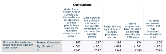
The strongest correlation was the variable that asked whether the respondent agreed more that, "One, the novel coronavirus (COVID-19) was developed intentionally in a lab; or Two, the novel coronavirus (COVID-19) was not developed intentionally in a lab.” Let's look at this one further, in relation to the question about vaccines and autism.
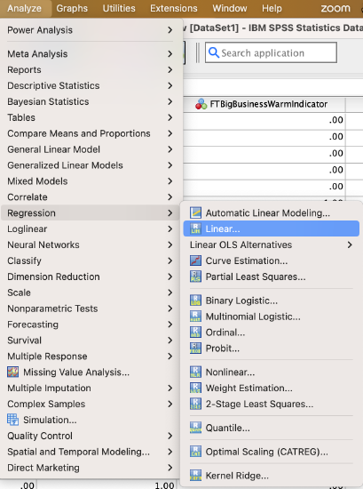
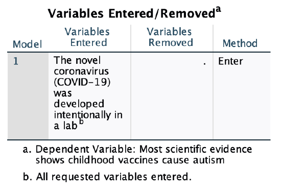
Let's return to the line of best fit, or regression line. To find out the equation for our line, we first will run a bivariate linear regression. Here's how to do that in SPSS:
Which variable is my IV and which is my DV? Timewise I'm assuming that for most people, evaluations of COVID would come after evaluations of vaccines and autism, since COVID-19 was a year or less old at the time of this survey. That would make the COVID variable the DV and the vaccines and autism variable the IV. However, I'm interested in predicting how people feel about the vaccine/autism variable based on how they feel about the COVID one, so I'm going to use the vaccine/autism variable as my DV. I don't think this is the right causal order, so I'm not arguing for a causal relationship, but I'm interested in the relationship between the two variables and whether based on someone's feelings about COVID's origins I can predict their feelings on the science being clear that vaccines causing autism, so I'm setting up my variables in this way.
Syntax:
Here is the syntax for running a bivariate OLS linear regression in SPSS. Just replace "DVName" with the name of your dependent variable and IVName with the name of your independent variable.
REGRESSION
/DESCRIPTIVES MEAN STDDEV CORR SIG N
/MISSING LISTWISE
/STATISTICS COEFF OUTS CI(95) R ANOVA
/CRITERIA=PIN(.05) POUT(.10) TOLERANCE(.0001)
/NOORIGIN
/DEPENDENT DVName
/METHOD=ENTER IVName.
Menu:
Go to Analyze → Regression → Linear
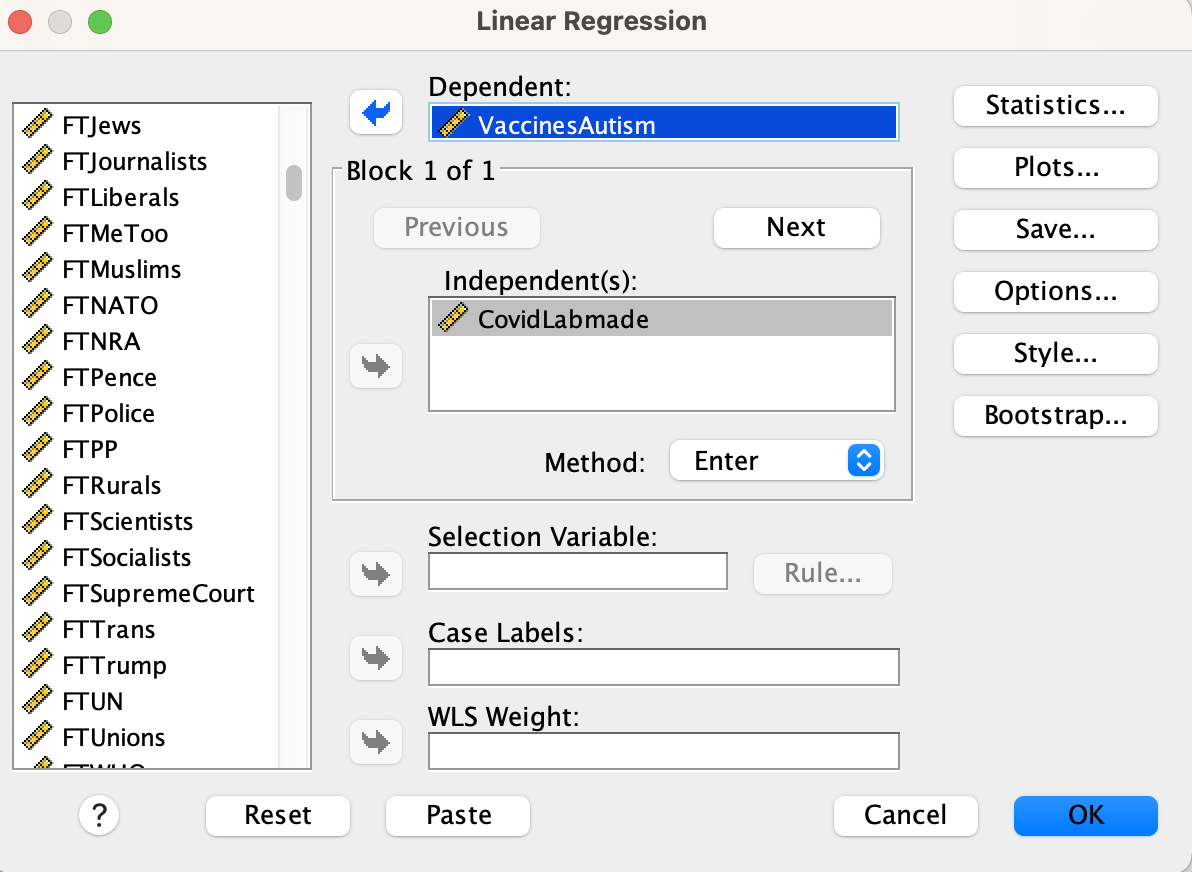
Put your independent variable in the “Independent(s)” box and your dependent variable in the “Dependent” box.
Then click on the "Statistics..." button to the right.
In the statistics window, turn on descriptives and confidence intervals.
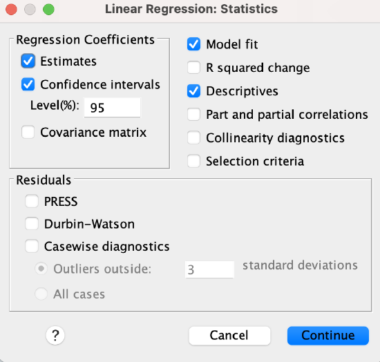
Click the "Continue" button and then click the "OK" button.
Here's my output. Chapter 11 will only cover some of the output, but we'll come back to more of it in Chapter 12.
1. Descriptive statistics and Correlations Matrix:
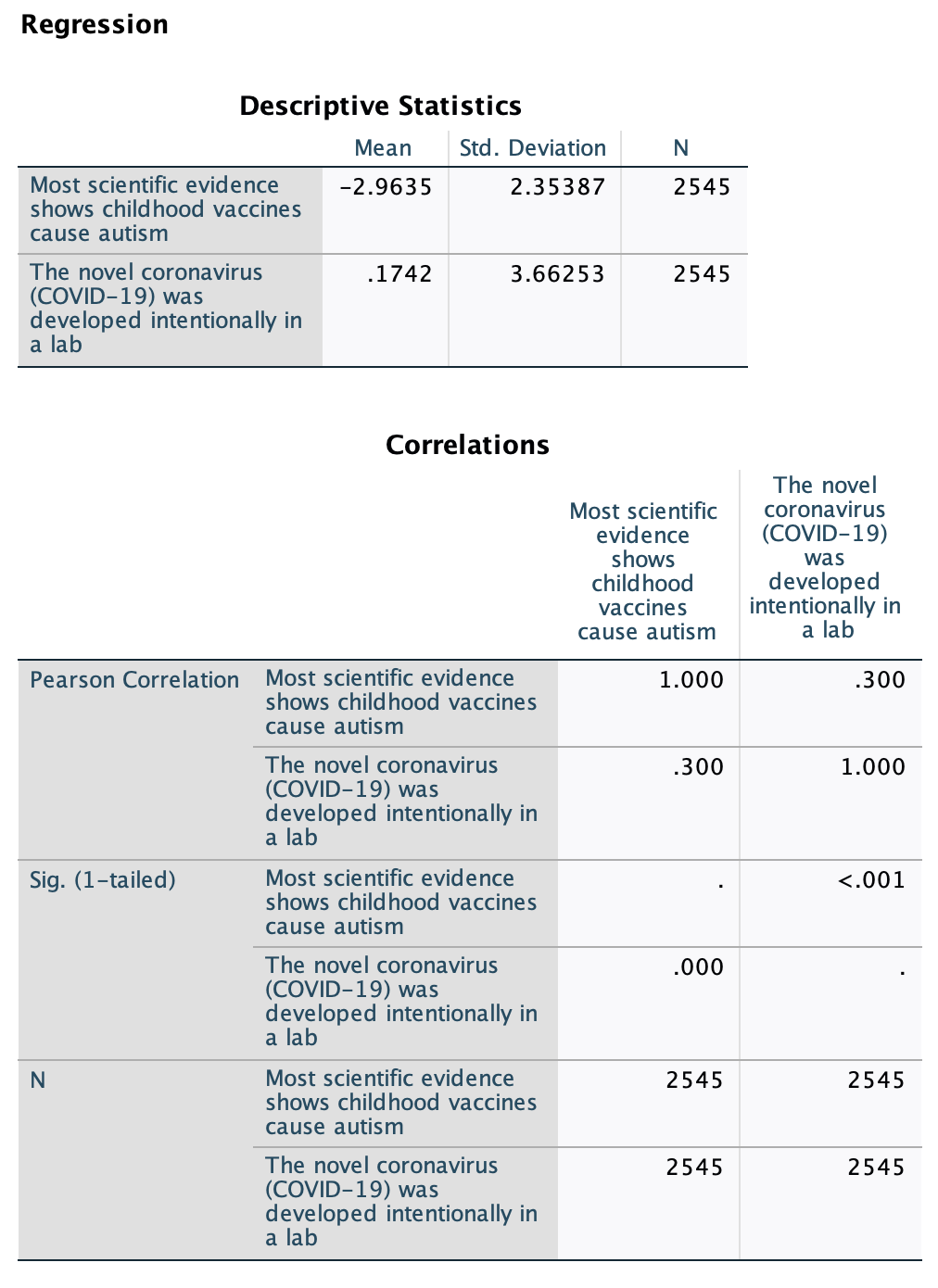
Above in the "Correlations" table you can find the correlation coefficient for the relationship. However, note that unlike the correlation matrices above or in Chapter 10, the corresponding p-values here are "1-tailed," so we won't use them.
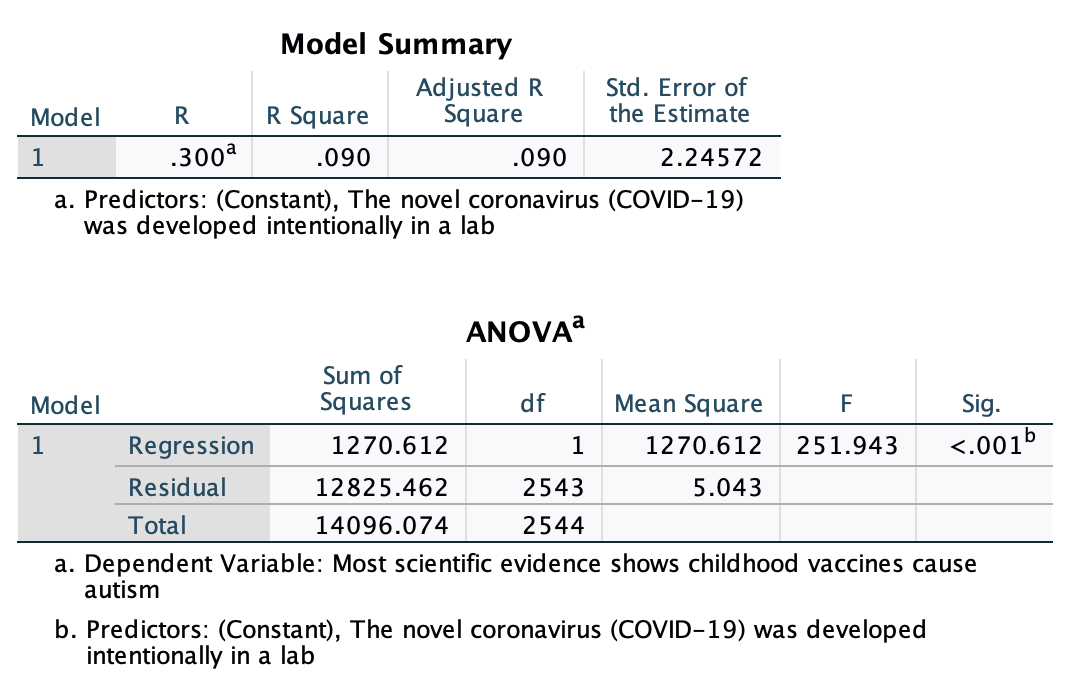
Above in the "Model Summary" output you can also find "R" which is the correlation coefficient. However, a word of caution: get your r value from the correlation matrix near the top of the output, not from this model summary. This R is actually its absolute value. The strength is accurate, but it will be positive whether or not the correlation coefficient is positive. This is because as a "model summary" it takes into account the full model, which could include multiple independent variables, some of which may have positive and some of which may have negative relationships with the dependent variable. The model summary refers to the overall strength of the whole model. This will be useful in Chapter 13, but for now you can just ignore this table.
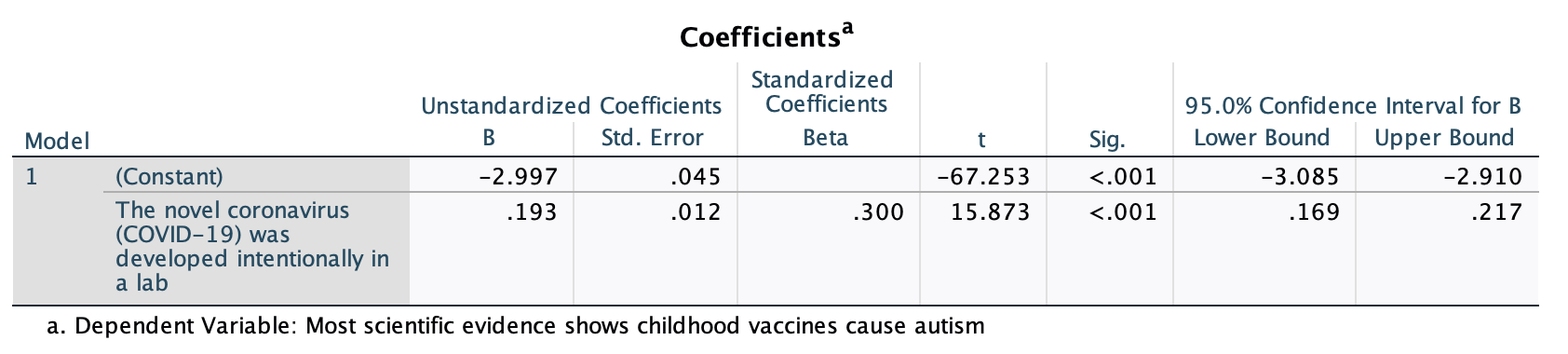
This "Coefficients" table is our focus for Chapter 11. It has the information we need to put together our regression equation, as well as additional data. After introducing you to linear equations, we'll return to this table.
Regression Equations
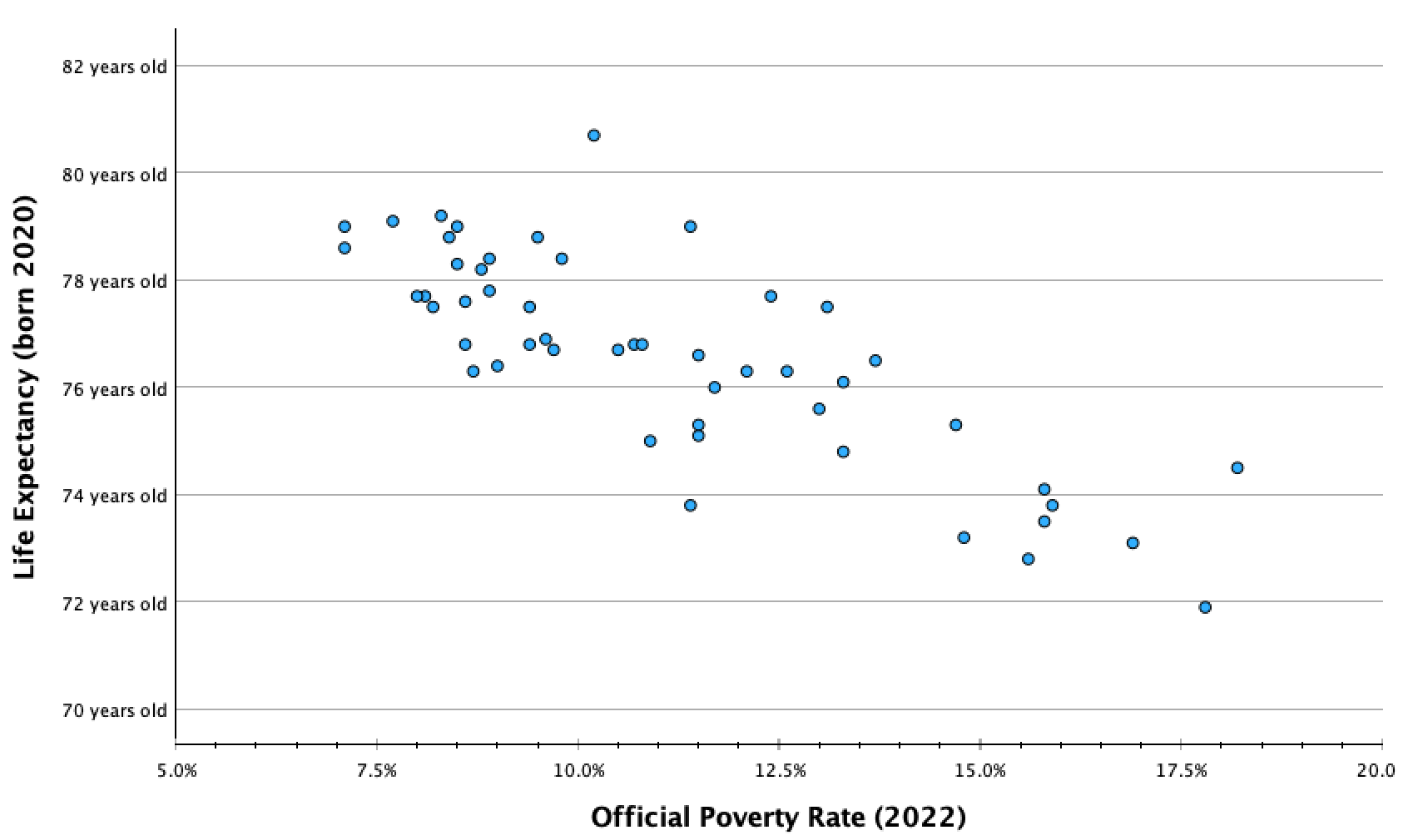
Let's return to our example from Chapter 10, of the official poverty rate and life expectancy for each U.S. state (and DC).
Here was our scatterplot:
Here was the scatterplot with the line of best fit:
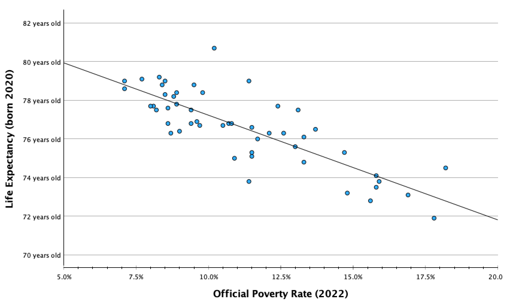
Recall that linear regression is the process of fitting a line to the data such that it minimizes the sum of the squared difference between the data points and the line. When you add your regression line, or line of best fit, to your scatterplot in SPSS, it also gives you the equation for the line (deleted above):
y=82.65 + -0.54(x)
The equation is in the form y=a+bx. (This is similar to y=mx+b that you may have learned in secondary school, but the order and letters are different.)
y: dependent variable value
a: y-intercept (the y-value for the point on the line with an x-value of 0)
b: slope (how much the dependent variable value changes for every one-unit increase in the independent variable value)
x: independent variable value
Y-Intercept:
The y-value in the coordinate (0,y). The y-intercept is the value of y would be if x=0. It is the y-value where the line crosses the y-axis.
y=a+bx y=82.65 + -0.54(x) The y-intercept, a, is 82.65.
For this equation, if x=0, y=82.65.
Sometimes the y-intercept can be interpreted sensically in real-life context, and has a story. In this case it doesn't have an empirical story since there are not any states that would have zero poverty (a 0% poverty rate), and we cannot assume that the best fit line would continue to follow the same pattern when it gets closer to and to zero. There could, for example, be diminishing returns or exponential returns on life expectancy as poverty rates approach zero. However, theoretically, the y-intercept here means that if a state had a 0% poverty rate, we would predict that the life expectancy for that state would average 82.65 years. The y-intercept can be interpreted whenever x=0 has real-life meaning and there is data at or nearby x=0.
Template: I would predict that [respondents / name unit of analysis] who/that [describe what it means for the independent variable to equal 0] would [describe what it means to be at the y-intercept value for the dependent variable].
Examples:
I would predict that someone who feels absolutely cold towards labor unions (x=0) would feel fairly cold/unfavorable towards Obama (y=23.11 on the 0-100 feelings thermometer scale).
A state with a 0% poverty rate would theoretically be predicted to have a life expectancy of 82.7 years. However, all states have poverty rates of 7% or higher, so we don't have enough information to make such a prediction.
Mathematically the y-intercept means that we would predict a 0-year-old would have slightly warm feelings towards journalists (54.9 degrees). However, this survey was only of adults, so such a prediction would not make any sense.
Slope:
y=a+bx y=82.65 + -0.54(x) The slope, b, is -0.54.
For every one-unit increase in x, how much does y increase?
For every one-unit increase in x, meaning for every 1% increase in the official poverty rate, there is a -0.54% increase in y, meaning a 0.54% decrease in life expectancy.
You may have heard slope referred to as rise over run. It is calculated by taking the difference in y between two coordinates and dividing it by the difference in x (to make the difference in y standardized into the different for every one unit change in x). In the graph below, you can see how for every one unit increase in x (in this case, a 1% increase in the official poverty rate), the line decreases by about half a percent.
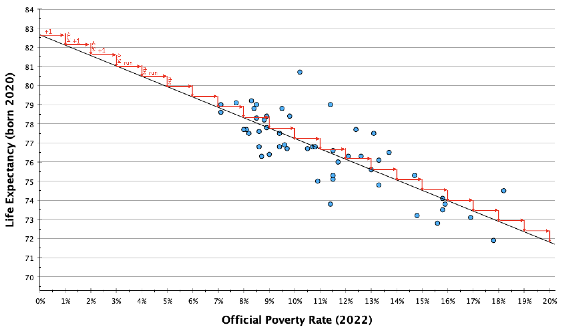
In context, -0.54 can be kind of confusing. I prefer working with whole numbers and estimates when I explain slopes. One way to do this is to calculate multiples until I get something a bit more interpretable. This can also be useful for providing a second example that scales up the change to give your audience a broader perspective of what kind of change they might expect in your DV as the IV changes.
 .
. 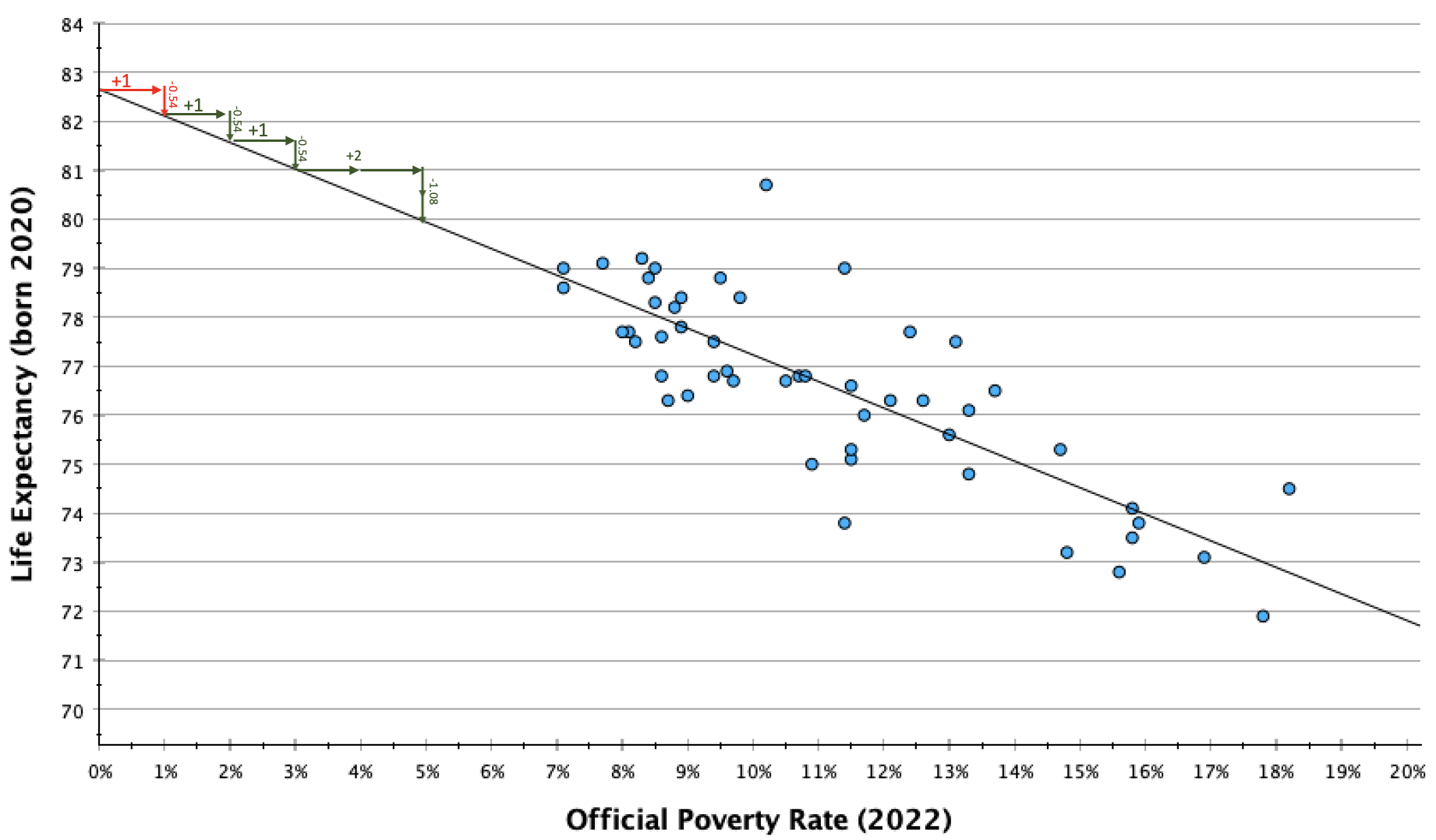
In the table and graph above, you can see that for every two-unit change in x, y decreases by about 1 unit. So every 2% increase in the official poverty rate is associated with a 1 year decrease in life expectancy.
Template: On average, every one [IV unit label] increase in [a respondent's/name unit of analysis] [variable description] is associated with an increase/decrease of [slope value] [DV unit label] in [DV variable description].
If not easily digestible numbers, or to scale up:
Similarly, every [multiple of one] [IV unit label] in [variable description] is associated with a [slope value times same multiple] [DV unit label] in [DV variable description].
Examples:
On average, every one degree warmer a respondent feels towards labor unions on the 0-100 feelings thermometer scale is associated with an increase of 0.68 degrees warmer in how they feel towards Obama on the 0-100 feelings thermometer scale. Every 3 degrees warmer toward labor unions is associated with 2 degrees warmer towards Obama. Similarly, every 15 degrees warmer respondents feel towards labor unions is associated with 10 degrees warmer in feelings towards Obama.
On average, a 1% increase in a state's poverty rate is associated with a 0.54 year decrease in the state's average life expectancy. A 2% increase in the poverty rate is associated with about a 1 year decrease in life expectancy. Similarly, a 5% increase in the poverty rate (1 in 20 more residents) is associated with a decrease in average life expectancy of about 2 1/2 (2.7) years
On average, every one year older a respondent's age is is associated with a marginal change of 0.086 degrees colder feelings towards journalists (using the 0-100 feelings thermometer scale). Someone who is a decade older would still be less than a degree (0.86) colder. Being 60 years older is associated with over 5 (5.16) degrees colder feelings toward journalists.
Predictions
Using the line of best fit, for any independent variable value, we can make predictions of our dependent value. However, while the linear equation is the line of "best fit," depending on the strength of the relationship, it may be a better or worse fit for the data. The more the data converges into a common linear pattern, the better our predictions will be.
To make a prediction, I select a value for the independent variable, plug it into the equation for x, and then calculate the y-value.
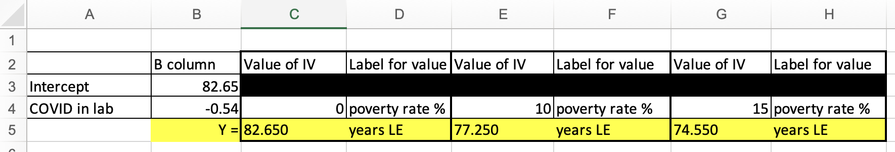
Let's say I wanted to predict the life expectancy for a state with a 10% poverty rate.
y=a+bx
y=82.65 + -0.54(x)
y=82.65 + -0.54(10)
y=82.65 + -5.4
y=77.25
I would predict that a state with a 10% poverty rate has a life expectancy of 77.25.
Let's say I wanted to predict the life expectancy for a state with a 15% poverty rate.
y=a+bx
y=82.65 + -0.54(x)
y=82.65 + -0.54(15)
y=82.65 + -8.1
y=74.55
If you don't want to do this math, I've provided a spreadsheet in Excel: BivariateLinearRegressionGraphTemplate.xlsx
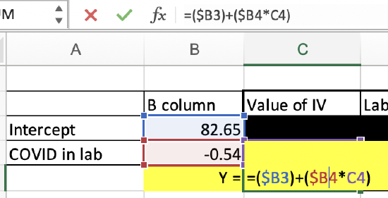
The fifth worksheet tab, "PredictedValueCalculator," lets you put in your intercept value, IV slope value, and IV value you want to calculate the predicted DV value for, and it will calculate it for you.
This is doing the same thing as if you were to calculate it on your own. You can see the formula below. This is just doing the math for you.
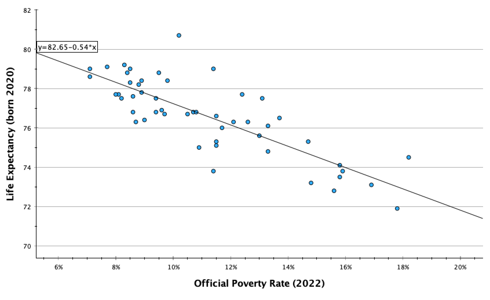
Here you can see how the life expectancy predictions for a 10% poverty rate and a 15% poverty rate match up with the line. The coordinates (10,77.25) and (15,74.55) both fall on the line.
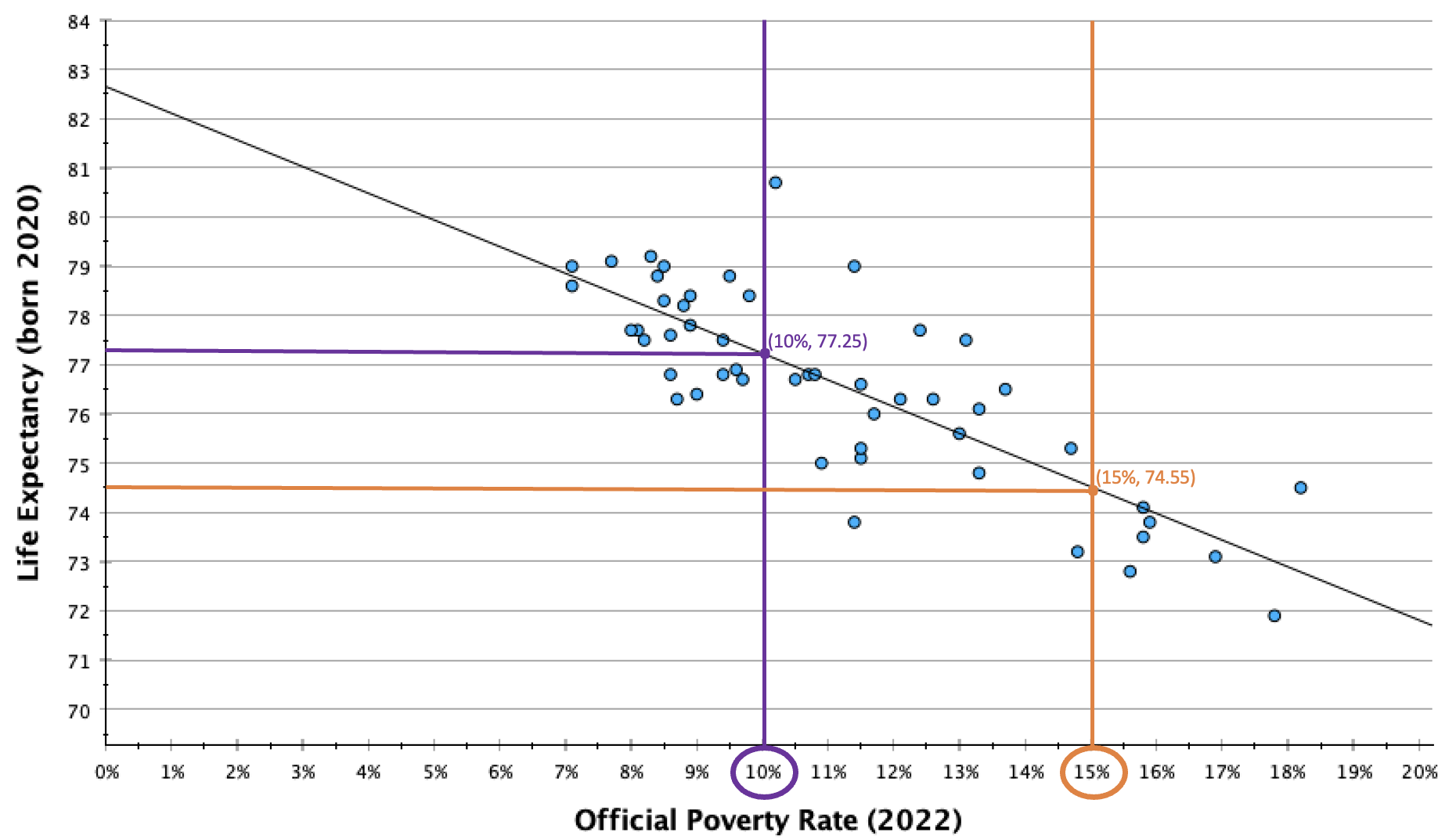
You can also see that no states are actually at these coordinates, and most states are not directly on the line. These are our predictions, and absent a perfect relationship, we expect variability such that our predicted values will not be an exact match for what the values would actually be in real life. They are an estimate, and the stronger the relationship, the more likely our estimate is to be accurate.
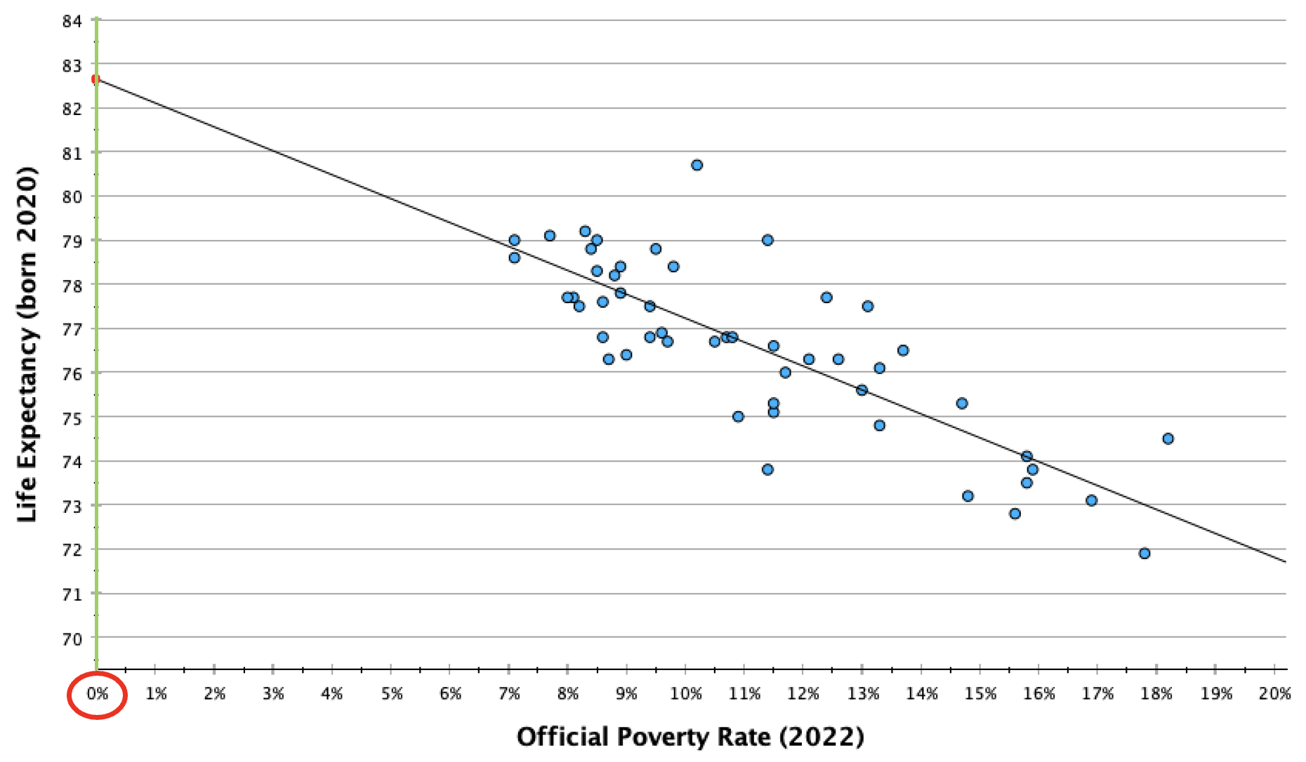
I mentioned before that we wouldn't want to make a prediction for a poverty rate of 0% (our y-intercept), even though it would be great to have a state eliminate poverty. However, our line of best fit is based on the data we have available. There were no states with a 7% or lower poverty rate and no states with a 19% or higher poverty rate. We want to contain our predictions to the range of the data available, since we don't know what the trend line would look like outside of the data we have. The pattern could look the same, or it could be quite different.
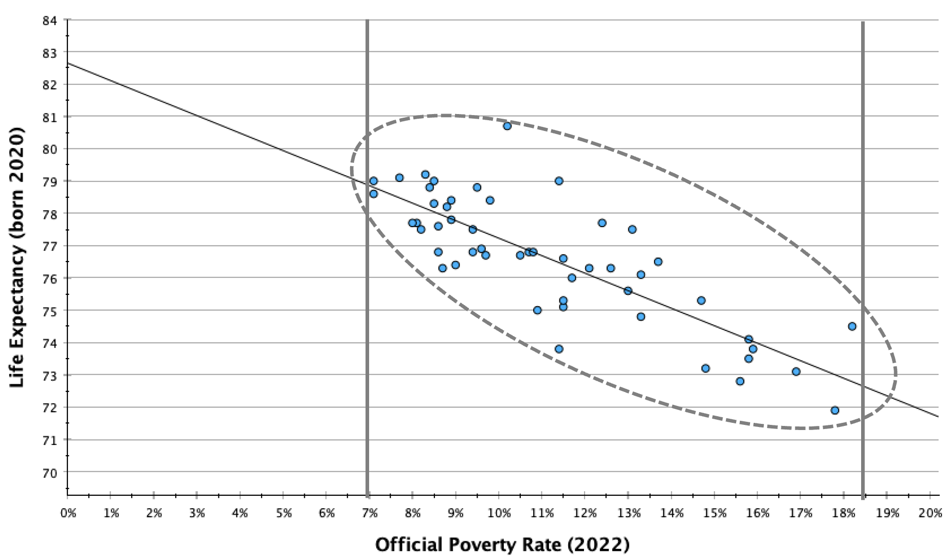
In general, only make predictions between your minimum and maximum IV values (and within a narrower range if one or both of these are outliers).
Let's return to the SPSS output from our linear regression of views on whether COVID-19 was intentionally developed in a lab and views on whether most scientific evidence suggests childhood vaccines cause autism.
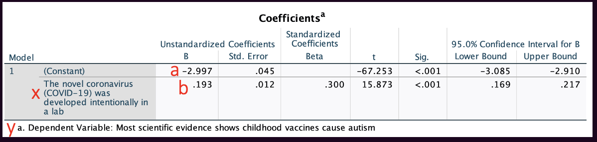
We can write out our regression equation from values in the coefficients box.
Our two coefficients will be in the "B" column under "Unstandardized Coefficients."
The y-intercept, a, is in the row marked "(Constant)".
The slope, b, is in the row marked with the label/description of the IV.
y=a+bx
Here, y = -2.997 + 0.193x
y, our dependent variable, is agreement with the statement "Most scientific evidence shows childhood vaccines cause autism."
x, our independent variable, is agreement with the statement, "The novel coronavirus (COVID-19) was developed intentionally in a lab."
Confidence Intervals:
We can also see 95% confidence intervals for these two coefficients. The regression equation is a descriptive statistic. If you have a representative sample, you can look at the confidence interval to evaluate where, at the 95% confidence level, the y-intercept and slope would be. For example, here, while the slope was 0.193 in the sample, we are 95% confident that, among all U.S. eligible voters following the 2020 election, the slope would be somewhere between 0.169 and 0.217.
P-values:
The "Sig." column contains p-values. These are the probability we would pull this sample if B=0.
- For the y-intercept, this has meaning but is not that important. It's just evaluating whether, while we are predicting someone who is at a 0 for the IV (neutral on the statement) would be at about a -3 (moderately confident that the scientific evidence does not show childhood vaccines cause autism), our confidence level that this is not actually a 0 (neutral on whether the scientific evidence shows childhood vaccines cause autism). If I look at the cell in the row labeled "(Constant)" and the column labeled "Sig.", I find a p-value of <0.001. I am over 99.9% confident that, among all U.S. eligible voters, when x=0, y is not also 0.
- For the slope, the p-value is evaluating whether there is a significant relationship between the IV and DV. Recall from Chapter 10 that a flat horizontal line indicates no relationship. A flat line would have a slope of 0. For every one unit increase in x, there is a 0 unit increase in y. What's the probability we would pull this sample if the slope was actually 0 (if there was actually no relationship)? If I look at the cell in the row labeled with the IV label/description and the column labeled "Sig.", I find a p-value of <0.001. I am over 99.9% confident that, among all U.S. eligible voters, there is a relationship between people's beliefs about whether COVID-19 was intentionally developed in a lab and whether most scientific evidence shows childhood vaccines cause autism. Because p<0.05 and I am over 95% confident there is a relationship among my target population, the relationship is significant.
Making predictions
Just like above, we can use the regression equation to make predictions.
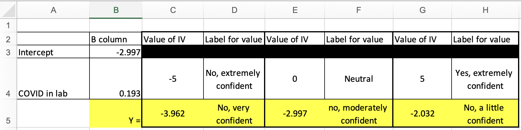
For example, what if x=-5 (extremely confident COVID-19 was not intentionally made in a lab).
y = -2.997 + 0.193x y = -2.997 + 0.193*-5 = -3.962
Here I again used the Excel spreadsheet to make predictions for three different IV values:
We're also going to use this Excel spreadsheet to graph the linear equation. This will look like the line of best fits above, but without a scatterplot.
BivariateLinearRegressionGraphTemplate.xlsx
The first tab/worksheet in the file is labeled "BivariateGraph." Here is what it looks like:
The first thing to do is to put in the intercept, slope, minimum IV value, and maximum IV value (the cells shaded yellow). If you're not sure what the minimum and maximum IV values are, you can run descriptive statistics in SPSS to find out.

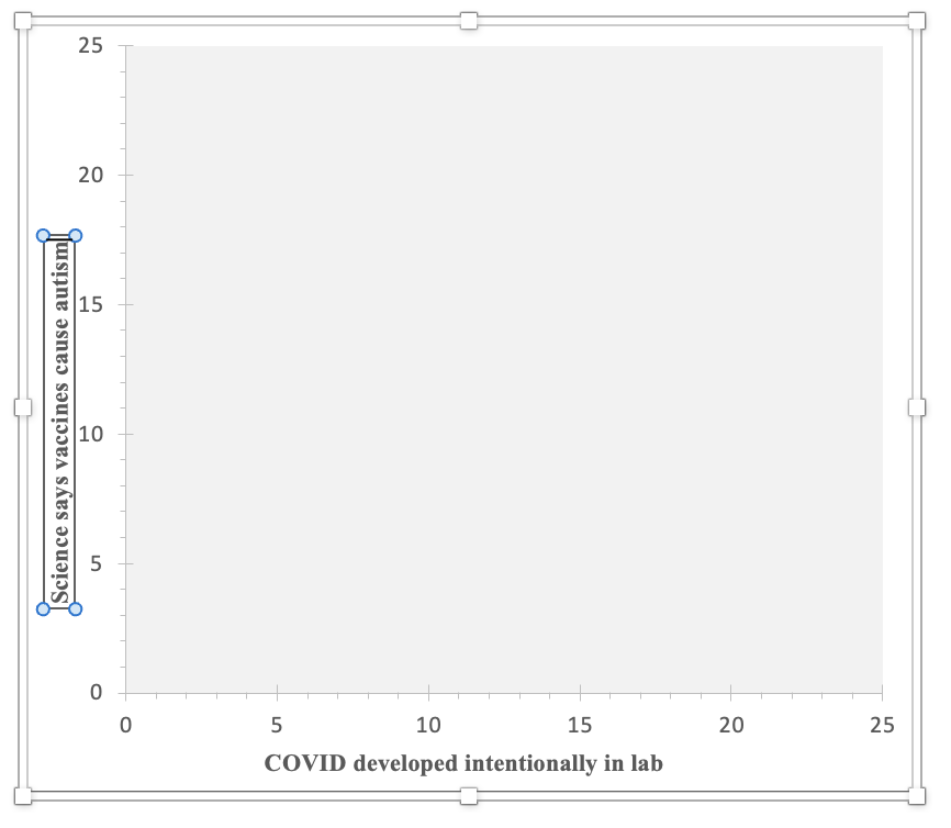
I added in the four values (the intercept of -2.997, the slope of 0.193, the minimum IV value of -5, and the maximum IV value of 5), but the graph is still blank. The line is actually there, but it's outside of the current scope of the graph. The line is connecting two points, one at (-5,-3.962) and one at (5,-2.032). Since the y-axis on the graph template goes from 0 to 25, none of those negative values are appearing within the visible area.
Before I address that, I'm going to update where it says "X-axis (replace with label)" and "Y-axis (replace with label)", by clicking on these and typing in a description of the variable.
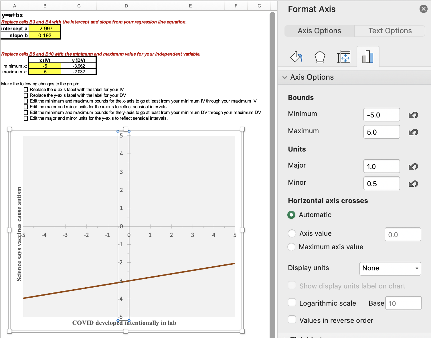
Now I am going to change the graph area so that my line shows up. Double-click one at a time on the x-axis and on the y-axis. When you do there will be a pop-up. Here's what happened when I clicked on one of the numbers on the x-axis:

Under Axis Options, click on the picture icon that looks like a bar graph or histogram. Then you will change the bounds and units. The bounds for the x-axis need to from at least your minimum IV value through your maximum IV value. The major units are the interval for what numbers will be displayed. For example, if your x-axis goes from 0 to 100, you could decide to show every 0, 10, 20, 30, etc. with a major unit of 10. The minor units are for marks on the x-axis in between the major labeled units. You can decide how big or small you want these for ease of viewing the graph. Think about what your major unit numbers will easily break into and will add information without overwhelming. For example, if you are doing 0, 10, 20, 30, etc., with a major unit of 10, maybe you use a minor unit of 2, so that there are 4 little dash marks in between each major unit number label. You can always experiment with the units to see what looks good on the graph.
Next, double-click on the y-axis, and again edit the bounds and units. For the y-axis, the bounds need to start at or below the y (DV) value to the right of your minimum x value (cell C9) and through the value in cell C10. Depending on the variable and its coding, you may want to display the full range of possible values or you may want to zoom in. If you do zoom in, it's important to make sure your audience is aware that the line looks more substantive/steeper than it actually is.
For this example, I set the bounds for both the IV and DV as going from -5 to +5, which are my minimum and maximum IV and DV values. With a range of 10, I decided on a major unit of 1 and then breaking each of those into a mark halfway between them.
Here is my final graph:
In this graph, you can find the coordinates for my earlier calculated predictions: (-5, -3.962), (0, -2.997), and (5,-2.032).
You can see that there is a positive relationship, that as likelihood increases in believing COVID-19 was intentionally developed in a lab, respondents are more likely to believe that most scientific evidence shows childhood vaccines cause autism. However, you can also see that the range is from about -4 to about -2, so across the entire spectrum of responses to the question about COVID, on average respondents were likely to not believe that most scientific evidence shows childhood vaccines cause autism. We would not predict that anyone would lean towards believing this based solely on their views on COVID, but our predictions would change from someone who is extremely confident that COVID-19 was not intentionally developed in a lab being very confident that most scientific evidence does not show childhood vaccines cause autism to, for someone who is extremely confident that COVID-19 was intentionally developed in a lab, predicting they would be a little confident that most scientific evidence does not show childhood vaccines cause autism.
Let's look at one more example, and also discuss here 1) substantiveness, 2) what to do if your line of best fit goes above or below the bounds of where your dependent variable values can actually be, and 3) evaluating "ratio-like" variables as candidates for linear regression.
Example:
We'll keep the same dependent variable, but this time use education as our independent variable. Here is the codebook information on our IV:
What is the highest level of school you have completed or the highest degree you have received?
0. Less than high school credential
1. High school credential
2. Some post-high school, no bachelor’s degree
3. Bachelor’s degree
4. Graduate degree
Here is the coefficients output from running a weighted linear regression:
 With the p-value on the bottom row (the one that starts, "What is the highest level of school...") being <0.001, we know there is a statistically significant relationship between education and whether people believe that most scientific evidence shows childhood vaccines cause autism.
Here you can see what numbers I put in for the Excel template, along with how I adjusted the x-axis bounds and units. I was able to leave the y-axis bounds and units alone since it was the same dependent variable.
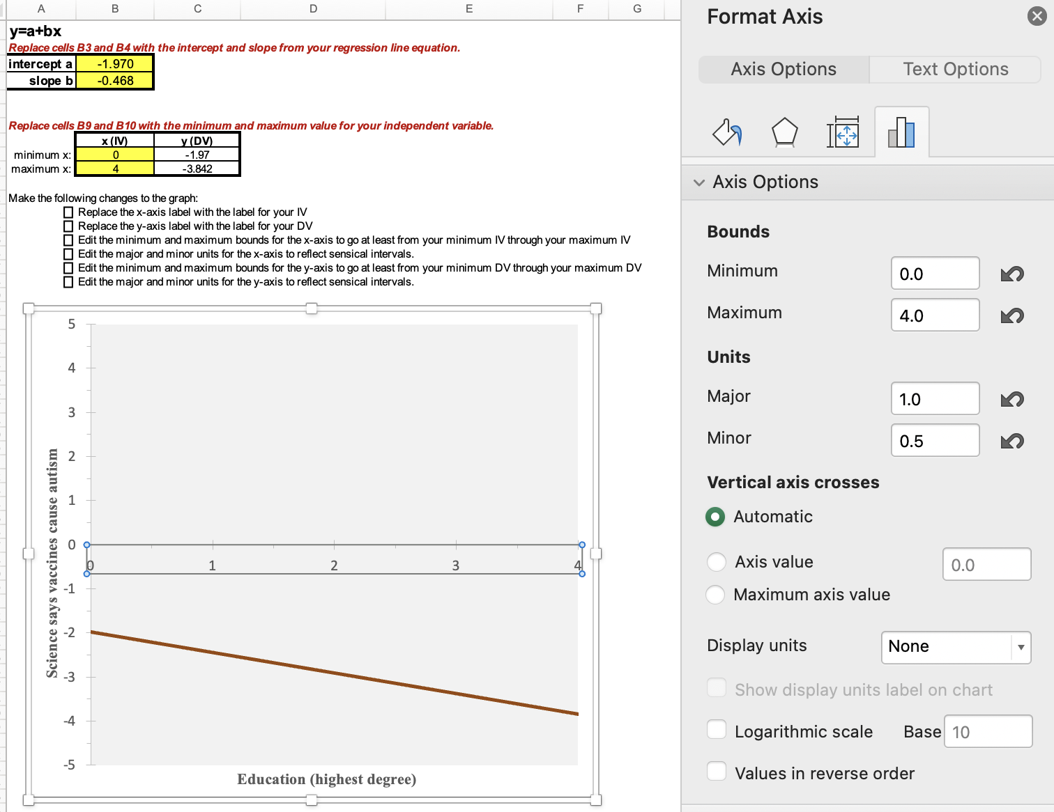
Here is a graph of the equation, y = -1.970 + (-0.468)x
You can see that there is a negative relationship --- on average, as education increases, respondents are less likely to believe that most scientific evidence shows childhood vaccines cause autism.
Those with less than a high school credential are predicted at around -2 (a little confident most scientific evidence does not show childhood vaccines cause autism), while those with a graduate degree are predicted almost at -4 (very confident most scientific evidence does not show childhood vaccines cause autism).
1) Substantiveness
For a relationship to be substantive, it first needs to exist. If your data is of a representative sample, is the relationship significant? If you are not confident that the relationship exists among your target population, you won't claim it is substantive. (In the example above, p<0.001 and the relationship is significant.)
The next criterion to evaluate is the steepness of the slope. How much does the DV change as the IV changes? Is this a sizable and meaningful amount? When you go from low IV values to high IV values, what is the change to the predicted DV values? Is this a sizable and meaningful amount? (In the example above, the DV values range from very confident to a little confident that most scientific evidence does not show childhood vaccines cause autism. Do you think this is substantive?)
If the slope seems substantive, and you are using representative sample data, you should also look at the slope's 95% confidence interval. If you have a significant relationship, the confidence interval should not overlap zero. Use the bound closer to zero. You are 95% confident that, among your target population, the slope is at least that amount. (In the example above, while the sample slope is -0.468, we are 95% confident that the slope is at least -0.391. Going from 0 to 4 for education is over a 1.5 unit difference in the dependent variable. In context, is that substantive?)
In Chapter 12, we'll also consider r-squared, the "coefficient of determination", to make a determination of substantiveness.
And finally, remember that even if a relationship is significant and substantive, that does not mean it's necessarily causal. It still needs to have the correct causal order, make sense theoretically, and not be spurious.
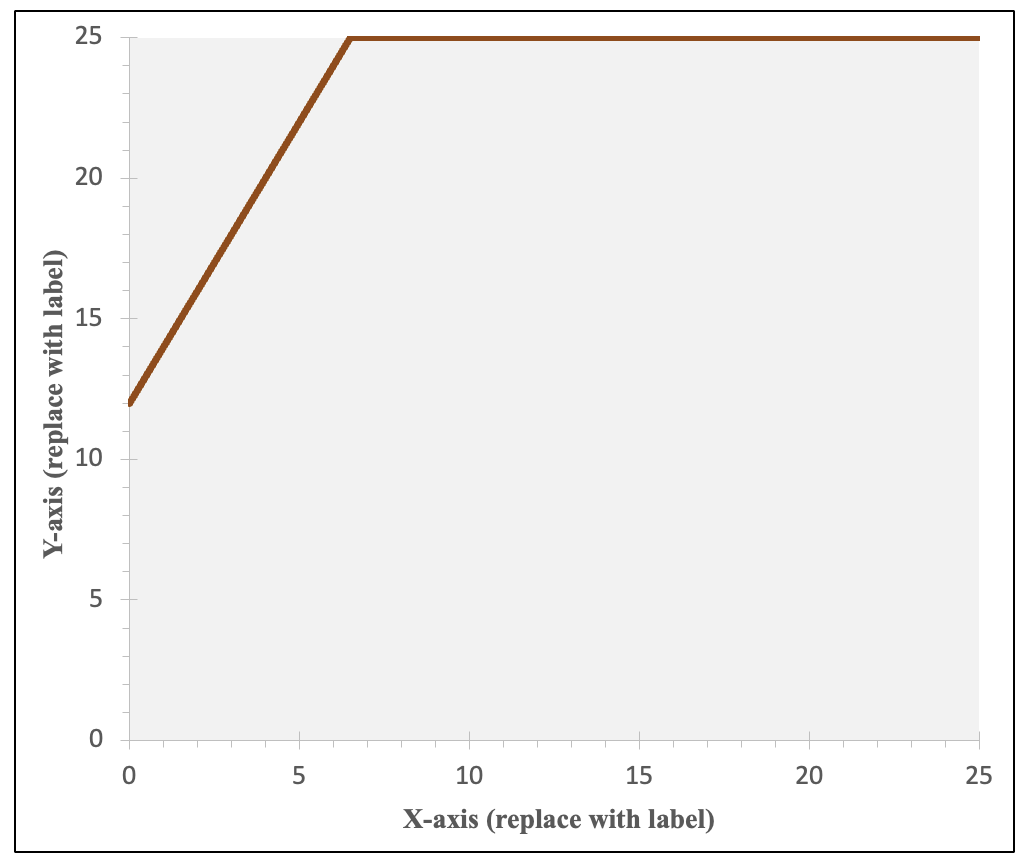
2) What to do if your line of best fit goes above or below the bounds of where your dependent variable values can actually be
Sometimes the line of best fit goes above or below where it actually can be in real life. For example, in the graph above, y can't be below -5 or above +5. If you were using a feelings thermometer variable as your DV, in real life it can't go below 0 (very cold) or above 100 (very warm). If this happens, you can graph your regression line within the bounds of your DV range. In the template, there are three additional worksheets/tabs to use depending on your situation. These will help change the graph so that you either start, end, or start and end with a flat horizontal line at your y-value bound, keeping the predicted values within what is actually empirically possible.
3) Evaluating "ratio-like" variables as candidates for linear regression.
Is the relationship between education and evaluation of what most scientific evidence on vaccines and autism concludes a linear relationship? Sometimes with degree, the relationship is not linear. For example, it may be that those with less than a high school degree are very supportive of raising the minimum wage, those with a high school degree a little less supportive, those with a college degree even a little less supportive, but then those with a graduate degree are as supportive of as those without a high school degree. This would not be ordered correctly for a linear pattern. Or what if those with some college and college are basically the same in regards to your dependent variable while otherwise the progression is linear? Should you check for this and combine those categories? Age, even as a ratio-level variable measured in years, might also have a non-linear relationship rather than the dependent variable either continuously decreasing or increasing with age. In other situations, you may have an ordinal categorical variable that you want to know if you can use a a ratio-like variable as an IV for linear regression, perhaps one that stretches the definition of ratio-like (e.g., one with only four categories).)
For the above example, I checked the mean of my dependent variable, broken down by the independent variable.
This plot comes from what we did in Chapter 7 on hypothesis tests, where we generated these togetehr with a one-way ANOVA test: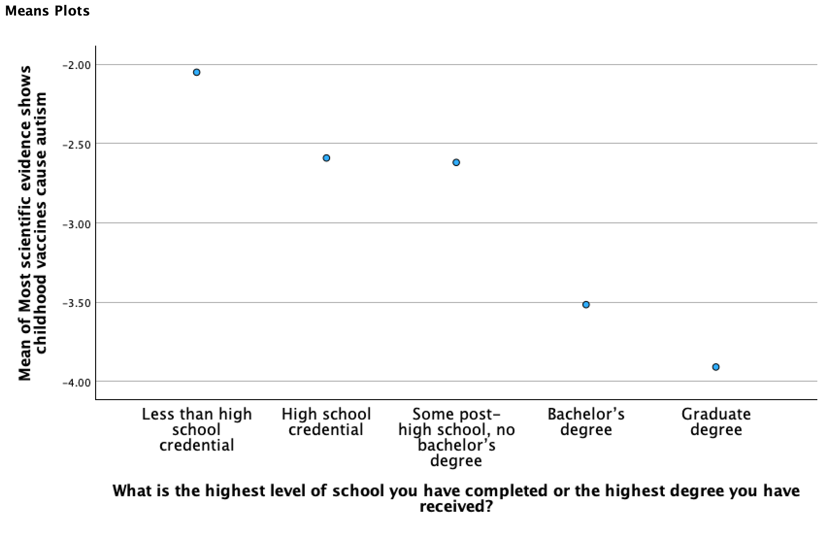
The output below comes from what we did in Chapter 3, where we used Examine/Explore to break means for a primary variable down by another grouping variable:
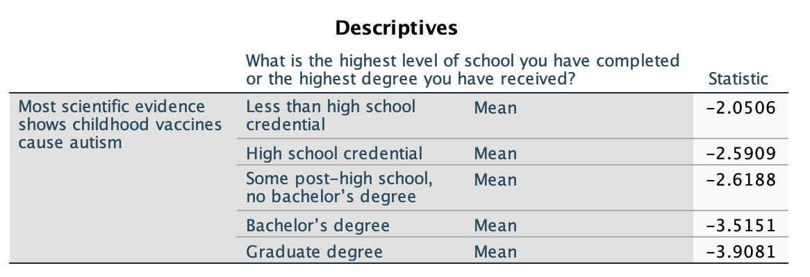
What I'm looking for in these is if there is a somewhat continuous pattern of similarly sized increases or decreases, unidirectional, as the IV increases. If the pattern doesn't look linear (e.g., it changes direction, flattens out, or it appears like a curve with a changing speed), this is a sign the IV may not be appropriate in its current form for linear regression. Depending on the situation, there are different techniques you can use to still use the IV. You may transform it, collapsing some categories together, exponentiating it, adjusting the coding, or otherwise changing it to better reflect a linear pattern. You may end up using it in indicator form. In Chapter 12, we'll look at situations where you can use a dichotomous independent variable. Depending on the situation, sometimes you can collapse a ratio-like variable into a dichotomous variable (e.g., perhaps what matters for age is whether someone is <65 or 65+). Or, sometimes you will want to leave more categories, (e.g., maybe you want 3 or more degree categories, or age groups). In that case you can use something called reference group sets, which will be discussed in Chapter 13 when we look at nominal-level independent variables.