Solutions
- Page ID
- 108301
\( \newcommand{\vecs}[1]{\overset { \scriptstyle \rightharpoonup} {\mathbf{#1}} } \)
\( \newcommand{\vecd}[1]{\overset{-\!-\!\rightharpoonup}{\vphantom{a}\smash {#1}}} \)
\( \newcommand{\dsum}{\displaystyle\sum\limits} \)
\( \newcommand{\dint}{\displaystyle\int\limits} \)
\( \newcommand{\dlim}{\displaystyle\lim\limits} \)
\( \newcommand{\id}{\mathrm{id}}\) \( \newcommand{\Span}{\mathrm{span}}\)
( \newcommand{\kernel}{\mathrm{null}\,}\) \( \newcommand{\range}{\mathrm{range}\,}\)
\( \newcommand{\RealPart}{\mathrm{Re}}\) \( \newcommand{\ImaginaryPart}{\mathrm{Im}}\)
\( \newcommand{\Argument}{\mathrm{Arg}}\) \( \newcommand{\norm}[1]{\| #1 \|}\)
\( \newcommand{\inner}[2]{\langle #1, #2 \rangle}\)
\( \newcommand{\Span}{\mathrm{span}}\)
\( \newcommand{\id}{\mathrm{id}}\)
\( \newcommand{\Span}{\mathrm{span}}\)
\( \newcommand{\kernel}{\mathrm{null}\,}\)
\( \newcommand{\range}{\mathrm{range}\,}\)
\( \newcommand{\RealPart}{\mathrm{Re}}\)
\( \newcommand{\ImaginaryPart}{\mathrm{Im}}\)
\( \newcommand{\Argument}{\mathrm{Arg}}\)
\( \newcommand{\norm}[1]{\| #1 \|}\)
\( \newcommand{\inner}[2]{\langle #1, #2 \rangle}\)
\( \newcommand{\Span}{\mathrm{span}}\) \( \newcommand{\AA}{\unicode[.8,0]{x212B}}\)
\( \newcommand{\vectorA}[1]{\vec{#1}} % arrow\)
\( \newcommand{\vectorAt}[1]{\vec{\text{#1}}} % arrow\)
\( \newcommand{\vectorB}[1]{\overset { \scriptstyle \rightharpoonup} {\mathbf{#1}} } \)
\( \newcommand{\vectorC}[1]{\textbf{#1}} \)
\( \newcommand{\vectorD}[1]{\overrightarrow{#1}} \)
\( \newcommand{\vectorDt}[1]{\overrightarrow{\text{#1}}} \)
\( \newcommand{\vectE}[1]{\overset{-\!-\!\rightharpoonup}{\vphantom{a}\smash{\mathbf {#1}}}} \)
\( \newcommand{\vecs}[1]{\overset { \scriptstyle \rightharpoonup} {\mathbf{#1}} } \)
\(\newcommand{\longvect}{\overrightarrow}\)
\( \newcommand{\vecd}[1]{\overset{-\!-\!\rightharpoonup}{\vphantom{a}\smash {#1}}} \)
\(\newcommand{\avec}{\mathbf a}\) \(\newcommand{\bvec}{\mathbf b}\) \(\newcommand{\cvec}{\mathbf c}\) \(\newcommand{\dvec}{\mathbf d}\) \(\newcommand{\dtil}{\widetilde{\mathbf d}}\) \(\newcommand{\evec}{\mathbf e}\) \(\newcommand{\fvec}{\mathbf f}\) \(\newcommand{\nvec}{\mathbf n}\) \(\newcommand{\pvec}{\mathbf p}\) \(\newcommand{\qvec}{\mathbf q}\) \(\newcommand{\svec}{\mathbf s}\) \(\newcommand{\tvec}{\mathbf t}\) \(\newcommand{\uvec}{\mathbf u}\) \(\newcommand{\vvec}{\mathbf v}\) \(\newcommand{\wvec}{\mathbf w}\) \(\newcommand{\xvec}{\mathbf x}\) \(\newcommand{\yvec}{\mathbf y}\) \(\newcommand{\zvec}{\mathbf z}\) \(\newcommand{\rvec}{\mathbf r}\) \(\newcommand{\mvec}{\mathbf m}\) \(\newcommand{\zerovec}{\mathbf 0}\) \(\newcommand{\onevec}{\mathbf 1}\) \(\newcommand{\real}{\mathbb R}\) \(\newcommand{\twovec}[2]{\left[\begin{array}{r}#1 \\ #2 \end{array}\right]}\) \(\newcommand{\ctwovec}[2]{\left[\begin{array}{c}#1 \\ #2 \end{array}\right]}\) \(\newcommand{\threevec}[3]{\left[\begin{array}{r}#1 \\ #2 \\ #3 \end{array}\right]}\) \(\newcommand{\cthreevec}[3]{\left[\begin{array}{c}#1 \\ #2 \\ #3 \end{array}\right]}\) \(\newcommand{\fourvec}[4]{\left[\begin{array}{r}#1 \\ #2 \\ #3 \\ #4 \end{array}\right]}\) \(\newcommand{\cfourvec}[4]{\left[\begin{array}{c}#1 \\ #2 \\ #3 \\ #4 \end{array}\right]}\) \(\newcommand{\fivevec}[5]{\left[\begin{array}{r}#1 \\ #2 \\ #3 \\ #4 \\ #5 \\ \end{array}\right]}\) \(\newcommand{\cfivevec}[5]{\left[\begin{array}{c}#1 \\ #2 \\ #3 \\ #4 \\ #5 \\ \end{array}\right]}\) \(\newcommand{\mattwo}[4]{\left[\begin{array}{rr}#1 \amp #2 \\ #3 \amp #4 \\ \end{array}\right]}\) \(\newcommand{\laspan}[1]{\text{Span}\{#1\}}\) \(\newcommand{\bcal}{\cal B}\) \(\newcommand{\ccal}{\cal C}\) \(\newcommand{\scal}{\cal S}\) \(\newcommand{\wcal}{\cal W}\) \(\newcommand{\ecal}{\cal E}\) \(\newcommand{\coords}[2]{\left\{#1\right\}_{#2}}\) \(\newcommand{\gray}[1]{\color{gray}{#1}}\) \(\newcommand{\lgray}[1]{\color{lightgray}{#1}}\) \(\newcommand{\rank}{\operatorname{rank}}\) \(\newcommand{\row}{\text{Row}}\) \(\newcommand{\col}{\text{Col}}\) \(\renewcommand{\row}{\text{Row}}\) \(\newcommand{\nul}{\text{Nul}}\) \(\newcommand{\var}{\text{Var}}\) \(\newcommand{\corr}{\text{corr}}\) \(\newcommand{\len}[1]{\left|#1\right|}\) \(\newcommand{\bbar}{\overline{\bvec}}\) \(\newcommand{\bhat}{\widehat{\bvec}}\) \(\newcommand{\bperp}{\bvec^\perp}\) \(\newcommand{\xhat}{\widehat{\xvec}}\) \(\newcommand{\vhat}{\widehat{\vvec}}\) \(\newcommand{\uhat}{\widehat{\uvec}}\) \(\newcommand{\what}{\widehat{\wvec}}\) \(\newcommand{\Sighat}{\widehat{\Sigma}}\) \(\newcommand{\lt}{<}\) \(\newcommand{\gt}{>}\) \(\newcommand{\amp}{&}\) \(\definecolor{fillinmathshade}{gray}{0.9}\)Solutions
Chapter 1 Solutions
If all 100 workers make cakes their output is
 .
.If all workers make shirts their output is
 .
.The diagram shows the PPF for this economy.
As illustrated in the diagram.

The PPF is curved outwards with intercepts of 1000 on the Thinkpod axis and 6000 on the iPad axis. Each point on the PPF shows one combination of outputs.
Different.
400 X.
The new PPF in the diagram has the same Thinkpod intercept, 1000, but a new iPad intercept of 7200.

By examining the opportunity cost in the region where the combinations are defined, and by assuming a linear trade-off between each set of combinations, it can be seen that the first combination in the table is feasible, but not the second combination.
$20.
$30.
See lower curve on diagram.
See upper curve on diagram.

Louis has an advantage in cutting the grass while Carrie Anne should wash cars.
If they each work a twelve-hour day, between them they can cut 12 lawns and wash 24 cars.
Carrie Anne's lawn intercept is now 12 rather than 8.
Yes, specialization still matters because C.A. is more efficient at cars.
The new coordinates will be 39 on the vertical axis, 24 on the horizontal axis and the kink point is the same.
220 cakes requires 55 workers, the remaining 45 workers can produce 135 shirts. Hence this combination lies inside the PPF described in Exercise 1.1.
98 workers.
2%.
Chapter 2 Solutions
Imports and national income are positively related.

For (b) the answer is 28.6%, for (c) the answer is 3.8%, and for (d) the answers are 3.3% and -2.0%.
| Year | 2005 | 2006 | 2007 | 2008 | 2009 | 2010 | 2011 | 2012 | 2013 | 2014 |
| Index | 100.0 | 104.8 | 108.6 | 114.3 | 119.0 | 119.0 | 126.7 | 128.6 | 138.1 | 141.9 |
The scatter diagram plots observed combinations of income and consumption as follows. For parts (c) and (d): the variables are positively related and the causation runs from income to consumption.
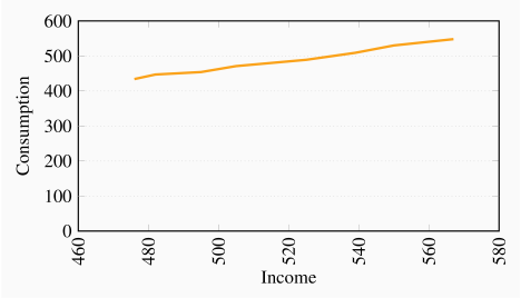
The percentage changes in income are:
| Pct Inc | 1.3 | 2.7 | 2.0 | 4.0 | 2.7 | 2.0 | 3.1 |
| Pct Con | 3.0 | 1.6 | 3.7 | 3.8 | 4.1 | 4.1 | 3.4 |
The relationship given by the equation Y=10+2X when plotted has an intercept on the vertical (Y) axis of 10 and the slope of the line is 2. The maximum value of Y (where X is 12) is 34.
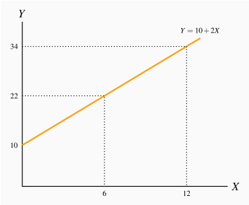
| X | 0 | 1 | 2 | 3 | 4 | 5 | 6 | 7 | 8 | 9 | 10 | 11 | 12 |
| Y | 10 | 12 | 14 | 16 | 18 | 20 | 22 | 24 | 26 | 28 | 30 | 32 | 34 |
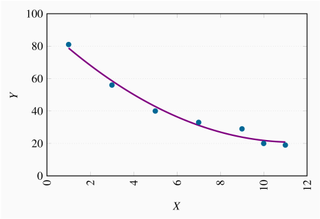
The relationship is negative.
The relationship is non-linear.
Chapter 3 Solutions
The diagram shows the supply and demand curves from the data in the table. These curves intersect at the equilibrium price $32 and the equilibrium quantity 7.
Excess demand is 6 and excess supply is 3.
With excess demand the price is bid up, with excess supply the price is pushed down.
Equate supply P to demand: 18+2Q=60–4Q, implying 6Q=42, which is Q=7. Hence P=32.

Demand curve facing Air Canada shifts left and down. The price of the substitute Via Rail has fallen and reduced the quantity of air transport services demanded at any price.
Demand curve facing Air Canada shifts left and down. The substitute car travel has improved in quality and perhaps declined in cost.
Demand curve facing Air Canada shifts left and down. A new budget air carrier is another substitute for Air Canada that will divide the market for air transport.
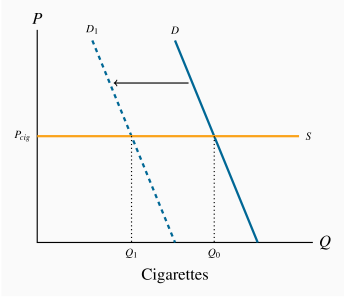
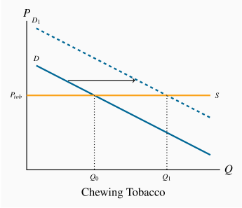
The market diagrams are drawn on the assumption that each product can be purchased for a given price, the supply curve in each market segment is horizontal. A downward sloping demand should characterize each market. If the cigarette market is 'quashed' the demand in the market for chewing tobacco, a substitute, should shift outward, leading to higher consumption at the same price.
The diagram shows that equilibrium quantity is 240, equilibrium price is $130, which are the values obtained from equating supply and demand.
At a price of $120 the quantity demanded is 300 and the quantity supplied 210. Excess demand is therefore 90.
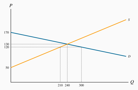
At a price of $140 quantity demanded is 180 and quantity supplied is 270; excess supply is therefore 90.
Total quotas of 180 will maintain a price of $140. This is obtained by substituting the price of $140 into the demand curve and solving for Q.
It must buy 90 units at a cost of $140 each. Hence it incurs a loss on each unit of $60, making for a total loss of $5,400.
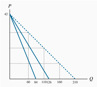
The quantity axis intercepts are 84 and 126.
The quantities demanded are 160, 110 and 60 respectively, on the market demand curve in the diagram. These values are obtained by solving the quantity demanded in each demand equation for a given price and summing the quantities.
The equation for the market demand curve is: Q=210–5P.
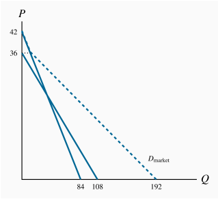
The demand curve is plotted below.
The supply function is horizontal as plotted.
Equilibrium quantity traded at P=2 is Q=225.
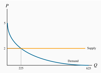
See the diagram below.
The equilibrium admission price is
 ,
,  .
.The equilibrium price would now become $18 and
 . Yes.
The answer is no, because total revenue falls.

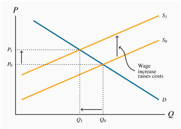
Wages are a cost of bringing lettuce to market. In the market diagram the supply curve for lettuce shifts upwards to reflect the increased costs. If demand is unchanged the price of lettuce rises from P0 to P1 and the quantity demanded falls from Q0 to Q1.
Chapter 4 Solutions
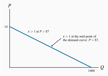
The intercepts for this straight line demand curve are
 , Q=1400.
Total revenue is this product of price times quantity. Compute it!
At
 , total revenue is $4,900.
Elasticities, in descending order, are 0.22, 0.33, 0.47, 0.65, 0.87, 1.15.
Elasticity becomes greater than one in magnitude at one point where total revenue is maximized.
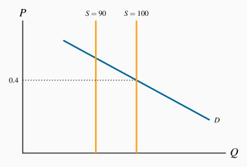
The supply curve is vertical at a quantity of 100.
We are told
 . The percentage change of quantity is –10/95; therefore the percentage change in price must be:
  . The new price is therefore
  .
.
Since the price is fixed the supply curve is horizontal. See figure below.
You cannot estimate a demand elasticity value since there has been no price change.
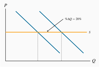
Here the (adjoining) horizontal supply curve shifts upwards by 60%. If enrolment has increased the demand curve must also have shifted upwards. Draw an additional supply curve representing a 60% upward shift, and find an intersection between the new demand and new supply such that the percentage increase in quantity is 15% (this diagram is not included here).
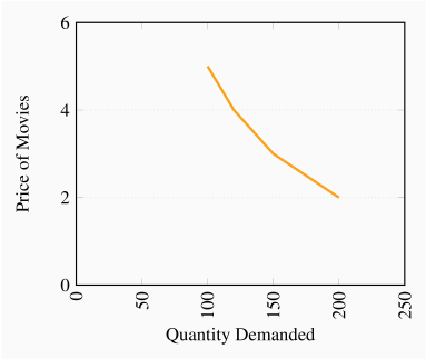
The demand curve is nonlinear.
Total revenue is price times quantity.
Elasticity values are 0.71, 0.78, and 0.82 respectively.
There has been a 20% increase in price. Feeding this into the elasticity formula yields
 . Hence the percentage change (reduction) in quantity is 12%.
Following the same reasoning as in part (a) the result is 24%.
In the short run revenue rises since demand is inelastic (less than one in absolute value); in the long run it falls since demand is elastic (greater than one in absolute value).
It is elastic for magazines and inelastic for CDs and Cappuccinos.
A reduction in magazines purchased and an increase in cappuccinos purchased. Magazines are complements and cappuccinos are substitutes for CDs.
The demand curve for magazines shifts down in response to an increase in the price of CDs and it increases in response to an increase in the price of cappuccinos.
Reduce the price, because the elasticity is greater than one.
Yes, it would reduce train ridership because the positive cross-price elasticity indicates that these goods are substitutes.
Plot the scatter.
The scatter is a positively sloping group of points indicating a positive relationship.
The elasticities estimated at mid values are 1.0, 0.64, 0.47, 0.52, 0.29 and 0.32. For example: the first pair of points yields a
 and
and  . Hence,
  .
.They are normal goods because the income elasticity is positive.
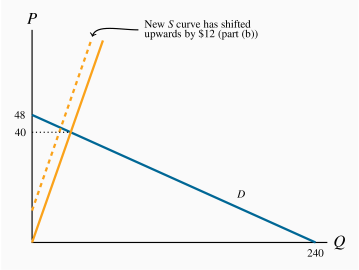
The price intercept for the demand curve is 48 and the quantity intercept is 240. The supply curve goes through the origin with a slope of 1. The equilibrium price is $40 and the equilibrium quantity is 40.
The supply curve shifts upwards everywhere by $12.
The price will increase to $42 and the quantity declines to 30.
The curve still goes through the origin but with a slope of 1.3 rather than 1.0 (not illustrated in the figure).
The equilibrium quantity is Q=32; corresponding price is
 .
.
The demand curve has a price intercept of 100 and a quantity intercept of 50. The supply curve is horizontal at a price of $30. The equilibrium quantity is 35 units at this price.
The new, tax-inclusive, supply curve is horizontal at
 (not illustrated in the figure). The equilibrium price is $40 and the equilibrium quantity becomes 30. With 30 units sold, each generating a tax of $10, total tax revenue is $300.
Since the equilibrium is on the lower half of a linear demand curve the demand is inelastic.

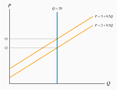
The supply and demand curves are illustrated below.
Solving the demand equations for Q=20 yields prices of $12 and $15 respectively.
The consumer bears the entire tax burden.
Chapter 5 Solutions
The step functions are similar to those in Figure 5.1. In ascending order, Margaret is the first supplier, Liam the second, etc. You must also order the demanders in descending order.
Two: Margaret and Liam will supply, while Jones and Lafleur will purchase. The third highest demander (Murray) is willing to pay $6, while the third supplier is willing to supply only if the price is $9. Hence there is no third unit supplied.
The equilibrium price will lie in the range $7.0-$7.5. So let us say it is $7. The consumer surplus of each buyer is therefore $1 and $0.5. The supplier surpluses are zero and $2.
Two driveways will still be cleared. The highest value buyers are now willing to pay $12 and $8. The third highest value buyer is willing to pay $7.0. But on the supply side the third supplier still supplies only if he gets $9. Therefore two units will be supplied. If the price remains at $7 (it could fall in the range between $7 and $8) the consumer surpluses are now $5 and $1, and the supplier surpluses remain the same.
The supply curve is horizontal at a price of $10. The demand curve price intercept is $34 and the quantity intercept is 34. The equilibrium quantity is 24.
The new supply curve is P=12, yielding an equilibrium Q=22.
Tax revenue is $44: each of the 22 units sold yields $2.
The DWL is $2.

The supply curve goes through the origin and the demand curve is horizontal at
 – see diagram below.
The equilibrium amount of labour supplied is 20 units. The supplier surplus is the area above the supply curve below the equilibrium price
 .
.At a net wage of $12, labour supplied falls to 15. The downward shift in the wage reduces the quantity supplied. The new supplier surplus is the triangular area bounded by W=12 and L=15. Its value is therefore $90.

The demand curve shifts inwards.
Yes, because consumers previously did not have full information about the product.
Yes.
Yes, because the congestion effect is not incorporated into the price of driving.
The free market equilibrium is obtained by equating demand and private-cost supply curves: Q=10,
 .
.The true supply is above the private supply. The social optimum involves a lower output and higher price.

The supply curve is horizontal at
 . The demand curve has a price intercept of 5 and a quantity intercept of 1000. The equilibrium quantity is 800.
The socially optimal quantity is obtained by recognizing that the social cost is $1.25 rather than $1.0. The supply curve that includes social costs is now horizontal at
 .
. .
.
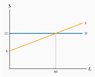
The demand curve is horizontal at
 . The supply curve slopes upwards with a price intercept of $6. Equilibrium is L=60.
Surplus is the area beneath the demand curve above the supply curve
 .
.
See the diagram below.
The market solution is obtained by equating the market demand and supply. This yields Q=16 and
 .
.The socially optimal amount takes account of the fact that there are positive externalities. The demand curve that reflects these externalities is above the private demand curve. Hence the socially optimal equilibrium is at a greater output Q=32.

Chapter 6 Solutions
Since the additional utility per dollar spent on another unit of either activity is the same (1.2 units), he should be indifferent as to where he spends it. However, if he gets an income increase that is sufficient to cover the purchase of one whole unit of the goods then snowboarding yields the highest MU per dollar spent.
The utility and marginal utility curves are given below.
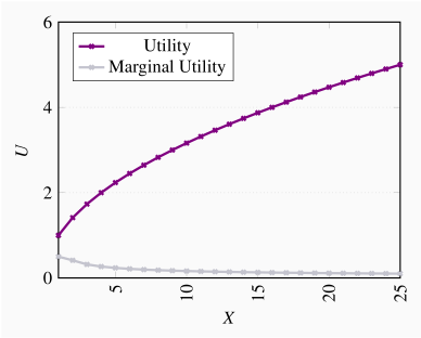
See the diagram below.
Because the MU increases with each unit consumed.

See the diagram below.
The MU is constant, rather than diminishing.
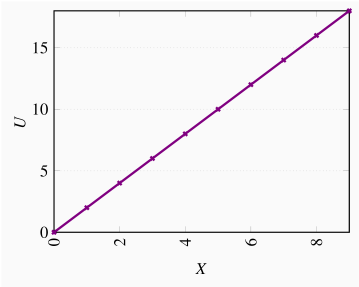
See the diagram below.
X=3.
X=6.

See the diagram below.
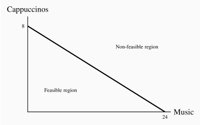
The slope is –8/24=–1/3. Opportunity cost of 1 cappuccino is 3 'tunes'.
Yes, yes, yes.
The first two lie inside, the third lies on the budget line.
Let G be the initial intercept on the gasoline axis, then 1/2G is the new intercept.
A vertical line at a point less than 1/2G reduces the feasible set to the area bounded by the new budget constraint (dashed line) and the vertical line GQ.

They are not strictly convex to the origin, and so they do not display a diminishing marginal rate of substitution.
See figure below.

See the figure below. Part (b) will see the rotation point stay at the X intercept.

With movies on the Y axis and public transport on the X, the higher income equilibrium will lie to the north-west of the lower income equilibrium.
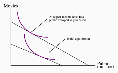
Chapter 7 Solutions
Accounting profit is $15,000 (
 ).
).Economic costs include opportunity cost of the investment ($7,000) plus the additional earnings of $10,000 (
 ). These additional costs of $17,000 mean that economic profits are negative.
No.
5%
If there is no medical exam then it is probable that less healthy individuals will avail of it. Knowing this, the firm should choose its benefit/payout structure to reflect a high-cost clientele. It will have lower payouts and/or higher premiums. Therefore a healthy individual would likely not obtain favourable insurance terms.
Spread.
Pooled.
Spread.
Spread and pooling.
$700 (
 )
)She is averse to risk.
See the diagram below.
See the diagram below.
2, 3, 4.
3 units (
 ).
).(
 )
)This is because of diminishing marginal utility: the loss in utility in going from $10 to $4 exceeds the gain in utility from $10 to $16.

See the diagram below.
See the diagram below.
2, 4.5, 8.
5 (
 ).
).5
In this case the MU of money is constant. Each increment in income yields the same additional utility. Hence the utility loss of -$6 equals the utility gain of +$6.
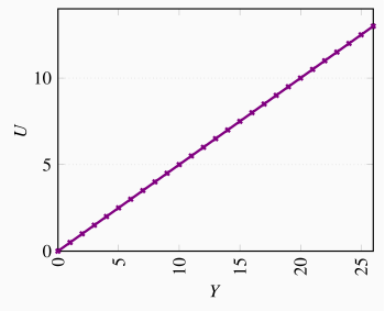
Chapter 8 Solutions
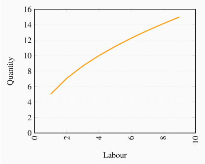
The MP is the difference in output at different labour levels: 5, 2.07, 1.59, 1.34, 1.18,...
See the figure below.
Note that total output increases at a diminishing rate – the MP is declining.
For each level of labour used, its AP is: 1.0, 3.0, 4.0, 5.0, 6.0, 7.0, 7.57, 7.5, 7.33, 7.0. and the MP is: 1, 5, 6, 8, 10, 12, 11, 7, 6, 4. The AP and MP are graphed below. If the MP cuts the AP at the latter's maximum, your graph is likely correct.
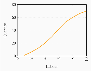

Fixed cost is $12.
See below.
See below.
Q TC AFC AVC ATC MC 0 12 1 27 12.00 15.00 27.00 15 2 40 6.00 14.00 20.00 13 3 51 4.00 13.00 17.00 11 4 61 3.00 12.25 15.25 10 5 70 2.40 11.60 14.00 9 6 80 2.00 11.33 13.33 10 7 91 1.71 11.29 13.00 11 8 104 1.50 11.50 13.00 13 9 120 1.33 12.00 13.33 16 See below.

The costs are given in the table below.
Firm A experiences decreasing returns to scale at high outputs, whereas B does not.
| Q | TCA | LACA | TCB | LACB |
| 1 | 40 | 40.00 | 30.00 | 30.00 |
| 2 | 52 | 26.00 | 40.00 | 20.00 |
| 3 | 65 | 21.67 | 50.00 | 16.67 |
| 4 | 80 | 20.00 | 60.00 | 15.00 |
| 5 | 97 | 19.40 | 70.00 | 14.00 |
| 6 | 119 | 19.83 | 80.00 | 13.33 |
| 7 | 144 | 20.57 | 90.00 | 12.86 |
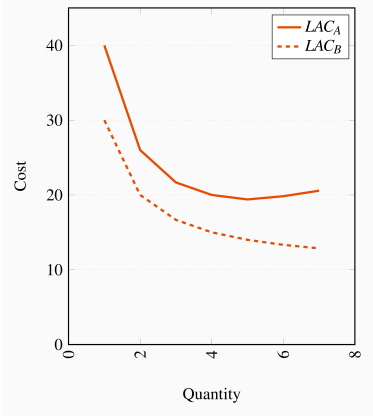
MC curve data are given in the table below. Firm B has constant marginal costs in the LR; hence never encounters decreasing returns to scale. Firm A's LR MC intersects its LR ATC at an output between 5 and 6 units, where the ATC is at a minimum. Firm B's MC lies everywhere below its ATC.
| Output | 1 | 2 | 3 | 4 | 5 | 6 | 7 |
| MC Firm A | 40 | 12 | 13 | 15 | 17 | 22 | 25 |
| MC Firm B | 30 | 10 | 10 | 10 | 10 | 10 | 10 |
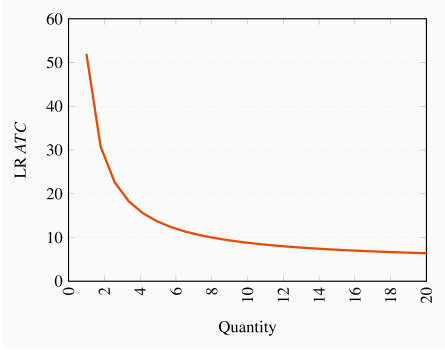
See graphic below.
Decreasing returns to scale.
As q becomes infinitely large the second term tends to zero, hence ATC tends to $4.
LMC=4.
Chapter 9 Solutions
The MC is $32.
Her break-even level of output is 25 units.
No, because she can cover her variable costs.
 ;
;  .
.
For total revenue to equal total cost it must be the case that ![]() . Therefore Q=4,000.
. Therefore Q=4,000.
The MC is horizontal at $80.
See diagram below.
See diagram below.
The MC would have to increase at some point.

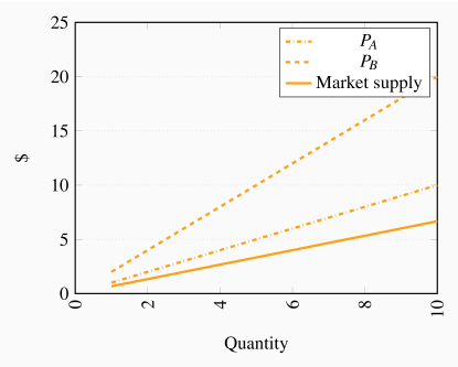
The market supply curve goes through the origin with a slope of 2/3. This follows from the fact that we can write the supply curves as qA=P and qB=0.5P. Hence Q=qA+qB=1.5P; or P=(2/3)Q.
Since the costs per unit are declining with output, they are producing on the downward-sloping segment of the LATC. To see this we need just calculate ATC at each output.
See the table.
See the figure below.
Q=7. At this output MC=MR.
Price is fixed.
| Q | 0 | 1 | 2 | 3 | 4 | 5 | 6 | 7 | 8 | 9 | 10 |
| TC | 10 | 18 | 24 | 31 | 39 | 48 | 58 | 69 | 82 | 100 | 120 |
| TR | 0 | 11 | 22 | 33 | 44 | 55 | 66 | 77 | 88 | 99 | 110 |
| Profit | –10.00 | –7.00 | –2.00 | 2.00 | 5.00 | 7.00 | 8.00 | 8.00 | 6.00 | –1.00 | –10.00 |
| MR | 11.00 | 11.00 | 11.00 | 11.00 | 11.00 | 11.00 | 11.00 | 11.00 | 11.00 | 11.00 | |
| MC | 8.00 | 6.00 | 7.00 | 8.00 | 9.00 | 10.00 | 11.00 | 13.00 | 18.00 | 20.00 | |
| AFC | 10.00 | 5.00 | 3.33 | 2.50 | 2.00 | 1.67 | 1.43 | 1.25 | 1.11 | 1.00 | |
| AVC | 8.00 | 7.00 | 7.00 | 7.25 | 7.60 | 8.00 | 8.43 | 9.00 | 10.00 | 11.00 | |
| ATC | 18.00 | 12.00 | 10.33 | 9.75 | 9.60 | 9.67 | 9.86 | 10.25 | 11.11 | 12.00 |

The equilibrium price is $40 and the equilibrium quantity is 6,000. The price intercept for the demand equation is 50, the quantity intercept 30,000. The price intercept for the supply equation is 10 and the quantity intercept -2,000.
With a perfectly competitive structure, this new firm cannot influence the price. Therefore it maximizes profit by setting P=MC. That is 40=10+0.5q. Solving this equation yields a quantity value q=60.
See the table below.
See the diagram below.
The break-even prices correspond to the minimum of each ATC curve: $30 and $25.
The price in the market will be forced down to the level at which the most efficient producers can supply the market. Consequently the producer with the higher fixed cost will either have to adopt the technology of the lower-cost producer or exit the industry.
| Q | ATC1 | ATC2 | MC |
| 5 | 91.25 | 56.25 | 12.5 |
| 10 | 52.50 | 35.00 | 15 |
| 15 | 40.42 | 28.75 | 17.5 |
| 20 | 35.00 | 26.25 | 20 |
| 25 | 32.25 | 25.25 | 22.5 |
| 30 | 30.83 | 25.00 | 25 |
| 35 | 30.18 | 25.18 | 27.5 |
| 40 | 30.00 | 25.63 | 30 |
| 45 | 30.14 | 26.25 | 32.5 |
| 50 | 30.50 | 27.00 | 35 |

Chapter 10 Solutions
This is a standard diagram for the monopolist. See the figure below. Equating MC=MR yields Q=18, ![]() .
.

See below.
Total revenue is a maximum where MR becomes zero. This is at
 and Q=36.
The quantity Q=36 sells at a price
 , from the demand curve. Hence total revenue is
  .
.
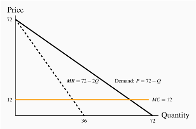
Where demand equals MC, we obtain 72–Q=12. Therefore Q=60.
From the demand curve, if Q=60 then
 .
.The efficiency gain in going from a profit maximizing monopoly (Q=30) to perfect competition (Q=60) is given by the area under the demand curve and above the MC curve between these output levels. This is
 .
.
The buyers' reservation prices are given in row P. The cost of producing each unit is given in row MC. The profit on the first unit is therefore ![]() ; on the second unit is
; on the second unit is ![]() , etc. On the fifth unit the additional profit is zero. Therefore, four units should be produced and sold. Total profit is
, etc. On the fifth unit the additional profit is zero. Therefore, four units should be produced and sold. Total profit is ![]() .
.
See figure below. The profit maximizing outcome is Q=24 and
 – obtained from MC=MR.
With perfect price discrimination the monopolist's revenue is the area under the demand curve. He should continue to produce and sell as long as the demand price is greater than MC. Where the demand price equals MC profit is maximized. This occurs at
 , Q=48.
Profit is TR–TC at Q=24. This is $576. In (b) the profit is the area under the demand curve up to the output Q=48 minus the area under the MC curve up to this same output. This is $1152.

Profit maximizing output is where MC=MR in each market. The MRs are MRA=20–(1/2)QA, MRB=14–(1/2)QB. Equating each of these in turn to MC=4 yields QA=32 and QB=20. These outputs can be sold at a price obtained from their demand curves:
 and
and  . This is illustrated in the table below.
Total profit is the sum of profit in each market:
 .
.
| Q | PA | PB | MC | MRA | MRB |
| 1 | 19.75 | 13.75 | 4 | 19.5 | 13.5 |
| 4 | 19 | 13 | 4 | 18 | 12 |
| 8 | 18 | 12 | 4 | 16 | 10 |
| 12 | 17 | 11 | 4 | 14 | 8 |
| 16 | 16 | 10 | 4 | 12 | 6 |
| 20 | 15 | 9 | 4 | 10 | 4 |
| 24 | 14 | 8 | 4 | 8 | 2 |
| 28 | 13 | 7 | 4 | 6 | 0 |
| 32 | 12 | 6 | 4 | 4 | -2 |
| 36 | 11 | 5 | 4 | 2 | -4 |
| 40 | 10 | 4 | 4 | 0 | -6 |
| 44 | 9 | 3 | 4 | -2 | -8 |
| 48 | 8 | 2 | 4 | -4 | -10 |
| 52 | 7 | 1 | 4 | -6 | -12 |
| 56 | 6 | 0 | 4 | -8 | -14 |
| 60 | 5 | -1 | 4 | -10 | -16 |
| 64 | 4 | -2 | 4 | -12 | -18 |
| 68 | 3 | -3 | 4 | -14 | -20 |
| 72 | 2 | -4 | 4 | -16 | -22 |
| 76 | 1 | -5 | 4 | -18 | -24 |
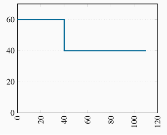
The diagram here is equivalent to the one in Figure 10.11 in the text. The first segment, up to an output of 40 units, has a price of $60; the second, from an output of 40 to 110, has a price of $40.
The MC curve runs along the horizontal axis – after the fixed cost is incurred, the MC is zero. The demand curve is the MR curve here, composed of the two horizontal segments.
A price of $60 can be charged to 40 buyers, and a price of $40 charged to 70 buyers. Hence
 . Since
  , profit is $1,700.
Yes; 110 buyers at $40 each yields a
 . Subtract the TC to yield a profit of $900.
Setting MC=MR yields Q=12 and from the demand curve,
 . See the figure below.
Where MC equals demand the output is Q=24. In moving from the output level Q=24 to Q=12, the DWL is the area bounded by the demand curve and the MC between these output levels:
 .
.

Chapter 11 Solutions
The three-firm ratios are 0.14, 0.49, 0.80, 0.94. The four-firm ratios are 0.15, 0.54, 0.82, 0.95.
See graph below.
Equating MC to MR yields Q=36 and therefore, from the demand curve,
 when Q=30.
TR is $1,080, total cost is $432 and therefore profit is $648.
Profits plus freedom of entry will see new firms take some of this firm's market share, and therefore reduce profit.

The diagram here is similar to the one above.
Acting as a monopolist they would set MR=MC, hence Q=90,
 .
.Combined profit is
 . Individual profit is half of this amount.
Yes. If A confesses then B's best strategy is also to confess. If A denies, B's best strategy is also to confess. Hence, either way B's best choice is to confess – this is a dominant strategy. The same reasoning applies to A.
The Nash Equilibrium is that they both confess.
Yes.
If the crooks could communicate with each other they could cooperate and agree to deny. This would be better for each.
Each firm has a 'high output' dominant strategy, since their profit is greater here regardless of the output chosen by the other firm.
From (a) it follows that high/high is the Nash Equilibrium.
Since low/low yields more profit for each firm, a cartel is an attractive possibility. But it may not be sustainable, given that each player has the incentive to renege on the cartel agreement.
While Ronnie can threaten to lower its price if Flash enters the market it would not be profitable for Ronnie to do that because a higher price, even with Flash in the market, yields a superior profit to Ronnie. Hence Flash should enter.
The issue here is that the threat to lower price is not credible.
Equating price to MC yields Q=11,200.
Equating MR to MC yields Q=5,600.
Using the formula
 yields market
  .
.
Profit under perfect competition is zero (only normal profit). Under monopoly the price charged is $1,800. Cost per unit is $400, and quantity produced is 5,600. Hence profit
 m. Since the output in the duopoly market is 2/3 times the perfectly competitive output, then Q=7,466.67. The price is thus
  . Profit per unit is thus $933.33, and total profit is $6.97m.
Since the unit costs are constant we could have any number of firms producing in this market.
Chapter 12 Solutions
At L=4 the VMP of labour is $400, which is also the wage rate. Therefore this is the profit maximizing output level (on the assumption that fixed costs are less than profits). The table below contains the calculations.
| Labour | Output | | | | | Profit |
| 0 | 0 | |||||
| 1 | 20 | 20 | 400 | 400 | 400 | 0 |
| 2 | 50 | 30 | 600 | 1000 | 800 | 200 |
| 3 | 75 | 25 | 500 | 1500 | 1200 | 300 |
| 4 | 95 | 20 | 400 | 1900 | 1600 | 300 |
| 5 | 110 | 15 | 300 | 2200 | 2000 | 200 |
| 6 | 120 | 10 | 200 | 2400 | 2400 | 0 |
Here you must calculate the additional cost of each employee. The first costs $250; the second $350 ($300 plus an additional $50 to the first employee); the third $450; the fourth $550, etc. The additional revenue from each employee is the VMP of labour. As long as this exceeds the MC of hiring another employee then that employee should be hired. The answer is thus L=3.
| Labour | Output | | | Marginal Wage | |
| 0 | 0 | ||||
| 1 | 20 | 20 | 400 | 250 | 250 |
| 2 | 50 | 30 | 600 | 300 | 350 |
| 3 | 75 | 25 | 500 | 350 | 450 |
| 4 | 95 | 20 | 400 | 400 | 550 |
| 5 | 110 | 15 | 300 | 450 | 650 |
In a spreadsheet, for each value of L, we can compute a supply price and a demand price. Those prices are equal at L=20,
 .
.See the diagram below.
See the diagram below.
Total wage bill is $280, of which transfer earnings account for $240 and rent $40.

The present values of the three streams are: $16,333.3; $943.4; $8,545.5. Therefore only the first project should be adopted because it alone generates revenue in excess of costs.
Only the first plot generates sufficient revenue to yield a profit.
You would hold it for 5 years because the wine is appreciating by more than the cost of borrowing for each of the first five years. The sixth year the wine grows in value by the same as the borrowing cost.
In this case the carrying has increased to 7% per year. So it would be profitable to hold the wine for three years – until the growth in the value of the wine equals the carrying cost.
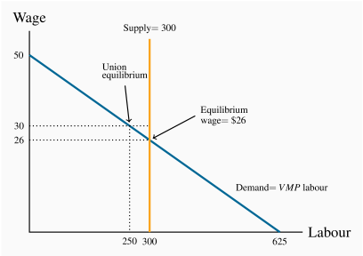
The demand curve has a regular downward-sloping form, while the supply curve is vertical at L=300. See figure below.
At L=300 the demand curve indicates that the wage is $26.
At
 , the corresponding demand is L=250.
Chapter 13 Solutions
The present value of going to university is higher at an interest rate of 10%. If you discount the first stream of values you will obtain –20,000, 36,360 and 41,320 yielding a net present value of 57,680. With 20,000 dollars each period in contrast, the net present value is 54,710 dollars.
By performing the same set of calculations using the 2% discount rate, you will find that university is still preferred.
At an interest rate above 15% the 'no university' option will yield a higher net present value. Try discounting the two income streams using a rate of 16% and you will see.
These two distributions have intersecting Lorenz curves, so it is difficult to say which is more unequal without further analysis.
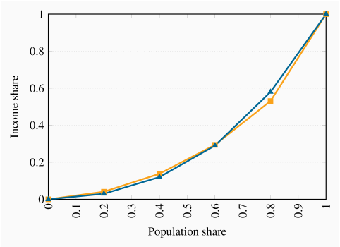
The coordinates on the vertical axis measured in percentages are: 4, 15, 34, 60, 100. See the figure below for the graphic.
The new coordinates are: 5.4, 18.9, 40.5, 66.2, 100.
The coordinates for post government income are: 13, 29, 50, 72, 100. The three Lorenz curves are plotted below.

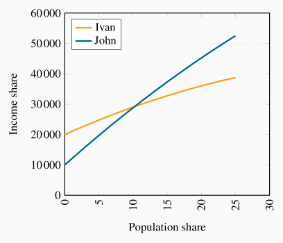
The profiles are shown in the figure below. John passes Ivan about year ten.
Solving the demand and supply involves equating Q=40–40f to f=0.5. Thus the equilibrium premium is 20, which is interpreted in percentage terms. See figure below.
If demand shifts upwards to W=60–60f, the new equilibrium is 30 percent, as illustrated in the figure below again.
See diagram below.
See diagram below.
In the long run the relative supply is W=40f, and equating this with demand yields a 24 percent premium rather than a 30 percent premium and f=0.6.

Chapter 14 Solutions
See figure below.
The total demand for the public good has a vertical intercept of 20 and a horizontal intercept of 24. The form of the equation is therefore P=20–(5/6)Q.
Equate the MC of $5 to the total demand curve to obtain Q=18. This is the 'optimal' output – where the cost of the last unit produced equals the value placed on it by both individuals. At this quantity the individual valuations (the price that each is willing to pay) are obtained from the individual demand curves. Substituting Q=18 into each yields $3 and $2.
The area below the total demand, above the quantity axis up to
 .
.

The new individual demand has a value of $10 and a quantity intercept of 24. The new total demand has intercepts
 .
.The new
 is greater than with two individuals. Hence the total value of the public good rises.
See the diagram.
See the diagram below.
The efficient output is where the MC=P, as given by the demand curve. He would maximize profit by producing where MC=MR.
He would choose a price from the demand curve at an output where MC=MR.
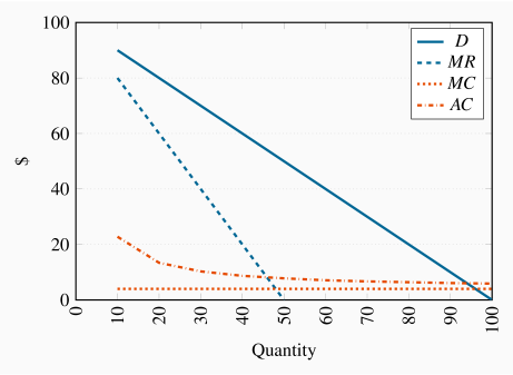
Equating the ATC to the demand curve yields 100–Q=4+188/Q. The solution is Q=94.
This is (slightly) less than the efficient output.
Average cost is $(4+188)/94=$6; price is $6.
The DWL under this regulation equals the area beneath the demand curve and above the MC curve between quantity values 94 and 96. The unrestricted monopoly DWL is the same area between the quantity values where MC=MR and 96.
An efficient output is where P=MC, that is Q=96. At this output he charges a price of $4. Hence his loss per unit is the difference between price and ATC which is 188/96. Since he produces 96 units, then charging a price of just $4 leads to a revenue shortfall of ![]() . This amount would have to be spread as a charge over the number of buyers in the market as a fixed cost associated with purchasing. In essence each buyer would have to pay a certain entry fee just to purchase the good.
. This amount would have to be spread as a charge over the number of buyers in the market as a fixed cost associated with purchasing. In essence each buyer would have to pay a certain entry fee just to purchase the good.
Chapter 15 Solutions
Northland has an absolute advantage in the production of both goods, as it has lower labour requirements for each.
The opportunity cost of 1 bushel of wheat is 1/2 litre of wine in Northland and 3/4 litre of wine in Southland.
Northland has a comparative advantage in wheat while Southland does in wine.
By reducing wheat production by 1 bushel, Southland can produce an additional 3/4 litre of wine.
Both countries can gain if Northland shifts production from wine to wheat and the countries trade wine for wheat at a rate between 1/2 litre of wine for 1 bushel of wheat and 3/4 litre of wine for one bushel of wheat.
By reducing wine production by 1/2 litre, Northland can increase wheat production by 1 bushel, which, at Southland's opportunity cost, exchanges for 3/4 litre of wine, giving Northland a gain of 1/4 litre of wine.
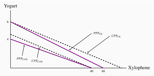
The US has an absolute advantage in both goods.
Canada has a comparative advantage in xylophones. The US has a comparative advantage in yogurt.
See diagram below.
See diagram below.
See diagram below.
The diagram shows that the amount traded is 60 units; of which domestic producers supply 5 and 55 are imported.
In this case, the foreign supply curve SW shifts up from a price of $18 to $24. The amount traded is now 40 units, 20 of which are supplied domestically.
Tariff revenue is EFHI
 .
.Equate the demand and supply curves to yield the above values.

The deadweight losses correspond to the two triangles, A and B, in the diagram, and amount to $105.
The amount of additional profit for domestic producers is given by the area above the supply curve between prices $18 and $24.
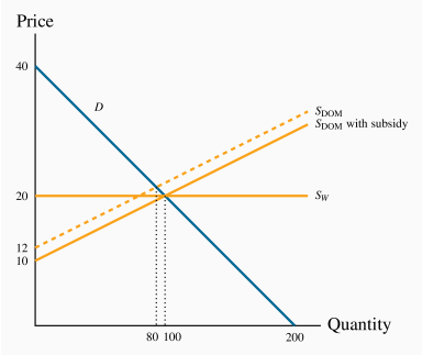
See figure below. The total quantity of trade is 100 units, of which 80 are supplied domestically.
The subsidy shifts the domestic supply curve down by $2 at each quantity. This supply intersects the demand curve at Q=100. Foreign producers are squeezed out of the market completely.
Cost to the government is $200 (100 units each with a $2 subsidy.
See diagram below. The US PPF now has an X intercept of 64 units.
See diagram below.
Yes, the US should specialize in fish.

The figure below illustrates parts (a) through (e).
For part (f): Since the total production before trade was 20 of each, and after specialization it is 30 of each, the gain is 10 of each good.


