
11.4: Cost Curves
- Last updated
- Save as PDF
- Page ID
- 58495

In the next chapter, we will work on the firm’s second optimization problem: maximize profits by choosing the amount of output to produce. Because profits are revenues minus costs, the cost function plays an important role in the firm’s profit maximization problem.
This section is devoted to the terminology of cost curves and an exploration of their geometric properties. Derived from the cost function, a variety of cost curves are used to solve and display the firm’s profit-maximization problem. This section defines and derives them.
A basic idea that is easy to forget is that there are many shapes of cost functions. Our work on deriving the cost function used a Cobb-Douglas production function and that gives rise to a particularly shaped cost function. A different production function would give a different cost function. A key idea is that \(q=f(L,K)\) determines the shape of \(TC \mbox{*}=f(q)\).
Names and Acronyms
You know that if we track \(TC \mbox{*}\), minimum total cost, as a function of q, we derive the cost function. Since we will be using other measures of costs, to avoid confusion, we refer to the cost function as the total cost (TC) function. The total cost function has units of dollars ($) on the y axis. We can divide total costs into two parts, total variable costs, TVC, and total fixed costs, TFC. \[TC(q) = TVC(q) + TFC\] If the firm is in the short run, it has at least one fixed factor of production (usually K) and the total fixed costs are the dollar value spent on the fixed inputs (rK). Notice that the total fixed costs do not vary with output. TFC is a constant and does not change as output changes so there is no "(q)" in the TFC function like there is on TVC and TC.
The total variable costs are the costs of the factors that the firm is free to adjust or vary (hence the name "variable costs"), usually L. As output rises, firms need more inputs to produce the increased output so total variable costs rise.
In the long run, defined as a planning horizon in which there are no fixed factors, there are no fixed costs (TFC = 0) and, therefore, \(TC(q) = TVC(q)\). In other words, the total cost and total variable cost functions are identical.
In addition to total costs, the firm has average, or per unit, costs associated with each level of output. Average total cost, ATC (also known as AC), is the total cost divided by the output level. \[ATC(q)=\frac{TC(q)}{q}\] Average variable cost, AVC, is total variable cost divided by output. \[AVC(q)=\frac{TVC(q)}{q}\] Average fixed cost, AFC, is total fixed cost divided by output. \[AFC(q)=\frac{TFC(q)}{q}\] Notice that AFC(q) is a function of q even though TFC is not because AFC is TFC divided by q. Since the numerator is a constant, AFC(q) is a rectangular hyperbola (\(y = c/x\)) and is guaranteed to fall as q rises. This can be confirmed by a simple example. Say TFC = $100. For very small q, such as 0.0001, AFC is extremely large. But AFC falls really fast as q rises from zero (and AFC is undefined at q = 0). At \(q =1\), AFC is $100, at q = 2, AFC is $50, and so forth. The larger the value of q, the closer AFC gets to zero (i.e., it approaches the x axis).
It is easy to show that the average total cost must equal the sum of the average variable and average fixed costs: \[TC(q) = TVC(q) + TFC\] \[\frac{TC(q)}{q} = \frac{TVC(q)}{q} + \frac{TFC}{q}\] \[ATC(q) = AVC(q) + AFC(q)\] We often omit AFC(q) from the graphical display of the firm’s cost structure (see Figure 11.14) because we know that \(AFC(q) = ATC(q) - AVC(q)\). Thus, average fixed cost can be easily determined by simply measuring the vertical distance between ATC and AVC at a given q.
The facts that \(AFC(q) = ATC(q) - AVC(q)\) and AFC goes to zero as q rises means that AVC must approach ATC as q rises. Always draw AVC getting closer to ATC as q increases past minimum AVC. Figure 11.14 obeys this condition.
Unlike the total curves, which share the same y axis units of dollars, the average costs are a rate, dollars per unit of output. You cannot plot total and average cost curves on the same graph because the y axes are different.
Another cost concept that we get from the total cost function is marginal cost (MC). Like average costs, MC is a rate and it comes in $/unit. Marginal cost is often graphed together with the average curves (as shown in Figure 11.14).
Marginal means additional in economics. Marginal cost tells you the additional cost of producing more output. If the change in output is discrete, then we are measuring marginal cost from one point to another on the cost curve and the equation looks like this: \[MC(q)=\frac{\Delta TC(q)}{\Delta q}\] If, on the other hand, we treat the change in output as infinitesimally small, then we use the derivative and we have: \[MC(q)=\frac{dTC(q)}{dq}\] Because TFC does not vary with q, marginal cost also can be found by taking the derivative of TVC(q) with respect to q.
Average cost and marginal cost are used to refer to entire functions (see Figure 11.14), but also to specific values. For example, if ATC = $10/unit and MC = $3/unit at \(q=5\), this means that it costs $10 per unit to make the five units and, thus, the firm had $50 of total costs to make five units. The MC tells us that the 5th unit costs an additional $3 so the total cost went from $47 for 4 units to $50 for 5 units.
The Geometry of Cost Curves
The average and marginal curves are connected to each other and must be drawn according to strict requirements. Whenever a marginal curve is above an average curve, the average curve must be rising. Conversely, whenever a marginal is below an average, the average must be falling.
For example, consider the average score on an exam. After the first 10 students are graded, there is an average score. The 11th student is now graded. Suppose she gets a score above average. Hers is the marginal score and we know it is above the average so it has to pull the average up. Suppose the next student did poorly. His marginal score is below the average and it pulls the average down. So, we know that whenever a marginal score is below the average, the average must be falling and whenever a marginal score is above the average, the average must be rising. The only time the average stays the same is when the marginal score is exactly equal to the average score.
This relationship between the average and marginal means that the marginal cost curve must intersect the average variable and average total cost curves at their respective minimums, as shown in Figure 11.14. From q = 0 to the intersection of MC with ATC, MC is below the ATC and the ATC falls. To the right of the intersection of MC with ATC, MC is above the ATC so the ATC is pulled up. MC and AVC curves share the same relationship.
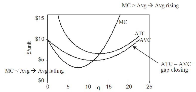 Figure 11.14: Marginal and average relationships.
Figure 11.14 also shows a property that was highlighted earlier: The gap between ATC and AVC must fall as q rises.
You will understand these abstract ideas better by exploring concrete examples. Three cost functional forms will be examined:
- Cobb-Douglas Cost Curves
- Canonical Cost Curves
- Quadratic Cost Curves
Instead of memorizing specific facts or points, look for the pattern and repeated connections. Focus on the relationship between the total and average and marginal curves.
STEP Open the Excel workbook CostCurves.xls and read the Intro sheet, then go to the CobbDouglas sheet to see the first example.
1. Cobb-Douglas Cost Curves
The CobbDouglas sheet is the CostFn sheet from the DerivingCostFunction.xls workbook with the ATC and MC curves plotted below the TC curve. Column I has a formula for the TC curve using \(L \mbox{*}\) and \(K \mbox{*}\), from which we can compute ATC and MC in columns J and K. Click on an MC cell, for example, cell K4, to see that the cell formula is actually for \(\lambda \mbox{*}\). We are using the shortcut that \(\lambda \mbox{*}\) = MC.
With L and K both endogenous, there are no fixed factors of production. This means we are in the long run and there are no fixed costs. Thus, TC = TVC and ATC = AVC.
It is immediately obvious that the marginal and average curves do not look at all like the conventional family of cost curves as shown in Figure 11.14. In fact, a Cobb-Douglas production function cannot give U-shaped average and marginal cost curves as in Figure 11.14.
Remember that there are many functional forms for cost curves (total, average, and marginal) and the shape depends on the production function. In other words, the production function is expressed in the cost structure of a firm.
STEP Set the exponent on capital, d, to 2 to replicate Figure 11.15.
Figure 11.15: Total cost shifts down when labor productivity rises.
Source: CostCurves.xls!CostFn, after setting d = 2.
Because average cost is falling as q rises in Figure 11.15 (and your computer screen), it means that total cost is increasing less than linearly as output rises. The total cost graph on your screen confirms that this is the case. It costs $33 to make 200 units, but only $43 to make 400 units. Double output again to 800. How much does it cost? Cell I9 tells you, $55. This is puzzling. If input prices remain constant, how can we double output and not at least double costs?
The answer lies in the production function. You changed the exponent on capital, d, from 0.2 to 2. Now the sum of the exponents, \(c + d\), is greater than 1. For the Cobb-Douglas production function, this means that we are operating under increasing returns to scale. This means that if we double the inputs, we get more than double the output. Or, put another way, we can double the output by using less than double the inputs.
This firm can make 400 units cheaper per unit than 200 units. It can make 800 units even cheaper per unit because it is taking advantage of the increasing returns to scale.
Increasing returns are a big problem in the eyes of some economists because they lead to a paradox: One firm should make all of the output. There are situations in which increasing returns seem to be justified, such as the case of natural monopolies, in which a single firm provides the output for an entire industry because the production function exhibits increasing returns to scale. The classic examples are utility companies, e.g., electric, water, and natural gas companies. Often, these firms are nationalized or heavily regulated.
We can emphasize the crucial connection between the production function and the cost function via the isoquant map.
STEP Scroll down to row 100 or so in the CobbDouglas sheet.
The three isoquants are based on a Cobb-Douglas production function with parameter values from the top of the sheet, except for d, which can be manipulated from the Set d radio buttons (above the chart). The three red points are the cost-minimizing input combinations for three different output levels: 100, 120, and 140.
Above the graph, the value of the sum of the exponents, initially 0.95, is displayed. A description of the shape of the total cost function, which depends on the value of c + d, and a small picture of that shape is shown. Figure 11.16 has the initial display.
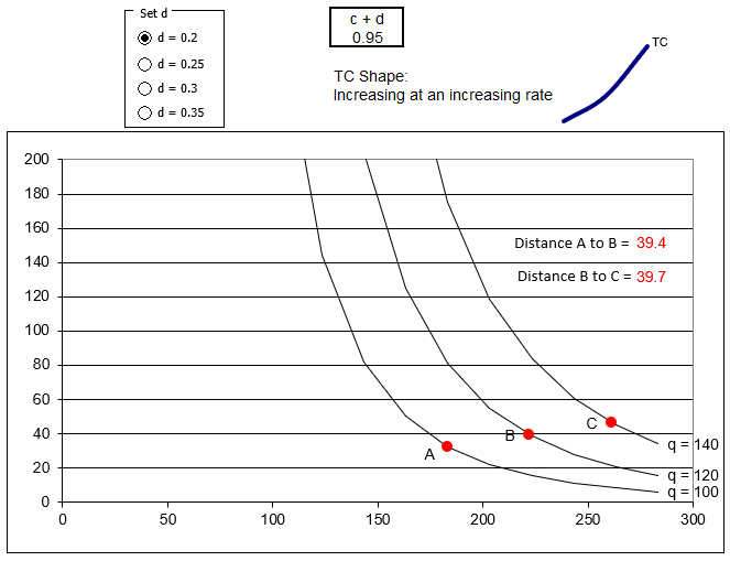
Figure 11.16: Isoquants determine the shape of the cost function.
Source: CostCurves.xls!CobbDouglas.
The spacing between the points is critical. The distance from A to B is a little less than that from B to C. This means that as output is increased from 120 to 140, the firm needs a bigger increase in inputs than when q rose from 100 to 120.
As output continues rising by 20 units, the next isoquant we have to reach is getting farther and farther away, requiring progressively more inputs, and progressively higher costs. This is why TC is increasing at an increasing rate.
STEP Click on the d = 0.25 option.
The isoquants shift in because it takes fewer inputs to make the three levels of output depicted. The distance between the isoquants has decreased and TC is linear. Most importantly, the distance between the points is identical.
With \(c + d = 1\), the spacing of the isoquants is constant. As q increases by 20, the next isoquant is the same distance away and the firm increases its input use and costs by a constant amount. This is why the TC function is a line, increasing at a constant rate.
STEP Click on the d = 0.3 option.
Once again, the chart refreshes and isoquants shift in. Now the distance between the isoquants is decreasing. As q rises, the isoquants get closer together and the total cost function is increasing at a decreasing rate.
STEP Click on the d = 0.35 option.
This produces even stronger increasing returns and a TC function that bends faster than d = 0.3.
The fundamental point is that the distance between the isoquants reflects the production function. There are three cases:
- If the distance is increasing as constant increases in quantity are applied, the total cost function will increase at an increasing rate.
- If the distance remains constant, the cost function will be linear.
- If the distance get smaller as output rises, the firm has costs that rise at a decreasing rate.
This holds for all production functions and, in the case of Cobb-Douglas, it is easy to see what is going on because the value of c + d immediately reveals the returns to scale and spacing between the isoquants.
But the advantage of Cobb-Douglas in easily displaying the three cases (depending on the value of C + d) means it cannot do all three cases at once. A Cobb-Douglas production function can generate a TC functon that is increasing at an increasing or constant or decreasing rate, but not all three.
The shape of the cost function is dependent on the production technology. Repeatedly cycle through the radio buttons, keeping your eye on the isoquants, the distance between the points, and the resulting total cost function. Your task is to understand and cement the relationship between the production and cost functions.
An accordion is a good metaphor for what is going on. When scrunched up, the isoquants are being squeezed together, which gives increasing returns to scale and TC increasing at a decreasing rate. When the accordion is expanded and the isoquants are far apart, we have decreasing returns to scale and TC rising at an increasing rate.
Do not be confused. The reason why increasing (decreasing) returns to scale leads to TC rising at a decreasing (increasing) rate (they are opposite) is that productivity (returns to scale) and costs are opposites. Increased productivity enables slower increases in costs of production. Production increasing at an increasing rate and costs increasing at a decreasing rate are two sides of the same coin.
2. Canonical Cost Curves
STEP Proceed to the Cubic sheet.
This sheet displays the canonical cost structure, in other words, the most commonly used cost function. It produces the familiar U-shaped family of average and marginal costs (which Cobb-Douglas cannot).
The canonical cost curves graph can be generated by a cost function with a cubic polynomial functional form. \[TC(q) = aq^3 + b q^2 + c q + d\] The d coefficient (not to be confused with the d exponent in the Cobb-Douglas production function) represents the fixed cost. If \(d > 0\), then there are fixed costs and we know the firm is in the short run.
Once we have the cost function, the top curve on the top graph in the Cubic sheet, we can apply the cost definitions (from the beginning of this section) to get all of the other cost curves. The other total curves are: \[TVC(q) = aq^3 + b q^2 + c q\] \[TFC = d\]
STEP Click on each of the three curves in the top graph of the Cubic sheet to see the data that are being plotted.
Now turn your attention to the bottom graph. The curves in the bottom graph are all derived from the top graph. Notice that the y axis label is different, the totals in the top have units of $, while the average and marginal curves have a y scale of $/unit (of output).
STEP Click on each of the three curves in the bottom graph to see the data that are being plotted.
Custom formatting has been applied to the numbers in the average and marginal cost cells to display “$/unit” in each cell. It is easy to forget that "$" is not the units of average and marginal cost curves.
The average total and average variable costs are easy to compute: simply divide the total by q. You can confirm that column E’s formula does exactly this. There is no ATC value for \(q=0\) because dividing by zero is undefined.
We can also divide the equation itself by q to get an average. This is done for AVC. The formula in cell F2 is "= a_*(A6^2) + b_*A6 + c_" because dividing \(TVC(q) = aq^3 + b q^2 + c q\) by q yields \(= aq^2 + b q + c\). Notice that AVC for \(q=0\) does exist.
Marginal cost is more difficult to understand than average cost. Marginal cost is defined as the additional cost of producing more output. "More" can be an arbitrary, finite amount (such as 1 unit or 10 units) or an infinitesimally small change in the number of units.
If we use an arbitrary, finite amount of increase in q, then we compute MC as \(\frac{\Delta TC}{\Delta q}\). We can also compute MC for an infinitesimally small change, using the derivative, \(\frac{dTC}{dq}\). These two computations will be exactly the same only if MC is a line.
The two approaches are applied in columns G and H. The derivative of TC with respect to q is: \[TC(q) = aq^3 + b q^2 + c q + d\] \[\frac{dTC}{dq} = 3aq^2 + 2b q + c\]
Notice how we apply the usual derivative rule, bringing the exponent down and subtracting one from the exponent for each term. The d coefficient, TFC, disappears because it does not have q in it (or, if you prefer, think of d as \(dq^0\)). The expression for MC is entered in column G.
Column H has MC for a discrete-size change. You can vary the size of the change in q by adjusting the step size in cell B3.
STEP Make the step size smaller and smaller. Try 0.1, 0.01, and 0.001.
As you make the step size smaller, the values in column H get closer to those in column G. This, once again, demonstrates the concept of the derivative.
Another way to get the cost function is to use the neat result from Lagrangean method. We can simply use \(\lambda \mbox{*} = MC\) and we have the MC curve. No delta-size change or derivative required. If what we really wanted was the total cost function, then we would have to integrate the \(\lambda \mbox{*}\) function with respect to q. The constant of integration is the fixed cost, which would be zero in the long run.
The family of cost curves in the Intro and Cubic sheets (and in Figure 11.14) are the canonical cost curves displayed in countless economics textbooks. You might wonder, if not Cobb-Douglas, then what production function could produce such a cost function? That is not an easy question to answer. In fact, the functional form for technology that would give rise to the canonical cost curves is quite complicated and it is not worth the effort to painstakingly derive the usual U-shaped average and marginal cost curves from first principles.
It is sufficient to know that a production function underlies the polynomial TC function and its resulting U-shaped average and marginal cost curves. We also want to keep in mind that if input prices rise, the cost curves shift up and, if technology improves, they shift down.
3. Quadratic Cost Curves
STEP Proceed to the Quadratic sheet to see a final example of cost curves.
It is immediately clear that the quadratic functional form is a special case of the cubic cost function, with coefficients a and c equal to zero.
Look at the top chart and connect the shapes of the TC, TVC, and TFC functions to the functional form \(TC(q)=bq^2+d\). Given the coefficient values in the sheet, this gives \(TC(q)=q^2+1\), \(TVC(q)=q^2\), and \(TFC=1\).
The bottom chart does not look familiar, but it obeys the definitions of average and marginal cost explained earlier in this section. ATC is \(TC(q)\) divided by q: \(ATC(q)=q+\frac{1}{q}\). Similarly, AVC is \(TVC(q)/q\), which is q (a ray out of the origin). MC is the derivative of TC with respect to q, which is 2q.
Although not the usual U-shaped curves, the MC curve (actually, MC is linear) intersects AVC and ATC at their minimums. When MC is below ATC, ATC is falling, but beyond the point at which MC intersects ATC (at the minimum ATC), MC is above ATC and ATC is rising. As q increases, AVC converges to ATC, which implies that AFC goes to zero.
The shapes of the cost curves are not the usual U-shaped average and marginal curves, but this is another of the many possible cost structures that could be derived from a firm’s input cost minimization problem.
The Role of Cost Curves in the Theory of the Firm
Cost curves are not particularly exciting, but they are an important geometric tool. When combined with a firm’s revenue structure, the family of cost curves is used to find the profit-maximizing level of output and maximum profits.
Cost curves can come in many forms and shapes, but they all share the basic idea that they are derived by minimizing the total cost of producing output, where output is generated by the firm’s production function. Different production functions give rise to different cost functions.
The shape of the cost function, rising at an increasing, constant, or decreasing rate, is determined by the production function. With increasing returns to scale, for example, a firm can more than double output when it doubles its input use. That means, on the cost side, that doubling output will less than double total cost. Returns to scale can be spotted by the spacing between the isoquants. With increasing returns to scale, for example, the gaps between the isoquants get smaller as output rises.
No matter the production function, it is always true that for output levels at which marginal cost is below an average cost, the average must be falling and MC above AVC or ATC means AVC or ATC is rising. It is also true that, in the short run (when there are fixed costs), AVC approaches ATC as output rises.
Lastly, consider the message conveyed by Figure 11.17. The arrows show the progressionaverage and marginal curves come from the total cost function, which comes from the input cost minimization problem (with the production function expressed in the isoquants).
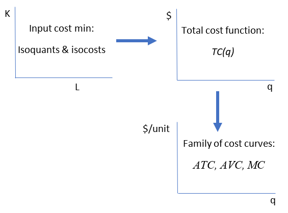 Figure 11.17: Connecting cost graphs.
Economists use graphs to communicate. It may seem like graphs are conjured out of thin air, but this is false. All graphs have a genealogy and a story to tell. When you know where graphs come from, that helps in reading them correctly.
Exercises
- A Cobb-Douglas production function with increasing returns to scale yields a total cost function that increases at a decreasing rate. Use Word’s Drawing Tools to draw the underlying isoquant map for such a production function.
A commonly used specification for production functions in empirical work is the translog functional form. There are several versions. When applied to the cost function, you get a result like this: \[\ln TC\ = \alpha_0 + \alpha_1 \ln Q\ + \alpha_2 \ln w\ + \alpha_3 \ln r\ + \alpha_4 \ln Q\ \ln w\ + \alpha_5 \ln Q\ \ln r\ + \alpha_6 \ln w\ \ln r\ \] Notice that the function is a modification of the log version of a Cobb-Douglas function. In addition to the individual log terms there are combinations of the three variables, called interaction terms.
Click the  button at the bottom of the Q&A sheet in the CostCurves.xls workbook to reveal a sheet with translog cost function parameters. Use this sheet to answer the following questions.
- Enter a formula in cell B18 for the TC of producing 100 units of output, given the alpha coefficient and input price values in cells B5:B13. Fill your formula down and then create a chart of the total cost function (with appropriate axes labels and a title). Copy and paste your chart in a Word document.
Hints: \(TC = e \ln TC\ \) and the exponentiation operator in Excel is EXP(). "=EXP(number)" in Excel returns e raised to the power of that number.
- Compute MC via the change in output from 100 to 110 in cell C19. Report your result.
- Compute MC via the derivative at Q = 100 in cell D18. Report your result.
Hint: \(\frac{d}{dx}(e^{f(x)})=e^{f(x)}\frac{d}{dx}(f(x))\)
- Compare your results for MC in questions 3 and 4are your answers the same or different? Explain.
References
The epigraph is from page 218 of Alan Blinder, Elie Canetti, David Lebow, and Jeremy Rudd, Asking About Prices: A New Approach to Understanding Price Stickiness (Russell Sage Foundation, 1998). This book reports the results of interviews with more than 200 business executives. The authors explain that asking about a firm’s marginal cost "turned out to be quite tricky because the term ’marginal cost’ is not in the lexicon of most business people; the concept itself may not even be a natural one" (p. 216). The question was, therefore, phrased in terms of "variable costs of producing additional units."
The results confirmed what many who have attempted to estimate cost curves know: The canonical, U-shaped family of cost curves makes for nice theory, but it is not common in the real world. In fact, many business leaders have no idea what marginal cost is or how to measure it. Do not lose sight, however, of the purpose of the Theory of the Firm. It is not designed to realistically describe a living firm. The Theory of the Firm is a severe abstraction with a primary goal of deriving a supply curve. The next chapter does exactly that.