
4.3: Deriving a Demand Curve
- Last updated
- Save as PDF
- Page ID
- 58452

We know how to find the initial optimal solution in the Theory of Consumer Behavior and we have explored the comparative statics properties of a change in income.
We are well prepared to embark on the most important comparative statics analysis in the Theory of Consumer Behavior: deriving a demand curve.
Numerical Comparative Statics Analysis of Changing Price
STEP Open the Excel workbook DemandCurves.xls and read the Intro sheet,then go to the OptimalChoice sheet.
The problem is set up, but the consumer is not optimizing because the MRS does not equal the price ratio and the consumer can move to higher indifference curves by traveling up the constraint.
STEP Run Solver to find the initial solution: \(x_1 \mbox{*} = 25\) and \(x_2 \mbox{*} = 16 \frac{2}{3}\).
Next, we explore how this initial optimal solution changes as the price of good 1 changes, ceteris paribus. This comparative statics analysis will produce a demand curve.
Before we actually do it, can you anticipate what will happen when we increase the price of good 1? Believe it or not, if you try to figure it out firstbefore actually seeing ityou will learn more. Take a moment to think: what will happen to the graph on your screen when we increase the price of \(x_1\)?
Let’s see how you did.
STEP Shock: Change cell B16 to 3.
Figure 4.9 shows how your screen should look. With a higher \(p_1\),the budget constraint rotates in, pivoting on the \(x_2\) intercept. The consumer now has fewer consumption possibilities and needs to re-optimize to find the new optimal solution.
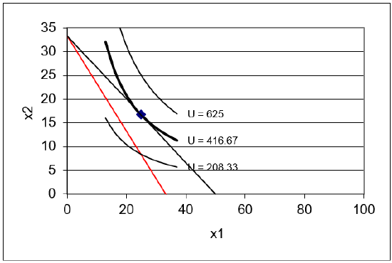 Figure 4.9: New budget line when \(p_1\) rises.
STEP New: Run Solver to find the new optimal solution.
We have completed initial, shock, and newthe last step is to compare. Figure 4.10 shows a table that displays the comparative statics results.
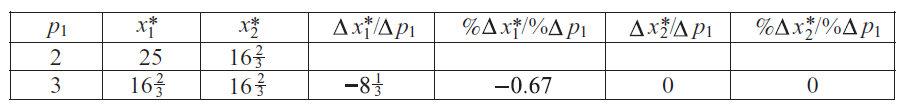 Figure 4.10: Comparative statics results of an increase in \(p_1\).
In qualitative terms, we can see that \(x_1 \mbox{*}\) falls as \(p_1\) rises, but \(x_2 \mbox{*}\) remains unchanged.
Quantitatively, we can compute the own units response in good 1 as new minus initial \(x_1 \mbox{*}\), which is \(16 \frac{2}{3} - 25 = - 8 \frac{1}{3}\) divided by 1 (from \(3-2\)). This is the value displayed in the table. The own units response in \(x_2\) is zero since it did not change.
Responsiveness in percentage terms is the price elasticity of demand. We need to compute the percentage change in \(x_1 \mbox{*}\) divided by the percentage change in \(p_1\). The numerator is \(- 33\%\) because \(\frac{16 \frac{2}{3} - 25}{25} = - \frac{1}{3}\). The denominator is \(\frac{3 - 2}{2} = 0.5\) or 50%. So, a 50% increase in price, from \(p_1 = 2\) to 3, caused a 33% decrease in quantity demanded. Thus the price elasticity of demand is \(\frac{- 0.33}{0.5}= - \frac{2}{3}\) or roughly \(- 0.67\). This number is displayed in the table in Figure 4.10.
The same calculation can be performed on \(x_2\). Since we are considering the effect on good 2 from a shock to the price of good 1, we call this a cross price analysis. The term cross is used in economics when we examine the effect of i on j; an own effect, for example, would be \(p_1\) on \(x_1\).
We quickly realize that the cross price elasticity, the \(p_1\) elasticity of \(x_2\), is zero because the numerator is zero. This is perfectly inelastic or completely unresponsive.
Comparative statics via numerical methods is easier with the Comparative Statics Wizard add-in. If it is not installed, return to the beginning of this chapter to load the CSWiz add-in.
STEP Analyze the effect of a change in \(p_1\) by running the CSWiz add-in and changing the price of good 1 by $1 increments (for five shocks).
You can see a slightly different comparative statics analysis in the CS1 sheet. Instead of changing price by one dollar increments, the CS1 sheet was performed with a shock size of 0.1.
STEP Use your comparative statics results to make a demand curve, a graph of \(x_1 \mbox{*} = f(p_1)\). To do this, select the \(p_1\) data in column A, then hold down the ctrl key (and keep holding it), while selecting the \(x_1\) data in column C. With cells in columns A and C selected, select the Scatter chart type. Title the graph and label the axes.
Another way to display the comparative statics results is via the price consumption (or offer) curve, as shown in Panel A of Figure 4.11 for a utility function that is not Cobb-Douglas and not meant to display the increasing price analysis that you just completed. Instead, a price decrease is shown.
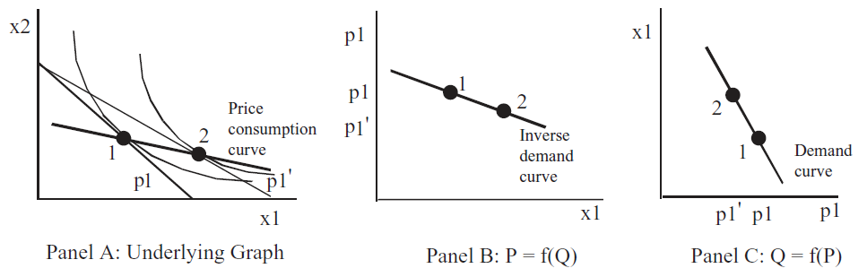 Figure 4.11: Three ways to show effects of \(p_1\) shock.
There is a lot going on in Figure 4.11. The graph on the left (Panel A) shows a price decrease swinging the budget constraint out. It uses numbers to indicate the initial and new optimal solutions.
Panels B and C show demand, but look closely, the axes have been flipped. Instead of graphing \(x_1\) as a function of \(p_1\), the exogenous variable (\(p_1\)) is on the y axis in Panel B. This is a backwards, but common presentation in economics. The roots of this strange way of presenting the results can be traced back in the history of economics to Alfred Marshall in 1890.
Modern economists call the graph in Panel B of Figure 4.11 an inverse demand curve because it is plotted as \(P = f(Q)\). The demand curve, the mathematically correct version, is \(Q = f(P)\) because we plot \(y = f(x)\) with y as the dependent variable that is determined by x.
In introductory economics, the inverse demand curve is used. The professor just draws a downward sloping line or curve and pronounces that it is obvious that as price goes up, quantity demanded falls (we will soon see that this is not guaranteed). As the level of sophistication rises, especially if we are doing econometrics and trying to estimate a demand curve, economists use the mathematically correct demand curve. Economists are used to both ways of presenting demand. It is confusing at first, but you can get the hang of it pretty quickly.
STEP Read the information in the CS1 sheet. It explains how the ROUND function was used to create the price consumption curve from the comparative statics results.
Notice that the price consumption curve for changes in \(p_1\) in the Excel workbook is horizontal. This is a property of the Cobb-Douglas utility function and is not especially realistic. The indifference map in Figure 4.11 is not based on a Cobb-Douglas utility function because the price consumption curve is not horizontal.
Another useful Excel skill to master that is especially relevant right now involves controlling the x and y axes. Excel’s default is that the leftmost column of selected data goes on the x axis. If we want to make a demand curve with the data in the CS1 sheet, this is convenient. We select the data in column A (\(p_1\)), hold down the ctrl key and select the data in column C (\(x_1\)). When you make a Scatter chart, Excel puts price on the x axis and quantity on the y axis.
But what if we want to make an inverse demand curve, with \(p_1\) on the y axis? One easy way to do it is by directly editing the SERIES formula in the chart.
STEP Visit vimeo.com/econexcel/using-series-formula to watch a quick, 5-minute video of how the SERIES formula works.
After you watch the video, try it on your demand curve chart. Can you flip the axes by directly editing the SERIES formula? Click on your demand curve, then switch columns A and C in the x and y arguments in the SERIES formula. To see an example of this, click on the series in the chart in the CS1 sheet.
Analytical Comparative Statics Analysis of Changing Price
We take the opportunity here to extend our previous analytical work. We could just leave \(p_1\) as a letter since we want to derive a demand curve, but we will be more aggressive and leave all exogenous variables as letters. This will give us the most general answer we can get.
We rewrite the constraint and form the Lagrangean.
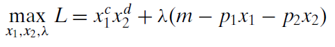
Although it seems more formidable than when numbers are used in place of letters, we can apply the usual strategies for taking derivatives and solving the first-order conditions to find the optimal solution.
We take derivatives and set them equal to zero.
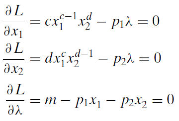
To solve for the optimal values of \(x_1\) and \(x_2\), we move the lambda terms to the right-hand side and divide the first equation by the second. This gets rid of lambda and gives the familiar MRS = \(\frac{p_1}{p_2}\) condition, which can then be solved for optimal \(x_2\) as a function of optimal \(x_1\).
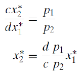
We substitute this expression into the third first-order condition (the budget constraint) and solve for optimal \(x_1\).
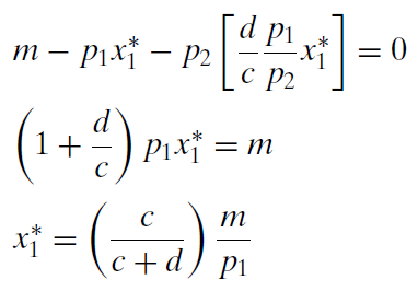
This expression contains the demand curve for \(x_1\) because it shows the quantity demanded at a given \(p_1\). It also contains an Engel curve because it shows how \(x_1\) varies with income. It also shows how \(x_1\) moves when c or d, the consumer’s tastes and preferences, changealthough, such a graph is unnamed.
Furthermore, this expression can be evaluated for any combination of exogenous variable values. For example, suppose \(c = d = 1, p_1 = 2\), and \(m = 100\). Then it can be seen easily that optimal \(x_1\) = 25. In fact, you can readily see that the reduced form expression for optimal \(x_1\) agrees with the numerical approach using the Comparative Statics Wizard to recalculate the optimal solution at given values of \(p_1\).
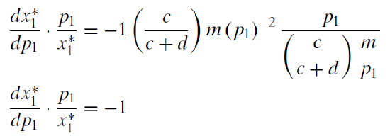
We can use our reduced form expression to calculate an own units response to a shock in \(p_1\) by taking the derivative with respect to \(p_1\).
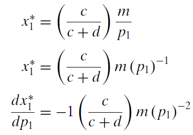
This formidable-looking expression is the instantaneous rate of change of the demand curve at a particular point. Because \(x_1 \mbox{*}\) is a nonlinear function of \(p_1\), its derivative with respect to \(p_1\) contains \(p_1\). The fact that the demand curve is not a line explains why we get different results when we compute responsiveness with \(\Delta\) versus d.
STEP Read the CS1 sheet carefully. Your primary goal is to understand the relationship between \(\Delta\) in cells F14 and G14 versus the derivative in cells I13 and J13.
The key idea is this: as \(\Delta\) gets smaller, it approaches d. Thus, earlier, we computed the price elasticity of demand from \(p_1=2\) to 3 and got \(-0.67\). But the CS1 sheet shows an elasticity of \(-0.95\) (in G14) as we go from \(p_1=2\) to 2.1 and when we use the derivative formula, which is based on an infinitesimally small change in \(p_1\), we get an elasticity of \(-1\).
Notice that, unlike the demand curve, \(x_1 \mbox{*} = f(p_1)\), the Engel curve, \(x_1 \mbox{*} = f(m)\) is a line for the Cobb-Douglas utility function. We say, "x one star is nonlinear in p one" and "x one star is linear in m." Because the Engel curve is a line, \(\Delta m\) and the derivative with respect to m give identical results. The size of the change in m does not matter if the relationship is linear.
The unit price elasticity is a property of a Cobb-Douglas utility function. We can use the reduced form expression for \(x_1 \mbox{*}\) to show that we always get a \(-1\) price elasticity.
So Cobb-Douglas produces three constant elasticities:
- Unit income elasticity
- Unit own price elasticity
- Zero cross price elasticity
None of these are especially realistic. Cobb-Douglas is common because it is easy to work with, not because it produces sensible elasticities.
A Point Off the Demand Curve?
Unlike an introductory economics course where demand curves appear out of the blue as downward sloping lines or curves, understanding where demand curves come from and what they actually represent are major goals for us.
So far, we have a mechanical understanding of the derivation of demand. Yes, it is true that changing \(p_1\), ceteris paribus, and tracking how \(x_1 \mbox{*}\) changes is how a demand curve is derived. And, yes, it is true that at every price, quantity demanded is the solution to an optimization problem for that price. But let’s try a thought experiment not included in introductory economics.
If we consider what it means to be at a point off the demand curve, such as point Z in Figure 4.12, it helps us understand that the demand curve is really like a ridgeline across the top of a mountain range.
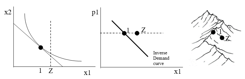 Figure 4.12: Interpreting a point off the (inverse) demand curve..
With a point Z to the right of the inverse demand curve, we know that the consumer is buying too much \(x_1\), as shown by the vertical dashed line in the graph on the left of Figure 4.12. We cannot precisely plot the point Z on the indifference curve graph because we do not know how much good 2 the person is buying at point Z. We do know, however, that she is not optimizing. In other words, at point Z, this consumer is failing to maximize satisfaction and is not on the tangency of the budget line and highest attainable indifference curve.
Considering the meaning of a point off the demand curve reveals that a demand curve is a geometrical object with a special characteristicevery point on the demand curve is a point of maximum utility given prices and income. If we added an axis for utility, the demand curve would show itself as a 3D object that displayed the maximum utility at each given price. In other words, the demand curve is a ridgeline that connects mountain peaks, as shown in the sketch on the right in Figure 4.12.
A Demand Curve Is a Comparative Statics Exercise
Deriving a demand curve is the most important comparative statics exercise in the Theory of Consumer Behavior. Demand and supply (the most important comparative statics exercise in the Theory of the Firm) are at the heart of the market mechanism.
Given a particular functional form for utility, demand curves can be derived via numerical methods, picking off individual points on the demand curve for explicit values of price, ceteris paribus. Slopes and elasticities can be computed.
Demand curves can also be derived via analytical methods by finding the reduced form expression as a function of price (and any other exogenous variables). Slopes and elasticities can be computed by using the derivative.
For Cobb-Douglas utility, we found that \(x_1 \mbox{*} = (\frac{c}{c+d})\frac{m}{p_1}\). For this reduced form, the numerical and analytical methods yield different values for slopes and elasticities based on changing \(p_1\) because the demand curve is a curve, instead of a line (like the Engel curve). The smaller the discrete change in \(p_1\) used in the numerical method, the closer it gets to the analytical result.
We can also "derive" a demand curve with graphs, as shown in Figure 4.11. We can display the effect of a price change by rotating the budget line and showing the initial and new points of tangency. If we display the \(p_1\) and corresponding optimal amount of \(x_1\) in a separate graph, we have graphically derived a demand curve (or inverse demand curve, if we flip the axes).
Finally, if we work out the implications of a point off the demand curve, we can see the demand curve in a new lightit is actually a 3D object represented in 2D space. All of the points on the demand curve are actually points of maximum utility subject to the budget constraint.
Exercises
- In the OptimalChoice sheet, click the
 button and reproduce Figure 4.10 with a decrease (instead of an increase) in \(p_1\) from $2/unit to $1/unit. Use Word’s Table feature to create the table and fill in the cells.
- Use Word’s Drawing Tools to create a graph of the price consumption curve and demand curve for \(x_1\) (as in Figure 4.11) that accurately reflects the shock and results from question 1.
- What is the difference between a demand curve and an inverse demand curve?
References
The epigraph is from page 103 of George J. Stigler, "The Early History of Empirical Studies of Consumer Behavior," The Journal of Political Economy, Vol. 62, No. 2 (April, 1954), pp. 95–113 (www.jstor.org/stable/1825569)
Most economists do not care who first came up with the concept of a demand schedule. Most of those who do care believe that it was Gregory King, a century after Charles Davenant. Stigler was a winner of the Nobel Prize in Economics and a professor at the University of Chicago. He had a lifelong passion for the intellectual history of economics. In this article, he showed that Davenant actually preceded King.
It took a long time to translate demand (and supply) schedules as tables (with columns for price and quantity) into graphs. Fleeming (pronounced flem-ming) Jenkin in 1870 is often given credit for drawing the first demand curve, but there were precursors. Alfred Marshall’s Principles of Economics (1890) popularized supply and demand graphs. His graphs appeared, however, only in footnotes.
Marshall’s Principles was the most popular economics book of its era. It is freely available online at www.econlib.org/library/Marshall/marP.html.
Modern economists sometimes mock Marshall for switching the axes, claiming he made a mistake, but this assertion is incorrect. Marshall put price on the vertical axis because he wanted to show market demand and supply curves on a graph as the horizontal sum of individual demand and supply curves, as in footnote 70 from Book III, Chapter IV. Future generations of introductory economics students became locked in to the Marshallian inverse demand and supply curves.
Although you may conclude that Marshall’s violation of accepted mathematical convention (i.e., independent variables belong on the x axis) is confusing, the decision was not due to a lack of math knowledge. In fact, Marshall was a brilliant mathematician, earning Second Wrangler (to the future Lord Rayleigh) as an undergraduate at Cambridge in the Tripos competition.
To understand how the role of mathematics has changed in economics, consider the recipe Marshall gave a friend for using math in economics: "1) Use mathematics as a shorthand language, rather than as an engine of inquiry. 2) Keep to them till you have done. 3) Translate into English. 4) Then illustrate by examples that are important in real life. 5) Burn the mathematics. 6) If you can’t succeed in 4 burn 3. This last I did often." (A. C. Pigou, Memorials of Alfred Marshall, 1925, p. 427.)