In this chapter we will explore:
| 3.1 | The marketplace – trading
|
| 3.2 | The market's building blocks
|
| 3.3 | Demand curves and supply curves
|
| 3.4 | Non-price determinants of demand
|
| 3.5 | Non-price determinants of supply
|
| 3.6 | Simultaneous demand and supply movements
|
| 3.7 | Free and managed markets – interventions
|
| 3.8 | From individuals to markets
|
| 3.9 | Useful techniques – demand and supply equations
|
3.1 The marketplace – trading
The marketplace in today's economy has evolved from earlier times. It no
longer has a unique form – one where buyers and sellers physically come
together for the purpose of exchange. Indeed, supermarkets usually require
individuals to be physically present to make their purchases. But when
purchasing an airline ticket, individuals simply go online and interact with
perhaps a number of different airlines (suppliers) simultaneously. Or again,
individuals may simply give an instruction to their stock broker, who will
execute a purchase on their behalf – the broker performs the role of a
middleman, who may additionally give advice to the purchaser. Or a marketing
agency may decide to subcontract work to a translator or graphic artist who
resides in Mumbai. The advent of the coronavirus has shifted grocery purchases from in-store presence to home delivery for many buyers. In pure auctions (where a single work of art or a single
residence is offered for sale) buyers compete one against the other for the
single item supplied. Accommodations in private homes are supplied to
potential visitors (buyers) through Airbnb. Taxi rides are mediated
through Lyft or Uber. These institutions are all different
types of markets; they serve the purpose of facilitating exchange and trade.
Not all goods and services in the modern economy are obtained through the
marketplace. Schooling and health care are allocated in Canada primarily by
government decree. In some instances the market plays a supporting role:
Universities and colleges may levy fees, and most individuals must pay, at
least in part, for their pharmaceuticals. In contrast, broadcasting services
may carry a price of zero; Buzzfeed or other news and social media come free of payment. Furthermore, some markets have no price, yet they find a way of facilitating
an exchange. For example, graduating medical students need to be matched
with hospitals for their residencies. Matching mechanisms are a form of
market in that they bring together suppliers and demanders. We explore their
operation in Chapter 11.
The importance of the marketplace springs from its role as an allocating
mechanism. Elevated prices effectively send a signal to suppliers that the
buyers in the market place a high value on the product being traded;
conversely when prices are low. Accordingly, suppliers may decide to cease
supplying markets where prices do not remunerate them sufficiently, and
redirect their energies and the productive resources under their control to
other markets – markets where the product being traded is more highly
valued, and where the buyer is willing to pay more.
Whatever their form, the marketplace is central to the economy we live in.
Not only does it facilitate trade, it also provides a means of earning a
livelihood. Suppliers must hire resources – human and non-human – in order to
bring their supplies to market and these resources must be paid a return: income is generated.
In this chapter we will examine the process of price formation – how the
prices that we observe in the marketplace come to be what they are. We will
illustrate that the price for a good is inevitably linked to the quantity of
a good; price and quantity are different sides of the same coin and cannot
generally be analyzed separately. To understand this process more fully, we
need to model a typical market. The essentials are demand and
supply.
3.2 The market's building blocks
In economics we use the terminology that describes trade in a particular
manner. Non-economists frequently describe microeconomics by saying "it's
all about supply and demand". While this is largely true we need to define
exactly what we mean by these two central words.
Demand is the quantity of a good or service that buyers wish
to purchase at each conceivable price, with all other influences on demand
remaining unchanged. It reflects a multitude of values, not a single value.
It is not a single or unique quantity such as two cell phones, but rather a
full description of the quantity of a good or service that buyers would
purchase at various prices.
Demand is the quantity of a good or service that buyers wish to purchase at each possible price, with all other influences on demand remaining unchanged.
As a hypothetical example, the first column of Table 3.1 shows the
price of natural gas per cubic foot. The second column shows the quantity
that would be purchased in a given time period at each price. It is
therefore a schedule of quantities demanded at various prices. For example, at a price $6 per unit, buyers
would like to purchase 4 units, whereas at the lower price of $3 buyers
would like to purchase 7 units. Note also that this is a homogeneous good. A
cubit foot of natural gas is considered to be the same product no matter
which supplier brings it to the market. In contrast, accommodations supplied
through Airbnb are heterogeneous – they vary in size and quality.
Table 3.1 Demand and supply for natural gas
|
Price ($) | Demand (thousands | Supply (thousands | Excess |
|
| of cu feet) | of cu feet) | |
|
10 | 0 | 18 | Excess Supply |
|
9 | 1 | 16 |
|
8 | 2 | 14 |
|
7 | 3 | 12 |
|
6 | 4 | 10 |
|
5 | 5 | 8 |
|
4 | 6 | 6 | Equilibrium |
|
3 | 7 | 4 | Excess Demand |
|
2 | 8 | 2 |
|
1 | 9 | 0 |
|
0 | 10 | 0 |
Supply is interpreted in a similar manner. It is not a single value; we
say that supply is the quantity of a good or service
that sellers are willing to sell at each possible price, with all other
influences on supply remaining unchanged. Such a supply schedule is defined
in the third column of the table. It is assumed that no supplier can make a
profit (on account of their costs) unless the price is at least $2 per
unit, and therefore a zero quantity is supplied below that price. The higher
price is more profitable, and therefore induces a greater quantity supplied,
perhaps by attracting more suppliers. This is reflected in the data. For
example, at a price of $3 suppliers are willing to supply 4 units, whereas
with a price of $7 they are willing to supply 12 units. There is thus a
positive relationship between price and quantity for the supplier – a higher
price induces a greater quantity; whereas on the demand side of the market a
higher price induces a lower quantity demanded – a negative relationship.
Supply is the quantity of a good or service that sellers are willing to sell at each possible price, with all other influences on supply remaining unchanged.
We can now identify a key difference in terminology – between the words
demand and quantity demanded, and between supply and quantity supplied.
While the words demand and supply refer to the complete schedules of demand
and supply, the terms quantity demanded and quantity supplied each define a single value of demand or
supply at a particular price.
Quantity demanded defines the amount purchased at a particular price.
Quantity supplied refers to the amount supplied at a particular price.
Thus while the non-economist may say that when some fans did not get tickets
to the Stanley Cup it was a case of demand exceeding supply, as economists
we say that the quantity demanded exceeded the quantity supplied at
the going price of tickets. In this instance, had every ticket been offered
at a sufficiently high price, the market could have generated an excess
supply rather than an excess demand. A higher ticket price would reduce the
quantity demanded; yet would not change demand, because
demand refers to the whole schedule of possible quantities demanded at
different prices.
Other things equal – ceteris paribus
The demand and supply schedules rest on the assumption that all other
influences on supply and demand remain the same as we move up and down the
possible price values. The expression other things being equal, or its Latin counterpart ceteris paribus, describes this
constancy of other influences. For example, we assume on the demand side
that the prices of other goods remain constant, and that tastes and incomes are
unchanging. On the supply side we assume, for example, that there is no
technological change in production methods. If any of these elements change
then the market supply or demand schedules will reflect such changes. For
example, if coal or oil prices increase (decline) then some buyers may switch
to (away from) gas or solar power. This will be reflected in the data: At any given price
more (or less) will be demanded. We will illustrate this in graphic form
presently.
Market equilibrium
Let us now bring the demand and supply schedules together in an attempt to
analyze what the marketplace will produce – will a single price emerge
that will equate supply and demand? We will keep other things constant for
the moment, and explore what materializes at different prices. At low
prices, the data in Table 3.1 indicate that the
quantity demanded exceeds the quantity supplied – for example, verify what
happens when the price is $3 per unit. The opposite occurs when the price
is high – what would happen if the price were $8? Evidently, there exists
an intermediate price, where the quantity demanded equals the quantity
supplied. At this point we say that the market is in equilibrium. The equilibrium price equates demand and supply – it clears the
market.
The equilibrium price equilibrates the market. It is the price at which quantity demanded equals the quantity supplied.
In Table 3.1 the equilibrium price is $4, and the
equilibrium quantity is 6 thousand cubic feet of gas (we use the
notation 'k' to denote thousands). At higher prices there is an excess supply—suppliers wish to sell more than buyers wish
to buy. Conversely, at lower prices there is an excess demand.
Only at the equilibrium price is the quantity supplied equal to the quantity demanded.
Excess supply exists when the quantity supplied exceeds the quantity demanded at the going price.
Excess demand exists when the quantity demanded exceeds the quantity supplied at the going price.
Does the market automatically reach equilibrium? To answer this question,
suppose initially that the sellers choose a price of $10. Here suppliers
would like to supply 18k cubic feet, but there are no buyers—a situation
of extreme excess supply. At the price of $7 the excess supply is reduced
to 9k, because both the quantity demanded is now higher at 3k units, and the
quantity supplied is lower at 12k. But excess supply means that there are
suppliers willing to supply at a lower price, and this willingness exerts
continual downward pressure on any price above the price that equates demand
and supply.
At prices below the equilibrium there is, conversely, an excess demand. In
this situation, suppliers could force the price upward, knowing that buyers
will continue to buy at a price at which the suppliers are willing to sell.
Such upward pressure would continue until the excess demand is eliminated.
In general then, above the equilibrium price excess supply exerts downward
pressure on price, and below the equilibrium excess demand exerts upward
pressure on price. This process implies that the buyers and sellers have
information on the various elements that make up the marketplace.
We will explore later in this chapter some specific circumstances in which
trading could take place at prices above or below the equilibrium price. In
such situations the quantity actually traded always corresponds to the short
side of the market: this means that at high prices the quantity demanded is less than
the quantity supplied, and it is the quantity demanded that is traded because buyers will
not buy the amount suppliers would like to supply. Correspondingly, at low prices the
quantity demanded exceeds quantity supplied, and it is the amount that
suppliers are willing to sell that is traded. In sum, when trading takes
place at prices other than the equilibrium price it is always the lesser of
the quantity demanded or supplied that is traded. Hence we say that at non-equilibrium
prices the short side dominates. We will return to
this in a series of examples later in this chapter.
The short side of the market determines outcomes at prices other than the equilibrium.
Supply and the nature of costs
Before progressing to a graphical analysis, we should add a word about
costs. The supply schedules are based primarily on the cost of producing the
product in question, and we frequently assume that all of the costs
associated with supply are incorporated in the supply schedules. In
Chapter 6 we will explore cases where costs additional to
those incurred by producers may be relevant. For example, coal burning power
plants emit pollutants into the atmosphere; but the individual supplier may
not take account of these pollutants, which are costs to society at large,
in deciding how much to supply at different prices. Stated another way, the
private costs of production would not reflect the total, or full social
costs of production. Conversely, if some individuals immunize themselves
against a rampant virus, other individuals gain from that action because
they become less likely to contract the virus - the social value thus
exceeds the private value. For the moment the assumption is that no such
additional costs are associated with the markets we analyze.
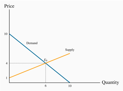
3.3 Demand and supply curves
The demand curve is a graphical expression of the relationship
between price and quantity demanded, holding other things constant. Figure 3.1
measures price on the vertical axis and quantity on the
horizontal axis. The curve D represents the data from the first two
columns of Table 3.1. Each combination of price and
quantity demanded lies on the curve. In this case the curve is linear—it is a straight line. The demand curve slopes downward (technically we
say that its slope is negative), reflecting the fact that buyers wish to
purchase more when the price is less.
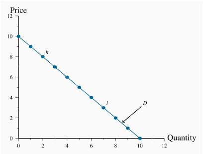
To derive this demand curve we take each price-quantity combination from the
demand schedule in Table 3.1 and insert a point that corresponds to those
combinations. For example, point h defines the combination  , the point l denotes the combination
  .
If we join all such points we obtain the demand curve in Figure 3.2.The same process yields the supply curve in Figure 3.2. In this example the supply and the demand curves are each
linear. There is no reason why this linear property characterizes demand and
supply curves in the real world; they are frequently found to have
curvature. But straight lines are easier to work with, so we continue with
them for the moment.
.
If we join all such points we obtain the demand curve in Figure 3.2.The same process yields the supply curve in Figure 3.2. In this example the supply and the demand curves are each
linear. There is no reason why this linear property characterizes demand and
supply curves in the real world; they are frequently found to have
curvature. But straight lines are easier to work with, so we continue with
them for the moment.
The demand curve is a graphical expression of the relationship between price and quantity demanded, with other influences remaining unchanged.
The supply curve is a graphical representation of the relationship
between price and quantity supplied, holding other things constant.
The supply curve S in Figure 3.2 is based on the data from
columns 1 and 3 in Table 3.1. It has a positive slope indicating that suppliers wish to supply more at higher
prices.
The supply curve is a graphical expression of the relationship between price and quantity supplied, with other influences remaining unchanged.
The demand and supply curves intersect at point E0, corresponding to a
price of $4 which, as illustrated above, is the equilibrium price for this
market. At any price below this the horizontal distance between the supply
and demand curves represents excess demand, because demand exceeds supply.
Conversely, at any price above $4 there is an excess supply that is again
measured by the horizontal distance between the two curves. Market forces
tend to eliminate excess demand and excess supply as we explained above. In
the final section of the chapter we illustrate how the supply and demand
curves can be 'solved' for the equilibrium price and quantity.
3.4 Non-price influences on demand
We have emphasized several times the importance of the ceteris
paribus assumption when exploring the impact of different prices on the
quantity demanded: We assume all other influences on the purchase decision
are unchanged (at least momentarily). These other influences fall into
several broad categories: The prices of related goods; the incomes of
buyers; buyer tastes; and expectations about the future. Before proceeding,
note that we are dealing with market demand rather than demand by
one individual (the precise relationship between the two is
developed later in this chapter).
The prices of related goods – oil and gas, Kindle and
paperbacks
We expect that the price of other forms of energy would impact the price of
natural gas. For example, if hydro-electricity, oil or solar becomes less expensive
we would expect some buyers to switch to these other products.
Alternatively, if gas-burning furnaces experience a technological
breakthrough that makes them more efficient and cheaper we would expect some
users of other fuels to move to gas. Among these examples, oil and electricity are substitute fuels for gas; in contrast a more fuel-efficient
new gas furnace complements the use of gas. We use these terms,
substitutes and complements, to describe
products that influence the demand for the primary good.
Substitute goods: when a price reduction (rise) for a related product reduces (increases) the demand for a primary product, it is a substitute for the primary product.
Complementary goods: when a price reduction (rise) for a related product increases (reduces) the demand for a primary product, it is a complement for the primary product.
Clearly electricity is a substitute for gas in the power market, whereas a
gas furnace is a complement for gas as a fuel. The words substitutes and
complements immediately suggest the nature of the relationships. Every
product has complements and substitutes. As another example: Electronic
readers and tablets are substitutes for paper-form books;
a rise in the price of paper books should increase the demand for electronic
readers at any given price for electronic readers. In graphical terms, the
demand curve shifts in response to changes in the prices of other
goods – an increase in the price of paper-form books shifts the demand
for electronic readers outward, because more electronic readers will be
demanded at any price.
Buyer incomes – which goods to buy
The demand for most goods increases in response to income growth. Given
this, the demand curve for gas will shift outward if household incomes in
the economy increase. Household incomes may increase either because there
are more households in the economy or because the incomes of the existing
households grow.
Most goods are demanded in greater quantity in response to higher incomes at
any given price. But there are exceptions. For example, public transit
demand may decline at any price when household incomes rise, because some
individuals move to cars. Or the demand for laundromats may decline in
response to higher incomes, as households purchase more of their own
consumer durables – washers and driers. We use the term inferior good to define these cases: An inferior good is one
whose demand declines in response to increasing incomes, whereas a normal good experiences an increase in demand in response to
rising incomes.
An inferior good is one whose demand falls in response to higher incomes.
A normal good is one whose demand increases in response to higher incomes.
There is a further sense in which consumer incomes influence demand, and
this relates to how the incomes are distributed in the economy. In
the discussion above we stated that higher total incomes shift demand curves
outwards when goods are normal. But think of the difference in the demand
for electronic readers between Portugal and Saudi Arabia. These economies
have roughly the same average per-person income, but incomes are distributed
more unequally in Saudi Arabia. It does not have a large middle class that
can afford electronic readers or iPads, despite the huge wealth
held by the elite. In contrast, Portugal has a relatively larger middle
class that can afford such goods. Consequently, the distribution of
income can be an important determinant of the demand for many commodities
and services.
Tastes and networks – hemlines, lapels and homogeneity
While demand functions are drawn on the assumption that tastes are constant,
in an evolving world they are not. We are all subject to peer pressure, the
fashion industry, marketing, and a desire to maintain our image. If the
fashion industry dictates that lapels on men's suits or long skirts are de rigueur
for the coming season, some fashion-conscious individuals will discard a
large segment of their wardrobe, even though the clothes may be in perfectly
good condition: Their demand is influenced by the dictates of current
fashion.
Correspondingly, the items that other individuals buy or use frequently
determine our own purchases. Businesses frequently decide that all of their
employees will have the same type of computer and software on account of
network economies: It is easier to communicate if equipment is
compatible, and it is less costly to maintain infrastructure where the
variety is less.
Expectations – betting on the future
In our natural gas example, if households expected that the price of natural
gas was going to stay relatively low for many years – perhaps on account of
the discovery of large deposits – then they would be tempted to purchase a
gas burning furnace rather than one based upon an alternative fuel. In this example, it
is more than the current price that determines choices; the prices
that are expected to prevail in the future also determine current demand.
Expectations are particularly important in stock markets. When investors
anticipate that corporations will earn high rewards in the future they will
buy a stock today. If enough people believe this, the price of the stock
will be driven upward on the market, even before profitable earnings are
registered.
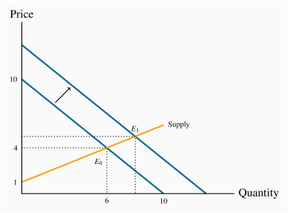
Shifts in demand
The demand curve in Figure 3.2 is drawn for a given level of
other prices, incomes, tastes, and expectations. Movements along the demand
curve reflect solely the impact of different prices for the good in
question, holding other influences constant. But changes in any of these
other factors will change the position of the demand curve. Figure 3.3 illustrates a shift in the demand curve. This shift could
result from a rise in household incomes that increase the quantity demanded
at every price. This is illustrated by an outward shift in the
demand curve. With supply conditions unchanged, there is a new equilibrium
at  , indicating a greater quantity of purchases accompanied by a
higher price. The new equilibrium reflects a change in quantity
supplied and a change in demand.
, indicating a greater quantity of purchases accompanied by a
higher price. The new equilibrium reflects a change in quantity
supplied and a change in demand.
We may well ask why so much emphasis in our diagrams and analysis is placed
on the relationship between price and quantity, rather than on the
relationship between quantity and its other determinants. The answer is that
we could indeed draw diagrams with quantity on the horizontal axis and a
measure of one of these other influences on the vertical axis. But the price
mechanism plays a very important role. Variations in price are what
equilibrate the market. By focusing primarily upon the price, we see the
self-correcting mechanism by which the market reacts to excess supply or
excess demand.
In addition, this analysis illustrates the method of comparative statics—examining the impact of changing one of
the other things that are assumed constant in the supply and demand diagrams.
Comparative static analysis compares an initial equilibrium with a new equilibrium, where the difference is due to a change in one of the other things that lie behind the demand curve or the supply curve.
'Comparative' obviously denotes the idea of a comparison, and static means
that we are not in a state of motion. Hence we use these words in
conjunction to indicate that we compare one outcome with another, without
being concerned too much about the transition from an initial equilibrium to
a new equilibrium. The transition would be concerned with dynamics rather
than statics. In Figure 3.3 we explain the difference
between the points E0 and E1 by indicating that there has been a
change in incomes or in the price of a substitute good. We do not attempt to
analyze the details of this move or the exact path from E0 to E1.
Application Box 3.1 Corn prices and demand shifts
In the middle of its second mandate, the Bush Administration in the US decided to encourage the production of ethanol – a fuel that is less polluting than gasoline. The target production was 35 billion for 2017 – from a base of 1 billion gallons in 2000. Corn is the principal input in ethanol production. It is also used as animal feed, as a sweetener and as a food for humans. The target was to be met with the help of a subsidy to producers and a tariff on imports of Brazil's sugar-cane based ethanol.
The impact on corn prices was immediate; from a farm-gate price of $2 per bushel in 2005, the price reached the $4 range two years later. In 2012 the price rose temporarily to $7. While other factors were in play - growing incomes and possibly speculation by commodity investors, ethanol is seen as the main price driver: demand for corn increased and the supply could not be increased to keep up with the demand without an increase in price.
The wider impact of these developments was that the prices of virtually all grains increased in tandem with corn: the prices of sorghum and barley increased because of a switch in land use towards corn on account of its profitability.
While farmers benefited from the price rise, consumers – particularly those in less developed economies – experienced a dramatic increase in their basic living costs. Visit the site of the United Nations' Food and Agricultural Organization for an assessment. Since hitting $7 per bushel in 2012, the price has dropped and averaged $3.50 in 2016.
In terms of supply and demand shifts: the demand side has dominated, particularly in the short run. The ethanol drive, combined with secular growth in the demand for food, means that the demand for grains shifted outward faster than the supply. In the period 2013–2016, supply has increased and the price has moderated.
3.5 Non-price influences on supply
To date we have drawn supply curves with an upward slope. Is this a
reasonable representation of supply in view of what is frequently observed
in markets? We suggested earlier that the various producers of a particular
good or service may have different levels of efficiency. If so, only the
more efficient producers can make a profit at a low price, whereas at higher
prices more producers or suppliers enter the market – producers who may not
be as lean and efficient as those who can survive in a lower-price
environment. This view of the world yields a positively-sloping supply curve.
As a second example, consider Uber or Lyft taxi drivers. Some drivers may
be in serious need of income and may be willing to drive for a low hourly
rate. For other individuals driving may be a secondary source of income, and
such drivers are less likely to want to drive unless the hourly wage is
higher. Consequently if these ride sharing services need a large number of drivers at any one time
it may be necessary to pay a higher wage – and charge a higher fare
to passengers, to induce more drivers to take their taxis onto the road.
This phenomenon corresponds to a positively-sloped supply curve.
In contrast to these two examples, some suppliers simply choose a unique
price and let buyers purchase as much as they want at that price. This is
the practice of most retailers. For example, the price of Samsung's
Galaxy is typically fixed, no matter how many are purchased – and tens of
millions are sold at a fixed price when a new model is launched. Apple also sets a price, and buyers purchase as many as they desire at that
price. This practice corresponds to a horizontal supply curve: The price does
not vary and the market equilibrium occurs where the demand curve intersects
this supply curve.
In yet other situations supply is fixed. This happens in auctions. Bidders
at the auction simply determine the price to be paid. At a real estate
auction a given property is put on the market and the price is determined by
the bidding process. In this case the supply of a single property is
represented by a vertical supply at a quantity of 1 unit.
Regardless of the type of market we encounter, however, it is safe to assume
that supply curves rarely slope downward. So, for the moment, we adopt the
stance that supply curves are generally upward sloping – somewhere between
the extremes of being vertical or horizontal – as we have drawn them to
this point.
Next, we examine those other influences that underlie supply curves.
Technology, input costs, the prices of competing goods, expectations and the
number of suppliers are the most important.
Technology – computers and fracking
A technological advance may involve an idea that allows more output to be
produced with the same inputs, or an equal output with fewer inputs. A good
example is just-in-time technology. Before the modern era, virtually all manufacturers kept large stocks of components in their production
facilities, but developments in communications and computers at that time
made it possible for manufacturers to link directly with their input
suppliers. Nowadays auto assembly plants place their order for, say, seat
delivery to their local seat supplier well ahead of assembly time. The seats
swing into the assembly area hours or minutes before assembly—just in
time. The result is that the assembler reduces her seat inventory (an input)
and thereby reduces production cost.
Such a technology-induced cost saving is represented by moving the supply
curve downward or outward: The supplier is now able and willing to supply
the same quantity at a lower price because of the technological innovation.
Or, saying the same thing slightly differently, suppliers will supply more
at a given price than before.
A second example relates to the extraction of natural gas. The development
of 'fracking' means that companies involved in gas recovery can now do so at
a lower cost. Hence they are willing to supply any given quantity at a lower
price. A third example concerns aluminum cans. Today they weigh a fraction
of what they weighed 20 years ago. This is a technology-based cost saving.
Input costs
Input costs can vary independently of technology. For example, a wage
negotiation that grants workers a substantial pay raise will increase the
cost of production. This is reflected in a leftward, or
upward, supply shift: Any quantity supplied is now priced higher;
alternatively, suppliers are willing to supply less at the going price.
Production costs may increase as a result of higher required standards in
production. As governments implement new safety or product-stress standards,
costs may increase. In this instance the increase in costs is not a 'bad'
outcome for the buyer. She may be purchasing a higher quality good as a
result.
Competing products – Airbnb versus hotels
If competing products improve in quality or fall in price, a supplier may be
forced to follow suit. For example, Asus and Dell are
constantly watching each other's pricing policies. If Dell brings
out a new generation of computers at a lower price, Asus may lower
its prices in turn—which is to say that Asus' supply curve will shift
downward. Likewise, Samsung and Apple each responds to the
other's pricing and technology behaviours. The arrival of new products in
the marketplace also impacts the willingness of suppliers to supply goods at
a given price. New intermediaries such as Airbnb and
Vacation Rentals by Owner have shifted the supply curves of hotel
rooms downward.
These are some of the many factors that influence the position of the supply
curve in a given market.
Application Box 3.2 The price of light
Technological developments have had a staggering impact on many price declines. Professor William Nordhaus of Yale University is an expert on measuring technological change. He has examined the trend in the real price of lighting. Originally, light was provided by whale oil and gas lamps and these sources of lumens (the scientific measure of the amount of light produced) were costly. In his research, Professor Nordhaus pieced together evidence on the actual historic cost of light produced at various times, going all the way back to 1800. He found that light in 1800 cost about 100 times more than in 1900, and light in the year 2000 was a fraction of its cost in 1900. A rough calculation suggests that light was five hundred times more expensive at the start of this 200-year period than at the end, and this was before the arrival of LEDs.
In terms of supply and demand analysis, light has been subject to very substantial downward supply shifts. Despite the long-term growth in demand, the technologically-induced supply changes have been the dominant factor in its price determination.
For further information, visit Professor Nordhaus's website in the Department of Economics at Yale University.
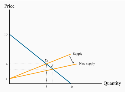
Shifts in supply
Whenever technology changes, or the costs of production change, or the
prices of competing products adjust, then one of our ceteris paribus
assumptions is violated. Such changes are generally reflected by shifting
the supply curve. Figure 3.4 illustrates the impact of the
arrival of just-in-time technology. The supply curve shifts, reflecting the
ability of suppliers to supply the same output at a reduced price. The
resulting new equilibrium price is lower, since production costs have
fallen. At this reduced price more gas is traded at a lower price.
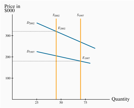
3.6 Simultaneous supply and demand impacts
In the real world, demand and supply frequently shift at the same time. We
present such a case in Figure 3.5. It is based upon
real estate data describing the housing market in a small Montreal
municipality. Vertical curves define the supply side of the market. Such
vertical curves mean that a given number of homeowners decide to put their
homes on the market, and these suppliers just take whatever price results in
the market. In this example, fewer houses were offered for sale in 2002
(less than 50) than in 1997 (more than 70). We are assuming in this market
that the houses traded were similar; that is, we are not lumping together
mansions with row houses.
During this time period household incomes increased substantially and, also,
mortgage rates fell. Both of these developments shifted the demand curve
upward/outward: Buyers were willing to pay more for housing in 2002 than in
1997, both because their incomes were on average higher and because they
could borrow more cheaply.
The shifts on both sides of the market resulted in a higher average price.
And each of these shifts compounded the other: The outward shift in demand
would lead to a higher price on its own, and a reduction in supply would do
likewise. Hence both forces acted to push up the price in 2002. If, instead,
the supply had been greater in 2002 than in 1997 this would have acted to
reduce the equilibrium price. And with the demand and supply shifts
operating in opposing directions, it is not possible to say in general
whether the price would increase or decrease. If the demand shift were
strong and the supply shift weak then the demand forces would have dominated
and led to a higher price. Conversely, if the supply forces were stronger
than the demand forces.
3.7 Market interventions – governments and interest groups
The freely functioning markets that we have developed certainly do not
describe all markets. For example, minimum wages characterize the labour
market, most agricultural markets have supply restrictions, apartments are
subject to rent controls, and blood is not a freely traded market commodity
in Canada. In short, price controls and quotas characterize many markets. Price controls are government rules or laws that inhibit the
formation of market-determined prices. Quotas are physical
restrictions on how much output can be brought to the market.
Price controls are government rules or laws that inhibit the formation of market-determined prices.
Quotas are physical restrictions on output.
Price controls come in the form of either floors or ceilings.
Price floors are frequently accompanied by marketing boards.
Price ceilings – rental boards
Ceilings mean that suppliers cannot legally charge more than a specific
price. Limits on apartment rents are one form of ceiling. In times of
emergency – such as flooding or famine, price controls are frequently
imposed on foodstuffs, in conjunction with rationing, to ensure that access
is not determined by who has the most income. The problem with price
ceilings, however, is that they leave demand unsatisfied, and therefore they
must be accompanied by some other allocation mechanism.
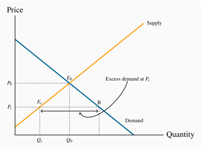
Consider an environment where, for some reason – perhaps a sudden and
unanticipated growth in population – rents increase. Let the resulting
equilibrium be defined by the point E0 in Figure 3.6.
If the government were to decide that this is an unfair price because it
places hardships on low- and middle-income households, it might impose a
price limit, or ceiling, of Pc. The problem with such a limit is that
excess demand results: Individuals want to rent more apartments than are
available in the city. In a free market the price would adjust upward to
eliminate the excess demand, but in this controlled environment it cannot.
So some other way of allocating the available supply between demanders must
evolve.
In reality, most apartments are allocated to those households already
occupying them. But what happens when such a resident household decides to
purchase a home or move to another city? In a free market, the landlord
could increase the rent in accordance with market pressures. But in a
controlled market a city's rental tribunal may restrict the annual rent
increase to just a couple of percent and the demand may continue to
outstrip supply. So how does the stock of apartments get allocated between
the potential renters? One allocation method is well known: The existing
tenant informs her friends of her plan to move, and the friends are the
first to apply to the landlord to occupy the apartment. But that still
leaves much unmet demand. If this is a student rental market, students whose
parents live nearby may simply return 'home'. Others may chose to move to a
part of the city where rents are more affordable.
However, rent controls sometimes yield undesirable outcomes. Rent
controls are widely studied in economics, and the consequences are well
understood: Landlords tend not to repair or maintain their rental units in
good condition if they cannot obtain the rent they believe they are entitled
to. Accordingly, the residential rental stock deteriorates. In addition,
builders realize that more money is to be made in building condominium units
than rental units, or in converting rental units to condominiums.
The frequent consequence is thus a reduction in supply and a
reduced quality. Market forces are hard to circumvent because, as we
emphasized in Chapter 1, economic players react to the
incentives they face. These outcomes are examples of what we call the
law of unintended consequences.
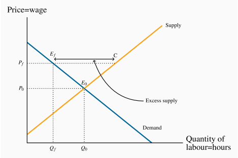
Price floors – minimum wages
An effective price floor sets the price above the market-clearing
price. A minimum wage is the most widespread example in the Canadian
economy. Provinces each set their own minimum, and it is seen as a way of
protecting the well-being of low-skill workers. Such a floor is illustrated
in Figure 3.7. The free-market equilibrium is again E0,
but the effective market outcome is the combination of price and quantity
corresponding to the point Ef at the price floor, Pf. In this
instance, there is excess supply equal to the amount EfC.
Note that there is a similarity between the outcomes defined in the floor
and ceiling cases: The quantity actually traded is the lesser of the
supply quantity and demand quantity at the going price: The short side
dominates.
If price floors, in the form of minimum wages, result in some workers going
unemployed, why do governments choose to put them in place? The excess
supply in this case corresponds to unemployment – more individuals are
willing to work for the going wage than buyers (employers) wish to employ.
The answer really depends upon the magnitude of the excess supply. In
particular, suppose, in Figure 3.7 that the supply and demand curves going
through the equilibrium E0 were more 'vertical'. This would result in a
smaller excess supply than is represented with the existing supply and
demand curves. This would mean in practice that a higher wage could go to
workers, making them better off, without causing substantial unemployment.
This is the trade off that governments face: With a view to increasing the
purchasing power of generally lower-skill individuals, a minimum wage is
set, hoping that the negative impact on employment will be small. We will
return to this in the next chapter, where we examine the responsiveness of
supply and demand curves to different prices.
Quotas – agricultural supply
A quota represents the right to supply a specified quantity of a good to the
market. It is a means of keeping prices higher than the free-market
equilibrium price. As an alternative to imposing a price floor, the
government can generate a high price by restricting supply.
Agricultural markets abound with examples. In these markets, farmers can
supply only what they are permitted by the quota they hold, and there is
usually a market for these quotas. For example, in several Canadian
provinces it currently costs in the region of $30,000 to purchase a quota
granting the right to sell the milk of one cow. The cost of purchasing
quotas can thus easily outstrip the cost of a farm and herd. Canadian cheese
importers must pay for the right to import cheese from abroad. Restrictions
also apply to poultry. The impact of all of these restrictions is to raise
the domestic price above the free market price.
In Figure 3.8, the free-market equilibrium is at E0. In
order to raise the price above P0, the government restricts supply to Qq
by granting quotas, which permit producers to supply a limited amount
of the good in question. This supply is purchased at the price equal to Pq.
From the standpoint of farmers, a higher price might be beneficial,
even if they get to supply a smaller quantity, provided the amount of
revenue they get as a result is as great as the revenue in the free market.
Marketing boards – milk and maple syrup
A marketing board is a means of insuring that a quota or price floor can be
maintained. Quotas are frequent in the agriculture sector of the economy.
One example is maple syrup in Quebec. The Federation of Maple Syrup Producers
of Quebec has the sole right to market maple syrup. All producers must sell
their syrup through this marketing board. The board thus has a
particular type of power in the market: it has control of the market at the
wholesale end, because it is a sole buyer. The
Federation increases the total revenue going to producers by artificially
restricting the supply to the market. The Federation calculates that by
reducing supply and selling it at a higher price, more revenue will accrue
to the producers. This is illustrated in Figure 3.8. The market
equilibrium is given by E0, but the Federation restricts supply to the
quantity Qq, which is sold to buyers at price Pq. To make this possible
the total supply must be restricted; otherwise producers would supply the amount
given by the point C on the supply curve, and this would result in excess
supply in the amount EqC. In order to restrict supply to Qq in total,
individual producers are limited in what they can sell to the Federation;
they have a quota, which gives them the right to produce and sell no more than
a specified amount. This system of quotas is necessary to eliminate
the excess supply that would emerge at the above-equilibrium price Pq.
We will return to this topic in Chapter 4. For the moment,
to see that this type of revenue-increasing outcome is possible, examine
Table 3.1 again. At this equilibrium price of $4 the
quantity traded is 6 units, yielding a total expenditure by buyers (revenue
to suppliers) of $24. However, if the supply were restricted and a price
of $5 were set, the expenditure by buyers (revenue to suppliers) would
rise to $25.
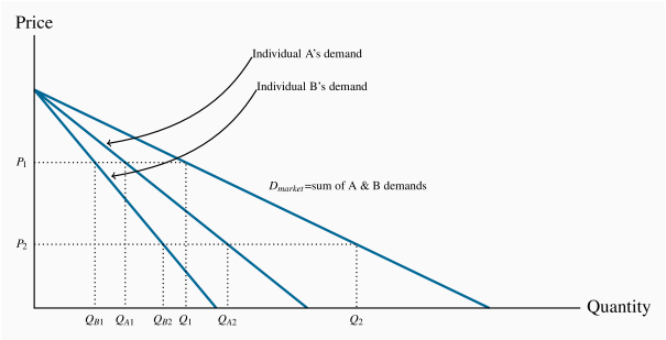
3.8 Individual and market functions
Markets are made up of many individual participants on the demand and supply
side. The supply and demand functions that we have worked with in this
chapter are those for the total of all participants on each side of the
market. But how do we arrive at such market functions when the economy is
composed of individuals? We can illustrate how, with the help of
Figure 3.9.
To concentrate on the essentials, imagine that there are just two buyers of
chocolate cookies in the economy. A has a stronger preference for cookies than B, so his demand is
greater. To simplify, let the two demands have the same intercept on the
vertical axis. The curves DA and DB indicate how many cookies A and
B, respectively, will buy at each price. The market demand indicates how
much they buy together at any price. Accordingly, at P1, A and B
purchase the quantities  and
and  respectively. Thus
  .
At a price P2, they purchase
.
At a price P2, they purchase  and
and  . Thus
  .
The market demand is therefore the horizontal sum of the individual
demands at these prices. In the figure this is defined by
.
The market demand is therefore the horizontal sum of the individual
demands at these prices. In the figure this is defined by  .
.
Market demand: the horizontal sum of individual demands.
3.9 Useful techniques – demand and supply equations
The supply and demand functions, or equations, underlying Table 3.1
and Figure 3.2 can be written in their mathematical form:
A straight line is represented completely by the intercept and slope. In
particular, if the variable P is on the vertical axis and Q on the
horizontal axis, the straight-line equation relating P and Q is defined
by P=a+bQ. Where the line is negatively sloped, as in the demand equation,
the parameter b must take a negative value. By observing either the data in
Table 3.1 or Figure 3.2 it is clear that the
vertical intercept, a, takes a value of $10. The vertical intercept
corresponds to a zero-value for the Q variable. Next we can see from
Figure 3.2 that the slope (given by the rise over the run) is 10/10
and hence has a value of –1. Accordingly the demand equation takes the form
P=10–Q.
On the supply side the price-axis intercept, from either the figure or the
table, is clearly 1. The slope is one half, because a two-unit change in
quantity is associated with a one-unit change in price. This is a positive
relationship obviously so the supply curve can be written as P=1+(1/2)Q.
Where the supply and demand curves intersect is the market equilibrium; that
is, the price-quantity combination is the same for both supply and demand
where the supply curve takes on the same values as the demand curve. This
unique price-quantity combination is obtained by equating the two curves: If
Demand=Supply, then
10–Q=1+(1/2)Q.
Gathering the terms involving Q to one side and the numerical terms to the
other side of the equation results in 9=1.5Q. This implies that the
equilibrium quantity must be 6 units. And this quantity must trade at a
price of $4. That is, when the price is $4 both the quantity demanded
and the quantity supplied take a value of 6 units.
Modelling market interventions using equations
To illustrate the impact of market interventions examined in Section 3.7 on
our numerical market model for natural gas, suppose that the
government imposes a minimum price of $6 – above the equilibrium price
obviously. We can easily determine the quantity supplied and demanded at
such a price. Given the supply equation
P=1+(1/2)Q,
it follows that at P=6 the quantity supplied is 10. This follows by solving
the relationship 6=1+(1/2)Q for the value of Q. Accordingly, suppliers
would like to supply 10 units at this price.
Correspondingly on the demand side, given the demand curve
P=10–Q,
with a price given by  , it must be the case that Q=4. So buyers
would like to buy 4 units at that price: There is excess supply.
But we know that the short side of the market will win out, and so the
actual amount traded at this restricted price will be 4 units.
, it must be the case that Q=4. So buyers
would like to buy 4 units at that price: There is excess supply.
But we know that the short side of the market will win out, and so the
actual amount traded at this restricted price will be 4 units.
Conclusion
We have covered a lot of ground in this chapter. It is intended to open up
the vista of economics to the new student in the discipline. Economics is
powerful and challenging, and the ideas we have developed here will serve as
conceptual foundations for our exploration of the subject. Our next chapter
deals with measurement and responsiveness.
Key Terms
Demand is the quantity of a good or service that buyers wish to purchase at each possible price, with all other influences on demand remaining unchanged.
Supply is the quantity of a good or service that sellers are willing to sell at each possible price, with all other influences on supply remaining unchanged.
Quantity demanded defines the amount purchased at a particular price.
Quantity supplied refers to the amount supplied at a particular price.
Equilibrium price: equilibrates the market. It is the price at which quantity demanded equals the quantity supplied.
Excess supply exists when the quantity supplied exceeds the quantity demanded at the going price.
Excess demand exists when the quantity demanded exceeds quantity supplied at the going price.
Short side of the market determines outcomes at prices other than the equilibrium.
Demand curve is a graphical expression of the relationship between price and quantity demanded, with other influences remaining unchanged.
Supply curve is a graphical expression of the relationship between price and quantity supplied, with other influences remaining unchanged.
Substitute goods: when a price reduction (rise) for a related product reduces (increases) the demand for a primary product, it is a substitute for the primary product.
Complementary goods: when a price reduction (rise) for a related product increases (reduces) the demand for a primary product, it is a complement for the primary product.
Inferior good is one whose demand falls in response to higher incomes.
Normal good is one whose demand increases in response to higher incomes.
Comparative static analysis compares an initial equilibrium with a new equilibrium, where the difference is due to a change in one of the other things that lie behind the demand curve or the supply curve.
Price controls are government rules or laws that inhibit the formation of market-determined prices.
Quotas are physical restrictions on output.
Market demand: the horizontal sum of individual demands.
Exercises for Chapter 3
The supply and demand for concert tickets are given in the table below.
|
Price ($) | 0 | 4 | 8 | 12 | 16 | 20 | 24 | 28 | 32 | 36 | 40 |
|
Quantity demanded | 15 | 14 | 13 | 12 | 11 | 10 | 9 | 8 | 7 | 6 | 5 |
|
Quantity supplied | 0 | 0 | 0 | 0 | 0 | 1 | 3 | 5 | 7 | 9 | 11 |
Plot the supply and demand curves to scale and establish the equilibrium price and quantity.
What is the excess supply or demand when price is $24? When price is $36?
Describe the market adjustments in price induced by these two prices.
Optional: The functions underlying the example in the table are linear and can be presented as P=18+2Q (supply) and P=60–4Q (demand). Solve the two equations for the equilibrium price and quantity values.
Illustrate in a supply/demand diagram, by shifting the demand curve appropriately, the effect on the demand for flights between Calgary and Winnipeg as a result of:
Increasing the annual government subsidy to Via Rail.
Improving the Trans-Canada highway between the two cities.
The arrival of a new budget airline on the scene.
A new trend in US high schools is the widespread use of chewing tobacco. A recent survey indicates that 15 percent of males in upper grades now use it – a figure not far below the use rate for cigarettes. This development came about in response to the widespread implementation by schools of regulations that forbade cigarette smoking on and around school property. Draw a supply-demand equilibrium for each of the cigarette and chewing tobacco markets before and after the introduction of the regulations.
The following table describes the demand and supply conditions for labour.
|
Price ($) = wage rate | 0 | 10 | 20 | 30 | 40 | 50 | 60 | 70 | 80 | 90 | 100 | 110 | 120 | 130 | 140 | 150 | 160 | 170 |
|
Quantity demanded | 1020 | 960 | 900 | 840 | 780 | 720 | 660 | 600 | 540 | 480 | 420 | 360 | 300 | 240 | 180 | 120 | 60 | 0 |
|
Quantity supplied | 0 | 0 | 0 | 0 | 0 | 0 | 30 | 60 | 90 | 120 | 150 | 180 | 210 | 240 | 270 | 300 | 330 | 360 |
Graph the functions and find the equilibrium price and quantity by equating demand and supply.
Suppose a price ceiling is established by the government at a price of $120. This price is below the equilibrium price that you have obtained in part (a). Calculate the amount that would be demanded and supplied and then calculate the excess demand.
In Exercise 3.4, suppose that the supply and demand describe an agricultural market rather than a labour market, and the government implements a price floor of $140. This is greater than the equilibrium price.
Estimate the quantity supplied and the quantity demanded at this price, and calculate the excess supply.
Suppose the government instead chose to maintain a price of $140 by implementing a system of quotas. What quantity of quotas should the government make available to the suppliers?
In Exercise 3.5, suppose that, at the minimum price, the government buys up all of the supply that is not demanded, and exports it at a price of $80 per unit. Compute the cost to the government of this operation.
Let us sum two demand curves to obtain a 'market' demand curve. We will suppose there are just two buyers in the market. Each of the individual demand curves has a price intercept of $42. One has a quantity intercept of 126, the other 84.
Draw the demands either to scale or in an Excel spreadsheet, and label the intercepts on both the price and quantity axes.
Determine how much would be purchased in the market at prices $10, $20, and $30.
Optional: Since you know the intercepts of the market (total) demand curve, can you write an equation for it?
In Exercise 3.7 the demand curves had the same price intercept. Suppose instead that the first demand curve has a price intercept of $36 and a quantity intercept of 126; the other individual has a demand curve defined by a price intercept of $42 and a quantity intercept of 84. Graph these curves and illustrate the market demand curve.
Here is an example of a demand curve that is not linear:
|
Price ($) | 4 | 3 | 2 | 1 | 0 |
|
Quantity demanded | 25 | 100 | 225 | 400 | 625 |
Plot this demand curve to scale or in Excel.
If the supply function in this market is P=2, plot this function in the same diagram.
Determine the equilibrium quantity traded in this market.
The football stadium of the University of the North West Territories has 30 seats. The demand curve for tickets has a price intercept of $36 and a quantity intercept of 72.
Draw the supply and demand curves to scale in a graph or in Excel. (This demand curve has the form 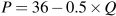 .)
.)
Determine the equilibrium admission price, and the amount of revenue generated from ticket sales for each game.
A local alumnus and benefactor offers to install 6 more seats at no cost to the University. Compute the price that would be charged with this new supply and compute the revenue that would accrue at this new equilibrium price. Should the University accept the offer to install the seats?
Redo the previous part of this question, assuming that the initial number of seats is 40, and the University has the option to increase capacity to 46 at no cost to itself. Should the University accept the offer in this case?
Suppose farm workers in Mexico are successful in obtaining a substantial wage increase. Illustrate the effect of this on the price of lettuce in the Canadian winter, using a supply and demand diagram, on the assumption that all lettuce in Canada is imported during its winter.