Social Sci LibreTexts

2.2: Images

  • Page ID
    201918
  • \( \newcommand{\vecs}[1]{\overset { \scriptstyle \rightharpoonup} {\mathbf{#1}} } \)

    \( \newcommand{\vecd}[1]{\overset{-\!-\!\rightharpoonup}{\vphantom{a}\smash {#1}}} \)

    \( \newcommand{\id}{\mathrm{id}}\) \( \newcommand{\Span}{\mathrm{span}}\)

    ( \newcommand{\kernel}{\mathrm{null}\,}\) \( \newcommand{\range}{\mathrm{range}\,}\)

    \( \newcommand{\RealPart}{\mathrm{Re}}\) \( \newcommand{\ImaginaryPart}{\mathrm{Im}}\)

    \( \newcommand{\Argument}{\mathrm{Arg}}\) \( \newcommand{\norm}[1]{\| #1 \|}\)

    \( \newcommand{\inner}[2]{\langle #1, #2 \rangle}\)

    \( \newcommand{\Span}{\mathrm{span}}\)

    \( \newcommand{\id}{\mathrm{id}}\)

    \( \newcommand{\Span}{\mathrm{span}}\)

    \( \newcommand{\kernel}{\mathrm{null}\,}\)

    \( \newcommand{\range}{\mathrm{range}\,}\)

    \( \newcommand{\RealPart}{\mathrm{Re}}\)

    \( \newcommand{\ImaginaryPart}{\mathrm{Im}}\)

    \( \newcommand{\Argument}{\mathrm{Arg}}\)

    \( \newcommand{\norm}[1]{\| #1 \|}\)

    \( \newcommand{\inner}[2]{\langle #1, #2 \rangle}\)

    \( \newcommand{\Span}{\mathrm{span}}\) \( \newcommand{\AA}{\unicode[.8,0]{x212B}}\)

    \( \newcommand{\vectorA}[1]{\vec{#1}}      % arrow\)

    \( \newcommand{\vectorAt}[1]{\vec{\text{#1}}}      % arrow\)

    \( \newcommand{\vectorB}[1]{\overset { \scriptstyle \rightharpoonup} {\mathbf{#1}} } \)

    \( \newcommand{\vectorC}[1]{\textbf{#1}} \)

    \( \newcommand{\vectorD}[1]{\overrightarrow{#1}} \)

    \( \newcommand{\vectorDt}[1]{\overrightarrow{\text{#1}}} \)

    \( \newcommand{\vectE}[1]{\overset{-\!-\!\rightharpoonup}{\vphantom{a}\smash{\mathbf {#1}}}} \)

    \( \newcommand{\vecs}[1]{\overset { \scriptstyle \rightharpoonup} {\mathbf{#1}} } \)

    \( \newcommand{\vecd}[1]{\overset{-\!-\!\rightharpoonup}{\vphantom{a}\smash {#1}}} \)

    \(\newcommand{\avec}{\mathbf a}\) \(\newcommand{\bvec}{\mathbf b}\) \(\newcommand{\cvec}{\mathbf c}\) \(\newcommand{\dvec}{\mathbf d}\) \(\newcommand{\dtil}{\widetilde{\mathbf d}}\) \(\newcommand{\evec}{\mathbf e}\) \(\newcommand{\fvec}{\mathbf f}\) \(\newcommand{\nvec}{\mathbf n}\) \(\newcommand{\pvec}{\mathbf p}\) \(\newcommand{\qvec}{\mathbf q}\) \(\newcommand{\svec}{\mathbf s}\) \(\newcommand{\tvec}{\mathbf t}\) \(\newcommand{\uvec}{\mathbf u}\) \(\newcommand{\vvec}{\mathbf v}\) \(\newcommand{\wvec}{\mathbf w}\) \(\newcommand{\xvec}{\mathbf x}\) \(\newcommand{\yvec}{\mathbf y}\) \(\newcommand{\zvec}{\mathbf z}\) \(\newcommand{\rvec}{\mathbf r}\) \(\newcommand{\mvec}{\mathbf m}\) \(\newcommand{\zerovec}{\mathbf 0}\) \(\newcommand{\onevec}{\mathbf 1}\) \(\newcommand{\real}{\mathbb R}\) \(\newcommand{\twovec}[2]{\left[\begin{array}{r}#1 \\ #2 \end{array}\right]}\) \(\newcommand{\ctwovec}[2]{\left[\begin{array}{c}#1 \\ #2 \end{array}\right]}\) \(\newcommand{\threevec}[3]{\left[\begin{array}{r}#1 \\ #2 \\ #3 \end{array}\right]}\) \(\newcommand{\cthreevec}[3]{\left[\begin{array}{c}#1 \\ #2 \\ #3 \end{array}\right]}\) \(\newcommand{\fourvec}[4]{\left[\begin{array}{r}#1 \\ #2 \\ #3 \\ #4 \end{array}\right]}\) \(\newcommand{\cfourvec}[4]{\left[\begin{array}{c}#1 \\ #2 \\ #3 \\ #4 \end{array}\right]}\) \(\newcommand{\fivevec}[5]{\left[\begin{array}{r}#1 \\ #2 \\ #3 \\ #4 \\ #5 \\ \end{array}\right]}\) \(\newcommand{\cfivevec}[5]{\left[\begin{array}{c}#1 \\ #2 \\ #3 \\ #4 \\ #5 \\ \end{array}\right]}\) \(\newcommand{\mattwo}[4]{\left[\begin{array}{rr}#1 \amp #2 \\ #3 \amp #4 \\ \end{array}\right]}\) \(\newcommand{\laspan}[1]{\text{Span}\{#1\}}\) \(\newcommand{\bcal}{\cal B}\) \(\newcommand{\ccal}{\cal C}\) \(\newcommand{\scal}{\cal S}\) \(\newcommand{\wcal}{\cal W}\) \(\newcommand{\ecal}{\cal E}\) \(\newcommand{\coords}[2]{\left\{#1\right\}_{#2}}\) \(\newcommand{\gray}[1]{\color{gray}{#1}}\) \(\newcommand{\lgray}[1]{\color{lightgray}{#1}}\) \(\newcommand{\rank}{\operatorname{rank}}\) \(\newcommand{\row}{\text{Row}}\) \(\newcommand{\col}{\text{Col}}\) \(\renewcommand{\row}{\text{Row}}\) \(\newcommand{\nul}{\text{Nul}}\) \(\newcommand{\var}{\text{Var}}\) \(\newcommand{\corr}{\text{corr}}\) \(\newcommand{\len}[1]{\left|#1\right|}\) \(\newcommand{\bbar}{\overline{\bvec}}\) \(\newcommand{\bhat}{\widehat{\bvec}}\) \(\newcommand{\bperp}{\bvec^\perp}\) \(\newcommand{\xhat}{\widehat{\xvec}}\) \(\newcommand{\vhat}{\widehat{\vvec}}\) \(\newcommand{\uhat}{\widehat{\uvec}}\) \(\newcommand{\what}{\widehat{\wvec}}\) \(\newcommand{\Sighat}{\widehat{\Sigma}}\) \(\newcommand{\lt}{<}\) \(\newcommand{\gt}{>}\) \(\newcommand{\amp}{&}\) \(\definecolor{fillinmathshade}{gray}{0.9}\)

    In this section, we provide recommendations to guide your inclusion of accessible, image-based content.

    What are images?

    Images are non-text elements that include photographs, illustrations, diagrams, pictures, charts, graphs, and maps.

    Additional Factors to Pay Attention To:
    • NO BMP figures are allowed to be imported. Avoid TIFF. Use PNG, JPG, GIF figures instead.
    • Please CROP your figures to remove superfluous white space that makes reading your module awkward. The Microsoft Office Picture Editor or Paint will crop images and is free on MS operating systems.
    • All figures constructed for this project must have the original image files used uploaded to the LibreTexts, preferable in the module itself. DO NOT HOTLINK images. Hotlinks in general are prone to vaporization.

    Why are you including the images you have selected?

    Before you can determine what to do to make an image accessible, you must identify its purpose or value to your textbook. Consider the following questions:

    1. Does your image serve a functional purpose? In other words, is it conveying non-text content to students? If so, you should:
      1. provide a text alternative that serves the equivalent purpose of the non-text material[1]
      2. not use colour as the only visual means of conveying information[2]
    2. Does your image serve more of a decorative purpose? In other words, is it primarily a design element that does not convey content? If so, you should:
      1. avoid unnecessary text descriptions

    Who are you doing this for?

    This work supports students who:

    • Are blind or have low vision, like Jacob
    • Have poor contrast vision
    • Are colour blind and cannot differentiate between certain colours
    • Use a device with monochrome display
    • Use a print copy that is in black and white
    • Have limited Internet access and cannot download images
    • Have a form of cognitive disability

    Jacob is blind


    What do you need to do?

    Determine the role of each image used in content as either functional or decorative. Once that has been decided, select how each image will meet accessibility needs by providing descriptive text in a variety of ways. Figures, such as charts and graphs that rely on color to convey information, should also be evaluated for accessibility by students who are unable to distinguish between or see color.

    Functional images

    Consider what your content page would look like if the images didn’t load. Now try writing alternative text for each image that would work as a replacement and provide the same information as the image.

    There are three ways to provide alternative text descriptions for images:

    1. Describe the image in the surrounding text.
    2. Describe the image in the alt tag.
    3. Create and link to a long description of the image.
    Note

    LibreTexts has not settled on a uniform way of handling long alt texts. You may want to consider the HTML longdesc attribute

    As you work on developing your alternative text descriptions, keep the following recommendations and guidelines in mind:

    • Remember that alternative text must convey the content and functionality of an image, and is rarely a literal description of the image (e.g., “photo of cat). Rather than providing what the image looks like, alternative text should convey the content of the image and what it does.[3]
    • For relatively simple images (e.g., photographs, illustrations), try to keep your text descriptions short. You should aim to create a brief alternative (one or two short sentences) that is an accurate and concise equivalent to the information in the image.
    • For more complex images (e.g., detailed charts, graphs, maps), you will need to provide more than a one- or two-sentence description to ensure all users will benefit from the content or context you intend to provide.
    • Leave out unnecessary information. For example, you do not need to include information like “image of…” or “photo of…”; assistive technologies will automatically identify the material as an image, so including that detail in your alternative description is redundant.
    • Avoid redundancy of content in your alternative description. Don’t repeat information that already appears in text adjacent to the image.

    For strategies on how to make complex visuals such as graphs, tables, charts, and more accessible, see the following resource created by Supada Amornchat (CC BY-NC-SA): Describing Complex Images for All Learners [PDF].

    If you need to describe images that appear in assessments, see the NWEA Image Description Guidelines for Assessments [PDF]. LibreTexts online assessment system ADAPT allows for an alternate question to be substituted if necessary and LibreTexts H5P Studio rates each question for accessibility.

     Descriptions in surrounding text

    You can use the surrounding text to provide the same information as conveyed by the image. This is often the best option for complex images because it makes the information available for everyone, not just those using the alt tags.

    If you are editing someone else’s work for accessibility, you are probably not at liberty to start adding to the main text. However, if you are the author, this is the best and easiest option.

    If an image has been adequately described in the surrounding text, you can either provide a few-word description of the image in the alt tag or follow the procedures for decorative images.

    Alt tags

    An alt tag refers to the alt attribute (alt is short for alternative) within an IMG tag. All images uploaded into Pressbooks have an alt tag, but for them to be useful, you need to insert an image description.

    Alt tags are used in two cases:

    1. When an image doesn’t download due slow Internet, the alt tag content will display instead of the image.
    2. For people who are visually impaired and use screen readers, when a screen reader finds an image, it will read out the content of the alt tag.

    Alt tags should be no longer than 125 characters, including spaces and punctuation.[4] This is because when a screen reader finds an image, it will say “Graphic” before reading out the alt tag. If the alt tag is longer than 125 characters, the screen reader will interrupt the flow of text and say “Graphic” again, before continuing to read out the alt tag. This can be confusing. For images that require descriptions longer than 125 characters, see the section on long descriptions.

    To edit an image’s alt tag in Pressbooks, click on the image and select the PENCIL icon (edit). Under image details, there will be two textboxes: one titled “Caption” and one titled “Alternative Text.” The “Caption” box contains the image’s caption, which appears under the image in the visual editor. The “Alternative Text” box is where you describe the image.

    Long descriptions

    Complex images, especially charts or graphs, will often require descriptions longer than 135 characters and it may not always be possible to add an explanation to the surrounding text. Modern screen readers no longer have a 135 character limit for alt text, although longer ones may try the patience of the reader (both human and computer)

    Note

    LibreTexts has not settled on a uniform way of handling long alt texts. You may want to consider the HTML longdesc attribute

    How to set up a long description for an image in Pressbooks

    Figure 1.1 shows an image from Introduction to Sociology – 2nd Canadian Edition that requires a longer description than what can fit in an alt tag. As such, at the end of the caption, there is a link to the image’s description.

    Anyone using this textbook can access this image description by clicking on the [Image description] link, which will take them to the image description at the end of the chapter (or by flipping to the end of the chapter in the print version). This will also work for people using screen readers who are navigating through the book with a keyboard.

    Decorative images

    If an image does not add meaning, i.e., if it’s included for decorative or design purposes only, or if the image is adequately described in the caption and/or surrounding text, it doesn’t need an alt tag. Including alternative text descriptions for decorative images “simply slows the process down with no benefit because the screen-reading software vocalizes the content of the [alternative text description], whether that alternative text adds value or not.”[5]

    When the alt tag is left blank, the screen reader will not announce the presence of the image and will skip to the next content.

    Using color

    Consider what your images would look like if they only displayed in black and white. Would any necessary context or content be lost if the color was “turned off?” Images should not rely on color to convey information; if your point requires color, you may need to edit or format the image so the concepts presented are not lost to those who are color blind or require high contrast between colours.

    Example 1: Inaccessible Bar Chart

    In Chart 1, color is the only means by which information is conveyed. For students who are color blind, have poor contrast vision, or are using a black-and-white print copy (see Chart 2), relevant information is lost.

    Chart 1: In this bar chart, color is the sole means of communicating the data.
    Bar chart viewed in greyscale

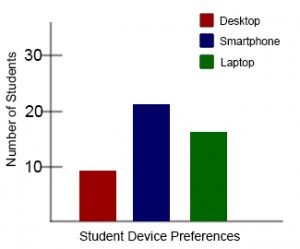
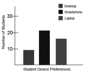
    Chart 2: This view of the same bar chart displays how the chart might appear to a student who is color blind, or whose device does not display colour. All of the meaningful data is lost.


    Example 2: Accessible Bar Chart

    Students who are color blind can distinguish between high-contrast shades. In Chart 3, contextual labels have been added to each bar at the bottom of the chart. Note that the chart will still require an alt tag.

    Modified bar chart with high-contrast colours and labels

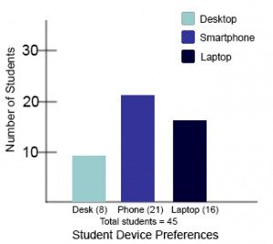
    Chart 3: In this view of the bar chart, high-contrast colours have been used so that shading differences will still display in grey scale. Text labels have also been added so that the data is not just being communicated with color.

    Media Attributions


    1. "Web Content Accessibility Guidelines (WCAG) 2.0: Guideline 1.1," W3C, accessed March 27, 2018, http://www.w3.org/TR/WCAG20/#text-equiv.
    2. "Web Content Accessibility Guidelines (WCAG) 2.0: Guideline 1.4.1," W3C, accessed March 27, 2018, http://www.w3.org/TR/WCAG20/#visual-audio-contrast.
    3. "Alt text blunders," WebAIM, accessed March 27, 2018, http://webaim.org/articles/gonewild/#alttext.
    4. All screen readers are different, so a 125-character max is a recommendation. Other sources may provide a different number.
    5. "Top 10 Tips for Making Your Website Accessible," UC Berkeley: Web Access, accessed March 27, 2018, https://webaccess.berkeley.edu/resou...accessible-alt.

    2.2: Images is shared under a CC BY 4.0 license and was authored, remixed, and/or curated by LibreTexts.

    • Was this article helpful?