We’re going to start by thinking about filtering as a frequency-domain operation, in which we suppress some frequencies and pass others. If you don’t already know how filtering works in the frequency domain, I recommend that you read the first 10 pages in Chapter 7 of Luck (2014) before you go any further.
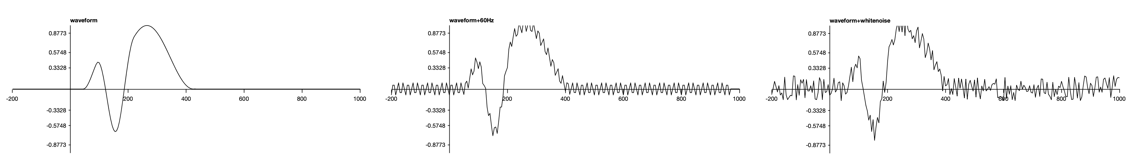
If EEGLAB is running, quit it and restart it so that everything is fresh. Set Chapter_4 to be Matlab’s current folder. Load the ERPset file named waveforms.erp (EEGLAB > ERPLAB > Load existing ERPset) and plot the waveforms (EEGLAB > ERPLAB > Plot ERP > Plot ERP waveforms). It should look something like Screenshot 4.1.
Screenshot 4.1
You can see that we have three channels. I created the waveforms in Excel. The first channel is an artificial waveform that I created by summing together three simulated ERP components, each of which was one cycle of a cosine function. The second channel is the sum of the first channel and a 60 Hz sine wave (like the line noise that is often picked up from electrical devices in the recording environment). The third channel is the sum of the first channel and some random noise (similar to the noise that is produced by tonic muscle activity and picked up by our EEG electrodes).
Line Noise
AC electrical lines run at 60 Hz in North America and some other parts of the world. Other regions use 50 Hz. We often call this the line frequency to be agnostic about whether it is 50 or 60 Hz. The noise produced by this signal is called line noise.
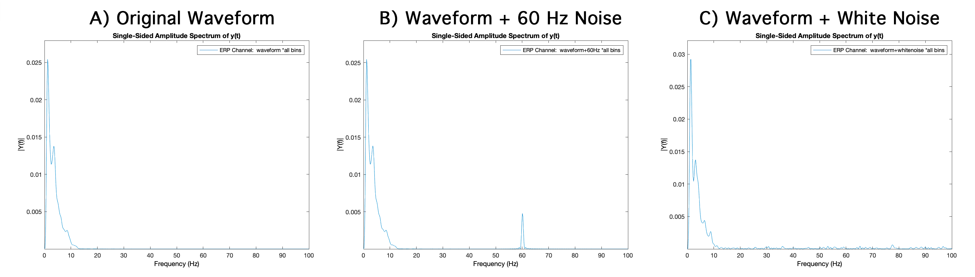
Before we filter the data, let’s perform a Fourier transform on these waveforms so that we can see their frequency content. To do this for the original waveform, select ERPLAB > Filter & Frequency Tools > Plot amplitude spectrum for ERP data. In the window that pops up, specify channel1 and bin1. For the Frequency range to plot, set F1 to 0 and F2 to 100. You should see something like Screenshot 4.2.A. The X axis is the frequency, and the Y axis is the amplitude at this frequency. This plot tells us that we could reconstruct the original time-domain waveform by summing together a set of sinusoids with the set of amplitudes shown at each frequency in the plot. We’d also need to know the phase at each frequency to reconstruct the original waveform, but phase information isn’t usually shown with ERP data. You can get a quick introduction to the Fourier transform in Chapter 6 of my online Introduction to ERPs course (or just watch this YouTube video). You can find a more detailed treatment in Chapters 7 and 12 of Luck (2014).
Screenshot 4.2
As you can see from the plot, the original ERP waveform mostly consists of relatively low frequencies. This is fairly typical of the waveforms you would see in most perceptual, cognitive, and affective experiments. In low-level sensory experiments, you might see more high-frequency activity.
Now repeat the process with Channel 2, which should produce something like Screenshot 4.2.B. It’s the same as the amplitude spectrum for the original waveform, except that there is also activity at 60 Hz. This is because I created Channel 2 by summing together the original waveform and a 60-Hz waveform. Now do the same thing for Channel 3. As shown in Screenshot 4.2.C, you can see some activity at all frequencies. Also, the low-frequency activity is slightly different from the original waveform, because the noise extends down to these frequencies. This broad band of frequencies occurred because I added white noise to the original waveform, and white noise consists of equal amount of all frequencies (just as white light consists of approximately equal amounts of all wavelengths in the visible spectrum).
When you’re first starting out in ERP research, you should plot Fourier transforms like these prior to filtering so that you have a good idea of the frequency content of the noise in your data. This can help you figure out where the noise is coming from (because different sources of noise have different frequency content). By knowing where the noise is coming from, you may be able to eliminate it in future recordings. It’s better to reduce the noise before it contaminates your data rather than relying on filters and other signal processing techniques. For reasons described in Luck (2014), I call this Hansen’s Axiom: “There is no substitute for clean data.” As we will see later in this chapter, filters reduce the temporal precision of your data. And isn’t temporal precision one of the most important features of the ERP technique?