
1.17: Population
- Last updated
- Save as PDF
- Page ID
- 53286

Demography is the scientific study of population growth and change. Everything in society influences demography and demography conversely influences everything in society. After World War II, the United States began to recover from the long-term negative effects of the war. Families had been separated, relatives died or were injured, and women who had gone to the factories then returned home at war's end. For about 4 years goods and services were rationed and the government had assumed war-time powers which they thought limited the civil rights of the average citizen. It was an era of social and cultural upheaval.
The year 1946 reflected the impact of that upheaval in its very atypical demographic statistics. Starting in 1946 people married younger, had more children per woman, divorced then remarried again, and kept having one child after another. From 1946 to 1956 the birth rate rose and peaked, then began to decline again. By 1964 the national high birth rate was finally back to the level it was at in 1946. All those millions of children born from 1946-1964 were called the Baby Boom Generation (there are about 78 million of them alive today, see Chapter 12). Why was there such a change in family-related rates? The millions of deaths caused by the war, the long-term separation of family members from one another, and the deep shifts toward conservative values all contributed. The Baby Boom had landed. And after the Baby Boom Generation was in place, it conversely affected personal and larger social levels of society in every conceivable way.
The Formula
In this chapter you will learn how financial, educational, spiritual, cultural, and emotional social forces shape and form the demographic trends within a society. You'll also get a glimpse of how demographic forces shape your society. The core of demographic studies has three component concerns: births, deaths, and migration. All of demography can be reduced to this very simple formula:
(Births-Deaths) +/- ((In-Migration)-(Out Migration))=Population Change.
This part of the formula, (Births-Deaths) is called Natural increase, or all births minus all the deaths in a given population over a given time period. The other part of the formula, ((In-Migration)-(Out Migration)) is called Net Migration which is all the in-migration minus all the out-migration in a given population over a given time period. Population Change is then added to a previous year's population to yield new population estimate. Most official population counts really are estimates. There are mistakes in counting that render results that are close, but never perfectly accurate.
Let's consider this formula by first looking at the US population in 1990. Census Enumeration is the formal counting of a population by its government. Based on the US Census, the US population was 248,709,000 (retrieved 7 April, 2009 from http://www.census.gov/main/www/cen1990.html ). If you start the estimate with the 1990 population, you can run the numbers through the formula and derive an end of year 1999 population estimate. You can see the results of adding all the US birth, death, and migration data for 1990-1999 in Table 1 below.
Table 1. Numbers of Births, Deaths, and Net Migrationa for the United States between 1990-1999b
| Births | - Deaths | + Net Migration | = Population Change |
|---|---|---|---|
| 39,860,000 | 22,711,000 | 9,580,000 | +26,729,000 |
a Net Migration=(In-Migration)-(Out-Migration) or (9,800,000)-(220,000)=(9,580,000)
b Data collected from two sources retrieved 7 April, 2009: Martin, P. & Midgley, E. (2003) "Immigration: Shaping and Reshaping America," Vol. 58, No. 2 Population Bulletin from www.prb.org; and www.census.gov Table 77. Live Births, Deaths, Marriages, and Divorces: 1960-2006.By the end of 1999 the population was estimated to be (1990)+(1990-1999 population change)=1999 population or (248,709,000)+(26,729,000)=275,438,000. These estimates are very close to the actual July 1st, 1999 US Census estimates (retrieved 7 April, 2009 from http://www.michigan.gov/documents/90...eg_26029_7.pdf US POPULATION 1790-2000).
Table 2 lists the 10 most populated countries of the world in 2008 and the US ranks 3rd in 2008. The US is one of the most populated nations of the world and is estimated to continue to rank 3rd even in 2050. Interestingly, in 2050, India will rank 1st and China 2nd (see Table 3 for the details).
Table 2. The Ten Most Populated Countries in the World, 2008*
| Country | Estimated Population | |
|---|---|---|
| 1 | China | 1,324,700,000 |
| 2 | India | 1,149,300,000 |
| 3 | United States | 304,500,000 |
| 4 | Indonesia | 239,900,000 |
| 5 | Brazil | 195,100,000 |
| 6 | Pakistan | 172,800,000 |
| 7 | Nigeria | 148,100,000 |
| 8 | Bangladesh | 147,300,000 |
| 9 | Russia | 141,900,000 |
| 10 | Japan | 127,700,000 |
Retrieved 7 April, 2009 from http://www.prb.org/pdf08/08WPDS_Eng.pdf
Table 3. The Ten Most Populated Countries in the World, 2050*
| Country | Estimated Population | |
|---|---|---|
| 1 | India | 1,755,200,000 |
| 2 | China | 1,437,000,000 |
| 3 | United States | 438,200,000 |
| 4 | Indonesia | 343,100,000 |
| 5 | Pakistan | 295,200,000 |
| 6 | Nigeria | 282,200,000 |
| 7 | Brazil | 259,800,000 |
| 8 | Bangladesh | 215,100,000 |
| 9 | Congo, De. Rep. | 189,300,000 |
| 10 | Philippines | 150,100,000 |
Retrieved 7 April, 2009 from http://www.prb.org/pdf08/08WPDS_Eng.pdf
United States Population and Key Rates
Figure 1 shows the US population for selected years between 1790 (the 1st US Census) and 2009 (estimated by the US Census Bureau). At its first official Census, the US had more than 4 million inhabitants, but it failed to count Natives, Blacks, and other racial groups. In the 219 years represented in Figure 1, you can see that the US population has increased nearly 78 times since its 1790 count-this taking into consideration all the births, all the deaths, and all the in-out migration. The US continues to grow in our day and will in coming years.
Figure 1. Estimated Population of the United States for Selected Years 1790-2009*
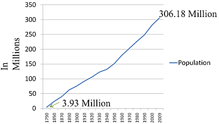
*Retrieved 9 April, 2009 from Table 1: Population Bulletin, Vol. 57, No 4 What Drives US Population Growth? Dec, 2002 http://www.prb.org/Source/57.4WhatDr...Population.pdf; Statistical Abstracts of the US, 1997 Table 1; 2009 estimated retrieved from www.census.gov
Let's look at the birth rates for the US compared to the current highest birth rate state, Utah, and the current lowest birth rate state, Vermont, between the years 1991-2006. But, first we need to define rates. The Crude Birth Rate is the number of live births per 1,000 people living in the population. It's called crude because it ignores age-specific risks of getting pregnant. Figure 2 shows these rates and clearly indicates the higher rates for Utah in comparison to the US and Vermont. Before 1991, Alaska often competed with Utah for the highest state birth rate. Vermont is the lowest state rate today, but has also competed with Maine in past years.
Figure 2. Estimated Crude Birth Rates per 1,000 Population of the United States, Utah, and Vermont for Selected Years 1991-2006*
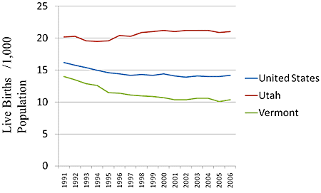
*Retrieved 9 April, 2009 from Table 77 Live Births, Deaths, Marriages, and Divorces: 1960-2006; Statistical Abstracts of the US and 1990-2006 from 1990-2006 data retrieved 9 April, 2009 from 205.207.175.93/VitalStats/Tab...tableView.aspx
There are other rates to measure births between populations. Demographers use slightly different terminology than the average person when describing a woman's ability to get pregnant. True Rate is the "Number of events/ Number" at risk of the event. In other words, the Crude Birth Rate is not a true rate because it includes children, males and the elderly in the denominator of "1,000 population." To demographers, Fertility is a measure of the number of children born to a woman.
Total Fertility Rate is the total number of children ever born to a woman calculated both individually and at the societal level. Fecundity is the physiological ability to conceive or give birth to children. In Table 4 you can see some of the striking differences in Crude Birth and Total Fertility Rates. To understand these data you need to understand the term, More Developed Nations are nations with comparably higher wealth than most countries of the world including: Western Europe; Canada, United States, Japan, New Zealand, and Australia. Less Developed Nations are nations located near to or south of the Equator which have less wealth and more of the world's population of inhabitants including: Africa, India, Central and South America, most island nations, and most of Asia (Excluding China). China has the most strict fertility policy in the world and is often excluded from the rest of Asia in most official reports.
Table 4. Crude Birth Rates and Total Fertility Rates for Selected Regions and Countries*
| Country or Region | Crude Birth Rates CBR | Total Fertility Rates TFR |
|---|---|---|
| More developed | 12 | 1.6 |
| Less Developed | 23 | 2.8 |
| Africa | 37 | 4.9 |
| Latin America/Caribbean | 21 | 2.5 |
| Asia (Excluding China) | 23 | 2.4 |
| China | 12 | 1.6 |
| Liberia | 50 | 6.8 |
| Canada | 11 | 1.6 |
| Mexico | 20 | 2.3 |
| United States | 14 | 2.1 |
| Italy | 9 | 1.3 |
| Japan | 9 | 1.0 |
| World | 21 | 2.6 |
*From 2008 World Population Data Sheet: Demographic Data and Estimates for the Countries and Regions of the World.
Africa is the "birth hot spot" of the world and has been since about 1950. It has a projected population change of an increase of 100 percent between the years 2008-2050. A few African nations are higher and some are a bit lower. Uganda for example should experience a 263 percent increase while Swaziland should experience a 33 percent decline. The 6.8 TFR for Liberia means that the average woman is expected to have 6.8 children there. In the US it is only 2.1. This is an important indicator of population change because there is a principle which states that it requires a minimum TFR of 2.1 for the population to replace the man and woman who made the children and a TFR of 2.3 to begin to expand the population. Thus you can see from Table 4 that the less-developed regions of the world (especially Africa) are expected to grow, while the more developed (especially Japan) should not grow. Japan should decrease by 25 percent between 2008-2050.
Theories and Principles
Doubling Time is the time required for a population to double if the current growth rate continues. To calculate the doubling time you simply divide 70 by the current growth rate of the country and that yields the number of years required for the double. Table 5 shows the growth rates and estimated doubling times for selected countries based on 2008 estimates. The world's population should double in 58 years. Liberia on the other hand should double its population in only 23 years.
In fact, most of the world's population now lives in the less developed regions of the world and they will double in about 47 years. There are approximately 68 percent of the 6.7 billion peoples of this world who now live in less developed countries (roughly 4.56 billion people). In the year 2055 (the year 2008 + 47 years=2055) there should be 9.12 billion people living in the less developed regions of the world. The more developed regions of the world will not double in any of our lifetimes (it would be the year 2358 according to these data).
Zero Population Growth occurs when a population neither shrinks nor expands from year to year. Based on other factors in the demographic equation, including death and migration, you can see various results. To understand why some countries have higher or lower rates, you must first understand some theoretical backgrounds.
There are two distinct perspectives that relate to births in a population. Antinatalist is a perspective which opposes childbearing and Pronatalist is a perspective which promotes birth and increased population. Antinatalists oppose birth, support contraceptive, abortions, and sterilization along with the education of women. Educating a woman is the most effective way of lowering her fertility. Pronatalists support birth, large families, extended families, and the governmental support of childbearing.
Table 5. Growth Rates and Doubling Times for Selected Countries 2008*
| Country or Region | Growth Rate | Doubling Time in Years |
|---|---|---|
| More developed | 0.2 | 350 |
| Less Developed | 1.5 | 47 |
| Africa | 2.4 | 29 |
| Latin America/Caribbean | 1.5 | 47 |
| Asia (Excluding China) | 1.5 | 47 |
| China | 0.5 | 140 |
| Liberia | 3.1 | 23 |
| Canada | 0.3 | 233 |
| Mexico | 1.6 | 44 |
| United States | 0.6 | 116 |
| Italy | 0.0 | Can't Calculate |
| Japan | 0.0 | Can't Calculate |
| World | 1.2 | 58 |
*From 2008 World Population Data Sheet: Demographic Data and Estimates for the Countries and Regions of the World.
The US had an antinatalist perspective until then President Ronald Reagan changed the US foreign policy in the 1984 population conference held in Mexico City. President Bill Clinton eventually changed it back to antinatalist. George W. Bush changed it back to pronatalist and President Barack Obama changed it back to antinatalist again. Once a US President chooses the nation's perspective, international and local policies come into effect by supporting pro-or antinatalist programs.
The first Antinatalist was Thomas Malthus (1766-1834). He was a Reverend and English scholar who took a strong stance against the unprepared parents of his day. To him "prepared parents" had established their education and livelihood, their household, and their marriage before they considered getting pregnant. Keep in mind that there were very few effective methods of birth control at this time, so Malthus came across as a hardliner against parenting. He published half a dozen editions of his work, An Essay on the Principles of Population (1798-1830) which were extremely controversial, yet carefully read by many influential people of his day.
For Malthus the problem was that populations grew more rapidly than the production of food, which to him was the cause of many social ills in the new industrial societies of Europe. See Figure 3 for a graph depicting the shortage. He declared that no sex before marriage, forced sterilization, and criminal treatment of unprepared parents would be the new conservative norm.
Indeed history has shown that famines, wars, plagues, and other terrible conditions do occur. The antinatalists blame too many babies and people, too much destruction of the natural environment, the existence of the traditional family, and capitalistic profit-seeking at the cost of global well-being. A contemporary antinatalist named Paul Ehrlich wrote the book, The Population Bomb in 1968 (Ballantine Books). He is considered to be a Neo-Malthusian, or an antinatalist who agrees with Malthus, but rejects his conservative and religious proscriptions. Much of the governmental organizations in the world today are antinatalistic.
Figure 3. The Malthus Graph Depicting the Shortage That Occurs When Population Growth Exceeds Food Production Capacity.
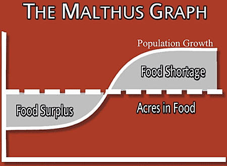
© 2009 Ron J. Hammond, Ph.D.
The pronatalists point out that there is plenty of food in the world and always has been. They blame political and social mismanagement for the social ills, not the high birth rates. Look at Figure 4 below to see the estimated world population from 10,000 BC to 2009 AD (these are only estimated since there were very few government statistics prior to the industrial revolution).
You can clearly see that there were millions and millions of people on the earth throughout the history of the world. Pronatalists argue that for the most part, civilizations ate, lived, and thrived and still do today. When they starved it was typically some political or natural disaster factor not a Malthusian shortage that explained it. Besides, they argue, Malthus underestimated the enormous gains in medical, agricultural, environmental, political, and other sciences that have given this world the highest standard of living it has ever known. Do you feel a bit confused? Truth is that there is ample evidence to support both antinatalist's and pronatalist's perspectives. Bottom line is that the World Health Organization, World Bank, United Nations, United States, and all of the other more developed nations of the world are Neo-Malthusian/Antinatalistic to some degree or another. While the people of the less developed regions of the world live a pronatalist's lifestyle and thereby are mainly responsible for the rapidly increasing growth of births into the world population.
Figure 4. World Population Estimates in Millions for 10,000 BC to 2009 AD*
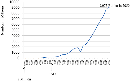
*Retrieved 9 April 2009 from US Census Bureau 's Historical estimates of the World's Population (10,000 BC to 1950 AD) www.census.gov/ipc/www/worldhis.html and from Historical World Population Estimates From Year 0 to 2050 How many people have ever lived on Earth? www.prb.org/Journalists/FAQ/W...opulation.aspx
Look at Table 6 below to see how fast the US and World are growing by seconds, minutes, hours, etc. In the US, every hour 432 babies are born, totaling up to about 3,784,320 in a year (please note that this estimate tends to be lower than the actual number reported by the US's Vital Statistics at 4.2 million births, because estimates are calculate base on previous years' rates, whereas the Vital Statistics are actual counts made 2 years after the actual data has been collected and tabulated.
In the world, every hour 15,834 babies are born adding up to 138,715,000 per year. Wow, that's just a great deal of babies! How do you suppose anti- and pronatalists might respond to these data? You're probably right, in totally opposite camps.
| Births Per: | United States | World |
|---|---|---|
| Second | 0.12 | 4.40 |
| Minute | 7.20 | 264.00 |
| Hour | 432.00 | 15,835.00 |
| Day | 10,368.00 | 380,041.00 |
| Year | 3,784,320.00 | 138,715,000.00 |
| Deaths Per: | United States | World |
|---|---|---|
| Second | 0.08 | 1.80 |
| Minute | 4.80 | 108.00 |
| Hour | 288.00 | 6,481.00 |
| Day | 6,912.00 | 155,553.00 |
| Year | 2,522,880.00 | 56,777,000.00 |
*Retrieved 9 April, 2009 from www.census.gov/population/www/popclockus.html and from www.prb.org/Articles/2008/wor...clock2008.aspx
Look at the deaths in table 6. Think about it. If you can hold your breath for 30 seconds, about 2 people will die in the US and over 54 will die worldwide during that time. Death is the termination of the body, its systems, and brain activity in an irreversible way. Death is a part of life. All of us are at risk of dying, but not all of us share the same risks. To be born around or below the equator, female, tribal, and non-white represents risk factors not shared by those born in the US, female, suburban, and non-white (think about Max Weber's Life Chances). In fact, in many cases migrants to the US raise their life expectancies higher than they would have been back in their less developed home countries.
Figure 5 shows the top 10 causes of death in the US. Heart disease is and has been the number 1 killer in the US for decades. Heart disease has lead world-wide causes of death for decades as well. The top 4 causes are highly correlated with tobacco use. And since smoking is becoming much more common in less developed countries, cancer is predicted to become the number 1 cause of death world-wide by 2010 with over 40 percent of the world's smokers living in China and India (retrieved 10 April, 2009 from www.foxnews.com/story/0,2933,464184,00.html).
In less developed nations there are other significant causes of death that we don't worry about here as much. Malaria, AIDS, accidents, maternal death, diarrhea, Measles, Mumps, Rubella, local exotic diseases, and other infectious and parasitic diseases. In fact, AIDS or Acquired Immune Deficiency Syndrome is much more common in Africa and parts of Asia than in any other region of the world. Heterosexuality is sex between a man and woman and is the most common way of transmitting AIDS throughout the world. Scientists from many different disciplines study and track diseases such as AIDS and the others.
Epidemiology is the scientific study of diseases, their transmission, and their management. The US has the most advanced disease tracking and epidemiological management system which is found at the Center for Disease Control, Atlanta, Georgia (http://www.cdc.gov/ ). On this website you can click on "Traveler's Alerts" and choose a country to see if there are any disease concerns for tourists (wwwn.cdc.gov/travel/default.aspx ). Go to the website, pick a country and read up about their current disease concerns and shots you should get in preparation to visit another country.
Figure 5. Top 10 Major Causes of Death in the United States 2005*
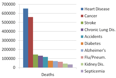
*Retrieved 10 April 2009 from CDC Leading Causes of Death 2005 Table C http://www.cdc.gov/nchs/FASTATS/lcod.htm
Because we have so many visiting and migrating to and from the US, it is in the CDC's best interest to be globally concerned and involved. The CDC concerns itself with all diseases in every country. Demographers also concern themselves with a number of death-related rates. The Crude Death Rate is the number of deaths in a given population per 1,000 people living in that population. Again, this is not a true rate because not all members of society have the same risks of dying (IE: 30 year-olds not at the same risks of death as 80 year-olds). The Infant Mortality Rate is the number of infant deaths per 1,000 live births. The CDR and IMR vary greatly between countries and regions (See Table 7 below).
The nation with the worst Crude Death Rate is Sierra Leone at 23. The best CDR's are found in the Middle East (Qatar and the United Arab Emirates at 2). The nations with the worst IMR happen to be Afghanistan at 163 and Sierra Leone at 158. The best IMR is found in Iceland at 1.3. The US does not have the best IMR. This is most likely a consequence of not having universal medical care. Table 7 shows some of the variations in death rates for select regions and countries. To summarize these and other findings in this chapter you can conclude that: 1) more babies are born in developing nations of the world than in the developed ones; 2) more infants and other people die sooner in the less developed regions of the world than in the developed ones; and 3) most of the world's future population growth will come from the less developed regions of the world.
Table 7. Crude Death Rates and Infant Mortality Rates for Selected Regions and Countries*
| Country or Region | Crude Death Rate CDR | Infant Mortality Rates TFR |
|---|---|---|
| More developed | 10 | 6.0 |
| Less Developed | 8 | 54.0 |
| Africa | 14 | 82.0 |
| Latin America/Caribbean | 6 | 23.0 |
| Asia (Excluding China) | 7 | 45.0 |
| China | 7 | 23.0 |
| Liberia | 18 | 133.0 |
| Canada | 7 | 5.5 |
| Mexico | 5 | 19.0 |
| United States | 14 | 2.1 |
| Italy | 10 | 4.2 |
| Japan | 9 | 2.8 |
| World | 8 | 49 |
*From 2008 World Population data Sheet: Demographic Data and Estimates for the Countries and Regions of the World.
Why is the world's population growing so rapidly in regions that have the fewest resources? Part of the answer to this question is found in the Demographic Transition Theory which claims that populations go through 3 distinct stages that correspond to the onset of the Industrial Revolution with regard to changes in birth and death rates. Look at Figure 6 below to see the three stages of this theory.
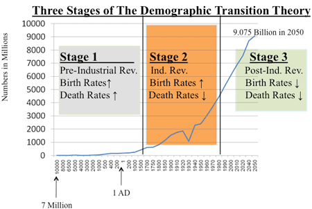
As you can see, the Demographic Transition Theory has three distinct stages. Stage 1, the Pre-Industrial Revolution Stage, encompassed the world's population up until about 1700 AD. Much of the world's population grew very slowly up to that point. That's all it could do because the high birth rates were offset by the high death rates (lots of people were born and they died soon).
Stage 2 or the Industrial Revolution Stage saw the decline in death rates while birth rates remained high. This is the perfect demographic storm for population growth and this coincides with the rapid growth of populations in Western Civilizations (lots of people were born and they died later in life). The Post-Industrial Revolution, Stage 3 came with the technical and computer chip revolution that raised the standard of living so much that death rates remained low while birth rates dropped (fewer people being born and they die even later in life).
The Demographic Transition theory did describe what happened in Western Europe, Canada, The United States, Australia , and Japan. But, it does not fit so neatly in the less developed countries of the world. They never really had an Industrial Revolution, they only benefited from the European one. They never really moved fully into the technological and computer chip revolution. It just spills over to them gradually. Because of post World War II medical delivery systems and because of international aid, the less developed countries of the world have had their death rates decline and their lives have been extended. But, their birth rates remain relatively high (as you've already read above). This is why so much of the world's future population growth will come from Africa, Latin America, Parts of Asia, and the island nations.
Very concerted antinatalistic efforts have been implemented in the less developed countries of the world over the last 40 years. Scientists can measure a gradual lowering of the birth rates as a direct result from it. But, keep in mind that however they got there, the peoples of the less developed regions of the world are still in Stage 2 and have explosive population trends that will continue for the next 40-50 years.
Population Structures
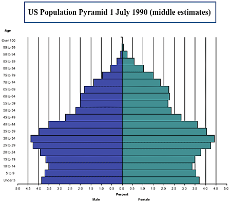
Before we discuss migration, let's talk about the population from an age-sex structural point of view. Every population/society can be compared by an age-sex structural approach called the Population Pyramid, or the graphic representation of specified 5-year age groups within a population and by being males or females. Look at the 1990 US population pyramid in Figure 7 below. Please notice that this pyramid was available on a quick search of www.census.gov and represents blue for males and green for females.
A population pyramid for 1990 can tell you some interesting things about the age-sex structure of the US at that time. For one thing, even though there are slightly more females than males, their relative proportions appear about even here. It also shows you the bulge of the Baby Boomers. By 1990, the Baby Boomers would have been between ages 26-44. The high fertility rates of the years 1946-1964 echo in the bulge of this pyramid. Also there is an interesting sex differences among the older US population. There are far more females than males in the later years.
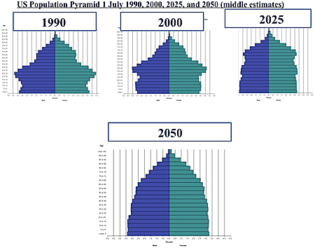
Now look at Figure 8. It shows you smaller pyramids that let you watch the disappearance of the Baby Boomers gradually over the years 1990-2050. By the year 2050 the oldest Baby Boomer would have to be 104 years old to still be alive. The Youngest Baby Boomer would be 86. These pyramids also show that there will be a similar proportion of males and females. Because birth rates are low and are remaining that way, you see a widening look as the pyramid portrays the population more as a column than a pyramid. Population pyramids can actually take on any number of shapes. But the true pyramid shape comes only when there are high birth rates (a wider pyramid in the younger ages) and people die soon (a narrower pyramid in the older years at the top of the pyramid).
*Retrieved 10 April 2009 from www.census.gov/population/www.../natchart.html
Figure 8. United State's Population Pyramid: 1990, 2000, 2025, and 2050*
*Retrieved 10 April 2009 from www.census.gov/population/www.../natchart.html
As this chapter draws to a close, we must discuss the last portion of the demographic formula, Migration. If someone moves out of your country they are called emigrants. Emigration is the departure from your country of origin to reside in another. Once there, they'd be considered to be an immigrant. Immigration is the arrival of a foreigner into a country they will reside in and likely become a citizen of on some future date. The US has far more immigrants (arrivals) than emigrants (departures) every year.
Why do people decide to move from one country to another? Demographers consider two very important factors in understanding migration: push and pull. Push Factors are negatives aspects of where you live which make you consider leaving. Pull Factors are positive aspects of another place which draw you to migrate to it. Push factors include wars, famines, political hostility, natural disasters, and other harsh circumstances that create an environment conducive to looking for another place to live. Pull factors include economic prosperity, jobs, food, safety, asylum, and the hope of survival that draws people to move to the desired location. About 1 in 6 people in the US moves each year. College students, job seekers, transferees, divorcees, and most recently people needing to live with extended family because of tough economic times all contribute to the migration process within the United States. As we finish the demography chapter, keep in mind that demography effects everything and everything effects demography