Did you ever live in a home where the basement was really cold
and the upstairs was hot? I did while growing up; we had cold
layers of air in the basement and warmer layers upstairs. I didn't
know it at the time but when layers occur in nature it is called
stratification. Layers occur almost everywhere in nature: in
tissues of the human body, rock formations in the ground,
atmospheres around the earth, and in societies of every nation on
the earth. We call these layers strata and the process of layering
stratification. Societies have stratification, too.
Social Stratification is the socio-economic
layering of society's members according to property, power, and
prestige. Property is all the wealth, investments,
deeded and titled properties, and other tangible sources of income.
Power is the ability to get one's way even in the
face of opposition to one's goals. Prestige is the
degree of social honor attached with your position in society. As
things go, those with lots of property tend to also have lots of
power and social prestige. Those with less property tend to have
less power and prestige.
The key concept of this chapter is that there are layers of
social stratification in every society, nation, and even at the
global level-there are the "haves" who coexist with the masses or
"Have nots." Does this remind you of Karl Marx and Max Weber? It
should. They focused heavily on wealth and poverty in the complex
social systems of their day. In our current social world there are
a very few who are extremely wealthy.
At www.Forbes.com they reported that even the richest in the
world got poorer between 2008-2009, "just like the rest of us." I'm
not sure about that. The richest billionaires lost 23 percent of
their wealth; they are still billionaires! In fact in 2008 there
were 1,125 billionaires worldwide, now they are only hundreds of
millionaires (I'll feel sad about that later). In March 2009 there
were only 793 billionaires who had an average wealth of 3 billion
US dollars with Bill Gates III leading the list (retrieved 21
April, 2009 from
http://www.forbes.com/2009/03/11/wor...ires_land.html ).
The GNI PPP Index Score
In spite of the rare and isolated wealth of these 793 people,
billions of other people still experience hunger, poverty,
preventable illness, early deaths, and famines and wars. In a
reference we use often in this textbook, you will find the
Population Reference Bureau's World Population Data Sheet can be
very enlightening in this discussion (www.PRB.org ). The PRB uses a
measure of relative economic well being called the GNI PPP. The
GNI PPP is the gross national income of a country converted
to international dollars using a factor called the purchasing power
parity. In other words this lets you understand how much a
person could buy in the US with a given amount of money, regardless
of the country's currency. It lets the United Nation and Population
Reference Bureau have a common value to compare countries with when
they look at international stratification issues. The 2008
estimates include key information from the World Bank.
The higher the GNI PPP the better off the average person in that
country. Look at Table 1 below to see GNI PPP values for selected
countries and regions of the world. The US ranks high $45, 840 per
capita (per person) but is the 6th wealthiest behind Luxembourg,
Norway, Kuwait, Brunei, and Singapore. Contrast that to Liberia's
score of just $290 per year. The only other nation as poor as
Liberia is the Democratic Republic of the Congo also at $290. You
can already see that there is clear evidence of stratification at a
global level. The average cell phone owner in the US spends more on
their annual bill than the average Liberian makes in a year. The
developed world is over 6 times wealthier than the less developed
world. More Developed Nationsare nations
with comparably higher wealth than most countries of the world
including: Western Europe; Canada, United States, Japan, and
Australia-these are also called Now Rich
Countries. Less Developed Nations are
nations located near to or south of the Equator which have
less wealth and more of the world's population of inhabitants
including: Africa, India, Central and South America, most island
nations, and most of Asia (Excluding China)-these are also called
Now Poor Countries. Africa is the poorest region with the
average person making less than 1/10th of what the average US
person makes.
Table 1. Selected GNI PPPs for Countries and Regions of the
World, 2008*
Country or Region
GNI PPP
More developed
$ 31,200
Less Developed
$ 4,760
Africa
$ 2,430
Latin America/Caribbean
$ 9,080
Asia (Excluding China)
$ 5,780
China
$ 5,370
Liberia
$ 290
Canada
$34,310
Mexico
$12,580
United States
$45,840
Italy
$29,900
Japan
$34,600
World
$ 9,600
*From 2008 World Population Data Sheet: Demographic Data and
Estimates for the Countries and Regions of the World.
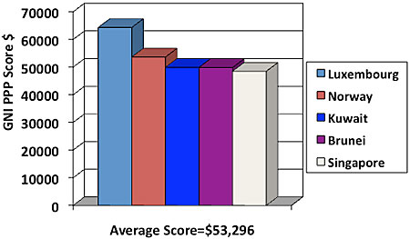
Look at Figure 1 which shows the top 5 GNI PPP countries of the
world. Again Luxembourg at $64,400 has a score over 20 times higher
than Africa's; 11 times higher than Asia (Excl. China); and 7 times
higher than Latin America. The other top 4 countries scores follow:
Norway-$53,690; Kuwait-$49,970; Brunei-$49,900; and
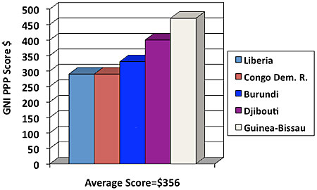
Singapore-$48,520. Figure 2 shows a comparison of the bottom 5
lowest scoring nations in the world. Their respective incomes are
as follows: Liberia-$290; Dem. Rep. of Congo-$290; Burundi-$330;
Djibouti-$400; and Guinea-Bissau-$470. The average GNI PPP score
for the top five was $53,296 and for the bottom 5 it was $356. That
means the stratification difference between the world's top five
countries is over 149 times higher than the bottom 5 countries.
Figure 1. A Comparison of the Top 5 GNI PPP Country's Scores in
2008*
*From 2008 World Population Data Sheet: Demographic Data and
Estimates for the Countries and Regions of the World.
Figure 2. A Comparison of the Top 5 GNI PPP Country's Scores in
2008*
*From 2008 World Population Data Sheet: Demographic Data and
Estimates for the Countries and Regions of the World.
United States Layers-Strata
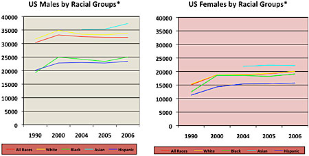
There is similar stratification in the United States. Look at
Figure 3 to see two line charts comparing the following All
Races---red line, White---yellow line, Black---green line,
Asian---blue line, and Hispanic---purple line. The chart on the
left is of US males and the one on the right is of US females. The
first thing you notice is visual stratification in both charts.
Females made much less income than males in all categories. The
Hispanic category is lowest for males and females. Among males
Hispanics and Blacks are similarly low and are far below the White
and even further below the Asian category. Asians had the highest
personal income for both sexes (Data for Asians was not reported
prior to 2004). Also notice that among females the income levels
grouped closer together-in other words, males had more disparity
between categories while females were collectively more similar.
Data were not available for Native Americans.
Figure 3. A Comparison of the US Personal Income by Race and
Between Males and Females 2006*
*Asian data not available before 2004. Retrieved 21 April 2009
from www.census.gov Table 679. Median Income of people with Income
in Constant 2006 Dollars by Sex, Race, and Hispanic Origin: 1990 to
2006
Table 2 shows some of the actual dollar difference in income
levels presented in Figure 3. For every single race, males make
more than females. In fact if you subtract male-female (all races
combined) income it equals $13,751 more income for males over these
years. White males make $14,914 more than White females. Black
males make $7,036; Asian males make $8,306; and Hispanic males make
$7,986 more than females in the same respective categories. Based
on the data in Figure 3 and Table 2 we've already seen that in the
US there is race and ethnicity-based stratification (in Chapter 11
you'll learn more about race and ethnicity issues in society) along
with sex-based stratification (in Chapter 10 you'll learn more
about the gender issues in a society).
Table 2. A Comparison of the US Personal Income by Race and
Between Males and Females in Constant 2006 US Dollars*
Race
Mean Male Income 1990 to 2006
Mean Female Income 1990 to 2006
Difference
All
$32,134
$18,383
$-13,751
White
$33,416
$18,502
$-14,914
Black
$35,999
$28,963
$- 7,036
Asian
$21,599
$13,293
$- 8,306
Hispanic
$22,449
$14,463
$- 7,986
*Asian data not available before 2004. Retrieved 21 April 2009
from www.census.gov Table 679. Median Income of people with Income
in Constant 2006 Dollars by Sex, Race, and Hispanic Origin: 1990 to
2006
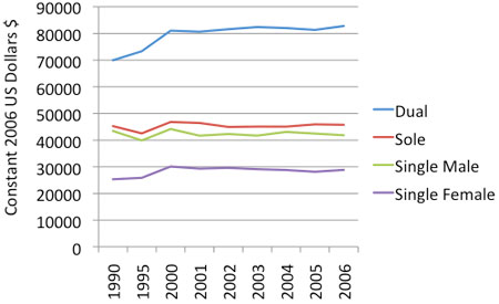
Figure 4 also shows stratification by marital status between
married and single households. The data are presented in constant
2006 US dollars which simply means they are adjusted for cost of
living changes for each year. The first thing you see is that
dual-earner marrieds (both husband and wife work in labor force) by
far have the highest income levels between 1990 and 2006.
Sole-earner married (husband only in labor force) comes in next
followed closely by single males. Single females reported the
lowest income. In sum, the females with the highest income are
married. The male with a co-breadwinner wife has the highest
combined income of all. We'll discuss some family-related issues in
Chapter 13.
Table 4. A Comparison of the US Personal Income by Marital
Status (includes duel versus sole breadwinner homes) in Constant
2006 US Dollars*
*Retrieved 21 April 2009 from www.census.gov Table 677. Median
Income of Families by Type of Family in Current and Constant (2006)
Dollars: 1990 to 2006
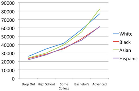
Figure 5 shows the stratification in our US society by
educational levels. Basically, the higher the education, the higher
the annual income in 2007. This is typically true every year. The
income levels are again higher for Whites and Asians followed by
Blacks and Hispanics. But, the layers are clearly visible by
education level. That's what is so cool about studying
stratification. Official data begin to tell you the story about how
the layers look in a society.
Figure 5. A Comparison of the US Personal Income of Full-Time
Workers by Education Level 2007*
*Retrieved 21 April 2009 from ÒEducational Attainment in the
United States: 2007 from
www.census.gov/prod/2009pubs/p20-560.pdf
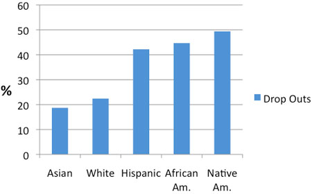
Figure 6 begins to show you why the layers look the way they do
in society. As we will discuss later in Chapter 14 on education,
dropping out of high school hurts your income and overall
socio-economic well-being. Asians had the lowest dropout rates
followed closely by Whites. Over 40 percent of Hispanics, African
Americans, and Native Americans dropped out. Dropping out is a dead
end personal income buster that hurts the individual, community,
and society at large. Dropping out is a very bad economic
choice.
But, not all economic disadvantage results from our choices. In
the US, non-Whites, non-Asians, and non-males are more likely to be
found in the lower layers. Figure 7 portrays what the layering of
society might look like if the US population were divided into 3
groups, the top 10 percent extremely wealthy, the next 20 percent
wealthy, and the remaining 70 percent of middle and lower classes.
The top 10 percent of our country owns the lion share of all the
wealth available to be owned in the US. They own as much as 100
times the average US person's wealth. For a relative few they make
more in a year than most of us make in a lifetime. Theirs' is the
life of high levels of the 3 Ps. Among the next 20 percent
Upper-class, they hold the high ranking jobs, run for elected
office, and run the major corporations in CEO-level positions.
These types of jobs: pay more; require more education; require more
abstract thought; and allow for more self-directed, autonomy in
their daily activities. The blue or largest category includes the
remainder of us. We fall in some layer between upper middle class,
middle class, working class, labor class, and/or poor.
Figure 6. Percentage of United States High School Dropouts by
Race for 2007*
*Extracted from Jason Amos, (August 2008) Dropouts, Diplomas,
and Dollars: US High Schools and the Nation's Economy taken from
Internet on 24 March 2009 from http://www.all4ed.org/files/Econ2008.pdf
All4edu funded by Bill and Malinda gates Foundation.
The US has an official definition of being poor or in poverty.
The Poverty Lineis the official measure
of those whose incomes are less than three times a lower cost food
budget. This definition has been the US 's official
poverty definition since the 1930s with only a few adjustments.
Near Povertyis when one earns up to 25%
above the poverty line. We would say that a person near
poverty has an income below 125% of the current poverty line.
In Table 2 below you can see the US Health and Human Services
2009 poverty guidelines with estimates of near poverty levels. Most
who qualify as living below poverty also qualify for state and
federal welfare which typically include health care benefits, food
assistance, housing and utility assistance, and some cash aid.
Those near poverty may or may not qualify depending upon current
state and federal regulations.
Do you remember up above where www.Forbes.com reported that the
world's 793 billionaires lost about 23 percent of their wealth
(they also were worth about $3 billion each)? If they suffered that
same 23 percent loss today they'd still be worth $2,310,000,000.
You take your highest range of poverty line ($37,010 for a family
of 10) and take 23 percent of a loss on that you see real economic
hurting with only $28,478 for 10 people in the family. We've all
lost during these economic downturns and we've all gained something
in the upswings. But, the losses hurt the lower layers of the
economic strata sometimes to the point that they fall below the
ability to sustain their families. Absolute
Povertyis the level of poverty where individuals
and families cannot sustain food, shelter, warmth, and safety
needs. Those below poverty are already in a bind. For
example, the average home where I live in Utah cost way more than
the average poor family of 10 could afford. A family that big could
not find an apartment to rent. They might find a mobile home or
might even on a real lucky break find some government subsidized
housing assistance. Not being able to find suitable housing is
correlated with many other social challenges for families.
Table 2. US Poverty Guidelines 2009 With Near Poverty
Estimates*
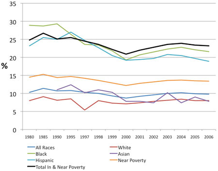
In Figure 8 you can see the poverty and near poverty rates for
various racial groups in the Unites States 1980 to 2006. The thick
black line represents the sum of the percent in poverty and below
125 percent of the poverty line (near poverty) for each year. The
line ranges about 25 percent or just below 1 in 4 being in or near
poverty for the US. Whites (the redline) have the lowest rate of
persons in poverty but make up the largest numbers of persons in
poverty because Whites represent about 75 percent of the US
population. Asians are slightly higher than Whites. The blue line
represents the percent in poverty for all races. It's much lower
than the high rates of poverty for Blacks and Hispanics because
Whites are such a larger portion of the population that it pulls
the overall average downward for all race. The near poverty line is
tan. Hispanic is second worst and Black is the worst for percent in
poverty. We see that the layers in the strata have racial factors
for both poverty and near poverty levels (we'll discuss race issues
more in Chapter 11). There are also layers in the strata based on
education (we'll discuss this more in Chapter 14).
Figure 8. Poverty and Near Poverty (<125 Percent of Poverty
Line) for US by Race and Hispanic for 1980 to 2006*
*Asian data not available until 1990Retrieved 22 April, 2009
from Table 693. Families Below poverty Level and Below 125 Percent
of Poverty Level by Race and Hispanic Origin: 1980 to 2006 from
www.census.gov/compendia/stat...es/09s0693.pdf
The US with such a high GNI PPP score has relatively high level
of a standard of living. Outside the US in the poorer regions of
the world a GNI PPP income of $1.25 or less per day is considered
below poverty (retrieved 22 April, 2009 from
www.unescap.org/stat/data/syb...inequality.asp Statistical Yearbook
17. Poverty-and-inequality).
There are differences among economic systems in which people
live and have opportunities. This brings up a very important
concept from Max Weber. Life Chancesare
an individual's access to basic opportunities and resources in the
marketplace. Not all of us have the same life chances as
others. For example, one of my best friends in high school came
from a wealthy family. Her father was a neurosurgeon and they had
many resources that myself and others like me didn't have. When I
went to college, I was the first ever on either my mother or
father's side to go to college. I had no financial aid, no family
support, and such bad high school grades that I had no scholarship
funding. My friend on the other hand had a new car, new Apple
computer, all expenses paid apartment and living costs. She and I
had very different life chances from one another. She earned her
Master's degree and I earned my Ph.D. I only received help once
from my father with a car repair bill (he gave me this as a
graduation present). I worked numerous part-time jobs and
eventually got my GPA high enough to earn a scholarship, and later
graduate assistantship. I also had to take out thousands in student
loans.
But, even I had far greater life chances than most people in the
world today. So do you. We have K-12 education, access to college,
and the possibility of a career of our choosing. In many less
developed countries low to no formal education is common fare. The
United Nations has the 2015 Millennium Development Goal and the
Education For All initiative (see Table 12.1 from
www.unescap.org/stat/data/syb...-education.asp ). It is simply that
all children of the world will have access to a primary education
by the year 2015.
This goal equates to them receiving K-6 education. In 2006, the
world average was 83.4 percent of children getting some k-6
education with an expected number of 10.6 years for males and 11.1
years for females worldwide. In Africa many children get no formal
education and in 2006, only 72.6 percent got K-6 with an expected
9.1 years for males 7.6 for females. As you can see, life chances
vary from house to house, state to state, region to region, and
nation to nation. It also clarifies your understanding of
stratification to look to the nation's economic system.
Measuring Economic Systems: Class and Caste
The United States has an open class system of life chances and
opportunities in the market place.
An Open Class System is an economic system that
has upward mobility, is achievement-based, and allows social
relations between the classes. India has a closed caste system. A
Closed Caste System is an economic system that
allows no mobility between caste levels: you are born into the
caste you stay in your entire life, and you can't have social
relations between the castes. India has a highly structured caste
system which has 5 distinct cast layers called: Brahman (Priests or
scholars); Kshatriya (Nobles and warriors); Vaishva (Merchants and
skilled artisans); Shudra (Common laborers); and Harijan
(Outcast/dirty workers).
In India you typically are born into a caste and that is your
destiny for life. This was basically true up until the 1980s when
multi-national corporations began to set up various types of
business enterprises in India. Western corporations hired thousands
and thousands based upon their personal skills and achievements (a
class trait in the West). The Indians have experienced cultural
disruptions because talented individuals have worked their way
above higher caste members in the organizational structure. We find
similar violations of caste rules here in the US where Indians who
migrate here find themselves with many opportunities. Their life
chances increase by virtue of their being able to shift residence
from a caste to a class society.
Sociologists like to study how people improve, diminish, or
leave unchanged their economic status-we call this Social
Mobility=the movement between economic strata in a society's
system. There are a few key types of mobility. Upward
Mobility=moving from a lower to higher class. Downward
Mobilityis moving from a higher to a lower class.
Horizontal Mobility is remaining in the same class. We can
compare mobility between or within generations of family members.
Inter-generational Mobilityis the
research of mobility between generations (IE: grandparents
to parents to grandchildren to great-grandchildren). Just list the
occupation your grandparents, parents, and you have and rank them
by property, power, and prestige. This is a measure of
inter-generational mobility at your personal level.
Intra-generational Mobilityis the
research of mobility within a generation. Just
compare your property, power, and prestige between you and your
brothers and sisters (this might even work for comparisons between
you and your cousins).
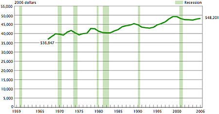
Structural Mobilityis mobility in
social class which is attributable to changes in social structure
of a society at the larger social, not personal level. The
United States has experienced collective upward social mobility for
the entire nation over the last 40 plus years. Figure 9 shows the
median household income in 2006 dollars from 1967 to 2006.
Figure 9. United States Median Household Income in 2006 Dollars
from 1967 to 2006.
*Source: US Census Bureau, Current Population Survey, 1968 to
2007 Annual Social and Economic Supplements. Note: Median household
incomes were not calculated for the US before 1967. Retrieved 22
April, 2009 from www.census.gov/population/www...oneyIncome.pdf
It is clear that there has been upward structural social
mobility. In other words, the median household income has gone up
nation-wide from 1967 to 2006. Remember these are inflation
adjusted 2006 constant dollars so they can be compared between
years. Notice that most of the declines were seasonal and came soon
after a recessionary time in the economy. Overall, this represents
one measure of upward structural mobility in the US.
Sociologists who focus on stratification typically use official
data to measure the layers. This is what is called the
Objective Method, where researchers set up
categories and rank people according to preset objective criteria
(such as median household income). Sociologists also talk
to people or ask their opinions about the layers and how they
perceive their fit into the economic strata. The
Reputational Methodis where researchers
look to people who know the individual and subjectively report on
his/her class. We ask them to answer a survey question
such as "which class best fits your current economic situation?
__Rich, __Middle, __Working, or __Poverty Class". Notice the
absence of numbers in the reputational method.
Another measure of economic well-being is health care coverage.
The US Census Bureau reported that in 2007 about 15.3 percent or
over 45 million in the US had no health care coverage (retrieved 22
April, 2009 from www.census.gov/prod/2008pubs/p60-235.pdf ).
Table 3. US Percent of Uninsured by Selected Characteristics
2007*
Category
% Uninsured
White
14.3%
Black
19.5%
Asian
16.8%
Hispanic
32.1%
< 6 years old
10.5%
6-11 years old
10.3%
12-17 years old
12.0%
<18 years old
11.0%
18-24 years old
28.1%
25-34 years old
25.7%
35-44 years old
18.3%
45-64 years old
14.0%
65+ years old
1.9%
Children in Poverty
17.6%
<$25,000 per year income
24.5%
$25-49,999 per year income
21.1%
$50-74,999 per year income
14.5%
$75,000+ per year income
7.8%
Worked Full-time
17.0%
Worked Part-time
23.4%
Did Not Work
25.4%
*Retrieved 22 April, 2009 from Table 6. People Without Health
Insurance Coverage by Selected Characteristics: 2006 and 2007&
Figure 8. Uninsured Children by Poverty Status, Age, and Race and
Hispanic Origin: 2007 from
www.census.gov/prod/2008pubs/p60-235.pdf
Health care coverage is a major economic resource. Again, White
and Asian categories are in the higher strata on this resource.
They have the lowest uninsured rates. Blacks are closer to Asians
than are Hispanics. Hispanics have the highest level of uninsurance
by racial group and it's over twice as high as for Whites. Since
nearly 60 percent of insurance is provided by employers, it makes
sense that the young adult 18-34 year olds would have less
insurance, because they are still getting their formal educations
and establishing their careers. But, what about the nearly 11
percent of children without insurance or the nearly 18 percent of
children in poverty without it?
This is difficult to justify in today's modern society. Every
country that the US compares itself to as being a similarly more
developed nation offers health insurance as a right to all, not
just a privilege to the wealthier people in the higher strata. The
less income one has per year the higher the uninsurance rates.
About 1 in 4 who worked part-time or did not work at all have no
insurance, while only 17 percent of full-time workers went
without.
Yes, there are layers in society. Through sociology's theories
and statistical style you can begin to better understand how they
develop and how they are perpetuated in various forms both within
and between countries.