Describe data coding, data, entry, and handling missing data.
Define a frequency distribution.
Define the three measures of central tendency.
Discuss dispersion.
Differentiate between univariate and bivariate data.
Introduction
Numeric data collected in a research project can be analyzed quantitatively using statistical tools in two different ways. Descriptive analysis refers to statistically describing, aggregating, and presenting the constructs of interest or associations between these constructs. Inferential analysis refers to the statistical testing of hypotheses (theory testing). In this chapter, we will examine statistical techniques used for descriptive analysis, and the next chapter will examine statistical techniques for inferential analysis. Much of today’s quantitative data analysis is conducted using software programs such as SPSS or SAS. Readers are advised to familiarize themselves with one of these programs for understanding the concepts described in this chapter.
Data Preparation
In research projects, data may be collected from a variety of sources: mail-in surveys, interviews, pretest or posttest experimental data, observational data, and so forth. This data must be converted into a machine -readable, numeric format, such as in a spreadsheet or a text file, so that they can be analyzed by computer programs like SPSS or SAS. Data preparation usually follows the following steps.
Data coding. Coding is the process of converting data into numeric format. A codebook should be created to guide the coding process. A codebook is a comprehensive document containing detailed description of each variable in a research study, items or measures for that variable, the format of each item (numeric, text, etc.), the response scale for each item (i.e., whether it is measured on a nominal, ordinal, interval, or ratio scale; whether such scale is a five-point, seven-point, or some other type of scale), and how to code each value into a numeric format. For instance, if we have a measurement item on a seven-point Likert scale with anchors ranging from “strongly disagree” to “strongly agree”, we may code that item as 1 for strongly disagree, 4 for neutral, and 7 for strongly agree, with the intermediate anchors in between. Nominal data such as industry type can be coded in numeric form using a coding scheme such as: 1 for manufacturing, 2 for retailing, 3 for financial, 4 for healthcare, and so forth (of course, nominal data cannot be analyzed statistically). Ratio scale data such as age, income, or test scores can be coded as entered by the respondent. Sometimes, data may need to be aggregated into a different form than the format used for data collection. For instance, for measuring a construct such as “benefits of computers,” if a survey provided respondents with a checklist of benefits that they could select from (i.e., they could choose as many of those benefits as they wanted), then the total number of checked items can be used as an aggregate measure of benefits. Note that many other forms of data, such as interview transcripts, cannot be converted into a numeric format for statistical analysis. Coding is especially important for large complex studies involving many variables and measurement items, where the coding process is conducted by different people, to help the coding team code data in a consistent manner, and also to help others understand and interpret the coded data.
Data entry. Coded data can be entered into a spreadsheet, database, text file, or directly into a statistical program like SPSS. Most statistical programs provide a data editor for entering data. However, these programs store data in their own native format (e.g., SPSS stores data as .sav files), which makes it difficult to share that data with other statistical programs. Hence, it is often better to enter data into a spreadsheet or database, where they can be reorganized as needed, shared across programs, and subsets of data can be extracted for analysis. Smaller data sets with less than 65,000 observations and 256 items can be stored in a spreadsheet such as Microsoft Excel, while larger dataset with millions of observations will require a database. Each observation can be entered as one row in the spreadsheet and each measurement item can be represented as one column. The entered data should be frequently checked for accuracy, via occasional spot checks on a set of items or observations, during and after entry. Furthermore, while entering data, the coder should watch out for obvious evidence of bad data, such as the respondent selecting the “strongly agree” response to all items irrespective of content, including reverse-coded items. If so, such data can be entered but should be excluded from subsequent analysis.
Missing values. Missing data is an inevitable part of any empirical data set. Respondents may not answer certain questions if they are ambiguously worded or too sensitive. Such problems should be detected earlier during pretests and corrected before the main data collection process begins. During data entry, some statistical programs automatically treat blank entries as missing values, while others require a specific numeric value such as -1 or 999 to be entered to denote a missing value. During data analysis, the default mode of handling missing values in most software programs is to simply drop the entire observation containing even a single missing value, in a technique called listwise deletion . Such deletion can significantly shrink the sample size and make it extremely difficult to detect small effects. Hence, some software programs allow the option of replacing missing values with an estimated value via a process called imputation . For instance, if the missing value is one item in a multi-item scale, the imputed value may be the average of the respondent’s responses to remaining items on that scale. If the missing value belongs to a single-item scale, many researchers use the average of other respondent’s responses to that item as the imputed value. Such imputation may be biased if the missing value is of a systematic nature rather than a random nature. Two methods that can produce relatively unbiased estimates for imputation are the maximum likelihood procedures and multiple imputation methods, both of which are supported in popular software programs such as SPSS and SAS.
Univariate Analysis
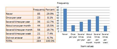
Univariate analysis, or analysis of a single variable, refers to a set of statistical techniques that can describe the general properties of one variable. Univariate statistics include: (1) frequency distribution, (2) central tendency, and (3) dispersion. The frequency distribution of a variable is a summary of the frequency (or percentages) of individual values or ranges of values for that variable. For instance, we can measure how many times a sample of respondents attend religious services (as a measure of their “religiosity”) using a categorical scale: never, once per year, several times per year, about once a month, several times per month, several times per week, and an optional category for “did not answer.” If we count the number (or percentage) of observations within each category (except “did not answer” which is really a missing value rather than a category), and display it in the form of a table as shown in Figure 13.1, what we have is a frequency distribution. This distribution can also be depicted in the form of a bar chart, as shown on the right panel of Figure 13.1, with the horizontal axis representing each category of that variable and the vertical axis representing the frequency or percentage of observations within each category.
Figure 13.1. Frequency distribution of religiosity
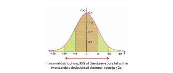
With very large samples where observations are independent and random, the frequency distribution tends to follow a plot that looked like a bell-shaped curve (a smoothed bar chart of the frequency distribution) similar to that shown in Figure 13.1, where most observations are clustered toward the center of the range of values, and fewer and fewer observations toward the extreme ends of the range. Such a curve is called a normal distribution .
Central tendency is an estimate of the center of a distribution of values. There are three major estimates of central tendency: mean, median, and mode. The arithmetic mean (often simply called the “mean”) is the simple average of all values in a given distribution. Consider a set of eight test scores: 15, 22, 21, 18, 36, 15, 25, 15. The arithmetic mean of these values is (15 + 20 + 21 + 20 + 36 + 15 + 25 + 15)/8 = 20.875. Other types of means include geometric mean (n th root of the product of n numbers in a distribution) and harmonic mean (the reciprocal of the arithmetic means of the reciprocal of each value in a distribution), but these means are not very popular for statistical analysis of social research data.
The second measure of central tendency, the median, is the middle value within a range of values in a distribution. This is computed by sorting all values in a distribution in increasing order and selecting the middle value. In case there are two middle values (if there is an even number of values in a distribution), the average of the two middle values represent the median. In the above example, the sorted values are: 15, 15, 15, 18, 22, 21, 25, 36. The two middle values are 18 and 22, and hence the median is (18 + 22)/2 = 20.
Lastly, the mode is the most frequently occurring value in a distribution of values. In the previous example, the most frequently occurring value is 15, which is the mode of the above set of test scores. Note that any value that is estimated from a sample, such as mean, median, mode, or any of the later estimates are called a statistic .
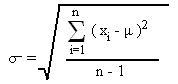
Dispersion refers to the way values are spread around the central tendency, for example, how tightly or how widely are the values clustered around the mean. Two common measures of dispersion are the range and standard deviation. The range is the difference between the highest and lowest values in a distribution. The range in our previous example is 36-15 = 21.
The range is particularly sensitive to the presence of outliers. For instance, if the highest value in the above distribution was 85 and the other vales remained the same, the range would be 85-15 = 70. Standard deviation , the second measure of dispersion, corrects for such outliers by using a formula that takes into account how close or how far each value from the distribution mean:
Bivariate Analysis
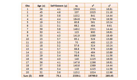
Bivariate analysis examines how two variables are related to each other. The most common bivariate statistic is the bivariate correlation (often, simply called “correlation”), which is a number between -1 and +1 denoting the strength of the relationship between two variables. Let’s say that we wish to study how age is related to self-esteem in a sample of 20 respondents, i.e., as age increases, does self-esteem increase, decrease, or remains unchanged. If self-esteem increases, then we have a positive correlation between the two variables, if self-esteem decreases, we have a negative correlation, and if it remains the same, we have a zero correlation. To calculate the value of this correlation, consider the hypothetical dataset shown in Table 13.1.
Figure 13.2. Normal distribution
Table 13.1. Hypothetical data on age and self-esteem
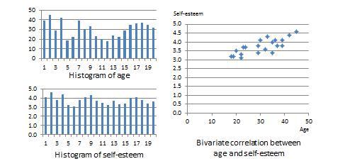
The two variables in this dataset are age (x) and self-esteem (y). Age is a ratio-scale variable, while self-esteem is an average score computed from a multi-item self-esteem scale measured using a 7-point Likert scale, ranging from “strongly disagree” to “strongly agree.” The histogram of each variable is shown on the left side of Figure 13.3. The formula for calculating bivariate correlation is:
Figure 13.3 is essentially a plot of self-esteem on the vertical axis against age on the horizontal axis. This plot roughly resembles an upward sloping line (i.e., positive slope), which is also indicative of a positive correlation. If the two variables were negatively correlated, the scatter plot would slope down (negative slope), implying that an increase in age would be related to a decrease in self-esteem and vice versa. If the two variables were uncorrelated, the scatter plot would approximate a horizontal line (zero slope), implying than an increase in age would have no systematic bearing on self-esteem.Figure 13.3. Histogram and correlation plot of age and self-esteem
After computing bivariate correlation, researchers are often interested in knowing whether the correlation is significant (i.e., a real one) or caused by mere chance. Answering such a question would require testing the following hypothesis:
H 0 : r = 0
H 1 : r ≠ 0
H 0 is called the null hypotheses , and H 1 is called the alternative hypothesis (sometimes, also represented as H a ). Although they may seem like two hypotheses, H 0 and H 1 actually represent a single hypothesis since they are direct opposites of each other. We are interested in testing H 1 rather than H 0 . Also note that H 1 is a non-directional hypotheses since it does not specify whether r is greater than or less than zero. Directional hypotheses will be specified as H 0 : r ≤ 0; H 1 : r > 0 (if we are testing for a positive correlation). Significance testing of directional hypothesis is done using a one-tailed t-test, while that for non-directional hypothesis is done using a two-tailed t-test.
In statistical testing, the alternative hypothesis cannot be tested directly. Rather, it is tested indirectly by rejecting the null hypotheses with a certain level of probability. Statistical testing is always probabilistic, because we are never sure if our inferences, based on sample data, apply to the population, since our sample never equals the population. The probability that a statistical inference is caused pure chance is called the p-value . The p-value is compared with the significance level (α), which represents the maximum level of risk that we are willing to take that our inference is incorrect. For most statistical analysis, α is set to 0.05. A p-value less than α=0.05 indicates that we have enough statistical evidence to reject the null hypothesis, and thereby, indirectly accept the alternative hypothesis. If p>0.05, then we do not have adequate statistical evidence to reject the null hypothesis or accept the alternative hypothesis.
The easiest way to test for the above hypothesis is to look up critical values of r from statistical tables available in any standard text book on statistics or on the Internet (most software programs also perform significance testing). The critical value of r depends on our desired significance level (α = 0.05), the degrees of freedom (df), and whether the desired test is a one-tailed or two-tailed test. The degree of freedom is the number of values that can vary freely in any calculation of a statistic. In case of correlation, the df simply equals n – 2, or for the data in Table 14.1, df is 20 – 2 = 18. There are two different statistical tables for one-tailed and two -tailed test. In the two -tailed table, the critical value of r for α = 0.05 and df = 18 is 0.44. For our computed correlation of 0.79 to be significant, it must be larger than the critical value of 0.44 or less than -0.44. Since our computed value of 0.79 is greater than 0.44, we conclude that there is a significant correlation between age and self-esteem in our data set, or in other words, the odds are less than 5% that this correlation is a chance occurrence. Therefore, we can reject the null hypotheses that r ≤ 0, which is an indirect way of saying that the alternative hypothesis r > 0 is probably correct.
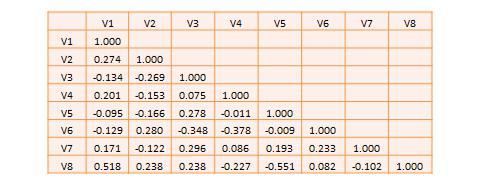
Most research studies involve more than two variables. If there are n variables, then we will have a total of n*(n-1)/2 possible correlations between these n variables. Such correlations are easily computed using a software program like SPSS, rather than manually using the formula for correlation (as we did in Table 13.1), and represented using a correlation matrix, as shown in Table 13.2. A correlation matrix is a matrix that lists the variable names along the first row and the first column, and depicts bivariate correlations between pairs of variables in the appropriate cell in the matrix. The values along the principal diagonal (from the top left to the bottom right corner) of this matrix are always 1, because any variable is always perfectly correlated with itself. Further, since correlations are non-directional, the correlation between variables V1 and V2 is the same as that between V2 and V1. Hence, the lower triangular matrix (values below the principal diagonal) is a mirror reflection of the upper triangular matrix (values above the principal diagonal), and therefore, we often list only the lower triangular matrix for simplicity. If the correlations involve variables measured using interval scales, then this specific type of correlations are called Pearson product moment correlations .
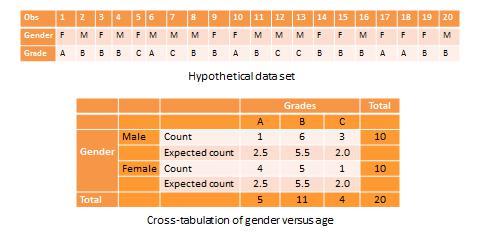
Another useful way of presenting bivariate data is cross-tabulation (often abbreviated to cross-tab, and sometimes called more formally as a contingency table). A cross-tab is a table that describes the frequency (or percentage) of all combinations of two or more nominal or categorical variables. As an example, let us assume that we have the following observations of gender and grade for a sample of 20 students, as shown in Figure 14.3. Gender is a nominal variable (male/female or M/F), and grade is a categorical variable with three levels (A, B, and C). A simple cross-tabulation of the data may display the joint distribution of gender and grades (i.e., how many students of each gender are in each grade category, as a raw frequency count or as a percentage) in a 2 x 3 matrix. This matrix will help us see if A, B, and C grades are equally distributed across male and female students. The cross-tab data in Table 13.3 shows that the distribution of A grades is biased heavily toward female students: in a sample of 10 male and 10 female students, five female students received the A grade compared to only one male students. In contrast, the distribution of C grades is biased toward male students: three male students received a C grade, compared to only one female student. However, the distribution of B grades was somewhat uniform, with six male students and five female students. The last row and the last column of this table are called marginal totals because they indicate the totals across each category and displayed along the margins of the table.
Table 13.2. A hypothetical correlation matrix for eight variables
Table 13.3. Example of cross-tab analysis
Although we can see a distinct pattern of grade distribution between male and female students in Table 14.3, is this pattern real or “statistically significant”? In other words, do the above frequency counts differ from that that may be expected from pure chance? To answer this question, we should compute the expected count of observation in each cell of the 2 x 3 cross-tab matrix. This is done by multiplying the marginal column total and the marginal row total for each cell and dividing it by the total number of observations. For example, for the male/A grade cell, expected count = 5 * 10 / 20 = 2.5. In other words, we were expecting 2.5 male students to receive an A grade, but in reality, only one student received the A grade. Whether this difference between expected and actual count is significant can be tested using a chi-square test . The chi-square statistic can be computed as the average difference between observed and expected counts across all cells. We can then compare this number to the critical value associated with a desired probability level (p < 0.05) and the degrees of freedom, which is simply (m-1)*(n-1), where m and n are the number of rows and columns respectively. In this example, df = (2 – 1) * (3 – 1) = 2. From standard chi-square tables in any statistics book, the critical chi-square value for p=0.05 and df=2 is 5.99. The computed chi -square value, based on our observed data, is 1.00, which is less than the critical value. Hence, we must conclude that the observed grade pattern is not statistically different from the pattern that can be expected by pure chance.
KEY TAKEAWAYS
Understanding how to enter and handle data is important.
Univariate analysis methods are useful at showing information about a single thing.
Bivariate analysis compares to variables and is key to getting at causation.