
14.4: Presentation Aids in Speaking
- Last updated
- Save as PDF
- Page ID
- 106497

Learning Objectives
After reading this chapter, the student will be able to:
- List and explain reasons why presentation aids are important in public speaking;
- Explain how presentation aids function in public speaking;
- Describe the various computer-based and non-computer-based types of presentation aids available to the students;
- Explain the correct use of various types of presentation aids;
- Design professional-looking slides using presentation software
What are Presentation Aids?
When you give a speech, you are presenting much more than just a collection of words and ideas. Because you are speaking “live and in-person,” your audience members will experience your speech through all five of their senses: hearing, vision, smell, taste, and touch. In some speaking situations, the speaker appeals only to the sense of hearing, more or less ignoring the other senses except to avoid visual distractions by dressing and properly presenting himself or herself. But the speaking event can be greatly enriched by appeals to the other senses. This is the role of presentation aids.
Presentation aids are resources beyond the speech words and delivery that a speaker uses to enhance the message conveyed to the audience. The type of presentation aids that speakers most typically make use of is visual aids: pictures, diagrams, charts and graphs, maps, and the like. Audible aids include musical excerpts, audio speech excerpts, and sound effects. A speaker may also use fragrance samples or food samples as olfactory (sense of smell) or gustatory (sense of taste) aids. Finally, presentation aids can be three-dimensional objects, animals, and people; they can also change over a period of time, as in the case of a how-to demonstration.
As you can see, the range of possible presentation aids is almost unlimited. However, all presentation aids have one thing in common: To be effective, each presentation aid a speaker uses must be a direct, uncluttered example of a specific element of the speech. Understandably, someone presenting a speech about Abraham Lincoln might want to include a photograph of him, but because everyone already knows what Lincoln looked like, the picture would not contribute much to the message unless, perhaps, the message was specifically about the changes in Lincoln’s appearance during his time in office.
Other visual artifacts are more likely to deliver information more directly relevant to the speech—a diagram of the interior of Ford’s Theater where Lincoln was assassinated, a facsimile of the messy and much-edited Gettysburg Address, or a photograph of the Lincoln family, for example. The key is that each presentation aid must directly express an idea in your speech.
Moreover, presentation aids must be used at the time when you are presenting the specific ideas related to the aid. For example, if you are speaking about coral reefs and one of your supporting points is about the location of the world’s major reefs, it would make sense to display a map of these reefs while you’re talking about location. If you display it while you are explaining what coral actually is, or describing the kinds of fish that feed on a reef, the map will not serve as a useful visual aid—in fact, it’s likely to be a distraction.
To be effective, presentation aids must also be easy to use and easy for the listeners to see and understand. In this chapter, we will present some principles and strategies to help you incorporate effective presentation aids into your speech. We will begin by discussing the functions that good presentation aids fulfill. Next, we will explore some of the many types of presentation aids and how best to design and utilize them. We will also describe various media that can be used for presentation aids. We will conclude with tips for successful preparation and the use of presentation aids in a speech.
Functions of Presentation Aids
Why should you use presentation aids? If you have prepared and rehearsed your speech adequately, shouldn’t a good speech with a good delivery be enough to stand on its own? While it is true that impressive presentation aids will not rescue a poor speech, a good speech can often be made even better by the strategic use of presentation aids. Presentation aids can fulfill several functions: they can serve to improve your audience’s understanding of the information you are conveying, enhance audience memory and retention of the message, add variety and interest to your speech, and enhance your credibility as a speaker. Let’s examine each of these functions.
Improving Audience Understanding
Human communication is a complex process that often leads to misunderstandings. If you are like most people, you can easily remember incidents when you misunderstood a message or when someone else misunderstood what you said to them. Misunderstandings happen in public speaking just as they do in everyday conversations.
One reason for misunderstandings is the fact that perception and interpretation are highly complex individual processes. Most of us have seen the image in which, depending on your perception, you see either the outline of a vase or the facial profiles of two people facing each other. Or perhaps you have seen the image of the woman who may or may not be young, depending on your frame of reference at the time. This shows how interpretations can differ, and it means that your presentations must be based on careful thought and preparation to maximize the likelihood that your listeners will understand your presentations as you intend them to do so.
As a speaker, one of your basic goals is to help your audience understand your message. To reduce misunderstanding, presentation aids can be used to clarify or to emphasize.
Clarifying
Clarification is important in a speech because if some of the information you convey is unclear, your listeners will come away puzzled or possibly even misled. Presentation aids can help clarify a message if the information is complex or if the point being made is a visual one.
If your speech is about the impact of the Coriolis Effect on tropical storms, for instance, you will have great difficulty clarifying it without a diagram because the process is a complex one. The diagram in Figure \(\PageIndex{1}\) (“Coriolis Effect”) would be effective because it shows the audience the interaction between equatorial wind patterns and wind patterns moving in other directions. The diagram allows the audience to process the information in two ways: through your verbal explanation and the visual elements of the diagram. By the way, the Coriolis Effect is defined as “an effect whereby a mass moving in a rotating system experiences a force (the Coriolis force) acting perpendicular to the direction of motion and the axis of rotation. On the earth, the effect tends to deflect moving objects to the right in the northern hemisphere and to the left in the southern and is important in the formation of cyclonic weather systems.” You can see why a picture really helps with this definition.
Emphasizing
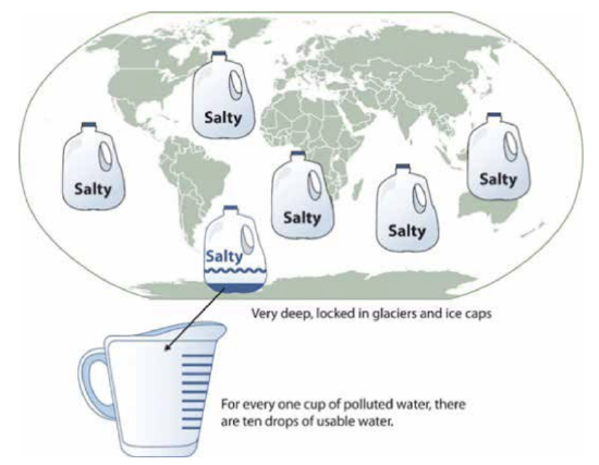
When you use a presentational aid for emphasis, you impress your listeners with the importance of an idea. In a speech on water conservation, you might try to show the environmental proportions of the resource. When you use a conceptual drawing like the one in Figure \(\PageIndex{2}\) (“Planetary Water Supply”), you show that if the world water supply were equal to ten gallons, only ten drops would be available and drinkable for human or household consumption. This drawing is effective because it emphasizes the scarcity of useful water and thus draws attention to this important information in your speech.
Aiding Retention and Recall
The second function that presentation aids can serve is to increase the audience’s chances of remembering your speech. An article by the U.S. Department of Labor (1996) summarized research on how people learn and remember. The authors found that “83% of human learning occurs visually, and the remaining 17% through the other senses—11% through hearing, 3.5% through smell, 1% through taste, and 1.5% through touch.”
For this reason, exposure to an image can serve as a memory aid to your listeners. When your graphic images deliver information effectively and when your listeners understand them clearly, audience members are likely to remember your message long after your speech is over. Moreover, people often can remember information that is presented in sequential steps more easily than if that information is presented in an unorganized pattern. When you use a presentation aid to display the organization of your speech (such as can be done with PowerPoint slides), you will help your listeners to observe, follow, and remember the sequence of information you conveyed to them. This is why some instructors display a lecture outline for their students to follow during class and why a slide with a preview of your main points can be helpful as you move into the body of your speech.
An added plus of using presentation aids is that they can boost your memory while you are speaking. Using your presentation aids while you rehearse your speech will familiarize you with the association between a given place in your speech and the presentation aid that accompanies that material.
Adding Variety and Interest
The third function of presentation aids is simply to make your speech more interesting. For example, wouldn’t a speech on varieties of roses have a greater impact if you accompanied your remarks with a picture of each rose? You can imagine that your audience would be even more enthralled if you had the ability to display an actual flower of each variety in a bud vase. Similarly, if you were speaking to a group of gourmet cooks about Indian spices, you might want to provide tiny samples of spices that they could smell and taste during your speech.
Enhancing a Speaker’s Credibility
Presentation aids alone will not be enough to create a professional image. As we mentioned earlier, impressive presentation aids will not rescue a poor speech. Even if you give a good speech, you run the risk of appearing unprofessional if your presentation aids are poorly executed. Conversely, a high-quality presentation will contribute to your professional image. This means that in addition to containing important information, your presentation aids must be clear, clean, uncluttered, organized, and large enough for the audience to see and interpret correctly. Misspellings and poorly designed presentation aids can damage your credibility as a speaker.
In addition, make sure that you give proper credit to the source of any presentation aids that you take from other sources. Using a statistical chart or a map without proper credit will detract from your credibility, just as using a quotation in your speech without credit would. This situation will usually take place with digital aids such as PowerPoint slides. The source of a chart or the data shown in a chart form should be cited at the bottom of the slide.
If you focus your efforts on producing presentation aids that contribute effectively to your meaning, that look professional, and that is handled well, your audience will most likely appreciate your efforts and pay close attention to your message. That attention will help them learn or understand your topic in a new way and will thus help the audience see you as a knowledgeable, competent, and credible speaker. With the prevalence of digital communication, the audience expectation of quality visual aids has increased.
Avoiding Problems with Presentation Aids
Using presentation aids can come with some risks. However, with a little forethought and adequate practice, you can choose presentation aids that enhance your message and boost your professional appearance in front of an audience. One principle to keep in mind is to use only as many presentation aids as necessary to present your message or to fulfill your classroom assignment. The number and the technical sophistication of your presentation aids should never overshadow your speech.
Another important consideration is technology. Keep your presentation aids within the limits of the working technology available to you. Whether or not your classroom technology works on the day of your speech, you will still have to present. What will you do if the computer file containing your slides is corrupted? What will you do if the easel is broken? What if you had counted on stacking your visuals on a table that disappears right when you need it? Or the Internet connection is down for a YouTube video you plan to show?
You must be prepared to adapt to an uncomfortable and scary situation. This is why we urge students to go to the classroom well ahead of time to test the equipment and ascertain the condition of items they’re planning to use. As the speaker, you are responsible for arranging the things you need to make your presentation aids work as intended. Carry a roll of masking tape so you can display your poster even if the easel is gone. Test the computer setup. Have your slides on a flash drive AND send it to yourself as an attachment or upload to a Cloud service. Has an alternative plan been prepared in case there is some glitch that prevents your computer-based presentation aids from being usable? And of course, you must know how to use the technology.
More important than the method of delivery is the audience’s ability to see and understand the presentation aid. It must deliver clear information, and it must not distract from the message. Avoid overly elaborate presentation aids. Instead, simplify as much as possible, emphasizing the information you want your audience to understand.
Another thing to remember is that presentation aids do not “speak for themselves.” When you display a visual aid, you should explain what it shows, pointing out and naming the most important features. If you use an audio aid such as a musical excerpt, you need to tell your audience what to listen for. Similarly, if you use a video clip, it is up to you as the speaker to point out the characteristics in the video that support the point you are making—but probably beforehand, so you are not speaking over the video. At the same time, a visual aid should be quickly accessible to the audience. This is where simplicity comes in. Just as in the organization of a speech you would not want to use 20 main points, but more like 3-5, you should limit categories of information on a visual aid.
Types of Presentation Aids
Now that we’ve explored some basic hints for preparing visual aids, let’s look at the most common types of visual aids: charts, graphs, representations, objects/models, and people.
Charts
A chart is commonly defined as a graphical representation of data (often numerical) or a sketch representing an ordered process. Whether you create your charts or do research to find charts that already exist, it is important for them to exactly match the specific purpose in your speech.
Statistical Charts
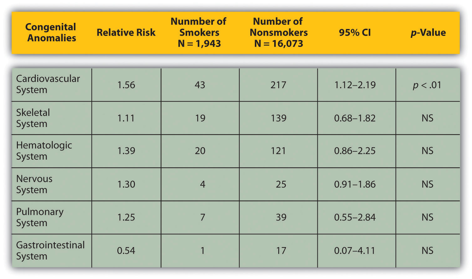
For most audiences, statistical charts must be kept as simple as possible, and they must be explained. These charts are useful for compiling and cross-referencing larger amounts of information. The combination of rows and columns allows you to create headers and then divide them up into units, categories, dates, and so on. Medical information is put into charts so that periods of recorded information, such as vital signs, can be updated and scanned by doctors and nurses. They are also good for combining text and numbers, and they are easy to make with word processing software like Microsoft Word or spreadsheet software like Excel. Think of presenting your department’s budget and spending at the end of a business quarter. You could have headers in the columns with the various categories and itemized deductions in the rows ending with a final total for each column. The statistical chart in Figure \(\PageIndex{3}\): “Birth Weight Chi-Square” is from a study examining the effects of maternal smoking on a range of congenital birth defects. Unless you are familiar with statistics, this chart may be very confusing. When visually displaying information from a quantitative study, you need to make sure that you understand the material and can successfully and simply explain how one should interpret the data. If you are unsure about the data yourself, then you should probably not use this type of information. This is definitely an example of a visual aid that, although it delivers a limited kind of information, does not speak for itself. On the other hand, if you are presenting to an upper-level or graduate class in health sciences or professionals in health occupations, this chart would be appropriate. As with all other principles of public speaking, KNOW YOUR AUDIENCE.
Sequence-of-Steps Charts
Sequence-of-steps charts are also useful when you are trying to explain a process that involves several steps. The two visual aids in Figure \(\PageIndex{4}\) (“Steps in Cell Reproduction”) both depict the process of cell division called mitosis using a sequence-of-steps chart, but they each deliver different information. The first chart lacks labels to indicate the different phases of cell division. Although the first chart has more visual detail and may look more scientific, the missing information may confuse your audience. In the second chart, each phase is labeled with a brief explanation of what is happening, which can help your audience understand the process.
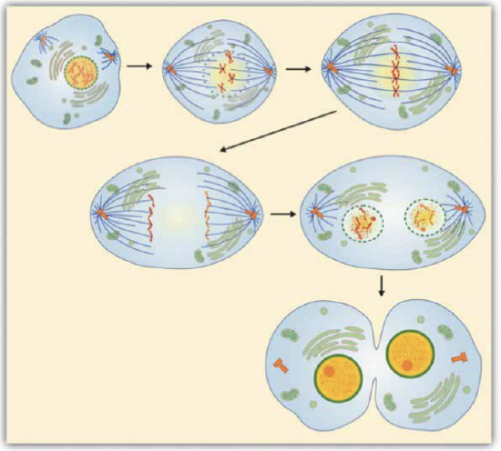

Figure \(\PageIndex{4}\): Steps in Cell Reproduction. Source: Images courtesy of LadyofHats, and the National Institutes of Health.
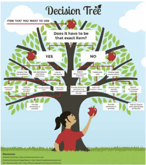
Decision Trees
Decision trees are useful for showing the relationships between ideas. The example in Figure \(\PageIndex{5}\) (“Open Educational Resource Decision Tree”) shows how a decision tree could be used to determine whether to use open-source textbook material. As with the other types of charts, you want to be sure that the information in the chart is relevant to the purpose of your speech and that each question and decision is clearly labeled. This particular tree is pertinent to this textbook, which is an open educational resource drawing from other open educational resources, and the decision tree shows some of the processes the authors went through to decide on the content of this text.
Graphs
Strictly speaking, a graph may be considered a type of chart, but graphs are so widely used that we will discuss them separately. A graph is a pictorial representation of the relationships of quantitative data using dots, lines, bars, pie slices, and the like. Graphs show how one factor (such as size, weight, number of items) varies in comparison to other items. Whereas a statistical chart may report the mean ages of individuals entering college, a graph would show how the mean age changes over time. A statistical chart may report the number of computers sold in the United States, while a graph will use bars or lines to show their breakdown by operating systems such as Windows, Macintosh, and Linux.
Public speakers can show graphs using a range of different formats. Some of those formats are specialized for various professional fields. Very complex graphs often contain too much information that is not related to the purpose of a student’s speech. If the graph is cluttered, it becomes difficult to comprehend. In this section, we’re going to analyze the common graphs speakers utilize in their speeches: line graphs, bar graphs, pie graphs, and pictographs.
Line Graph
A line graph is designed to show trends over time. In Figure \(\PageIndex{6}\): “Enron’s Stock Price," we see a line graph depicting the fall of Enron’s stock price from August 2000 to January 2002. Notice that although it has some steep rises, the line has an overall downward trend clearly depicting the plummeting of Enron’s stock price. This is far more effective in showing the relationship of numbers than a chart (as in Figure \(\PageIndex{7}\)) or reading the numbers aloud.
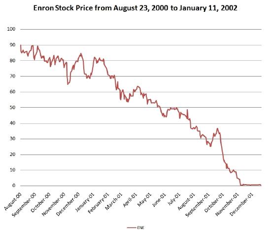
Figure \(\PageIndex{6}\): Enron’s Stock Price. Source: Image courtesy of Nehrams 2020.
Bar Graph
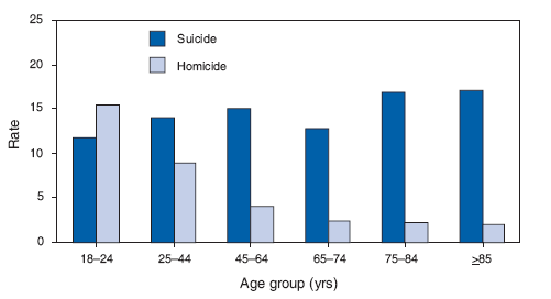
Bar graphs are useful for showing the differences between quantities. They can be used for population demographics, fuel costs, math ability in different grades, and many other kinds of data. The graph in Figure \(\PageIndex{7}\) (“Suicide vs. Homicide”) is well designed. It is relatively simple and is carefully labeled, making it easy for the speaker to guide the audience through the recorded numbers of each type of death. The bar graph is designed to show the difference between rates of suicides and homicides across various age groups. When you look at the data, the first grouping clearly shows that eighteen- to twenty-four-year-olds are more likely to die because of homicide than any of the other age groups.
The graph in Figure \(\PageIndex{8}\) (“Distribution of Income and Wealth in the United States”) is a complicated bar graph depicting the disparity between the so-called “haves” and the “have nots” within the United States. On the left-hand side of the graph, you can see that the Top 20% of people within the United States account for 84.7% of all of the wealth and 50.1% of all of the income. On the other hand, those in the bottom 40% account for only 0.2% of the wealth and 12.1% of the actual income.
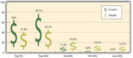
Figure \(\PageIndex{8}\): Distribution of Income and Wealth in the United States. Source: Wolff, E. N. (2007). Recent trends in household wealth in the United States: Rising debt and the middle-class squeeze (Working Paper No. 502). Retrieved from the Levy Economics Institute of Bard College.
While the graph is very well designed, it presents a great deal of information. For example, it shows “wealth” and “income,” for several groups; however, these are related but different concepts. In a written publication, readers will have time to sit and analyze the graph, but in a speaking situation, audience members need to be able to understand the information in a graph very quickly. For that reason, this graph is probably not as effective for speeches as the one in Figure \(\PageIndex{5}\) (“Suicide vs. Homicide”).
Pie Graph
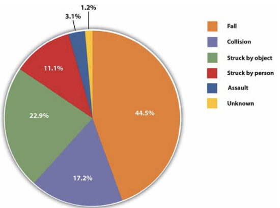
In a pie graph, each piece of the pie corresponds to a percentage of the whole, and the size of the pie varies with the size of the percentage. As with other charts and tables, most office software programs now easily make pie charts. They should be simplified as much as possible without eliminating important information. As with other graphs, the sections of the pie need to be plotted proportionally. In the pie graph shown in Figure \(\PageIndex{9}\) (“Causes of Concussions in Children”) we see a clear and proportional chart that has been color-coded. Color-coding is useful when it’s difficult to fit the explanations in the actual sections of the graph; in that case, you need to include a legend, or key, to indicate what the colors in the graph mean. In this graph, audience members can see very quickly that falls are the primary reason children receive concussions. However, the pie graph in Figure \(\PageIndex{10}\) (“20 Largest Economies”) is jumbled, illegible, confusing, and overwhelming in every way. The use of the flags doesn’t help. Overall, this graph simply contains too much information and is more likely to confuse an audience than help them understand something.

Graphs can present challenges in being effective but also in being ethical. To be both ethical and effective, you need a good understanding of what statistics mean, and you need to create or use graphs that show amounts clearly. If you were showing a bar graph and the bottom number on the graph was 37% rather than starting with 0%, that would result in a visually bigger difference than what really exists (see Figure \(\PageIndex{11}\)).

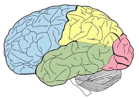
Diagrams
Diagrams are drawings or sketches that outline and explain the parts of an object, process, or phenomenon that cannot be readily seen. Like graphs, diagrams can be considered a type of chart, as in the case of organizational charts and process flow charts. Diagrams are good alternatives to pictures when you only need to point out certain things that may be difficult to see in a photograph.
When you use a diagram, be sure to explain each part of the phenomenon, paying special attention to elements that are complicated or prone to misunderstanding. In the example shown, you might want to color-code the parts of the brain, like in (Figure \(\PageIndex{12}\) ).
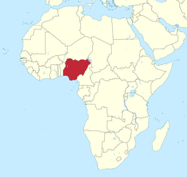
Maps
Maps are extremely useful if the information is clear and limited. There are all kinds of maps, including population, weather, ocean current, political, and economic maps, so you should find the right kind for your speech. Choose a map that emphasizes the information you need to deliver. The map is shown in Figure \(\PageIndex{13}\) (“African Map with Nigerian Emphasis”) is simple, showing clearly the geographic location of Nigeria. This can be extremely valuable for some audiences who might not be able to name and locate countries on the continent of Africa. The map also shows the relative size of Nigeria compared to its neighbors.
Photographs
Pictures can be useful when you need to show an exact replication of what you’re speaking about. Sometimes a photograph or a drawing is the best way to show an unfamiliar but important detail. Figure \(\PageIndex{14}\) (“Native American House - Wigwam”) is a photograph of a wigwam, a dwelling used by Native Americans in the North East. Audiences expect high quality in photographs now, and as with all presentation aids they should enhance the speech and not just “be there.” It is common to put stock photographs on PowerPoint slides as “clip art,” but they should be relevant and not detract from the message of the slide. Pictures can also connect to your audience on a personal level, especially if they evoke audience emotions. Think about the use of pictures in television commercials asking for donations or sponsorships. Organizations like Save the Children and the American Society for the Prevention of Cruelty to Animals successfully use pictures of malnourished children or abused animals to pull at the heartstrings of viewers. A series of well-chosen and themed pictures can have a meaningful impact on an audience. Although some pictures can be effectively presented when printed out on standard 8 1/2″ x 11″ printer paper using a black and white printer, others will need to be enlarged and/or printed in color, which will cost some money. You can often avoid this by incorporating a picture into a PowerPoint presentation, as the picture will be projected large enough for people to see. We will discuss PowerPoint in more detail later.

Video or Audio Recordings
Another very useful type of presentation aid is a video or audio recording. Whether it is a short video from a website such as YouTube or Vimeo, a segment from a song, or a piece of a podcast, a well-chosen video or audio recording may be a good choice to enhance your speech. Imagine, for example, that you’re giving a speech on how Lap-Band surgeries help people lose weight. One of the sections of your speech could explain how the Lap-Band works, so you could easily show a forty-three-second video available on YouTube to demonstrate the part of the surgery. Maybe you could include a recording of a real patient explaining why they decided to get the Lap-Band.
There is one major warning to using audio and video clips during a speech: do not forget that they are supposed to be aids to your speech, not the speech itself. In addition, be sure to avoid these five mistakes that speakers often make when using audio and video clips:
- Avoid choosing clips that are too long for the overall length of the speech. Your instructor can give you some guidelines for how long video and audio clips should be for the speeches in your class if they are allowed (and make sure they are).
- Practice with the audio or video equipment before speaking. If you are unfamiliar with the equipment, you’ll look foolish trying to figure out how it works. This fiddling around will not only take your audience out of your speech but also harm your credibility. It also wastes valuable time. Finally, be sure that the speakers on the computer are on and at the right volume level.
- Cue the clip to the appropriate place before beginning your speech. We cannot tell you the number of times we’ve seen students spend valuable speech time trying to find a clip on YouTube or a DVD. You need to make sure your clip is ready to go before you start speaking. Later in this chapter, we will look at using video links in slides.
- In addition to cueing the clip to the appropriate place, the browser window should be open and ready to go. If there are advertisements before the video, be sure to have the video cued to play after the ad. The audience should not have to sit through a commercial. There is a website called TubeChop that can allow you to cut a segment out of a YouTube video, then creating a new link. It has limitations but can be useful.
- The audience must be given context before a video or audio clip is played, specifically what the clip is and why it relates to the speech. At the same time, the video should not repeat what you have already said but add to it.
- One useful strategy for incorporating video is to play a video without audio and speak along with the video, acting as a narrator. This allows the speaker to have more control over the visual aid and to adapt it and make it more relevant to a specific topic and audience.
- Additionally, video editing software like Final Cut and iMovie are readily available to college students and relatively easy to use. Some simple editing to cut together various clips that are meaningful or adding an introductory title or transitions can go a long way toward making your video look professional.
Objects or Models
Three-dimensional objects or models that represent an idea can be useful as a visual aid for a speech. Objects refer to anything you could hold up and talk about during your speech. If you’re talking about the importance of not using plastic water bottles, you might hold up a plastic water bottle and a stainless steel water bottle as examples.
Models, on the other hand, are re-creations of physical objects that you cannot have readily available with you during a speech. If you’re giving a speech on heart murmurs, you may be able to show how heart murmurs work by holding up a model of the human heart.
Tips for Using Objects Effectively
- Make sure your objects are large enough for the audience to see.
- Do not pass objects around, as it will be distracting.
- Hold your objects up long enough for the audience to see them.
- Do not talk to your object, wiggle or wave it around, tap on it, or obstruct the audience’s view of your face with it.
- Practice with your objects so your delivery will be fluent and there won’t be any surprises.
People
Speakers can often use their own bodies to demonstrate facets of a speech. If your speech is about ballroom dancing or ballet, you might use your body to demonstrate the basic moves in the cha-cha or the five basic ballet positions.
In some cases, such as for a demonstration speech, you might want to ask someone else to serve as your presentation aid. You should arrange ahead of time for a person (or persons) to be an effective aid—do not assume that an audience member will volunteer on the spot. If you plan to demonstrate how to immobilize a broken bone, your volunteer must know ahead of time that you will touch them as much as necessary to splint the break
You must also make certain that they will arrive dressed presentably and that they will not draw attention away from your message through their appearance or behavior. The transaction between you and your human presentation aid must be appropriate, especially if you are going to demonstrate something like a dance step. In short, make sure your helper will know what is expected of them and consents to it.
Finally, before you decide to use an animal as a presentation aid, ask yourself if you could make your point equally well with a picture, model, diagram, or other representation of the animal in question.
Using Presentation Slides
Ever since the 1990s and the mainstreaming of personal computer technology, speakers have had the option of using slide presentation software to accompany their speeches and presentations. The most commonly known one is PowerPoint, although there are several others:
- Prezi, available at www.prezi.com You can see Prezi in action in this video by James Geary.
- Slide Rocket, available at www.sliderocket.com
- Google Slides, available in Google Drive and useful for collaborative assignments
- Keynote, the Apple presentation slide software on MACs
- Impress, an Open Office product (http://www.openoffice.org/product/impress.html)
- PrezentIt
- Adobe Acrobat Presenter
- ThinkFree
Creating Quality Slide Shows
Slides should show the principles of good design, which include unity, emphasis or focal point, scale and proportion, balance, and rhythm (Lauer & Pentak, 2000). Presenters should also pay attention to tone and usability. With those principles in mind, here are some tips for creating and then using presentation software.
Unity and Consistency
Generally, it is best to use a single font for the text on your visuals so that they look like a unified set. Or you can use two different fonts in a consistent way, such as having all headings and titles in the same font and all bullet points in the same font. Additionally, the background should probably remain consistent, whether you choose one of the many design templates or if you just opt for background color.
The adage, “Keep It Simple, Speaker” definitely applies to presentation slides in terms of unity. Each slide should have one message, one photo, one graphic. The audience members should know what they are supposed to look at on the slide. A phrase to remember about presentation slides and the wide range of design elements available is “Just because you can, doesn’t mean you should.”
The emphasis, Focal Point, and Visibility
Several points should be made about how to make sure the audience sees what they need to see on the slides.
- It is essential to make sure the information is large enough for the audience to see; and since the display size may vary according to the projector you are using, this is another reason for practicing in advance with the equipment you intend to use.
- High contrast between the text and slides is extremely important. White fonts against very dark backgrounds and black fonts against very light backgrounds are probably your safest bet here. Remember that the way it looks on your computer screen is not exactly how it will look when projected—the light is coming from a different place. Avoid words on photos.
- Also in terms of visibility, most experts say that sans serif fonts such as Arial, Tahoma, and Verdana are better for reading from screens than serif fonts such as Times New Roman, Bookface, Georgia, or Garamond. Merriam-Webster (2018) defines “serif” as “any of the short lines stemming from and at an angle to the upper and lower ends of the strokes of a letter.” Serifs are additions to the letters on different fonts that give them a different appearance and help the flow of the eye when reading.
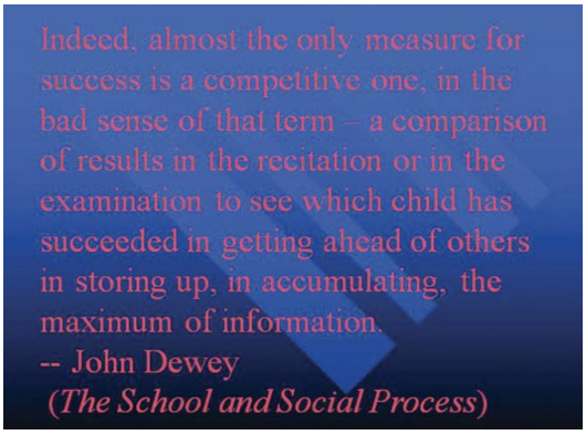
How does the slide in Figure \(\PageIndex{15}\) stack up beside these rules for visibility? You probably noticed that slide is a “fail” in terms of high contrast between the font and background and the use of a block of text not broken up for easy reading. The audience would feel like they are supposed to read it but not be able to. Also, since the text is a quotation from John Dewey, the text should have quotation marks around it.
Scale and Proportion
Although there are several ways to think about scale and proportion, we will discuss three here. First, bullet points. Bullet points infer that the items in the bulleted list are equal and the sequence doesn’t matter. If you want to communicate order or sequence or priority, use numbers. Do not mix outline points or numerical points with bullet points. Also, you should not put your outline (Roman numerals, etc.) on the slide.
Bullet points should be short—not long, full sentences—but at the same time should be long enough to mean something. In a speech on spaying and neutering pets, the bullet point “pain” may be better replaced with “Pet feels little pain.” Second, when you are designing your slides, it is best to choose a template and stick with it. If you input all your graphics and material and then change the template, the format of the slide will change, in some cases dramatically, and you will have distorted graphics and words covered up. You will then have to redesign each slide, which can be unnecessarily time-consuming.
The third aspect of scale and proportion is the relationship between the graphics and text in terms of size. This aspect is discussed below in the next section on “Balance.” Also, a graphic should be surrounded by some space and not just take up the whole slide.
Balance
In general, you want symmetrical slides.
- Use a consistent theme with limited variation in font style and font size.
- You don't want too much “white space” below the text, leaving an imbalance between the text and graphics. The graphic should not go up into the title, and the title should be centered.
- The slides should not have full sentences or paragraphs. Break the text up into bullet points. Limit content to no more than six lines of text or six bullet points per slide.
- The graphic(s) should be sized appropriately for the slide (pulling the image from the corner to maintain picture quality).
- Avoid slides that are too “busy.” Don't have too much text or too many images
Rhythm in Presenting
The rhythm of your slide display should be reasonably consistent—you would not want to display a dozen different slides in the first minute of a five-minute presentation and then display only one slide per minute for the rest of the speech. Timing them so that the audience can actually take them in is important. Presenters often overdo the number of slides, thinking they will get a better grade, but too many slides just cause overkill.
If you can obtain a remote mouse to change slides, that can help you feel independent of the mouse attached to the computer. However, you have to practice with the remote “clicker.” But if you have to use the mouse to change the slide, keep your hands off of it between clicks. We have seen students wiggle the little arrow all over the screen. It is extremely annoying.
Whether using a remote “clicker” or the attached mouse, you must attend to the connection between what is on the screen and what you are actually talking about at the moment. Put reminders in your notes about when you need to change slides during your speech.
For better or worse, we have become very screen-oriented in our communication, largely because screens change often and that changing teaches us to expect new stimuli, which we crave. If the screen is up but you are not talking about what is on the screen, it is very confusing to the audience. To avoid this, some presenters put a black slide between slides in the presentation so that hitting the forward key gives the same effect, but hitting it again takes them to a new screen.
In fact, a basic presentation rule is to only show your visual aid when you are talking about it, and remove it when you no longer are talking about it. Some other practical considerations are as follows:
- Be sure the file is saved in a format that will be “readable” on the computer where you are presenting. A common example is that a Keynote presentation (Apple) does not open on all PCs. You can save Keynote as a .ppt file for use on a PC. Likewise, if you chose to use Prezi or other web-based presentation software, you will need a strong, reliable Internet connection to show the slides.
- A very strong temptation for speakers is to look at the projected image rather than the audience during the speech. This practice cuts down on eye contact, of course, and is distracting for the audience. Two solutions for that are to print your notes from the presentation slides and/or use the slides as your note structure. Also remember that if the image is on the computer monitor in front of you, it is on the screen behind you.
- Always remember—and this cannot be emphasized enough—technology works for you, not you for the technology. The presentation aids are aids, not the speech itself.
- If you are using a video or audio clip from an Internet source, it is probably best to hyperlink the URL on one of the slides rather than minimize the program and change to the Internet site. You can do this by highlighting a keyword on the slide, right-clicking to find “hyperlink,” and then paste the URL there. Although you can also embed video in a PowerPoint, it makes the file extremely large and that may cause problems of its own.
- Finally, it is common for speakers to think “the slide changes, so the audience know there is a change, so I don’t need a verbal transition.” Please do not fall into this trap. Verbal transitions are just as, and maybe more, necessary for a speech using slides.
Something to Think About
What are some attention problems caused by using projection equipment during a speech?
Which kind of presentation aid would be most useful for the following?
- data on how the average American family uses its income
- discussing the number of wind turbines in five Midwestern states
- explaining the changes in enrollment of minority students at your college over 20 year
- a speech on the chambers of the human heart
- a speech on the differences between North and South Korea
- a speech on the Sutton Hoo archeological dig in England