
2.1: Qualitative Variables
- Page ID
- 195781
\( \newcommand{\vecs}[1]{\overset { \scriptstyle \rightharpoonup} {\mathbf{#1}} } \)
\( \newcommand{\vecd}[1]{\overset{-\!-\!\rightharpoonup}{\vphantom{a}\smash {#1}}} \)
\( \newcommand{\id}{\mathrm{id}}\) \( \newcommand{\Span}{\mathrm{span}}\)
( \newcommand{\kernel}{\mathrm{null}\,}\) \( \newcommand{\range}{\mathrm{range}\,}\)
\( \newcommand{\RealPart}{\mathrm{Re}}\) \( \newcommand{\ImaginaryPart}{\mathrm{Im}}\)
\( \newcommand{\Argument}{\mathrm{Arg}}\) \( \newcommand{\norm}[1]{\| #1 \|}\)
\( \newcommand{\inner}[2]{\langle #1, #2 \rangle}\)
\( \newcommand{\Span}{\mathrm{span}}\)
\( \newcommand{\id}{\mathrm{id}}\)
\( \newcommand{\Span}{\mathrm{span}}\)
\( \newcommand{\kernel}{\mathrm{null}\,}\)
\( \newcommand{\range}{\mathrm{range}\,}\)
\( \newcommand{\RealPart}{\mathrm{Re}}\)
\( \newcommand{\ImaginaryPart}{\mathrm{Im}}\)
\( \newcommand{\Argument}{\mathrm{Arg}}\)
\( \newcommand{\norm}[1]{\| #1 \|}\)
\( \newcommand{\inner}[2]{\langle #1, #2 \rangle}\)
\( \newcommand{\Span}{\mathrm{span}}\) \( \newcommand{\AA}{\unicode[.8,0]{x212B}}\)
\( \newcommand{\vectorA}[1]{\vec{#1}} % arrow\)
\( \newcommand{\vectorAt}[1]{\vec{\text{#1}}} % arrow\)
\( \newcommand{\vectorB}[1]{\overset { \scriptstyle \rightharpoonup} {\mathbf{#1}} } \)
\( \newcommand{\vectorC}[1]{\textbf{#1}} \)
\( \newcommand{\vectorD}[1]{\overrightarrow{#1}} \)
\( \newcommand{\vectorDt}[1]{\overrightarrow{\text{#1}}} \)
\( \newcommand{\vectE}[1]{\overset{-\!-\!\rightharpoonup}{\vphantom{a}\smash{\mathbf {#1}}}} \)
\( \newcommand{\vecs}[1]{\overset { \scriptstyle \rightharpoonup} {\mathbf{#1}} } \)
\( \newcommand{\vecd}[1]{\overset{-\!-\!\rightharpoonup}{\vphantom{a}\smash {#1}}} \)
\(\newcommand{\avec}{\mathbf a}\) \(\newcommand{\bvec}{\mathbf b}\) \(\newcommand{\cvec}{\mathbf c}\) \(\newcommand{\dvec}{\mathbf d}\) \(\newcommand{\dtil}{\widetilde{\mathbf d}}\) \(\newcommand{\evec}{\mathbf e}\) \(\newcommand{\fvec}{\mathbf f}\) \(\newcommand{\nvec}{\mathbf n}\) \(\newcommand{\pvec}{\mathbf p}\) \(\newcommand{\qvec}{\mathbf q}\) \(\newcommand{\svec}{\mathbf s}\) \(\newcommand{\tvec}{\mathbf t}\) \(\newcommand{\uvec}{\mathbf u}\) \(\newcommand{\vvec}{\mathbf v}\) \(\newcommand{\wvec}{\mathbf w}\) \(\newcommand{\xvec}{\mathbf x}\) \(\newcommand{\yvec}{\mathbf y}\) \(\newcommand{\zvec}{\mathbf z}\) \(\newcommand{\rvec}{\mathbf r}\) \(\newcommand{\mvec}{\mathbf m}\) \(\newcommand{\zerovec}{\mathbf 0}\) \(\newcommand{\onevec}{\mathbf 1}\) \(\newcommand{\real}{\mathbb R}\) \(\newcommand{\twovec}[2]{\left[\begin{array}{r}#1 \\ #2 \end{array}\right]}\) \(\newcommand{\ctwovec}[2]{\left[\begin{array}{c}#1 \\ #2 \end{array}\right]}\) \(\newcommand{\threevec}[3]{\left[\begin{array}{r}#1 \\ #2 \\ #3 \end{array}\right]}\) \(\newcommand{\cthreevec}[3]{\left[\begin{array}{c}#1 \\ #2 \\ #3 \end{array}\right]}\) \(\newcommand{\fourvec}[4]{\left[\begin{array}{r}#1 \\ #2 \\ #3 \\ #4 \end{array}\right]}\) \(\newcommand{\cfourvec}[4]{\left[\begin{array}{c}#1 \\ #2 \\ #3 \\ #4 \end{array}\right]}\) \(\newcommand{\fivevec}[5]{\left[\begin{array}{r}#1 \\ #2 \\ #3 \\ #4 \\ #5 \\ \end{array}\right]}\) \(\newcommand{\cfivevec}[5]{\left[\begin{array}{c}#1 \\ #2 \\ #3 \\ #4 \\ #5 \\ \end{array}\right]}\) \(\newcommand{\mattwo}[4]{\left[\begin{array}{rr}#1 \amp #2 \\ #3 \amp #4 \\ \end{array}\right]}\) \(\newcommand{\laspan}[1]{\text{Span}\{#1\}}\) \(\newcommand{\bcal}{\cal B}\) \(\newcommand{\ccal}{\cal C}\) \(\newcommand{\scal}{\cal S}\) \(\newcommand{\wcal}{\cal W}\) \(\newcommand{\ecal}{\cal E}\) \(\newcommand{\coords}[2]{\left\{#1\right\}_{#2}}\) \(\newcommand{\gray}[1]{\color{gray}{#1}}\) \(\newcommand{\lgray}[1]{\color{lightgray}{#1}}\) \(\newcommand{\rank}{\operatorname{rank}}\) \(\newcommand{\row}{\text{Row}}\) \(\newcommand{\col}{\text{Col}}\) \(\renewcommand{\row}{\text{Row}}\) \(\newcommand{\nul}{\text{Nul}}\) \(\newcommand{\var}{\text{Var}}\) \(\newcommand{\corr}{\text{corr}}\) \(\newcommand{\len}[1]{\left|#1\right|}\) \(\newcommand{\bbar}{\overline{\bvec}}\) \(\newcommand{\bhat}{\widehat{\bvec}}\) \(\newcommand{\bperp}{\bvec^\perp}\) \(\newcommand{\xhat}{\widehat{\xvec}}\) \(\newcommand{\vhat}{\widehat{\vvec}}\) \(\newcommand{\uhat}{\widehat{\uvec}}\) \(\newcommand{\what}{\widehat{\wvec}}\) \(\newcommand{\Sighat}{\widehat{\Sigma}}\) \(\newcommand{\lt}{<}\) \(\newcommand{\gt}{>}\) \(\newcommand{\amp}{&}\) \(\definecolor{fillinmathshade}{gray}{0.9}\)When Apple Computer introduced the iMac computer in August 1998, the company wanted to learn whether the iMac was expanding Apple’s market share. Was the iMac just attracting previous Macintosh owners? Or was it purchased by newcomers to the computer market and by previous Windows users who were switching over? To find out, 500 iMac customers were interviewed. Each customer was categorized as a previous Macintosh owner, a previous Windows owner, or a new computer purchaser.
This section examines graphical methods for displaying the results of the interviews. We’ll learn some general lessons about how to graph data that fall into a small number of categories. A later section will consider how to graph numerical data in which each observation is represented by a number in some range. The key point about the qualitative data that occupy us in the present section is that they do not come with a pre-established ordering (the way numbers are ordered). For example, there is no natural sense in which the category of previous Windows users comes before or after the category of previous Macintosh users. This situation may be contrasted with quantitative data, such as a person’s weight. People of one weight are naturally ordered with respect to people of a different weight.
Frequency Tables
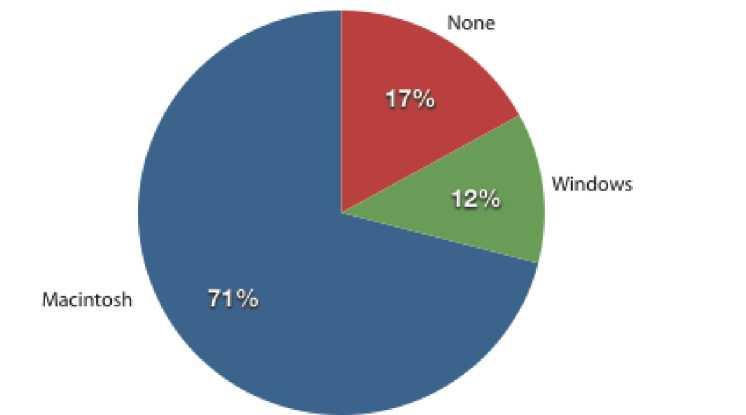
All of the graphical methods shown in this section are derived from frequency tables. Table 1 shows a frequency table for the results of the iMac study; it shows the frequencies of the various response categories. It also shows the relative frequencies, which are the proportion of responses in each category. For example, the relative frequency for “none” of .
|
Previous Ownership |
Frequency |
Relative Frequency |
|---|---|---|
|
None |
85 |
0.17 |
|
Windows |
60 |
0.12 |
|
Macintosh |
355 |
0.71 |
|
Total |
500 |
1 |
Table 1. Frequency Table for the iMac Data.
Pie Charts
The pie chart in Figure \(\PageIndex{1}\) shows the results of the iMac study. In a pie chart, each category is represented by a slice of the pie. The area of the slice is proportional to the percentage of responses in the category. This is simply the relative frequency multiplied by 100. Although most iMac purchasers were Macintosh owners, Apple was encouraged by the 12% of purchasers who were former Windows users, and by the 17% of purchasers who were buying a computer for the first time.
Pie charts are effective for displaying the relative frequencies of a small number of categories. They are not recommended, however, when you have a large number of categories. Pie charts can also be confusing when they are used to compare the outcomes of two different surveys or experiments. In an influential book on the use of graphs, Edward Tufte asserted “The only worse design than a pie chart is several of them.”
Here is another important point about pie charts. If they are based on a small number of observations, it can be misleading to label the pie slices with percentages. For example, if just 5 people had been interviewed by Apple Computers, and 3 were former Windows users, it would be misleading to display a pie chart with the Windows slice showing 60%. With so few people interviewed, such a large percentage of Windows users might easily have occurred since chance can cause large errors with small samples. In this case, it is better to alert the user of the pie chart to the actual numbers involved. The slices should therefore be labeled with the actual frequencies observed (e.g., 3) instead of with percentages.
Bar charts
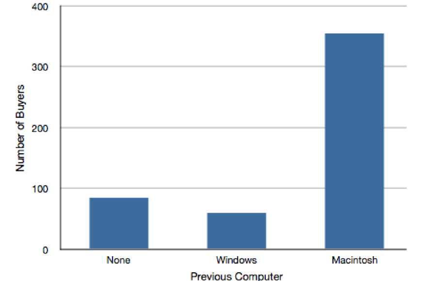
Bar charts can also be used to represent frequencies of different categories. A bar chart of the iMac purchases is shown in Figure \(\PageIndex{2}\). Frequencies are shown on the Y- axis and the type of computer previously owned is shown on the X-axis. Typically, the Y-axis shows the number of observations in each category rather than the percentage of observations in each category as is typical in pie charts.
Comparing Distributions
Often we need to compare the results of different surveys, or of different conditions within the same overall survey. In this case, we are comparing the “distributions” of responses between the surveys or conditions. Bar charts are often excellent for illustrating differences between two distributions. Figure \(\PageIndex{3}\) shows the number of people playing card games at the Yahoo web site on a Sunday and on a Wednesday in the spring of 2001. We see that there were more players overall on Wednesday compared to Sunday. The number of people playing Pinochle was nonetheless the same on these two days. In contrast, there were about twice as many people playing hearts on Wednesday as on Sunday. Facts like these emerge clearly from a well-designed bar chart.
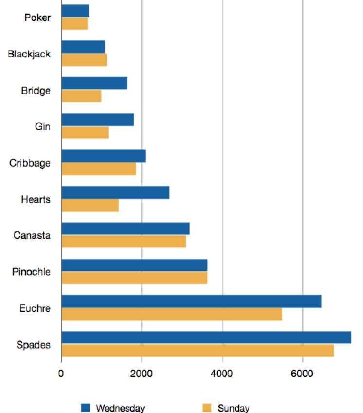
The bars in Figure \(\PageIndex{3}\) are oriented horizontally rather than vertically. The horizontal format is useful when you have many categories because there is more room for the category labels. We’ll have more to say about bar charts when we consider numerical quantities later in this chapter.
Some graphical mistakes to avoid
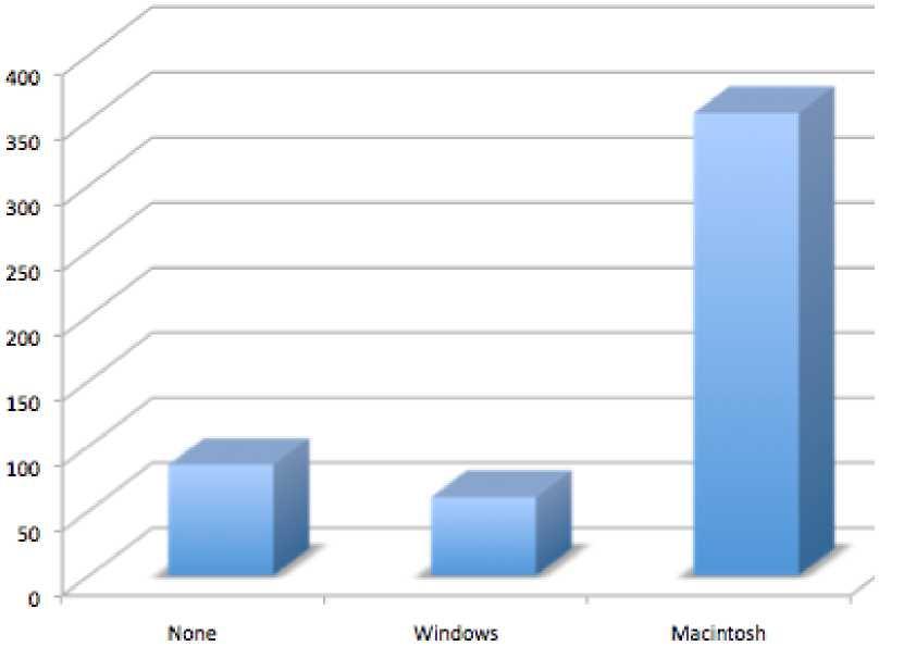
Don’t get fancy! People sometimes add features to graphs that don’t help to convey their information. For example, 3-dimensional bar charts such as the one shown in Figure \(\PageIndex{4}\) are usually not as effective as their two-dimensional counterparts.
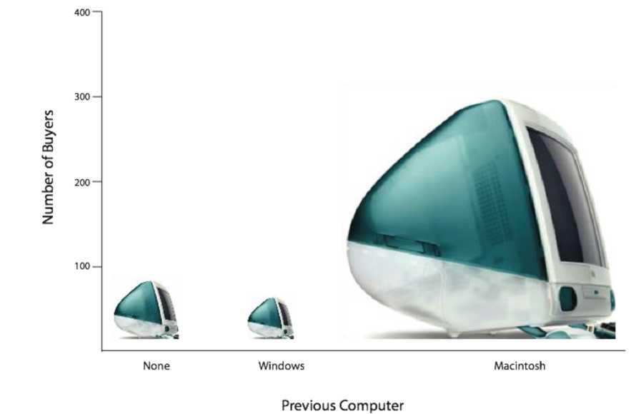
Here is another way that fanciness can lead to trouble. Instead of plain bars, it is tempting to substitute meaningful images. For example, Figure \(\PageIndex{5}\) presents the iMac data using pictures of computers. The heights of the pictures accurately represent the number of buyers, yet Figure \(\PageIndex{5}\) is misleading because the viewer’s attention will be captured by areas. The areas can exaggerate the size differences between the groups. In terms of percentages, the ratio of previous Macintosh owners to previous Windows owners is about 6 to 1. But the ratio of the two areas in Figure \(\PageIndex{5}\) is about 35 to 1. A biased person wishing to hide the fact that many Windows owners purchased iMacs would be tempted to use Figure \(\PageIndex{5}\) instead of Figure \(\PageIndex{2}\)! Edward Tufte coined the term “lie factor” to refer to the ratio of the size of the effect shown in a graph to the size of the effect shown in the data. He suggests that lie factors greater than 1.05 or less than 0.95 produce unacceptable distortion.
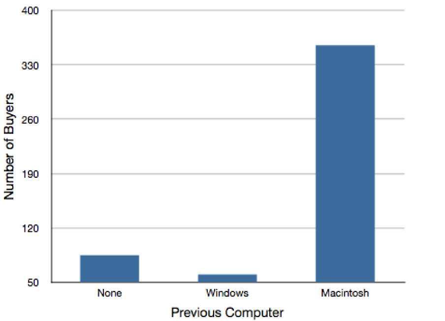
Another distortion in bar charts results from setting the baseline to a value other than zero. The baseline is the bottom of the Y-axis, representing the least number of cases that could have occurred in a category. Normally, but not always, this number should be zero. Figure \(\PageIndex{6}\) shows the iMac data with a baseline of 50. Once again, the differences in areas suggests a different story than the true differences in percentages. The number of Windows-switchers seems minuscule compared to its true value of 12%.
Finally, we note that it is a serious mistake to use a line graph when the X-axis contains merely qualitative variables. A line graph is essentially a bar graph with the tops of the bars represented by points joined by lines (the rest of the bar is suppressed). Figure 7 inappropriately shows a line graph of the card game data from Yahoo. The drawback to Figure \(\PageIndex{7}\) is that it gives the false impression that the games are naturally ordered in a numerical way when, in fact, they are ordered alphabetically.
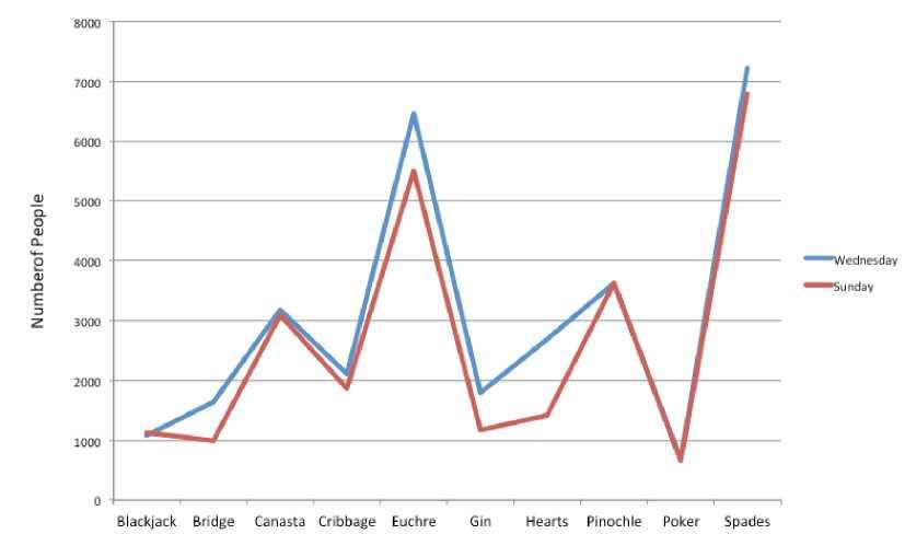
Figure \(\PageIndex{7}\): A line graph used inappropriately to depict the number of people playing different card games on Sunday and Wednesday.(Copyright; author via source)
Summary
Pie charts and bar charts can both be effective methods of portraying qualitative data. Bar charts are better when there are more than just a few categories and for comparing two or more distributions. Be careful to avoid creating misleading graphs.