This section applies the tools of partial equilibrium analysis and deadweight loss to analyze import restrictions on sugar in the United States. Supply and demand analysis is shown to be a flexible, powerful tool.
Before analyzing the US sugar quota through the lens of surplus and deadweight loss, we take a crash course on sugarproduction, pricing, and how import quotas on sugar are implemented.
Facts about Sugar
Everyone knows you can buy sugar in any grocery store and pour it into your coffee or use it to bake cookies. But there are many other kinds of white granulated sugars (like confectioners’ sugar) and also brown and liquid sugars.
No matter the final form, "All sugar is made by first extracting sugar juice from sugar beet or sugar cane plants" (www.sugar.org/sugar/types/). Cane sugar is grown in warmer areas, whereas beets come from cooler climates. Once refined, you cannot easily tell the difference. Unless you are an expert, sugars from beet versus cane are perfect substitutes.
Some sugars are used only by industrial food manufacturers and not available in the grocery store. Home and commercial users can choose from many other sweeteners, such as high fructose corn syrup, and a long list of artificial sweetener options.
In addition to eating it, sugar can be made into ethanol and used to power a car. Most cars in Brazil are flex-fuel and growing huge quantities of cane has enabled Brazil to greatly reduce oil imports.
Many countries produce sugar. The United States grows both beet and cane sugar, but domestic production does not meet total demand so the United States imports sugar. Figure 17.21 is a subsection of a bigger table that shows sources of US sugar.
The numbers in the table come in units of short tons, raw value, STRV. A short ton is 2,000 pounds. Raw value means the dry weight of raw sugar. You get 1 ton of refined sugar (the white crystals you buy in the store) from 1.07 tons of raw sugar.
Beets are grown in many states so they are not all listed, but half of US beet production comes from the Red River Valley in Minnesota and North Dakota. The table shows the US domestic sugar industry is split roughly evenly between beet and cane, producing about 4,000 thousand STRVs (or 4,000,000 STRVs) from each crop.
Figure 17.21 makes clear that the United States imports a great deal of sugar, 3,070 thousand STRVs in 2018/19 and approaching 4,000 in 2019/20 (although this estimate was made before the covid 19 pandemic). So, roughly, the United States grows 2/3 of its own sugar and imports the rest.
Figure 17.21 shows that sugar is imported under several categories, the most important of which is the tariff-rate quota, TRQ. This is a complicated scheme for controlling the amount of sugar imported from different countries. The details are available at www.ers.usda.gov/topics/crops/sugar-sweeteners/policy.aspx.
A TRQ is a type of import restriction where a split tariff (or tax on imported goods) is employed. There is an extremely low tariff (zero or a nominal charge) applied to imports under a given amount (called the in-quota tariff) and a really high tariff applied to quantities imported beyond the given amount (so little is imported after the in-quota tariff is exhausted).
The TRQ was created in 1990 after multilateral trade agreements forced elimination of traditional quotas. In Europe, the EU Sugar Protocol is similar to the US TRQ system. The U.S. Department of Agriculture (USDA) runs the TRQ. The overall allotment is established by multilateral trade agreements and the USDA decides on the country allocations.
We can look at reports issued by the USDA as Excel spreadsheets to understand the TRQ.
STEP Open the Excel workbook SugarQuota.xls, read the Intro sheet, then go to the TRQ sheet and scroll around.
The data are constantly updated, so the specific numbers are not our chief concern. What matters is that column A has a list of countries and column O has FY 2020 TRQ Original Allocations.
As an example, consider the Dominican Republic. As of May 18, 2020, it had used 114,516 STRVs of its 185,335 TRQ allocation. The USDA has given every country in column A an amount that they can import. Beyond the TRQ amount, a hefty tax is applied so imports stop.
Outside of sugar producers and commercial food manufacturers that buy sugar, very few people in the US know or care much about this. In many countries, like the Dominican Republic, however, the US TRQ is a big news. When it is announced, there is intense media coverage and discussion.
If you scroll up and down, you will see that the Dominican Republic has the highest TRQ allocation, even bigger than Brazil, which is obviously a much larger country. What is going on here? In addition to protecting domestic US sugar producers, the United States uses the TRQ as a major foreign policy lever, using allocations as punishments and rewards for foreign governments.
Now that we know a little about quantities of domestically produced sugar and imports, we turn to the price of sugar.
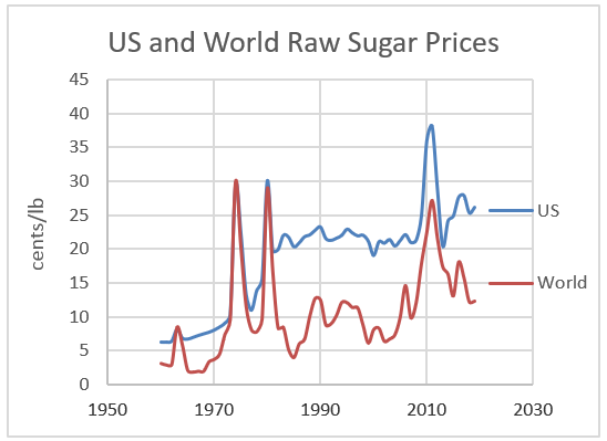
STEP Proceed to the Price sheet to see US and world raw sugar prices.
Figure 17.22 shows that prices have fluctuated over time, but US prices are always higher than world prices. The 1970s produced sharp spikes, followed by a period of calm until another spike during the Great Recession.
Figure 17.22: Nominal raw sugar prices.
Source: SugarQuota.xls!Price.
Since the TRQ was implemented in 1990, US sugar prices are consistently about 10 cents per pound higher than world prices. That might not sound like much of a difference, but think of it this way: US sugar prices are roughly double what others pay for sugar. If you make ice cream or candy or soft drinks or any one of the many products that uses sugar, doubling costs for this input is a really big deal.
STEP Review the price adjusted for inflation chart in the Price sheet.
The real price of sugar had been falling steadily, but it seems to have leveled off more recently. We can expect technological change (especially genetic engineering of cane and beet plants) to lower prices in the future.
We have ended our whirlwind tour of sugar production, the US TRQ system, and prices. Obviously, the sugar quota is causing higher prices for US consumers (including commercial buyers of sugar) and it benefits US producers. But we can say more and evaluate the US sugar quota by applying partial equilibrium analysis.
Supply and Demand for US Sugar
To analyze the effects of the sugar quota, we need estimates of demand and supply curves for sugar in the United States. Because we will work with linear functions, we need intercept and slope parameters for the demand and supply of sugar.
The USDA reports roughly 12,000 thousand STRVs of sugar are bought and sold in the United States for about 25 cents per pound for raw sugar. We assume the market is in equilibrium so we interpret these values as the equilibrium quantity and price.
There is a vast literature on sugar with countless estimates of demand, supply, and elasticities. Since this is an exercise in showing how partial equilibrium analysis works, we will use hypothetical demand and supply functions that are calibrated to the observed values in the US sugar market.
Our linear demand and supply curves are \[Q_D=15000-120P\] \[Q_S=400P\] At \(P=25\) cents per pound, quantity demanded is 12,000 thousand STRVs (our equilibrium P and Q) and the price elasticity of demand is \(\frac{\Delta Q_D}{\Delta P}\frac{P}{Q_D}=\frac{1}{-120}\frac{25}{12000}=- 0.25\). That is quite inelastic and conforms with estimates of sugar price elasticities of demand. Although there are substitutes, in many recipes (especially for commercial products), precise amounts of sugar are absolutely required. The price elasticity of supply in our simple model is \(+1\).
The inverse demand and supply curves are \[P=125-\frac{1}{120}Q_D\] \[P=\frac{1}{400Q_S}\] You probably did not do this, but computing the quantity supplied from the supply curve with \(P=25\) gives \(Q=10000\). Something is wrong because the quantity demanded does not equal the quantity supplied. For sugar, we need to include imports.
Free Trade
We begin our partial equilibrium analysis of the US sugar quota in Fantasylandwe assume that there is no restriction of any kind on the importation of sugar.
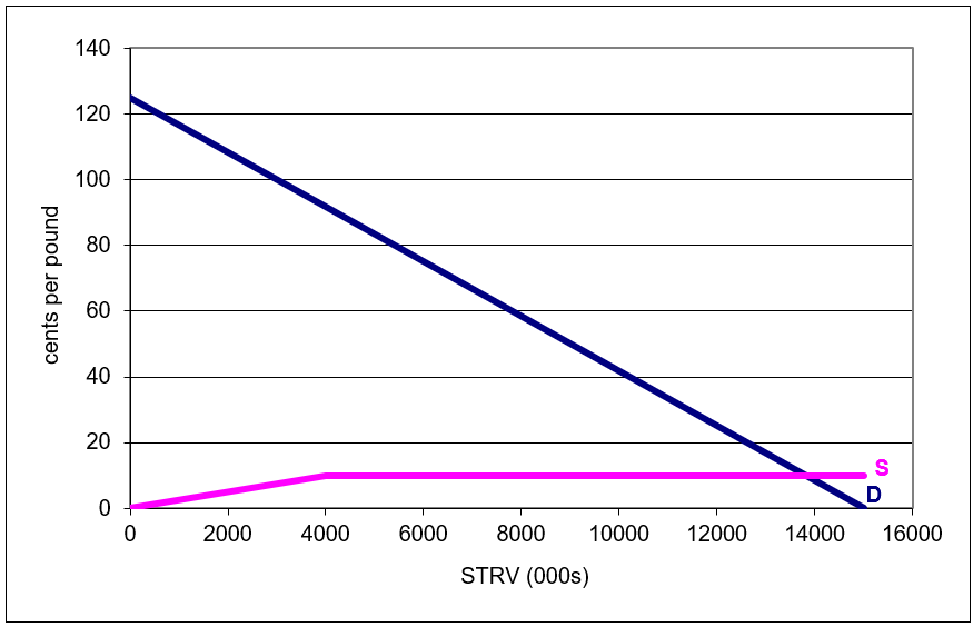
STEP Proceed to the FreeTrade sheet to see how the market would work under a regime of no restrictions on imports.
Figure 17.23 reproduces the graph. The demand curve is straightforward, but the supply curve merits special attention.
Figure 17.23: Supply and demand with hypothetical free trade.
Source: SugarQuota.xls!FreeTrade.
The first part of the supply curve (from the origin to the kink at \(Q = 4000\)) is domestically produced US sugar. As long as the price is below the world price of 10 cents per pound, the best, lowest cost US producers will supply the market.
Beyond 4,000 units (measured in thousands of STRVs for consistency with USDA TRQ units), world suppliers take over. It is assumed that the United States has access to as much sugar as it wants at the world raw sugar price of 10 cents per pound. Thus, the market would not continue to use US produced sugar beyond 4,000 units. Instead, supply would come from the perfectly elastic world supply curve.
US consumers (home and industrial buyers) would enjoy a 10 cent per pound price for raw sugar and the equilibrium quantity would be 13,800 thousands STRVs. Over 2/3 of sugar consumed would be imported.
The sum of US consumers’ and producers’ surplus would be more than $16 billion. In this properly functioning market, this is the maximum possible total surplus.
STEP Click on cells G33 and G34 to see the formulas used to compute CS and PS.
Notice that many US producers would be driven out of the market because they cannot make sugar at the low world price. Those US producers that remain (selling the first 4,000 units) would earn $400 million in producers’ surplus under a free trade regime. As will be clear in a moment, this is an important number to keep in mind.
Incorporating an Import Quota
The TRQ system is too complicated to exactly implement in Excel so we model a simple quota that is easier to understand and acts similarly to the TRQ scheme.
STEP Proceed to the ImportQuota sheet to see what happens with an import quota on sugar.
As before, we focus on the supply curve. It is crucial to the analysis.
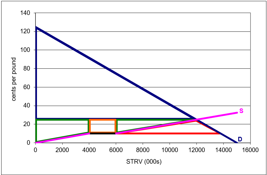
The ImportQuota sheet shows that the supply curve has an upward sloping part, then a flat part, and then it starts sloping up again. The first part is the US domestic supply curve. The lowest cost US firms will supply the market when the price is below the 10 cents per pound world price.
The flat part is the amount of imported sugar allowed. Cell H6 shows this amount is 2,000 units, so the flat segment is 2,000 units long.
The last, rising part of the supply curve is, once again, the domestic US supply curve. Once the quota is filled and no more foreign sugar is allowed into the United States, domestic producers that could not survive in a free market supply sugar.
Notice how the supply curve is pink, indicating it is domestic US sugar, at low and high levels of output. Imports snap the US supply curve, inserting a flat portion of length equal to amount of imports.
Cells I6 and J6 report equilibrium price and quantity (where S and D intersect). Compared to the FreeTrade sheet, \(P_e\) has risen from 10 to 25 cents per pound, while quantity has fallen from 13,800 to 12,000 thousand STRVs (2,000 of which are imported). Remember, we chose parameter values for the supply and demand curves to match real-world data from the US sugar market.
STEP Move the import slider control left and right to see how the import allotment affects the supply curve.
As you increase the amount of imports, you lengthen the flat segment and push the pink part of the S curve to the right. Decreasing the import allotment does the opposite. The beginning of the supply curve, below 4,000 units remains unchanged.
It is also easy to see how tightening the import allotment increases the equilibrium price and lowers the equilibrium quantity. Relaxing the imports allowed does the reverse.
STEP Enter 9800 in cell H6. This is the same as moving the import slider control all the way to the right.
This mimics the FreeTrade sheet. The import allotment is set so high that foreign sugar producers supply all of the US market after the first 4,000 units. Equilibrium price falls back to its free trade level of 10 cents per pound and quantity rises to 13,800 units.
Evaluating an Import Quota
We know import quotas raise prices and lower output, but this is just the outcome of the mechanism. To evaluate import quotas, we use the concepts of surplus and deadweight loss.
STEP Return the import quota to 2000 in cell H6 and then click the Show CS checkbox (cell C7).
Cells are displayed in columns A and B that are the source data for the blue consumers’ surplus triangle that has been added to the chart. Under the sugar quota, the CS no longer extends to the world price of 10 cents per pound and quantity is smaller than the optimal quantity. Consumers lose $3.87 billion in surplus compared to the optimal solution.
STEP Click the Show US PS checkbox.
This adds the producers’ surplus gained by sugar manufacturers in the United States. Their total PS is composed of two separate parts. On the left is a trapezoid and on the right is a triangle. What is in the middle?
STEP Click the Show Foreign PS checkbox.
The orange rectangle added to the chart is PS that goes to foreign producers. Notice that this is not deadweight loss because someone gets it.
Clearly, producers’ surplus is much higher with the quota, rising from a mere $400 million with free trade (which equals the optimal solution) to $2.5 billion for US producers and $3.1 billion for all producers.
The transfer of CS to PS under the quota system, however, is not without waste. Consumers lost $3.87 billion of surplus and producers gained $2.7 billion. What happened to the rest?
STEP Click the Show DWL checkbox.
The red triangle has an area of $1.17 billion. This is the amount of CS that was lost during the transfer of surplus from consumers to firms. Figure 17.24 shows the chart with all checkboxes checked.
A leaky bucket is an apt metaphor. While siphoning off billions of dollars from consumers and delivering them to producers, $1.17 billion leaked and was wasted, captured by no one. We can express the leakage as a percentage, \(\frac{1.17}{3.8} \approx 30\%\). That is a pretty big hole in the bucket.
Figure 17.24: Partial equilibrium analysis of a sugar quota.
Source: SugarQuota.xls!ImportQuota.
Notice the geometry in this example. The DWL triangle in Figure 17.24 is not the usual bow tie shape (as in the price ceiling, tax, and monopoly applications). In this case, the DWL is a triangle under supply and demand. But the interpretation is the samewe are measuring surplus foregone and using this as an indicator of the damage done by the misallocation of resources.
You might wonder why consumers are not up in arms. In fact, commercial sugar buyers do lobby Congress and when prices spike, the TRQ allotments are relaxed. The vast majority of buyers in the supermarket, however, simply have no idea that this is happening. A five pound bag of refined sugar that costs $2 is just another item in the shopping cart.
This is a common problem surrounding import quotas: costs are diffused widely while the benefits are concentrated on a few key players. Thus, although the costs add up to a large number, $3.7 billion in this example, no one individual is impacted enough to object. The handful of US sugar producers, however, have strong incentives to maintain the system to keep their profits. You will see what this means when you answer the last exercise question.
The transfer of surplus, no matter how unfair it may seem, is not the real problem in the eyes of partial equilibrium analysis. The fact that surplus is vaporized and vanishes into thin air so no one gets itthis is the real problem.
It is easy to be confused by the shapes on the graph and concerns that prices are higher and producers are stealing surplus from consumers. None of that really matters. Here is the takeaway: the import quota is causing a misallocation of resources. The United States is using land, labor, and capital to make sugar when it would be better off buying foreign sugar and using these inputs to make other goods and services.
Comparative Statics
We can explore the effects of changing demand and supply coefficients on the equilibrium price and quantity of sugar, but the natural question to ask is, what is the effect of the import allotment? We are chasing the import elasticity of price and the import elasticity of quantity. We want to know how responsive price and quantity are to shocking the import allotment.
We can also explore how the surplus and deadweight loss changes. These variables are also endogenous in this model because they are generated by the forces of supply and demand.
We have the initial position. With H6 = 2000, \(P_e=25\) and \(Q_e=12000\).
STEP Set H6 to 3000.
The length of the orange rectangle expands and the rising part of the US supply curve is pushed right. Equilibrium price falls to just over 23 cents per pound and output rises to about 12,231 thousand STRVs. CS and foreign PS rise. Deadweight loss falls. This is better for US consumers and foreign sugar producers than the initial quota of 2,000 units.
United States PS, however, falls. Domestic sugar producers are not happy with this. They prefer a lower import quota.
Elasticities give us more information than the qualitative statements (up or down) made above. We can compute the percentage change in price, quantity, surplus, and deadweight loss for the 50% increase in import (from 2,000 to 3,000 units).
The import elasticity of price \(\approx \frac{\frac{23-25}{25}}{\frac{3000-2000}{2000}}=\frac{-0.8}{0.5}=-0.16\). This tells us that equilibrium price is quite unresponsive to the import allotment.
The import elasticity of quantity \(\approx \frac{\frac{12231-12000}{12000}}{\frac{3000-2000}{2000}} \ approx \frac{-0.02}{0.5}=-0.04\) is even smaller. Equilibrium quantity is extremely unresponsive to the import allotment.
These elasticity estimates are for illustration. Our model relies on rudimentary, linear demand and supply curves. The framework, however, is exactly how an economist would model the sugar market and interpret the effects of a sugar quota.
Do as I Say, not as I Do
Rich, developed countries talk a lot about free trade, especially to lesser developed countries, but it is clear that powerful special interests can and do dominate individual markets in the rich countries of the world. The tools of partial equilibrium analysis can be used to (approximately) evaluate the results of protectionist policies.
In the case of the US sugar TRQ program, data provided by the USDA can be used to estimate the size of the deadweight loss. With a total import level of 2,000 thousand STRVs, assuming price elasticities of demand and supply of \(-0.25\) and \(+1.0\), the deadweight loss is around one billion dollars. United States consumers bear the brunt of the costs of the TRQ system, while US and foreign producers enjoy much higher profits.
But remember caveat emptor. Partial equilibrium deadweight loss analysis is a rough, back-of-the-envelope calculation. Although progress has been made in estimating deadweight loss (see the references to this chapter), consumers’ surplus using demand curves makes interpersonal utility comparisons, violating one of the principles of modern utility theory.
Even more importantly, by focusing on a single market, we ignore the ramifications of the sugar quota on other goods and services. We are not counting lost output of other goods by devoting resources to producing sugar in the United States. We are also not counting health effects of sugar.
Now that you know about the US sugar quota, you can take a break and watch comedian Stephen Colbert’s five minute segment from 2009: tiny.cc/TRQ. Recall from Figure 17.22 that sugar prices spiked to an all-time high back then.
Exercises
Use the ImportQuota sheet to figure out what happens if all imports are banned. Explain your procedure and take screenshots as needed. Would you support a ban of all imports? Explain.
The deadweight loss estimates in the text are sensitive to the demand and supply curve parameters. Suppose that the inverse supply curve had a slope of 1/100 instead of 1/400. Be sure to change this parameter in both the FreeTrade and ImportQuota sheets to 1/100. What effect would this have on the TRQ system? Explain your procedure and take screenshots as needed.
Search the web for information about how much money US sugar producers contribute to the political campaigns of members of the US Congress. Copy and paste one sentence from a web site that you think shows the influence US sugar producers have on the US Congress.
Please document your sentence with a URL and date visited citation.
References
The epigraph is from the abstract of Jerry A. Hausman and Whitney K. Newey, “Nonparametric Estimation of Exact Consumers Surplus and Deadweight Loss,” Econometrica, Vol. 63, No. 6 (November, 1995), pp. 1445–1476. www.jstor.org/stable/2171777. This paper has a nice explanation of developments in estimating deadweight loss and an example application to gasoline demand.
Economists know that using ordinary demand curves to measure CS and deadweight loss (the Marshallian approach) is a mistake, but some argue the error is small enough to ignore. This paper says the error matters. Pascal Lavergne, Vincent Requillart, and Michel Simioni, “Welfare Losses Due to Market Power: Hicksian Versus Marshallian Measurement,” American Journal of Agricultural Economics, Vol. 83, No. 1 (February, 2001), pp. 157–165, www.jstor.org/stable/1244307.