For the first couple decades of ERP research, the primary way of scoring ERP amplitudes was to find the peak voltage during the measurement window (either the most positive voltage for a positive peak or the most negative voltage for a negative peak). This approach was used initially because ERPs were processed using primitive computers that created a printout of the waveform, and researchers could easily determine the peak amplitude from the printout using a ruler (see Donchin & Heffley, 1978). This tradition persisted long after more sophisticated computers and software were available, but in many ways the peak voltage is a terrible way of scoring the amplitude of an ERP component. Mean amplitude is almost always superior. I provide a long list of the shortcomings of peak amplitude and the benefits of mean amplitude in Chapter 9 of Luck (2014). More generally, peaks are highly overrated in ERP research. Why should we care when the voltage reaches a maximum? Chapter 2 of Luck (2014) explains why peaks can be very misleading, even when they’re measured well. Mean amplitude is now much more common than peak amplitude in most ERP research areas, but there are some areas where peak amplitude is still common.
In this exercise, we’ll repeat the analyses from the previous exercise except that we’ll measure peak amplitude instead of mean amplitude. And then you’ll see for yourself some of the shortcomings of peak amplitude.
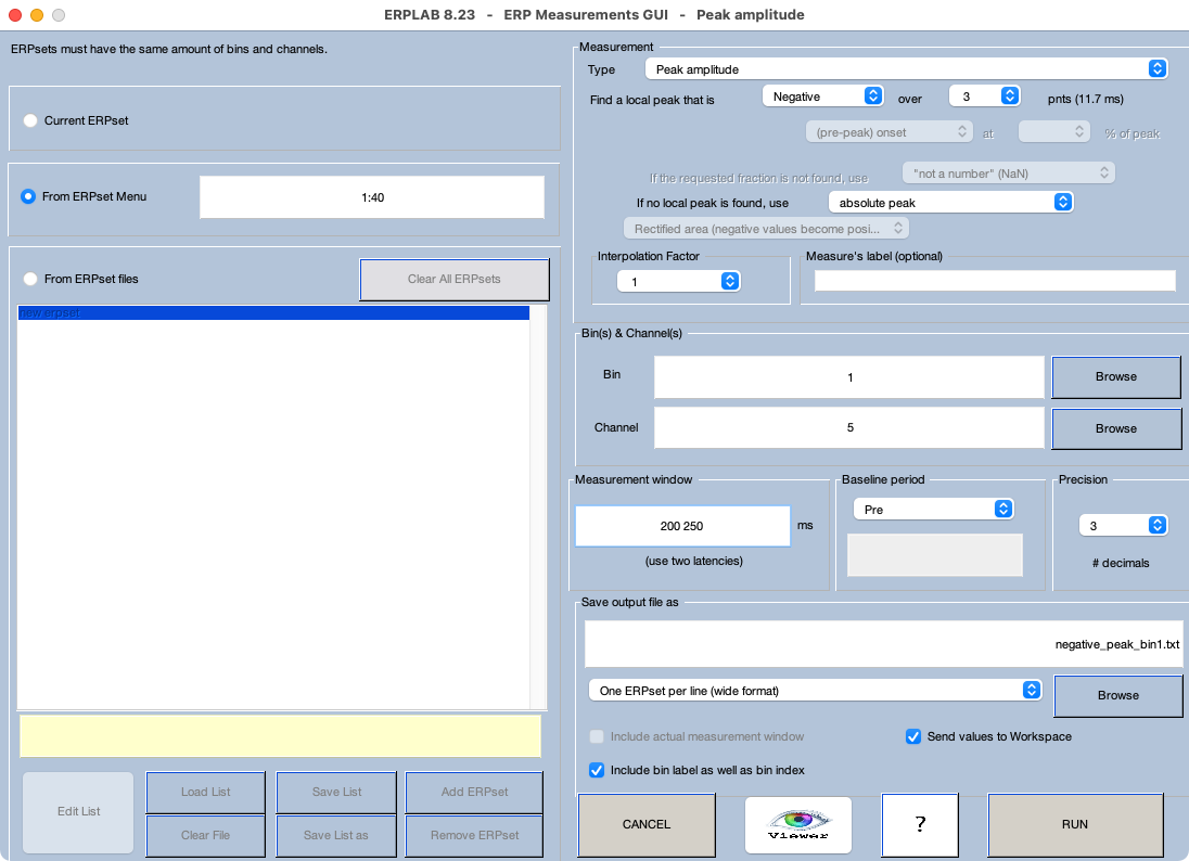
Make sure that the 40 ERPsets from the previous exercise (from the Chapter_10 > Data > ERPsets_CI_Diff folder) are loaded. Launch the Measurement Tool, and set it up as shown in Screenshot 10.3. As in the previous exercise, we want to see if there is a contralateral negativity for the Compatible condition and a contralateral positivity for the Incompatible condition. We therefore need to look for a negative peak for Bin 1 and a positive peak for Bin 2. This will take two steps. Screenshot 10.3 is set up for finding the negative peak in Bin 1. (Technically, we’ll find the local peak, defined in this example as the most negative point that is also more negative than the 3 points on either side; for details, see in Chapter 9 in Luck, 2014).
Screenshot 10.3
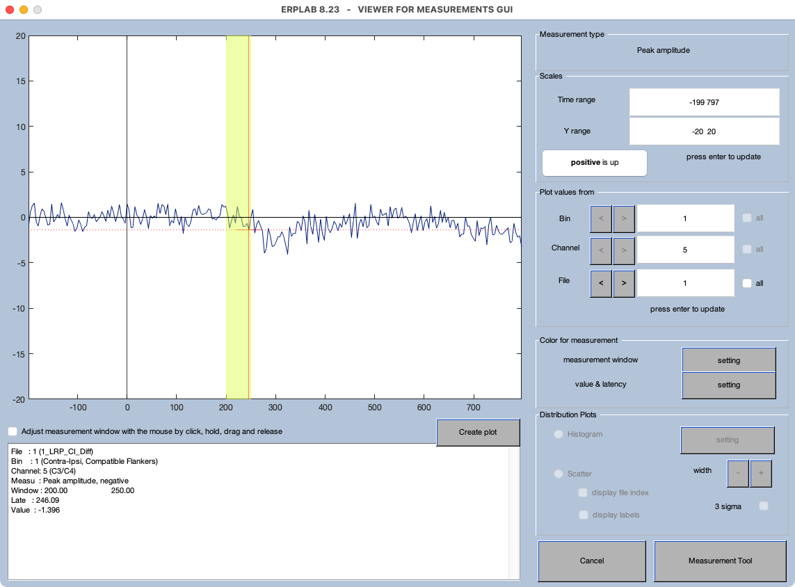
Once you have all the parameters set, click the Viewer button to verify that everything is working as intended. You should immediately see a problem: As shown in Screenshot 10.4, the peak of the LRP falls outside the measurement window for the first participant. And this isn’t an isolated incident; you’ll see the same problem for the 2nd and 3rd participants (and many others as well). This makes sense if you look at the grand average waveforms in Figure 10.2.C. In general, you need a wider window to find peaks than you need for mean amplitude.
Screenshot 10.4
To fix this, click the Measurement Tool button in the Viewer tool, and then change the Measurement Window to 150 400. Then click the Viewer button to see the waveforms again. You should see that the algorithm is now correctly finding the peak for every participant who has a clear peak. Go back to the Measurement Tool and click RUN to save the scores to a file named negative_peak_bin1.txt.
Now repeat the measurement for the positive peak in Bin 2. Leave the window at 150 400, but change Negative to Positive, change the bin from 1 to 2, and change the filename to positive_peak_bin2.txt. Make sure everything looks okay in the Viewer and then click RUN to save the scores.
Now perform the same t tests as you did in the previous exercise on these peak amplitude values (which may first require combining the scores into a single spreadsheet). You should see that the mean across participants is -3.23 µV for the Compatible condition and +1.46 µV for the Incompatible condition and that the difference between conditions is significant (t(39) = -16.34, p < .001). Also, the mean across participants is significantly less than zero for the Compatible condition (t(39) = -18.61, p < .001) and significantly greater than zero for the Incompatible condition (t(39) = 8.71, p < .001).
But this is a completely invalid way of analyzing these data! First, the positive peak for the Incompatible trials is much earlier than the negative peak for the Compatible trials, and it doesn’t usually make sense to compare voltages at different time points. Second, peak amplitude is a biased measure that will tend to be greater than zero for positive peaks and less than zero for negative peaks even if there is only noise in the data.
To see this bias, let’s repeat the analyses, but with a measurement window of -100 0 (i.e., the last 100 ms of the prestimulus baseline period). There shouldn’t be any real differences prior to the onset of the stimuli, and any differences we see must be a result of noise. To see this, find the negative peak between -100 and 0 ms for Bin 1 and the positive peak between -200 and 0 ms for Bin 2. Then repeat the t tests with these scores.
You should see that the mean across participants is -0.89 µV for the Compatible condition and +1.04 µV for the Incompatible condition. You should also see that the difference between conditions is significant (t(39) = -13.27, p < .001). Also, the mean across participants is significantly less than zero for the Compatible condition (t(39) = -12.50, p < .001) and significantly greater than zero for the Incompatible condition (t(39) = 11.30, p < .001). Thus, we get large and significant differences in peak amplitude between conditions during the baseline period, and each condition is significantly different from zero, even though there is only noise during this period. These are bogus-but-significant effects that a result of the fact that peak amplitude is a biased measure.
I hope it is clear why this happened. If you look at the baseline period of the single-participant waveforms with the Viewer, you’ll see that the noise in the baseline is typically positive at some time points and negative at others. That’s what you’d expect for random variations in voltage. If we take the most positive point in the period from -100 to 0 ms, it will almost always be greater than zero. If we take the most negative point in this period, it will almost always be less than zero. So, noise alone will tend to give us a difference in amplitude between the positive peak and the negative peak, and it will tend to make the positive peak greater than zero and the negative peak less than zero.
It should be clear that it is not ordinarily legitimate to compare a positive peak with a negative peak (because noise alone will cause a difference). And it should also be clear that it is not ordinarily legitimate to test whether an effect is present by comparing a peak voltage to zero (because noise will cause a non-zero voltage).
A related point (which is not shown directly by this example) is that the peaks will tend to be larger when the noise level is higher. This means that it is not ordinarily legitimate to compare peak amplitudes for two conditions that differ in noise level (e.g., standards and deviants in an oddball paradigm), because the averaged ERP waveforms will be noisier for the deviants owing to a smaller number of trials. This can be solved by equating the number of trials in the averaged ERPs for each condition, but that requires throwing away a large number of trials from the more frequent condition. Also, there may be other systematic sources of noise. For example, some electrode sites are noisier than others (because they are closer to EMG sources), and some groups of participants are noisier than others (e.g., patient waveforms are often noisier than control waveforms).
The bottom line is that the peak voltage is not usually the best way to quantify the amplitude of an ERP component. Mean amplitude is much better in the vast majority of cases.