4: Histograms, Normal Distributions, and the Central Limit Theorem
- Page ID
- 187993
\( \newcommand{\vecs}[1]{\overset { \scriptstyle \rightharpoonup} {\mathbf{#1}} } \)
\( \newcommand{\vecd}[1]{\overset{-\!-\!\rightharpoonup}{\vphantom{a}\smash {#1}}} \)
\( \newcommand{\dsum}{\displaystyle\sum\limits} \)
\( \newcommand{\dint}{\displaystyle\int\limits} \)
\( \newcommand{\dlim}{\displaystyle\lim\limits} \)
\( \newcommand{\id}{\mathrm{id}}\) \( \newcommand{\Span}{\mathrm{span}}\)
( \newcommand{\kernel}{\mathrm{null}\,}\) \( \newcommand{\range}{\mathrm{range}\,}\)
\( \newcommand{\RealPart}{\mathrm{Re}}\) \( \newcommand{\ImaginaryPart}{\mathrm{Im}}\)
\( \newcommand{\Argument}{\mathrm{Arg}}\) \( \newcommand{\norm}[1]{\| #1 \|}\)
\( \newcommand{\inner}[2]{\langle #1, #2 \rangle}\)
\( \newcommand{\Span}{\mathrm{span}}\)
\( \newcommand{\id}{\mathrm{id}}\)
\( \newcommand{\Span}{\mathrm{span}}\)
\( \newcommand{\kernel}{\mathrm{null}\,}\)
\( \newcommand{\range}{\mathrm{range}\,}\)
\( \newcommand{\RealPart}{\mathrm{Re}}\)
\( \newcommand{\ImaginaryPart}{\mathrm{Im}}\)
\( \newcommand{\Argument}{\mathrm{Arg}}\)
\( \newcommand{\norm}[1]{\| #1 \|}\)
\( \newcommand{\inner}[2]{\langle #1, #2 \rangle}\)
\( \newcommand{\Span}{\mathrm{span}}\) \( \newcommand{\AA}{\unicode[.8,0]{x212B}}\)
\( \newcommand{\vectorA}[1]{\vec{#1}} % arrow\)
\( \newcommand{\vectorAt}[1]{\vec{\text{#1}}} % arrow\)
\( \newcommand{\vectorB}[1]{\overset { \scriptstyle \rightharpoonup} {\mathbf{#1}} } \)
\( \newcommand{\vectorC}[1]{\textbf{#1}} \)
\( \newcommand{\vectorD}[1]{\overrightarrow{#1}} \)
\( \newcommand{\vectorDt}[1]{\overrightarrow{\text{#1}}} \)
\( \newcommand{\vectE}[1]{\overset{-\!-\!\rightharpoonup}{\vphantom{a}\smash{\mathbf {#1}}}} \)
\( \newcommand{\vecs}[1]{\overset { \scriptstyle \rightharpoonup} {\mathbf{#1}} } \)
\(\newcommand{\longvect}{\overrightarrow}\)
\( \newcommand{\vecd}[1]{\overset{-\!-\!\rightharpoonup}{\vphantom{a}\smash {#1}}} \)
\(\newcommand{\avec}{\mathbf a}\) \(\newcommand{\bvec}{\mathbf b}\) \(\newcommand{\cvec}{\mathbf c}\) \(\newcommand{\dvec}{\mathbf d}\) \(\newcommand{\dtil}{\widetilde{\mathbf d}}\) \(\newcommand{\evec}{\mathbf e}\) \(\newcommand{\fvec}{\mathbf f}\) \(\newcommand{\nvec}{\mathbf n}\) \(\newcommand{\pvec}{\mathbf p}\) \(\newcommand{\qvec}{\mathbf q}\) \(\newcommand{\svec}{\mathbf s}\) \(\newcommand{\tvec}{\mathbf t}\) \(\newcommand{\uvec}{\mathbf u}\) \(\newcommand{\vvec}{\mathbf v}\) \(\newcommand{\wvec}{\mathbf w}\) \(\newcommand{\xvec}{\mathbf x}\) \(\newcommand{\yvec}{\mathbf y}\) \(\newcommand{\zvec}{\mathbf z}\) \(\newcommand{\rvec}{\mathbf r}\) \(\newcommand{\mvec}{\mathbf m}\) \(\newcommand{\zerovec}{\mathbf 0}\) \(\newcommand{\onevec}{\mathbf 1}\) \(\newcommand{\real}{\mathbb R}\) \(\newcommand{\twovec}[2]{\left[\begin{array}{r}#1 \\ #2 \end{array}\right]}\) \(\newcommand{\ctwovec}[2]{\left[\begin{array}{c}#1 \\ #2 \end{array}\right]}\) \(\newcommand{\threevec}[3]{\left[\begin{array}{r}#1 \\ #2 \\ #3 \end{array}\right]}\) \(\newcommand{\cthreevec}[3]{\left[\begin{array}{c}#1 \\ #2 \\ #3 \end{array}\right]}\) \(\newcommand{\fourvec}[4]{\left[\begin{array}{r}#1 \\ #2 \\ #3 \\ #4 \end{array}\right]}\) \(\newcommand{\cfourvec}[4]{\left[\begin{array}{c}#1 \\ #2 \\ #3 \\ #4 \end{array}\right]}\) \(\newcommand{\fivevec}[5]{\left[\begin{array}{r}#1 \\ #2 \\ #3 \\ #4 \\ #5 \\ \end{array}\right]}\) \(\newcommand{\cfivevec}[5]{\left[\begin{array}{c}#1 \\ #2 \\ #3 \\ #4 \\ #5 \\ \end{array}\right]}\) \(\newcommand{\mattwo}[4]{\left[\begin{array}{rr}#1 \amp #2 \\ #3 \amp #4 \\ \end{array}\right]}\) \(\newcommand{\laspan}[1]{\text{Span}\{#1\}}\) \(\newcommand{\bcal}{\cal B}\) \(\newcommand{\ccal}{\cal C}\) \(\newcommand{\scal}{\cal S}\) \(\newcommand{\wcal}{\cal W}\) \(\newcommand{\ecal}{\cal E}\) \(\newcommand{\coords}[2]{\left\{#1\right\}_{#2}}\) \(\newcommand{\gray}[1]{\color{gray}{#1}}\) \(\newcommand{\lgray}[1]{\color{lightgray}{#1}}\) \(\newcommand{\rank}{\operatorname{rank}}\) \(\newcommand{\row}{\text{Row}}\) \(\newcommand{\col}{\text{Col}}\) \(\renewcommand{\row}{\text{Row}}\) \(\newcommand{\nul}{\text{Nul}}\) \(\newcommand{\var}{\text{Var}}\) \(\newcommand{\corr}{\text{corr}}\) \(\newcommand{\len}[1]{\left|#1\right|}\) \(\newcommand{\bbar}{\overline{\bvec}}\) \(\newcommand{\bhat}{\widehat{\bvec}}\) \(\newcommand{\bperp}{\bvec^\perp}\) \(\newcommand{\xhat}{\widehat{\xvec}}\) \(\newcommand{\vhat}{\widehat{\vvec}}\) \(\newcommand{\uhat}{\widehat{\uvec}}\) \(\newcommand{\what}{\widehat{\wvec}}\) \(\newcommand{\Sighat}{\widehat{\Sigma}}\) \(\newcommand{\lt}{<}\) \(\newcommand{\gt}{>}\) \(\newcommand{\amp}{&}\) \(\definecolor{fillinmathshade}{gray}{0.9}\)This chapter covers histograms, normal and skewed distributions, and introduces you to inferential statistics, including through the Central Limit Theorem and a discussion of weighting.
4a. Histograms
4a.1. Histograms
Histogram: A frequency distribution graph for numeric data.
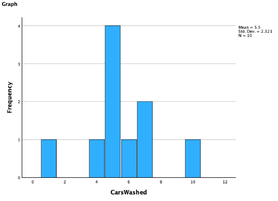
Returning to the example from Chapter 3, the histogram above shows the frequency of how many cars you and each of your nine friends washed.
While the graph above shows counts, another way to display a histogram is to show percentages.
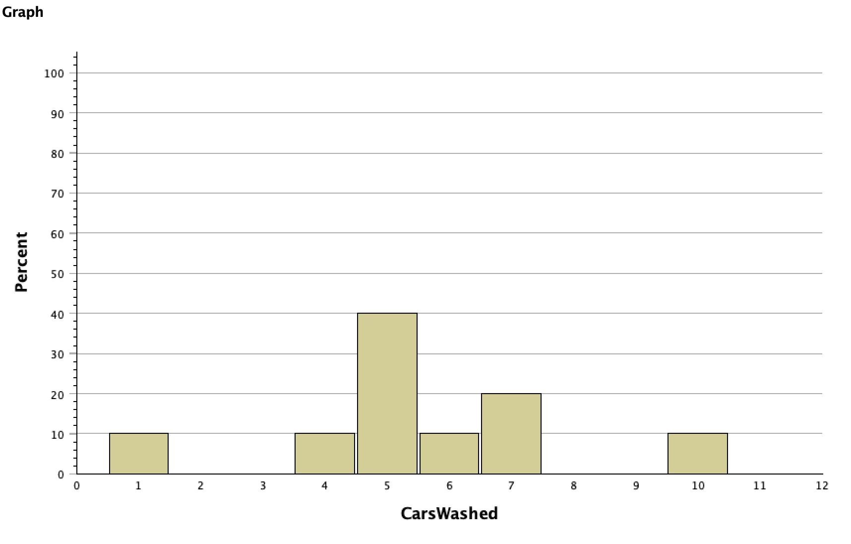
The key difference between a histogram and a bar graph is that a bar graph is a frequency distribution table of categorical rather than quantitative data. Therefore the x-axis on a bar graph has category labels rather than a number line.
For example, here is what happens when I try to run the cars washed variable as a bar graph:
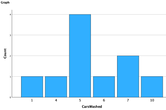
You can see that it includes the various numbers of cars washed as different categories. While generally a histogram is more appropriate for quantitative data, there are some exceptions. For example, if you have a ratio-like Likert scale variable, making a bar graph will give you labels (e.g., "strongly disagree") instead of numbers on the x-axis.
Traditionally the bars in a bar graph have space in between them, while the bars in a histogram are touching.
1. Syntax:
The syntax language below will produce a histogram. Just replace "VariableName" with the name of your variable.
GRAPH
/HISTOGRAM=VariableName.
Alternatively, the Explore menu item and Examine syntax can also produce a histogram.
EXAMINE VARIABLES=VariableName
/PLOT HISTOGRAM
/PERCENTILES(25,50,75) HAVERAGE
/STATISTICS DESCRIPTIVES
/CINTERVAL 95
/MISSING LISTWISE
/NOTOTAL.
Another option is to use the Frequencies syntax to produce a histogram.
FREQUENCIES VARIABLES=VariableName
/FORMAT=NOTABLE
/HISTOGRAM
/ORDER=ANALYSIS.
2. Menu:
To produce a histogram using the drop-down menus, click on Graphs → Histogram.

Put the variable you want a graph of in the variable box, and click OK.
Below you will see I added variables to the panel rows and columns boxes as well, which produced the series of partial histograms for income you will find below.
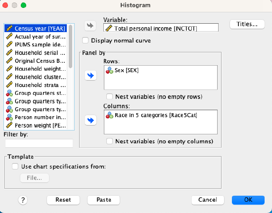
Some datasets have a lot of variables to look through to find the one you want! If you right-click on the list of variables in that left menu, you can choose to show the variable name instead of the label, and can sort them alphabetically. If I sorted the variable list alphabetically by name and then hit an "I" on the keyboard, SPSS would bring me down to the next variable that starts with an I.
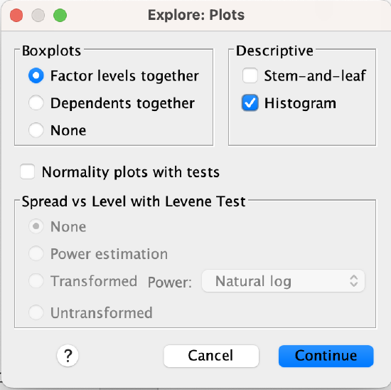
Alternatively, you can produce a histogram as part of Explore. Go to Analyze → Descriptive Statistics → Explore, and put your variable into the Dependents list. Make sure you either have Plots checked on the bottom or Both, not just Statistics. Click the Plots button and make sure the "Histogram" option is checked. Then click Continue and OK.
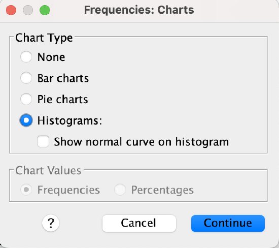
Or, you can produce a histogram as part of Frequencies. Go to Analyze → Descriptive Statistics → Frequencies, click the Charts button on the right, and check the Histograms button, then click Continue. Drag your variable into the variables box and click OK to generate your histogram.
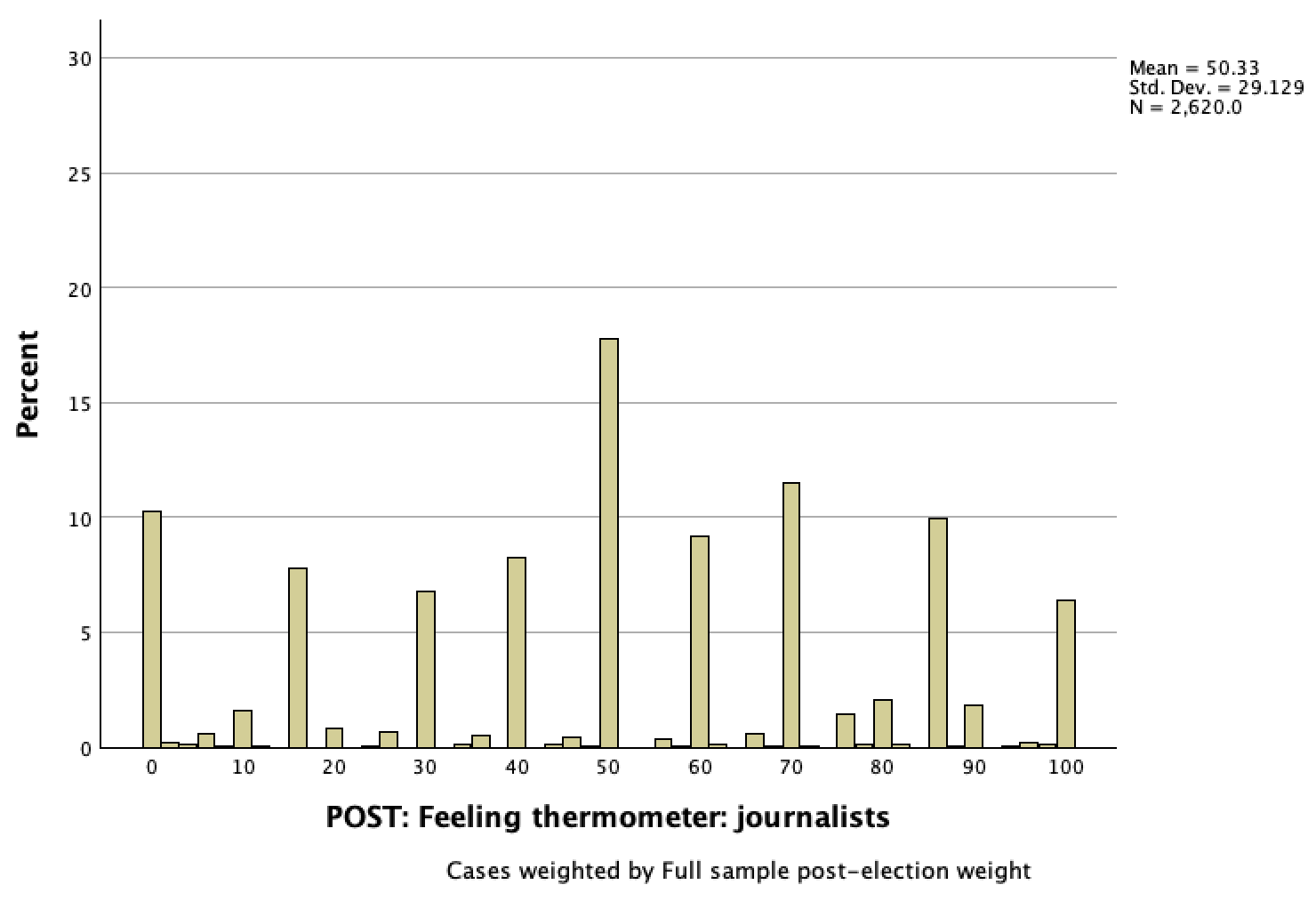
Continuing with the Chapter 3 example, here is a histogram of U.S. eligible voter respondents' feelings towards journalists on the feelings thermometer following the 2020 election.
 .
. 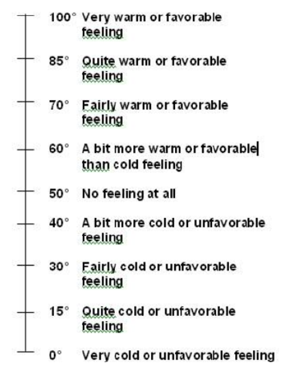
This histogram looks a little strange to me at first glance. The reason for this is because of the thermometer diagram respondents were shown to help them rate journalists. While respondents could give any number from 0 to 100, most gave numbers highlighted on the thermometer.
In this histogram, we can see that the most common response (over 1/6 of respondents) was neutral, but that there were respondents that rated journalists across the temperatures, and that there was still a sizable proportion of respondents who felt very cold (over 1/10 of them) or very warm (over 1/20).
4a.2 Normal and Skewed Distributions
Histograms come in different shapes based on data's distribution.
Pictured below is a histogram of the height of 1,035 Major League Baseball players.
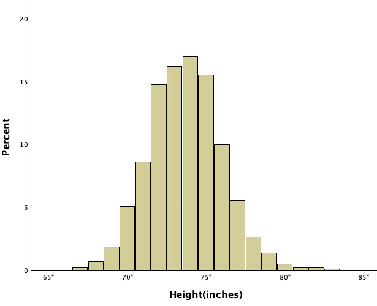
This histogram is in an important shaped called a "normal distribution." Notice how the bell-shaped histogram is relatively symmetric. At the peak are the mean (73.7"), median (74"), and mode (74"). There is more data (more players' heights) in this center, and then the frequency of players gradually decreases as you go out to both sides.
Normal distribution: A bell-shaped symmetrical histogram with data concentrated in the middle and evenly tapering off to both sides.
Normal distributions occur in real life, from height to weight to standardized tests to how long people cook their spaghetti for. All of these would be relatively symmetrical, with a clustering around the mean and median and then a declining number of cases as you go out in either direction.
In contrast, check out the histogram below of the same baseball players' ages.

You can clearly see the peak, and the data slowly tapering off to the right, but to the left of the peak the data quickly plummets. The data's distribution is not symmetrical. And with good reason ---- all the baseball players are adults! If you saw a tail on the left comparable to the tail on the right, that would mean there were kids playing Major League Baseball.
When a histogram that is unimodal (one mode, meaning it has one peak) is not symmetrical, it is called "skewed." Data with a tail to the right, like the histogram of the age variable above, is positively skewed, and data with a histogram that has a tail to the left is negatively skewed.
Skewed distribution: An asymmetrical histogram.
As we saw in the normal distribution above, measures of central tendency all conglomerate at the peak of the distribution curve.
However, skewed distributions are different.
- In positively skewed distributions, the tail to the right represents some high extreme values that do not exist to the left. This pulls the mean up.
- In negatively skewed distributions, the tail to the left represents some low extreme values that do not exist to the right. This pulls the mean down.
The tail pulls the mean.
Histograms can come in other shapes as well. Below, the uniform distribution shows a relatively equal proportion of cases across values, while the bimodal and multimodal distributions show multiple peaks / concentrations of cases.
Last chapter we looked at income and its distribution by gender and race. Below are histograms of some of this data ---- income among full-time, year-round, civilian workers ages 16 and older. Note that there were some outlier cases with really high incomes that are not shown in the race/gender histograms. There were so few cases comparatively that they were not really visible, and limiting the x-axis scale lets you see the rest of the distribution a bit better.
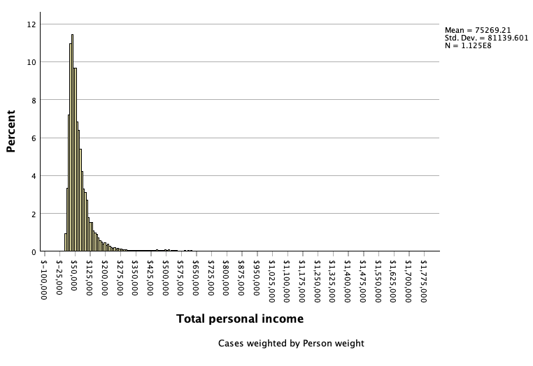
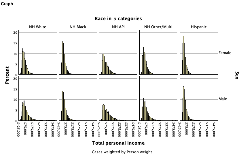
All of these histograms have a tail to the right, rather than being normally distributed and symmetrical. These high-income earners pull the tail to the right, which suggests that mean income is likely higher than median income.
Returning to the World Values Survey question about whether people choosing their leaders in free elections is an essential characteristic of democracy, the histogram below shows U.S. adult responses in 2017.
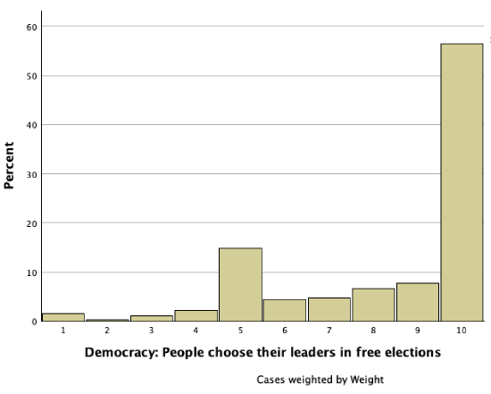
This distribution is also not symmetrical. The peak is all the way to the right at 10 (a majority of respondents felt people choosing their leaders in free elections is an essential characteristic of democracy) and then there is a tail to the left. This is a negatively skewed distribution, and the tail to the left, the respondents who felt free elections is not essential or not as essential, draws the mean lower. Based on this histogram the mean is likely less than the median.
4a.3 Standard Normal Distributions: Z-Scores and Probability under the Curve
Standard normal distribution: Also known as a z-distribution, this is a special normal distribution standardized by z-scores.
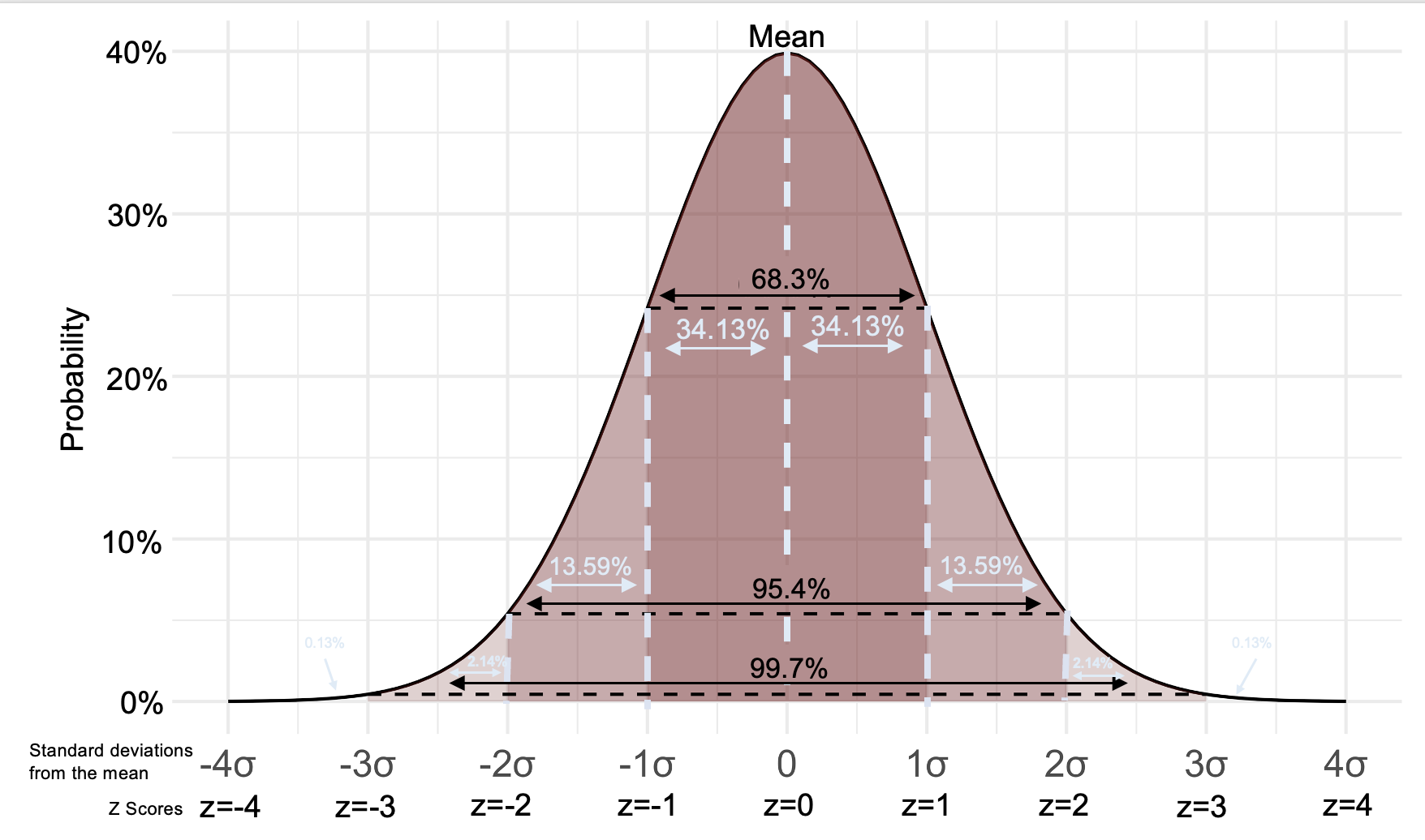
The figure below shows a standard normal distribution with the proportion/probability of cases in various portions of/under the curve. For example, 34.13% of cases are between the mean and one standard deviation above the mean.
A histogram shows your data. The curve imposed on top of the bars therefore has all the data under it. 100% of the data (probability=1) is under the curve. In a standard normal distribution, just over 2/3 (about 68%) of data is within one standard deviation of the mean, about 95% of data is within 2 standard deviations of the mean (95% of the data is within 1.96 standard deviations), and about 99.7% of data is within 3 standard deviations of the mean. Data further than three standard deviations from the mean are considered outliers.
In the last chapter, we calculated values at various z-scores:
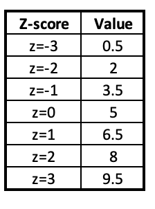
If your data is normally distributed, you can now figure out what percentage of cases are expected to be between these various values. For example, about 68% of data would be between 3.5 and 6.5 (within one standard deviation of the mean) and about 95% of data would be between 2 and 8 (within two standard deviations of the mean).
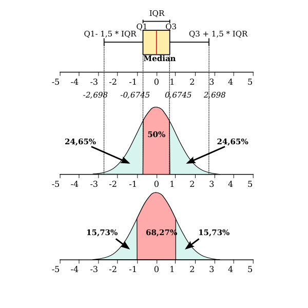
Don't get confused between the standard normal distribution and the five point summary and box plots. Remember that while about 68% of data is within one standard deviation of the mean in a normal distribution, an interquartile range is where the middle 50% of data is, between the lower and upper quartile. These are two separate concepts and not interchangable.
4b.1 Inferential Statistics
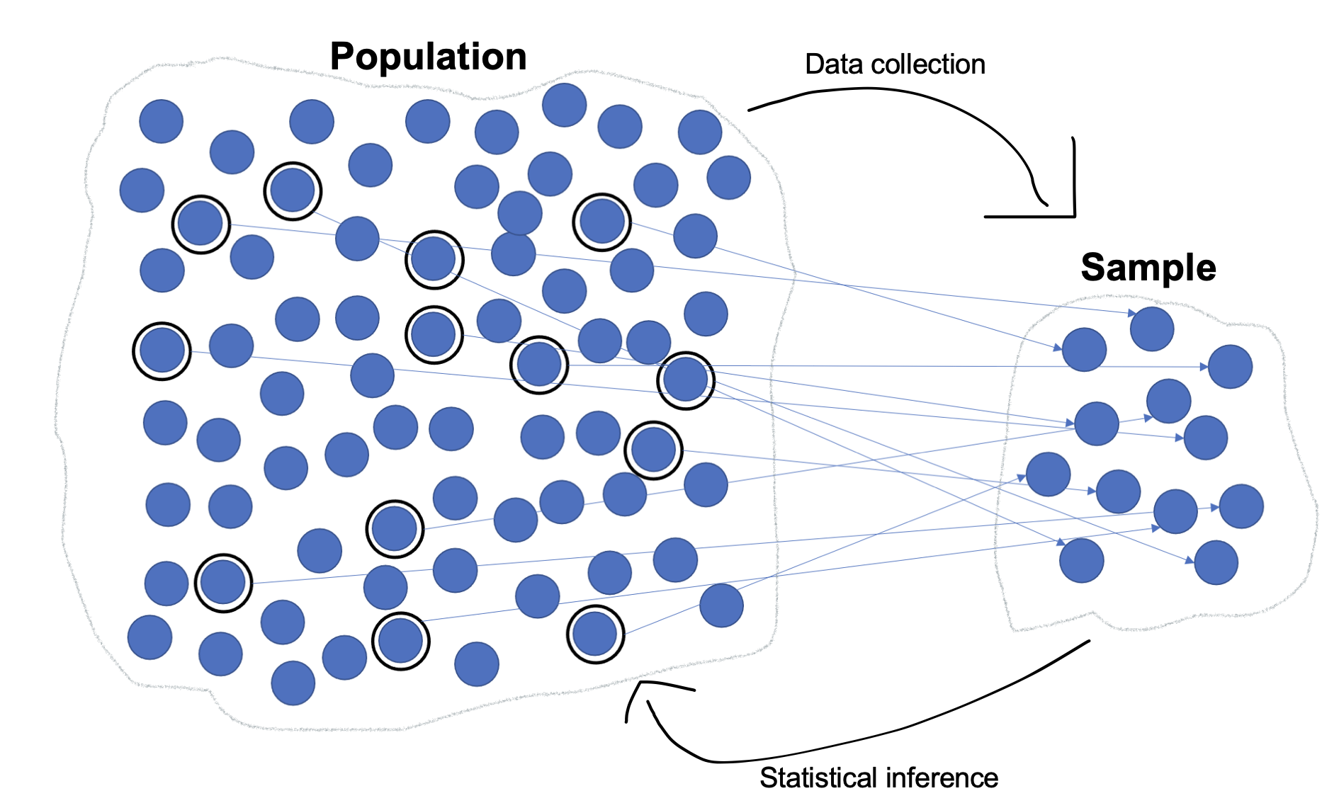
When you conduct a research study or ask a research question, you have a population you are interested in. For example, if you want to know about how U.S. likely voters felt about a candidate debate, the population you are interested in consists of all U.S. likely voters.
All individuals, groups, objects, or cases of interest.
However, there were over 150 million people who voted in the 2020 presidential election. You don't have the time or resources to efficiently survey them all, and if you tried and didn't do a great job (e.g., you missed a portion of them) your population parameters (measures describing populations, whereas statistics describe samples) may be inaccurate.
Instead, you would survey a sample of likely voters.
Sample: A subset of cases from the target population.
You then use the sample statistics to estimate population parameters.
Let's say you surveyed 200 people who watched a debate and you found out that 2/3 of them thought the most interesting part was how a fly landed on a candidate's head and stayed there for a really long time. This is a descriptive statistic. Descriptive statistics describe your sample data.
You know something about how those 200 debate watchers feel. But, if your target population is all likely voters, or everyone who watched the debate, then who cares about these particular 200 debate watchers? You want to know about your target population, not your sample.
In order to describe the population, I need to engage in inferential statistics. This is where I make claims about the target population based on my sample data. When we move to confidence intervals in the next chapter and statistical significance tests thereafter, we are engaging in inferential statistics.
Inferential statistics: Statistical procedures where we make claims about a population based on corresponding sample data.
In order to make generalizations from your sample to your target population, the sample needs to be representative of that population. This is a requirement for engaging in inferential statistics. For example, if you only spoke to climate change activists after a candidate debate, you could not generalize their perceptions to U.S. voters as a whole. Or what if the 200 debate watchers interested in the fly were interested because they were interacting on social media during the debate, and most debate watchers did not even notice the fly? I can only make inferences about a population if I have a representative sample from that particular population. Sociologists are especially insistent on representative samples because of our understanding of the importance of social context. You will find that many psychology studies that engage in inferential statistics do not seem to have a representative sample (often using college students, for example). Psychologists who do this may rationalize performing inferential statistics because they believe the processes they are studying are universal (e.g., human nature; hardwired reactions, etc.) rather than context-specific.
There are various sampling methods. Non-probability sampling methods like convenience, purposive, and snowball sampling do not generate representative samples. Probability sampling methods that use random sampling, giving each case in the population an equal chance of being selected, produce samples that, if you have enough cases, are representative. With random sampling, as your sample size increases, you control for various differences in your sample (e.g., gender, political leanings, etc.) such that as your sample gets bigger it will be more representative of and reflect the actual target population. Even with probabiilty sampling, your sample likely will not be an exact microcosm of your population. This is called sampling error and is a reason we estimate population parameters derived from a sample instead of having definitive conclusions about them.
Sampling error: The difference between sample statistics and population parameters resulting from samples not being perfectly representative of the populations they are drawn from.
Not all research studies are based on samples. You can also survey the full population. For example, every 10 years the U.S. Census collects data on all U.S.-American residents. Or if you were to want to find out information about high school students at a particular high school and give them all a survey, you are surveying the population, not a subset of that population. You would not do inferential statistics with population data---- you don't need to make inferences about the population, as you already have population parameters! For example, if you survey all students at your local high school and find out 15% of them own their own car, you already know what percentage own their own car. There's no reason to build confidence intervals or generalize further.
4b.2 Weighting
Even with random sampling, sometimes you still end up with less than representative samples. One statistical technique to attempt to make our data even more representative is called weighting. Weighting basically adjusts your sample so that the sample better reflects the population.
For example, weighting can adjust for non-response. Lets say a survey you conduct has more women than men respond, and so 60% of your respondents are women, but only 52% of your target population are women. If you have men’s responses count as 1.2 each and women’s responses count as 0.867 each, you end up balancing out for gender. Statistical programs that have weight variables can do this to take into account things like gender, race, income, etc. so long as we know the actual population parameters for it.
Weighting: A process of adjusting statistical calculations to compensate for sampling error.
Weighting is not always done just to balance out errors in your collection. Weighting can also correct for intentional oversampling by weighting each case inversely to its probability of selection. Sometimes you want to weight because you have oversampled a particular population.
For example, when I was preparing a lecture for a Society & Mental Health course on sexuality, I analyzed data from the General Social Survey for information about LGBT identified individuals. While the data was interesting, when I looked at how many people were in the sample, it was quite clear I could not make any inferences about the truth of this data. Depending on one’s research question, one may want to oversample populations like sexual and gender minorities, racial minorities, etc., so that there are enough people in the sample. If you were to do a random sample of 300 university students at a large university, you probably could not say much about how graduate students think, because you would be basing it off too few a number of people that would be included in that random sample. So, you can oversample, making the sample intentionally disproportionate. However, if you want to make statements about the population, you don’t want to still have more of a particular population proportionally---you want each group to reflect its actual proportion. Hence, you can balance this out using weighting.
People might also have different probabilities of selection built into the survey design. For example, if every household has an equal probability of being selected, but only one individual from each household can be selected, then people from larger households have a lower probability of being selected than people from smaller households or who live alone. These types of survey designs can be adjusted for at the analysis stage through weighting.
While it is important to use weighting when available, you want to report unweighted sample sizes, which are often (but not always) different from a weighted sample size. That way you can share the actual number of participants/cases. There also can be issues if you have small sample sizes, are using large weights, or if there are very few people from a subgroup that is being up-weighted (when respondents are being counted as multiple cases). In one poll, a 19-year-old black man in Illinois was being weighted as much as 30 times more than the average respondent. If your weighting and unweighted analyses are extremely different, that's a flag for concern.
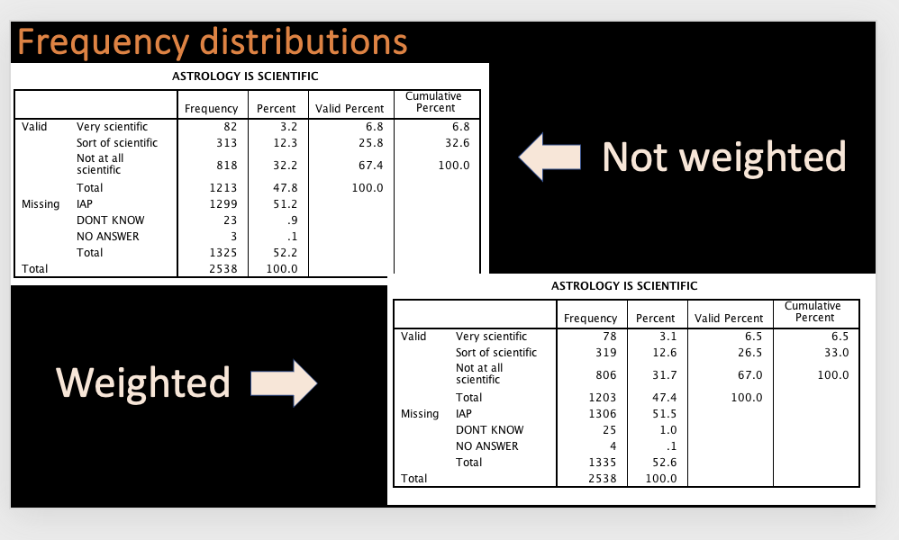
Example: The table below is based on the survey question, "Would you say that astrology is very scientific, sort of scientific, or not at all scientific?" Notice in the frequency tables below that the weighting distribution and sample size is different, but not that different, from the unweighted distribution.
How to weight in SPSS
Syntax:
To turn on weighting, use the following syntax, replacing WeightVariableName with the name of the designated weight variable.
Weight by WeightVariableName.
Once you turn on weighting, it will stay on for all the analyses you do with that dataset until you either close SPSS or turn weighting off.
To turn weighting off, use the following syntax:
Weight Off.
Menu:
Go to Data → Weight Cases.
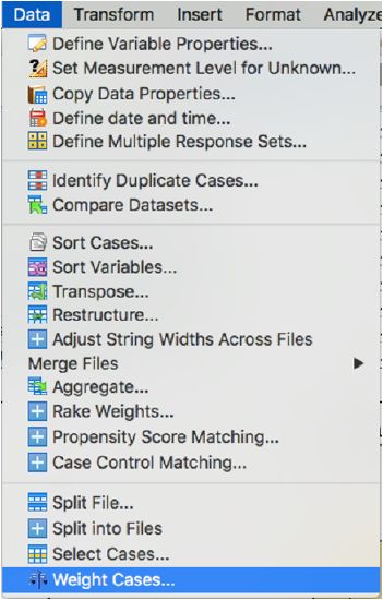
Select "Weight cases by." Select the designated weight variable and put it in the box where it says "Frequency Variable." Click OK.
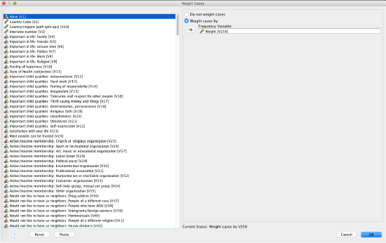
Note that if you exit SPSS or close your dataset, weighting will turn off. The next time you open your dataset, if you want to use weighting, you will need to turn it on again.
To turn off weighting, go to Data → Weight Cases. Select "Do not weight cases" and click OK.
Weight variables are carefully constructed to adjust cases in order to better reflect target populations. You must use the designated weight variable for weighting. Do not use any other variable, including variables that you are interested in learning about. If you mistakenly use a different variable, it will make all your results wrong. For example, if you use age, someone who is 80 years old will count 80 times, and someone who is 20 years old will count 20 times, etc. This will distort your data. Only use designated weight variables for weighting.
4b.3 Central Limit Theorem
In this section we'll walk through an experiment that will demonstrate the Central Limit Theorem.
1. Population of Dice Rolls
First, we're going to roll a die 1,000 times. This will constitute our population. What do you think the shape of our frequency distribution will look like?
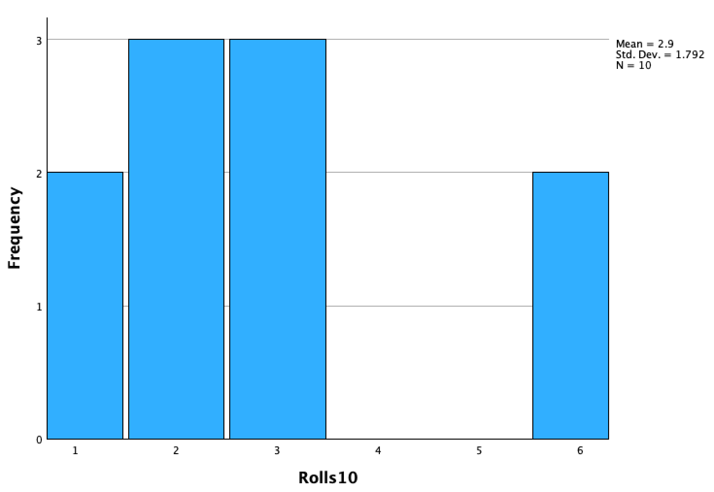
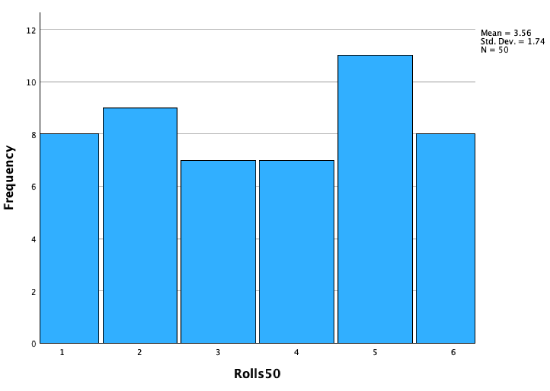
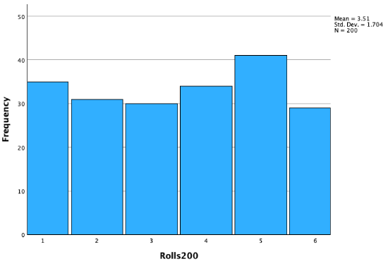
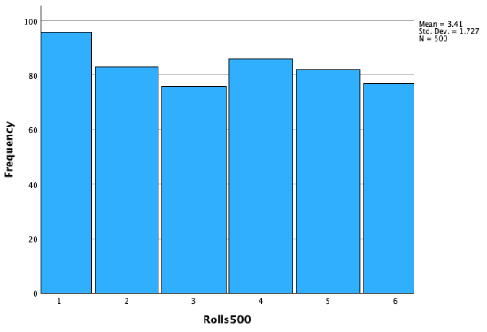
Let's take look at cumulative histograms, where we take the first 10 rolls, 50 rolls, 100 rolls, 200 rolls, 500 rolls, and 1000 rolls. As we add more rolls, observe the shape of our distribution and if/how it changes as the sample size increases
First 10 rolls:
First 50 rolls:
First 100 rolls:

First 200 rolls:
First 500 rolls:
All 1000 rolls:

I hypothesized that it would look like a uniform distribution, because each of 1 through 6 has an equal 1/6 chance of being landed on. However, 1/6 is the probability for each die face each time, so if I roll a 1, the next roll does not increase my chances of rolling a 2 through 6 ---- 1 has just as much chance as 2 or 3 or 4 or 5 or 6 as getting rolled the next time. If you try rolling a die yourself (a real one, or using a random dice roll generator online, or random number generator with 1 through 6 as options), you'll notice that the outcomes look more patterned than you might expect! However, you'll notice that as the number of dice rolls increases, it begins to look more and more like the predicted theoretical uniform distribution.
The outcomes from our dice rolls constitute our population. While our theoretical population mean would be 3.5 (if you had an even number of 1s, 2s, 3s, 4s, 5s, and 6s), our population mean is 3.43.
2. Random Samples of Dice Rolls
Let's randomly sample our population of 1,000 dice rolls, calculate means of those samples, and see how our sample means compare to the population mean. As previously noted, sample means are (usually) not the same as the population mean ---- this is called sampling error. While samples are drawn from a population, they do not usually completely accurately reflect the population.
I am going to randomly select 10 of the 1,000 rolls. This is 1% of the population. It is random selection since each of the 1,000 rolls will have an equal chance (in this case 0.1%) of being selected. From that random selection of 10 rolls, I will calculate its mean. I will do this 1,000 times. While I could write down all the rolls and pick them out of a hat or write them on balls and spin them around in a bingo cage, I used a random number generator to select cases (e.g., the 56th roll), then looked up what was rolled for that case (e.g., the 56th roll is a 3). There are plenty of random number generators online. I used Excel, with the formula =randbetween(1,1000) to randomly select a case. After I had 10 cases, I calclulated their mean by adding them up and dividing that total by 10. That gave me a sample mean. I repeated this 1,000 times.
Now that I have 1,000 sample means, I'm going to create a histogram of the sample means. This is called a sampling distribution.
A distribution of sample means from the same population.
What do you think the shape of our frequency distribution will look like?
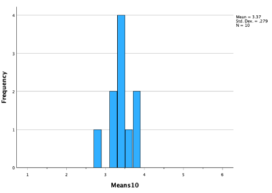
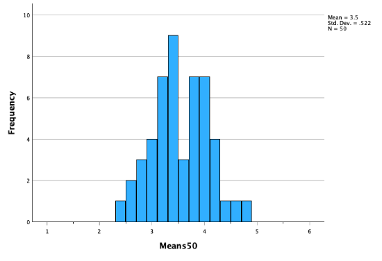
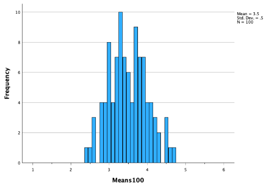
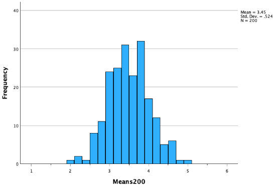
Let's look at cumulative histograms, first with the first 10 sample means, then the first 50 sample means, then 100, then 200, 500, and finally all 1,000 sample means. As more sample means are added, observe the shape of our distribution and if/how it changes as the number of samples change.
10 sample means:
50 sample means:
100 sample means:
200 sample means:
500 sample means:
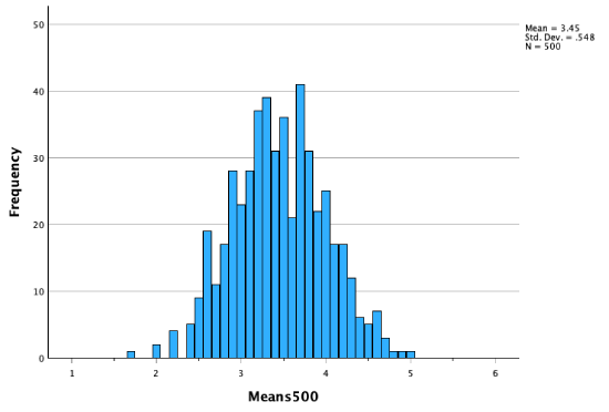
All 1,000 sample means:
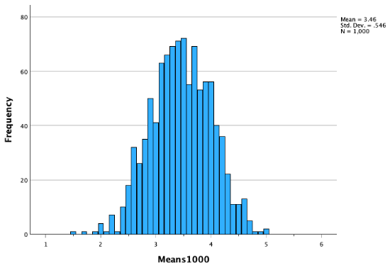
As our sampling distribution (our distribution of sample means) contains more and more sample means, we get a distribution that becomes closer and closer to a perfect bell curve, to a normal distribution.
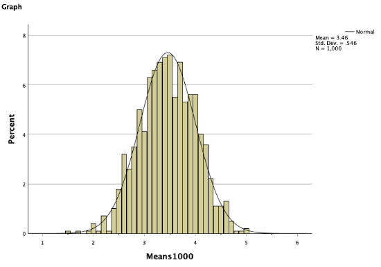
Remember that our population mean was 3.43. In the histogram above of all 1,000 sample means, you can see that there are more sample means close to 3.43, and fewer sample means as we get further out. Sample means further away from the population mean occurred less frequently. However, these still occurred. For example, there's a sample mean on there at 5. But you can see there was a low probability that we would get a sample mean of 5. It was more likely we would draw a sample mean closer to the actual population mean.
3. Central Limit Theorem
Central Limit Theorem: Given a random sample with enough cases, the distribution of sample means will be normally distributed.
Check out this animation that explains the Central Limit Theorem:
Sampling distributions have some useful terms and concepts embedded in them that are new, but are similar to concepts we've looked at already with frequency distribution histograms.
Below, notice how standard error and t-scores are familiar in that they have almost parallel definitions to standard deviation and z-scores respectively, except they are about sampling distributions.
Looking back: This is a frequency distribution graph (histogram) that is normally distributed:

Standard deviation: Average distance of values from the sample mean
Z-score: How many standard deviations a value is away from the sample mean
Looking forward: This is a sampling distribution, also a normally distributed histogram:

Standard error: The standard deviation for a sampling distribution. This is the average distance of sample means from the population mean
T-score: How many standard errors a value (sample mean) is away from the population mean.
A standard error does not communicate much intuitively, but it helps us calculate other useful statistics (e.g., to build confidence intervals, determine p-values, etc.). Standard errors are the standard deviation divided by the square root of the sample size.
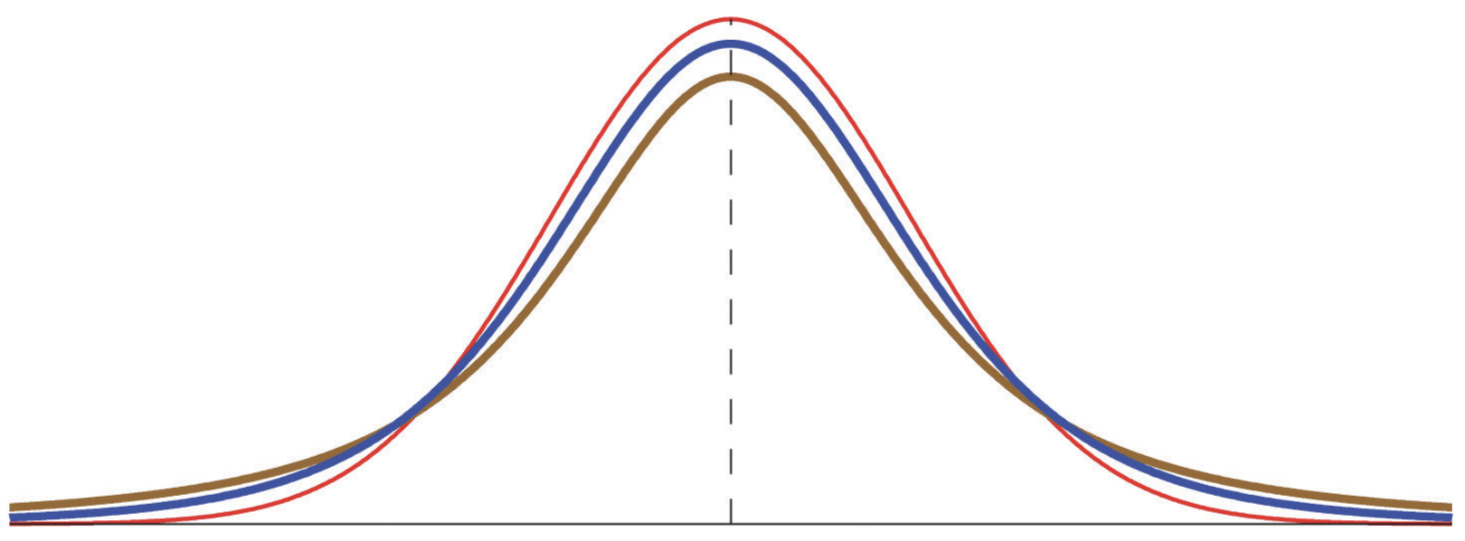
With a large enough sample size, t-scores and z-scores are identical. However, at smaller sample sizes t-scores will be a little different, as they won't have a standard normal distribution. The normal distributions below represent t-distributions at different sample sizes. Because of the differences in these curves, the probabilities under the curve are spread out differently. We'll see how t-scores can differ and how to calculate them in the next chapter.
Remember that in our sampling distribution of sample means of dice rolls, we were more likely to pull samples with means closer to the actual population mean, and less likely to pull samples with means further away from the actual population mean:
Given the characteristics of normal distributions, we can determine the probability of pulling a sample within various areas of this distribution.

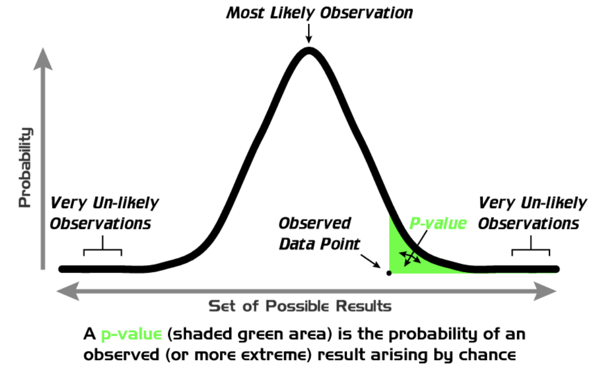
A p-value, or probability value, tells us how likely it is that we would get a particular sample mean (or one more extreme) given our actual population mean and distribution.
The probability (likelihood) of getting a particular sample statistic as extreme (or more extreme than) the outcome we observed, based on what we would expect from the sampling distribution.
Looking at our sampling distribution, we can thus calculate the probability of pulling a sample with a particular sample mean.


For example, 68% of sample means would be between 2.9 and 4.0 (in our empirical rather than theoretical sampling distribution, 72.1% of the sample means were between 2.9 and 4.0).
In our sampling distribution, 0.7% of sample means were 2.0 or less, and 0.2% of sample means were 5.0 or more.
How likely is it that we would get a sample mean of 5 or more if our population mean is actually 3.43? If the population mean is 3.43, there is only a 0.2% probability that we would draw a sample with a mean of 5 or more. If we draw a sample with a mean of 5 or more, there is only a 0.2% probability that the population mean is 3.43.
We'll come back to p-values in future chapters, but I wanted you to be introduced to the concept as you see a sampling distribution.


