
3: More Measures of Central Tendency and Spread- Mean, Standard Deviation, Z-scores
- Page ID
- 186630

\( \newcommand{\vecs}[1]{\overset { \scriptstyle \rightharpoonup} {\mathbf{#1}} } \)
\( \newcommand{\vecd}[1]{\overset{-\!-\!\rightharpoonup}{\vphantom{a}\smash {#1}}} \)
\( \newcommand{\dsum}{\displaystyle\sum\limits} \)
\( \newcommand{\dint}{\displaystyle\int\limits} \)
\( \newcommand{\dlim}{\displaystyle\lim\limits} \)
\( \newcommand{\id}{\mathrm{id}}\) \( \newcommand{\Span}{\mathrm{span}}\)
( \newcommand{\kernel}{\mathrm{null}\,}\) \( \newcommand{\range}{\mathrm{range}\,}\)
\( \newcommand{\RealPart}{\mathrm{Re}}\) \( \newcommand{\ImaginaryPart}{\mathrm{Im}}\)
\( \newcommand{\Argument}{\mathrm{Arg}}\) \( \newcommand{\norm}[1]{\| #1 \|}\)
\( \newcommand{\inner}[2]{\langle #1, #2 \rangle}\)
\( \newcommand{\Span}{\mathrm{span}}\)
\( \newcommand{\id}{\mathrm{id}}\)
\( \newcommand{\Span}{\mathrm{span}}\)
\( \newcommand{\kernel}{\mathrm{null}\,}\)
\( \newcommand{\range}{\mathrm{range}\,}\)
\( \newcommand{\RealPart}{\mathrm{Re}}\)
\( \newcommand{\ImaginaryPart}{\mathrm{Im}}\)
\( \newcommand{\Argument}{\mathrm{Arg}}\)
\( \newcommand{\norm}[1]{\| #1 \|}\)
\( \newcommand{\inner}[2]{\langle #1, #2 \rangle}\)
\( \newcommand{\Span}{\mathrm{span}}\) \( \newcommand{\AA}{\unicode[.8,0]{x212B}}\)
\( \newcommand{\vectorA}[1]{\vec{#1}} % arrow\)
\( \newcommand{\vectorAt}[1]{\vec{\text{#1}}} % arrow\)
\( \newcommand{\vectorB}[1]{\overset { \scriptstyle \rightharpoonup} {\mathbf{#1}} } \)
\( \newcommand{\vectorC}[1]{\textbf{#1}} \)
\( \newcommand{\vectorD}[1]{\overrightarrow{#1}} \)
\( \newcommand{\vectorDt}[1]{\overrightarrow{\text{#1}}} \)
\( \newcommand{\vectE}[1]{\overset{-\!-\!\rightharpoonup}{\vphantom{a}\smash{\mathbf {#1}}}} \)
\( \newcommand{\vecs}[1]{\overset { \scriptstyle \rightharpoonup} {\mathbf{#1}} } \)
\(\newcommand{\longvect}{\overrightarrow}\)
\( \newcommand{\vecd}[1]{\overset{-\!-\!\rightharpoonup}{\vphantom{a}\smash {#1}}} \)
\(\newcommand{\avec}{\mathbf a}\) \(\newcommand{\bvec}{\mathbf b}\) \(\newcommand{\cvec}{\mathbf c}\) \(\newcommand{\dvec}{\mathbf d}\) \(\newcommand{\dtil}{\widetilde{\mathbf d}}\) \(\newcommand{\evec}{\mathbf e}\) \(\newcommand{\fvec}{\mathbf f}\) \(\newcommand{\nvec}{\mathbf n}\) \(\newcommand{\pvec}{\mathbf p}\) \(\newcommand{\qvec}{\mathbf q}\) \(\newcommand{\svec}{\mathbf s}\) \(\newcommand{\tvec}{\mathbf t}\) \(\newcommand{\uvec}{\mathbf u}\) \(\newcommand{\vvec}{\mathbf v}\) \(\newcommand{\wvec}{\mathbf w}\) \(\newcommand{\xvec}{\mathbf x}\) \(\newcommand{\yvec}{\mathbf y}\) \(\newcommand{\zvec}{\mathbf z}\) \(\newcommand{\rvec}{\mathbf r}\) \(\newcommand{\mvec}{\mathbf m}\) \(\newcommand{\zerovec}{\mathbf 0}\) \(\newcommand{\onevec}{\mathbf 1}\) \(\newcommand{\real}{\mathbb R}\) \(\newcommand{\twovec}[2]{\left[\begin{array}{r}#1 \\ #2 \end{array}\right]}\) \(\newcommand{\ctwovec}[2]{\left[\begin{array}{c}#1 \\ #2 \end{array}\right]}\) \(\newcommand{\threevec}[3]{\left[\begin{array}{r}#1 \\ #2 \\ #3 \end{array}\right]}\) \(\newcommand{\cthreevec}[3]{\left[\begin{array}{c}#1 \\ #2 \\ #3 \end{array}\right]}\) \(\newcommand{\fourvec}[4]{\left[\begin{array}{r}#1 \\ #2 \\ #3 \\ #4 \end{array}\right]}\) \(\newcommand{\cfourvec}[4]{\left[\begin{array}{c}#1 \\ #2 \\ #3 \\ #4 \end{array}\right]}\) \(\newcommand{\fivevec}[5]{\left[\begin{array}{r}#1 \\ #2 \\ #3 \\ #4 \\ #5 \\ \end{array}\right]}\) \(\newcommand{\cfivevec}[5]{\left[\begin{array}{c}#1 \\ #2 \\ #3 \\ #4 \\ #5 \\ \end{array}\right]}\) \(\newcommand{\mattwo}[4]{\left[\begin{array}{rr}#1 \amp #2 \\ #3 \amp #4 \\ \end{array}\right]}\) \(\newcommand{\laspan}[1]{\text{Span}\{#1\}}\) \(\newcommand{\bcal}{\cal B}\) \(\newcommand{\ccal}{\cal C}\) \(\newcommand{\scal}{\cal S}\) \(\newcommand{\wcal}{\cal W}\) \(\newcommand{\ecal}{\cal E}\) \(\newcommand{\coords}[2]{\left\{#1\right\}_{#2}}\) \(\newcommand{\gray}[1]{\color{gray}{#1}}\) \(\newcommand{\lgray}[1]{\color{lightgray}{#1}}\) \(\newcommand{\rank}{\operatorname{rank}}\) \(\newcommand{\row}{\text{Row}}\) \(\newcommand{\col}{\text{Col}}\) \(\renewcommand{\row}{\text{Row}}\) \(\newcommand{\nul}{\text{Nul}}\) \(\newcommand{\var}{\text{Var}}\) \(\newcommand{\corr}{\text{corr}}\) \(\newcommand{\len}[1]{\left|#1\right|}\) \(\newcommand{\bbar}{\overline{\bvec}}\) \(\newcommand{\bhat}{\widehat{\bvec}}\) \(\newcommand{\bperp}{\bvec^\perp}\) \(\newcommand{\xhat}{\widehat{\xvec}}\) \(\newcommand{\vhat}{\widehat{\vvec}}\) \(\newcommand{\uhat}{\widehat{\uvec}}\) \(\newcommand{\what}{\widehat{\wvec}}\) \(\newcommand{\Sighat}{\widehat{\Sigma}}\) \(\newcommand{\lt}{<}\) \(\newcommand{\gt}{>}\) \(\newcommand{\amp}{&}\) \(\definecolor{fillinmathshade}{gray}{0.9}\)Chapter 2 focused on a measure of central tendency (median) and spread (the distribution and variation of data variation, through 5 point summaries and box plots). Chapter 3 focuses on another measure of central tendency: mean, and another measure of spread: standard deviation.
In order to show you how mean and standard deviation operates at different levels of measurement, this chapter will have examples around three questions. We will explore, within a U.S. context, (gender and racial) pay gaps, feelings towards journalists following the 2020 election, and Christian proselytization.
1. Mean
1.1. What is the mean?
Mean: The averagea value; the value each case would have if all cases' values were redistributed equally among all the cases.
a While both the mean and median are averages, the mean is the one colloquially used synonymously with average. When people make a claim like, "the average cost of a wedding in the United States is over $16,000" they are referring to mean.
You will sometimes see mean notated with one of two symbols: x̄ or μ
x̄ Pronounced x-bar, this symbol is used for the mean of sample data (Samples are subsets of populations; we will learn about samples in the next chapter).
μ Pronounced myoo, the lowercase Greek letter mu is used for the mean of a population.
The mean is about equal distribution.
For example, if you took everyone's wealth and redistributed it so that everyone had an equal amount of wealth,
that amount of wealth each person would have is the mean amount of wealth.
When you think of mean, think "balancing out"

1.2 Finding the Mean
 Let's say you and 9 of your friends were hosting a car wash. Some cars are dirtier than others, some of you are more efficient than others, etc. You don't all end up washing the same number of cars.
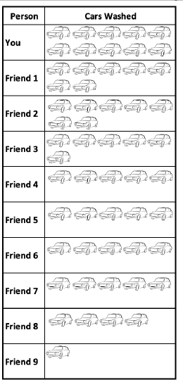
You worked your butt off and washed 10 cars. 2 of your friends washed 7 cars. 1 of your friends washed 6 cars. 4 of your friends washed 5 cars. 1 of your friends washed 4 cars. And 1 of your friends only washed 1 car.
What is the average number of cars washed?
Well, we know you didn't wash a typical amount of cars among your friend group!
One way to measure this is the median. The median number of cars washed per person was 5 cars.
1 4 5 5 5 5 6 7 7 10 (Those are the number of cars washed in order. There are two middle numbers, both 5. Their midpoint or median is 5.)
Another way to measure this is the mean.
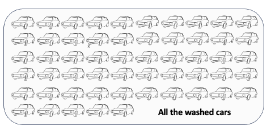
In total, you and your friends washed 55 cars.
How many cars would each of you have needed to wash to each wash the same number of cars? There were 10 of you. I can divide 55 cars up into 10 even groups. 55 ÷ 10 = 5.5. So each of you would have had to wash 5.5 cars. The mean is 5.5, another measure of the average number of cars washed per person.
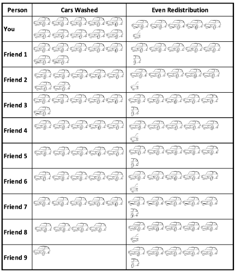
How do I interpret the mean?
On average, each person washed 5 ½ cars. If you balance out the number of cars washed by each person, each person would have washed 5 ½ cars.
Comparing the mean and median: Is the average 5 or 5.5?
While the mean and median are both averages, they did not give you the exact same answer. This is because the mean took into account all the cars washed and redistributed them, while the median looked for the middle number of cars washed. You washed a lot of cars, which brought the mean up, since all 10 of those cars were included in the total number of cars washed. But whether you had washed 5 or 50 cars, the median would still be 5, as it did not change the number of cars washed by your friends who washed the middle number of cars. Means are influenced by extreme values and outliers, while medians are not.
Mean = total sum of all values ÷ number of items/cases
Sometimes you will see the formula written out with symbols, like this:
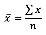 .
. 
Remember that x̄ is the sample mean. Σ, the Greek capital letter Sigma, means sum of. n is the sample size (number of cases). So this formula tells you that you find the sum of the values of all the cases and divided it by the number of cases.
1. You can find the mean when you run frequencies like you were doing for the range and five point summary.
Menu:
In SPSS, go to Analyze → Descriptive Statistics → Frequencies.
Click on the Statistics button to the right. Then check the box for mean in the upper right of the statistics window and click Continue.
Syntax:
*Include MEAN on the STATISTICS line to include a calculation of mean.
FREQUENCIES VARIABLES=VariableName
/FORMAT=NOTABLE
/STATISTICS=MEAN
/ORDER=ANALYSIS.
Output:
The row labeled mean gives you the mean (e.g., here it is 537.67)

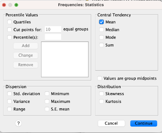
2. You can find the mean with Examine/Explore.
Menu:
Go to Analyze → Descriptive Statistics → Explore. Put your variable into the Dependent List window/box. At the bottom where it says "Display," make sure you either have "Both" or "Statistics" checked (Plots will only give you graphs/figures).
Click OK to run the Explore command.
Syntax:
*This will generate the mean along with other statistics and plots.
EXAMINE VARIABLES=VariableName
/PLOT BOXPLOT HISTOGRAM
/PERCENTILES(25,50,75) HAVERAGE
/STATISTICS DESCRIPTIVES
/CINTERVAL 95
/MISSING LISTWISE
/NOTOTAL.
1.3 The mean in action at different levels of measurement
Means work best with ratio-level variables. They do not work with nominal-level variables. You can interpret means for ordinal-level ratio-like variables, with caution, and the mean for indicator variables has interpretable meaning, but tells a different story than for ratio-level variables.
Nominal-level variables do not have interpretable means!
(What would be a mean of people's names? The numbers assigned are arbitrary.) For nominal-level variables only the mode has meaning.
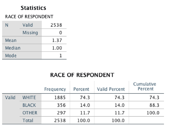
Example: In the SPSS output below, SPSS calculated a mean for respondent race. However, a mean of 1.37 does not have any actual meaning. The mode of 1 means that the value coded as 1 (in this case, White) was the most common/frequent response. That means that (in this sample) there were more white people than black people, and more white people than people of other races.
Indicator-level variables do have an interpretable mean, but with a different interpretation. For indicator variables, the mean is the proportion of respondents with the value coded as 1. An example below elaborates on this.
What do gender and race income gaps look like in the contemporary United States?
I analyzed U.S. Census data to find out. I used an IPUMS dataset (IPUMS originally stood for Integrated Public Use Microdata Series) of American Community Survey (ACS) 5-Year Data for 2017 to 2021. The ACS is intended to be representative of the U.S. population. I also used weighting to account for sampling error.
Pay gaps are earnings ratios. For example, a gender pay gap takes women's pay and divides it by men's pay; the resulting statistic is how much women on average earn for every dollar men earn.
Comparing the mean and median tells us about the distribution of the data.
- When the mean is higher than the median, there are likely some extreme high values.
- When the mean is lower than the median, there are likely some extreme low values.
- When the mean and median are similar, the data is likely more balanced.
Think about this with housing prices. If you were looking for neighborhoods where you might be able to afford to buy or rent a house, you probably want to know the median price, as a few really expensive or inexpensive homes won't influence what the typical price is, and will give you a misrepresentation of a typical house. However, if you wanted to compare neighborhoods for what kinds of property taxes they brought in, or what kinds of economic capital the neighborhoods had, or to take into account that there are some much more or less expensive homes in the neighborhood, you may want to look at the mean.
Conventionally pay gaps are based on median annual earnings. Why the median?
The median gives a better picture of the "typical" U.S. earner. It ignores the extremes (that are extreme), so doesn't take into account people with very high or very low incomes. This also means it doesn't take into account extreme income inequality, but because it's giving the "middle" earnings, they will be more "typical" for what the average U.S. earner would be making. The median might be a better measure of how much the typical person in one group is going to be making compared to the typical person in another group.
On the other hand, using the mean distorts pay gaps. It takes into account people with very high or very low incomes. Maybe this is less "typical," but it also better represents the distributions of incomes in our country and what it would look like if these earnings were redistributed (as a whole or among groups). Because there may be gender and race pay gaps among CEOs and other high-paying positions, ignoring these upper extremes only gives a partial picture of pay gaps. The mean might be a better measure of what gaps there are between groups and what that looks like per person.
So, which is a better measure of center? Of a typical U.S. adult? Of pay gaps?
There is no right answer (other than that mode is not the answer). Mean and median are both useful, and tell different stories.
Furthermore, conventionally the pay gap is calculated based solely on full-time year-round civilian workers, excluding institutionalized populations (e.g., people who live in nursing homes, military barracks, are incarcerated, etc.). The Pew Research Center also calculates pay gaps that include part-time workers. While we can look at industry specific pay gaps, and other pay gaps, who is working and how much they are working can also generate differences. Below I'll show you the mean and median both for the full-time civilian group and for everyone age 16 and older. The conventional group includes people who are at least 16 years old, report usually working at least 35 hours per week, worked 50 to 52 weeks in the past year, and are part of a civilian non-military non-institutionalized population. This included over 5 million cases. The second group includes everyone age 16+ regardless of institutionalization or work status. This included over 12 million cases.
To interpret the pay gaps in the table below, focus on the two groups in parentheses that are part of the ratio.
Template: [Group 1] earns [amount] for every $1 [Group 2] earns.
Example: First pay gap (Gender Pay Gap, Female:Male), using medians, among full-time, year-round, non-institutionalized U.S. workers ages 16+. The pay gap is $0.80. So, "Women earn 80¢ for every $1 men earn."
Example: Last row (Intersectional Pay Gaps, Hispanic Female:NH White Male), using medians, among all U.S. persons ages 16+. The pay gap is $0.34. So, "Hispanic women earn 34¢ for every $1 White men earn."
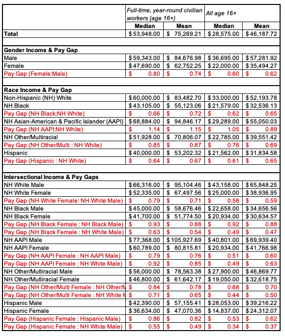
Template: The average [variable label] for [respondents/target population] is [mean value with label]. If you took everyone's [variable label] who is [respondents/target population] and redistributed it equally/evenly, each person would have [mean value with label].
This example: The average income for all U.S. respondents ages 16 or older is about $46,188. If you took everyone who is 16 or older's income and redistributed it so that everyone who is 16 or older earned the same amount, each person would have an income of just over $46,000.
Another example: The average age in the class is 8.5 years old. If you took all the years everyone in the class has been alive and distributed them equally, everyone in the class would be about 8 1/2 years old.
Following the 2020 elections, how did U.S. adults feel about journalists?
The American National Election Studies (ANES) study surveyed a representative sample of U.S. eligible voters. This analysis is based on a survey done in November and December following the 2020 elections.
ANES asks a series of questions using a feelings thermometer scale. Respondents rate their feelings towards political leaders, other people, and groups, on a scale from 0 to 100, with 0 being very cold feelings, 50 being neutral, and 100 being very warm feelings.

I ran (weighted) summary statistics for the question asking how respondents feel about journalists. Here were my results:
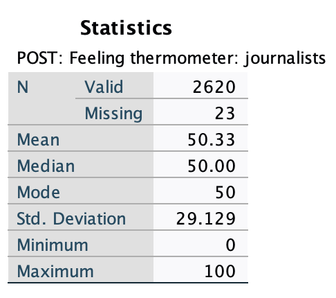
The mean is 50.33. The median is 50.
On average, U.S. eligible voters who took the survey feel neutral towards journalists. If you took everyone's responses, added all the temperatures together, and redistributed them evenly, everyone would have pretty middle/neutral feelings. We can also see from the median that half of respondents had neutral to warm feelings and half had neutral to cold feelings.
Did feelings differ based on whether or not people were Trump supporters?
I broke down the summary statistics by who respondents voted for. Here were my results:

Here we can see that, among respondents who voted for Trump, they on average felt fairly cold or unfavorable towards journalists (mean=28.25), whereas respondents who voted for Biden on average felt fairly warm or favorable towards journalists (mean=69.45). Note that this is imprecise, as we are adding numbers where people with the same feelings towards journalists may have reported different numbers, and we only have descriptors given to us for 9 benchmark temperatures. Sometimes we treat ordinal-level variables as ratio-like. It’s not perfect, but it gives us some insights we otherwise may not have.
I'm Jewish. When I moved from the Northeast to the Midwest, I experienced Christian proselytization permeating the culture in a way I had not experienced before. Are there regional differences that support my feelings? Or has this just been a result of who I have personally encountered?
The General Social Survey (GSS), a study that is representative of U.S. adults, regularly asks the question, "Have you ever tried to encourage someone to believe in Jesus Christ or to accept Jesus Christ as his or her savior?"
After re-coding the variable so that 0=no and 1=yes, I had an indicator variable, a dichotomous variable with 0 and 1 as its coding. Because it is an indicator variable, when the mean is calculated, all values being added up consist of 0s and 1s, so the sum ends up being the total number of cases with a value of 1. When the number of cases with a value of 1 is divided by the total number of cases, the quotient is the proportion of cases with a value of 1. Means for indicator variables are interpreted as the percent with a value of 1.
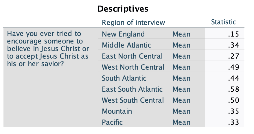
Here are my summary statistics and a frequency table for the GSS question, using 2022 data: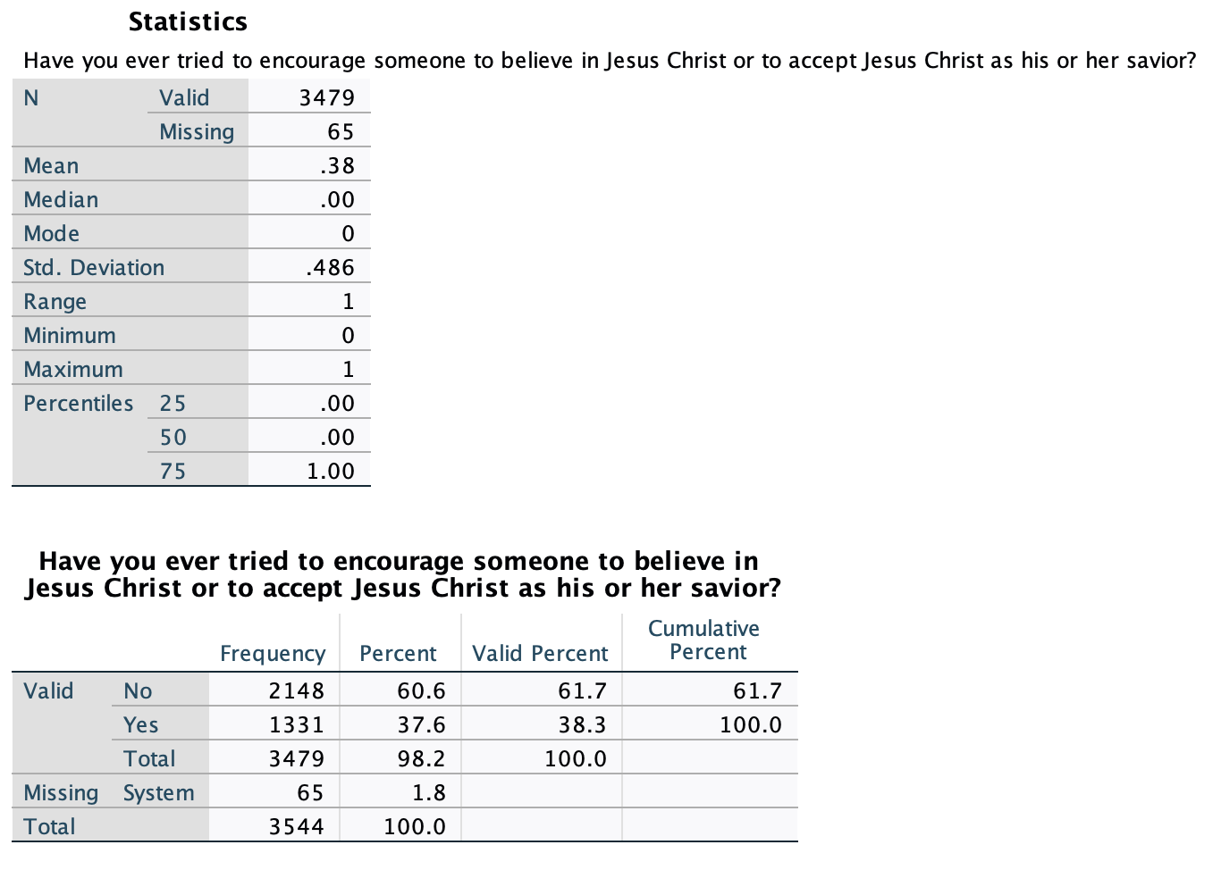
The mean is 0.38, which indicates that 38% of respondents had a 1 value (and the other 100%-38%=62% had a 0 value). Interpreted, 38% of respondents, almost 2/5, have engaged in Christian proselytization. You can see that this matches the frequency table below the output with the mean. The summary statistics also include a median and mode, both 0; with two possible values, these both simply tell you which value has a majority of cases.
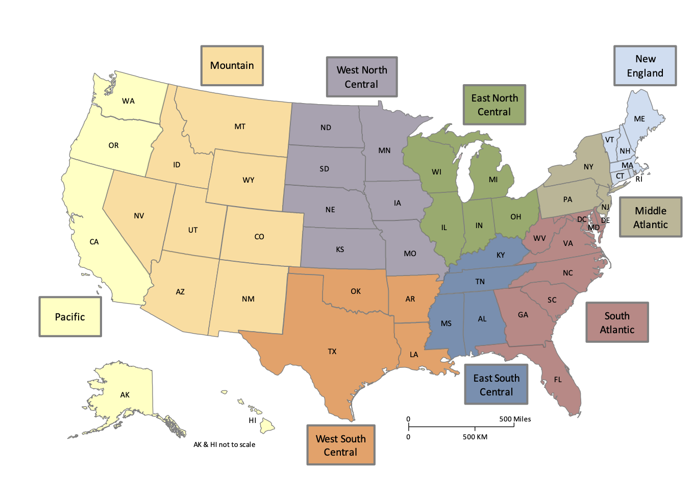
Next I broke down this variable by region. I used GSS's region variable, which breaks down regions as follows:
Here are my means, broken down by region:
To quickly interpret this, I made a graph using the one-way ANOVA means plot feature (we'll learn about one-way ANOVA in Chapter 7).
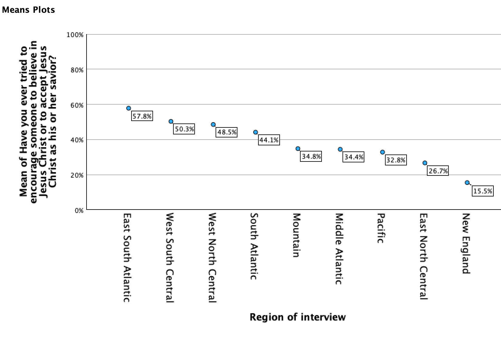
Here you can see that there are substantive differences in Christian proselytization around the country. While in New England about 2/13 of respondents proselytize for Jesus, and about 1/4 of those in the East North Central, it's closer to 1/3 in the Pacific, Middle Atlantic, and Mountain regions, above 2/5 in the South Atlantic, around 1/2 in West North Central and West South Central, and almost 3/5 of respondents in the East South Atlantic.
Template:
Convert your mean into a percentage (e.g., 0.38 becomes 38%).
[mean]% of [cases] [label of 1].
Examples:
Mean=0.33
About 1/3 (33%) of U.S. adult respondents in the Pacific region have tried to encourage someone to believe in Jesus Christ or to accept Jesus Christ as their savior.
Mean=0.58.
58% of U.S. eligible voters voted in the 2020 election.
1.4 The Mode
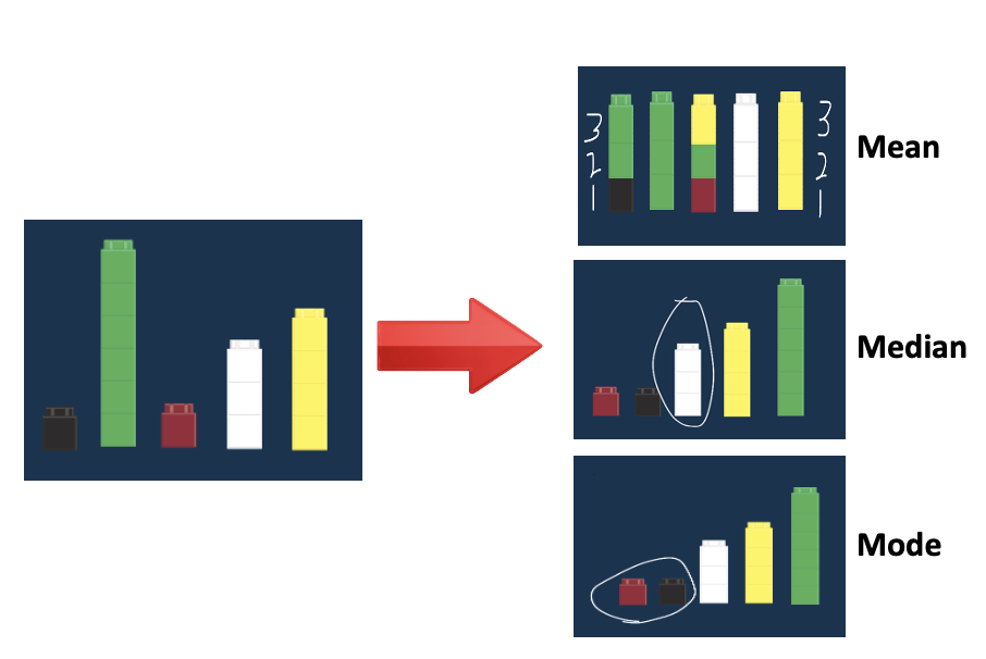
The mean and median are two averages. Another measure of central tendency is the mode.
The mode is the repeated value that appears most frequently
Mode = Most

Data can have no mode if no values repeat / each value is unique, called amodal (pronounced ay-mohd-l with a long a), e.g., if no one washed the same number of cars. Data can have multiple modes if more than one value is tied for most popular, called bimodal for two modes and multimodal for multiple modes, e.g., a mode of both 4 and 5 if 3 friends had washed 4 cars, 3 friends had washed 5 cars, and you didn't have any other number of cars that 3 or more people washed, meaning the most common number of cars washed was 4 and 5 cars.
The mode is generally useless. In some cases it can tell you the most common or popular item (e.g., What's your favorite ice cream flavor?), and in elections the mode, called the plurality, tells you who got the most votes, even if they did not get a majority. However, the mode can be very misleading. Let's say 3 people washed 2 cars each, and then among the remaining car-washers, 2 washed 19 cars, 2 washed 20 cars, 2 washed 21 cars, and 1 washed 22 cars. The mode is 2 cars, even though it does not seem to be the typical number of cars washed. Or let's say that 30 kids voted on which movie they wanted to watch, and 7 said Frozen, 6 said The Lego Batman Movie, 6 said The Lego Ninjago Movie, 5 said The Lego Movie, and 4 said The Lego Movie 2: The Second Part. The mode is Frozen, even though 3/4 of the kids said they want to watch some form of Lego movie. Finally, the more possible values (e.g., consider poverty rates, especially rounded to the hundredths place), the less likely the mode is to be useful, because multiple cases having the same value do not indicate there is any grouping or typicality around that value.
Measures of Central Tendency: Mean, Median, Mode
2. Standard Deviation
2.1 Standard Deviation
Standard deviation: An estimate of the average distance of cases' data values from their overall mean.
Variance: Another term you may hear is variance, which is the square of the standard deviation.
You will sometimes see standard deviation notated with one of two symbols: s or σ
s A lower-case s is used for the standard deviation of sample data.
σ A lower-case Greek letter sigma is used for the standard deviation of a population.
What is standard deviation?
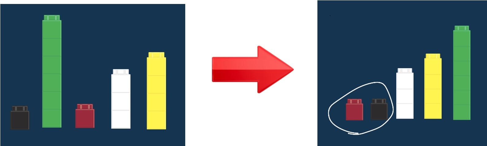
Standard deviation is a measure of how much variability there is in the data.
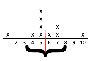
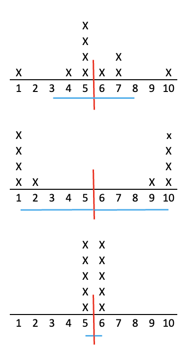
Returning to our car washing example, you and your friends washed a mean of 5.5 cars each. That's the top figure below, with the Xs representing each person and the red line indicating the mean. However, let's look at two other possibilities of how a group of 10 washed 55 cars. Look at the two charts below it. Both of those also have a mean of 5.5, but their distributions are very different. With the mean, we know one measure of central tendency, of how many cars each person washed on average, but as you can see in the middle chart, you can have a mean of 5.5 without anyone washing close to that number of cars, or in the bottom chart, you can have a mean of 5.5 and everyone washed close to that many cars. The mean does not tell us anything about the distribution or variation of how many cars people washed. It is solely a measure of central tendency.

Standard deviation is a statistic that measures how much variability there is in the data. It is an aggregate measure of how far away each number in the set of data is from their mean.
- The larger the standard deviation, the more spread out the data values are and the more variability they have. They tend to be further away from the mean.
- The smaller the standard deviation, the less spread out the data values are and the less variability they have. They tend to be closer to the mean.
The three charts above have standard deviations of 0.5, 2.3, and 4.6. Can you match these standard deviations to the correct charts?
- Answer
-
The second chart has the most variability or spread; its standard deviation is 4.6. The last chart has the least variability or spread; it's standard deviation is 0.5. Our original data, the top chart? It has some variation from the mean; its standard deviation is 2.3.
2.2 Finding the standard deviation
Let's look at how the standard deviation is calculated. You will see it is basically an average distance of the values from the mean. Follow along with the calculation steps to get a sense of the what standard deviation means conceptually.
Sometimes you will see the formula written out with symbols, like this:
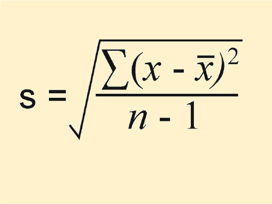
Again, s means standard deviation, Σ means sum, x-bar is the mean, and n is the number of cases. Basically this formula tells you to follow the steps below:
- Calculate the mean.
- Calculate the difference between each value and the mean.
- Square each of the differences.
- Add up the squared differences.
- Divide by n-1
- Take the square root of your answer.
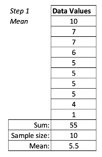
Let's return to the car washing example. We already have our raw data (how many cars each person washed).
Step 1. Calculate the mean
The standard deviation is a measure of average departure from the mean, so we need to start by determining the mean. We already did Step 1 of calculating our mean above. 55÷10=5.5
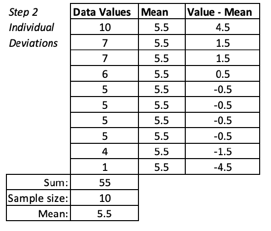
Step 2: Calculate the difference between each value and the mean.
Next we find out how different each case is from the mean. This generates a list of deviations from the mean.
Step 3. Square each of the differences.
Notice that some of the deviations are positive and some are negative. The final step is to find their average. However, adding them up would be problematic, as for example adding the case that is 1.5 above and 1.5 below the mean would give you a summed deviation of 0 instead of a summed deviation of 1.5. One way to account for this would be to take the absolute value of each deviation. If you did that and continued through the final steps, you would end up with a statistic called the mean absolute deviation. We use a different solution to make all the deviations positive---squaring them. This will give us the standard deviation that works with normal distributions and inferential statistics (see Chapter 4).

Step 4. Add up the squared differences.
We are going to find an average of the differences. First we find the sum of our squared differences. This is the total of all the squared deviations.
Step 5. Divide by n-1
We divide by one less than the number of cases. This has to do with degrees of freedom---if we know the mean and we know the values for the other 9 cases, then we already have enough information to figure out the 10th case. Additionally this makes the standard deviation a little bigger, which when we are estimating population parameters from sample statistics, helps us account for sampling error.
This value, here 5.4, is called the variance.
Step 6. Take the square root of your answer.
Recall that we squared our deviations. Therefore 5.4 is not a good estimate of average distance from the mean. We need to unsquare our variance by taking its square root. This gives us the standard deviation.

How do I interpret the standard deviation?
On average, each person washed 5 ½ cars. However, there was some variation from this. On average people washed 2.3 more or fewer cars than 5.5 (e.g., 3.2 and 7.8 cars).
Note: We can see in this example that the "typical" car washer actually did not wash 3.2 or 7.8 cars. Most car washers are closer to the mean. However, with the extreme values of 1 car and 10 cars, this draws the standard deviation out considerably.
However, check out our other two examples of car washers below. You can see in these examples, the standard deviation shows us about where the typical cases are:
1. You can find the standard deviation the same way you found the mean.
Menu:
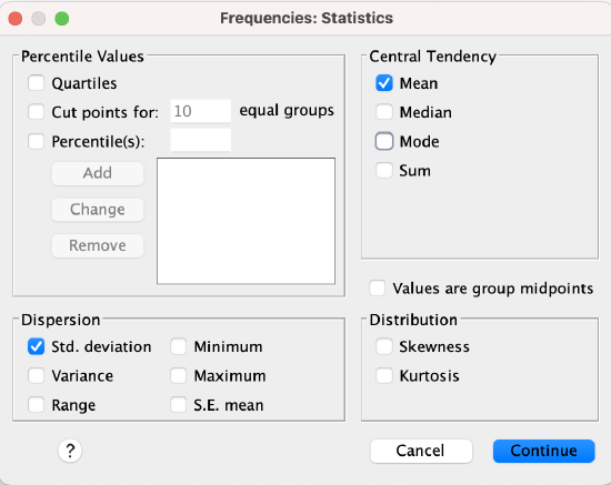
In SPSS, go to Analyze → Descriptive Statistics → Frequencies.
Click on the Statistics button to the right. Then check the box for standard deviation in the bottom left corner of the statistics window and click Continue.
Syntax:
*Include standard deviation (stddev) on the STATISTICS line to include a calculation of standard deviation.
FREQUENCIES VARIABLES=VariableName
/FORMAT=NOTABLE
/STATISTICS=MEAN STDDEV
/ORDER=ANALYSIS.
Output:
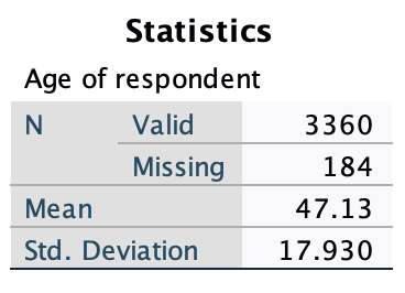
The row labeled standard deviation gives you the standard deviation (here it is 17.93).
2. You can find the standard deviation with Examine/Explore.
Menu:
Go to Analyze → Descriptive Statistics → Explore. Put your variable into the Dependent List window/box. At the bottom where it says "Display," make sure you either have "Both" or "Statistics" checked (Plots will only give you graphs/figures).

Click OK to run the Explore command.
Syntax:
*This will generate the mean along with other statistics and plots.
EXAMINE VARIABLES=VariableName
/PLOT BOXPLOT HISTOGRAM
/PERCENTILES(25,50,75) HAVERAGE
/STATISTICS DESCRIPTIVES
/CINTERVAL 95
/MISSING LISTWISE
/NOTOTAL.
2.3 Interpreting the standard deviation
Remember our summary statistics for feelings towards journalists?

While the mean and median were close to neutral, we saw with the breakdown by who people voted for for president that the typical repondent was not actually neutral.
Here we can see a standard deviation of 29.1. This means that on average, a respondent was about 29.1 degrees away from the mean of 50. This is about 20 or 80 (50-29.1 and 50+29.1, rounded). So we know that most respondents were not neutral, but felt warm or felt cold. Alternatively there could be a collection of neutral respondents and then a collection of respondents at 0 and 100, very cold and very warm. We don't know without seeing more of the distribution, since standard deviation is just one statistic that summarizes variation into one number. This is where box plots and other measures of variation can be helpful.
Next chapter we'll learn about normal distributions, and there will be more specific ways to be able to interpret standard deviations when they are part of normally distributed data. For now, just focus on whether there seems to be little variation, with cases close to the mean, some variation, or a lot of spread, with cases far away from the mean.
Standard deviation is deviation from the MEAN. Therefore standard deviation only works with variables you can calculate and interpret a mean for. It is also useless for indicator variables (just give the percentage distribution for each of the two categories).
The standard deviation can be a bit harder to access, so depending on your audience, it can be helpful to start your storytelling with a refresher/summary of what standard deviation is, e.g., "The standard deviation is a measure of how much individual cases vary away from the mean. Unlike the mean and median, which are measures of central tendency, this is a measure of spread."
Template: There was [not much, some, a good deal of] variation among [respondents/target population]. The average [respondent/target population] had an average deviation of about [value] from the mean of [mean value] [label].
Example: There was some variation among car washers. The average car washer had an average deviation of about 2 cars from the mean of 5 1/2 cars.
Example: There was a good deal of variation in how many shots were taken in each game. The average number of shots in a game had an average deviation of about 5½ shots from the mean of 11.7 shots per game.
2.4 Z-scores
What are “z-scores”?
A z-score is the number of standard deviations a value is from its mean.
z = 0 is the mean (zero standard deviations away from the mean)
z = -2 is two standard deviations below the mean
z = +3 is three standard deviations above the mean
Etc.
For example, let's say you have a mean of 5 and a standard deviation of 1.5. Here would be the values at various z-scores.
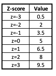
This may not seem very relevant yet. However, it will come in handy in the future.
2.5 Outliers
Last chapter discussed one systematic way to determine if a case for a ratio-like variable is an outlier. You took 1.5 times the IQR and then went that far out below the lower quartile and above the upper quartile. Anything beyond those values was an outlier.
Another way that people systematically determine outliers is by using the threshold of three standard deviations away from the mean. If a value is below z=-3 or above z=+3, it can be considered an outlier.
For example, in the table for 2.4 above, any values below 0.5 or above 9.5 would be considered outliers.
These different methods of determining outliers can lead to different outcomes in terms of whether or not a value is considered an outlier.
2.6 Other measures of variation
If half of your survey respondents' favorite color is green, one-quarter prefer orange, and one-quarter prefer black, what is the mean and standard deviation for your favorite color variable?
- Answer
-
Favorite color is a nominal-level variable, so you cannot calculate and interpret a sensical mean or standard deviation.
Index of Qualitative Variation (IQV)
The IQV can be used to measure variation for nominal-level variables.
It ranges from 0 to 1.
- 0 = no diversity at all (all cases in one category)
- 1 = maximum diversity (equal number of cases in all categories)
For example, if in a class everyone got As, the IQV value would be 0. If 1/5 got As, 1/5 Bs, 1/5 Cs, 1/5 Ds, and 1/5 Fs, the IQV value would be 1.
Additional measures you may come across:
Gini Coefficient
The Gini Coefficient is used for income inequality. It also ranges from 0 to 1, with 0 representing perfect income equality (everyone has an equal share) to 1 for for perfect income inequality (1 person/group has all the income).
Index of Dissimilarity
The Index of Dissimilarity measures racial segregation of two groups in a geographic area. It ranges from 0 at maximum integration to 100 at maximum segregation.