2: Levels of Measurement; Five Point Summaries
- Page ID
- 186582

\( \newcommand{\vecs}[1]{\overset { \scriptstyle \rightharpoonup} {\mathbf{#1}} } \)
\( \newcommand{\vecd}[1]{\overset{-\!-\!\rightharpoonup}{\vphantom{a}\smash {#1}}} \)
\( \newcommand{\dsum}{\displaystyle\sum\limits} \)
\( \newcommand{\dint}{\displaystyle\int\limits} \)
\( \newcommand{\dlim}{\displaystyle\lim\limits} \)
\( \newcommand{\id}{\mathrm{id}}\) \( \newcommand{\Span}{\mathrm{span}}\)
( \newcommand{\kernel}{\mathrm{null}\,}\) \( \newcommand{\range}{\mathrm{range}\,}\)
\( \newcommand{\RealPart}{\mathrm{Re}}\) \( \newcommand{\ImaginaryPart}{\mathrm{Im}}\)
\( \newcommand{\Argument}{\mathrm{Arg}}\) \( \newcommand{\norm}[1]{\| #1 \|}\)
\( \newcommand{\inner}[2]{\langle #1, #2 \rangle}\)
\( \newcommand{\Span}{\mathrm{span}}\)
\( \newcommand{\id}{\mathrm{id}}\)
\( \newcommand{\Span}{\mathrm{span}}\)
\( \newcommand{\kernel}{\mathrm{null}\,}\)
\( \newcommand{\range}{\mathrm{range}\,}\)
\( \newcommand{\RealPart}{\mathrm{Re}}\)
\( \newcommand{\ImaginaryPart}{\mathrm{Im}}\)
\( \newcommand{\Argument}{\mathrm{Arg}}\)
\( \newcommand{\norm}[1]{\| #1 \|}\)
\( \newcommand{\inner}[2]{\langle #1, #2 \rangle}\)
\( \newcommand{\Span}{\mathrm{span}}\) \( \newcommand{\AA}{\unicode[.8,0]{x212B}}\)
\( \newcommand{\vectorA}[1]{\vec{#1}} % arrow\)
\( \newcommand{\vectorAt}[1]{\vec{\text{#1}}} % arrow\)
\( \newcommand{\vectorB}[1]{\overset { \scriptstyle \rightharpoonup} {\mathbf{#1}} } \)
\( \newcommand{\vectorC}[1]{\textbf{#1}} \)
\( \newcommand{\vectorD}[1]{\overrightarrow{#1}} \)
\( \newcommand{\vectorDt}[1]{\overrightarrow{\text{#1}}} \)
\( \newcommand{\vectE}[1]{\overset{-\!-\!\rightharpoonup}{\vphantom{a}\smash{\mathbf {#1}}}} \)
\( \newcommand{\vecs}[1]{\overset { \scriptstyle \rightharpoonup} {\mathbf{#1}} } \)
\(\newcommand{\longvect}{\overrightarrow}\)
\( \newcommand{\vecd}[1]{\overset{-\!-\!\rightharpoonup}{\vphantom{a}\smash {#1}}} \)
\(\newcommand{\avec}{\mathbf a}\) \(\newcommand{\bvec}{\mathbf b}\) \(\newcommand{\cvec}{\mathbf c}\) \(\newcommand{\dvec}{\mathbf d}\) \(\newcommand{\dtil}{\widetilde{\mathbf d}}\) \(\newcommand{\evec}{\mathbf e}\) \(\newcommand{\fvec}{\mathbf f}\) \(\newcommand{\nvec}{\mathbf n}\) \(\newcommand{\pvec}{\mathbf p}\) \(\newcommand{\qvec}{\mathbf q}\) \(\newcommand{\svec}{\mathbf s}\) \(\newcommand{\tvec}{\mathbf t}\) \(\newcommand{\uvec}{\mathbf u}\) \(\newcommand{\vvec}{\mathbf v}\) \(\newcommand{\wvec}{\mathbf w}\) \(\newcommand{\xvec}{\mathbf x}\) \(\newcommand{\yvec}{\mathbf y}\) \(\newcommand{\zvec}{\mathbf z}\) \(\newcommand{\rvec}{\mathbf r}\) \(\newcommand{\mvec}{\mathbf m}\) \(\newcommand{\zerovec}{\mathbf 0}\) \(\newcommand{\onevec}{\mathbf 1}\) \(\newcommand{\real}{\mathbb R}\) \(\newcommand{\twovec}[2]{\left[\begin{array}{r}#1 \\ #2 \end{array}\right]}\) \(\newcommand{\ctwovec}[2]{\left[\begin{array}{c}#1 \\ #2 \end{array}\right]}\) \(\newcommand{\threevec}[3]{\left[\begin{array}{r}#1 \\ #2 \\ #3 \end{array}\right]}\) \(\newcommand{\cthreevec}[3]{\left[\begin{array}{c}#1 \\ #2 \\ #3 \end{array}\right]}\) \(\newcommand{\fourvec}[4]{\left[\begin{array}{r}#1 \\ #2 \\ #3 \\ #4 \end{array}\right]}\) \(\newcommand{\cfourvec}[4]{\left[\begin{array}{c}#1 \\ #2 \\ #3 \\ #4 \end{array}\right]}\) \(\newcommand{\fivevec}[5]{\left[\begin{array}{r}#1 \\ #2 \\ #3 \\ #4 \\ #5 \\ \end{array}\right]}\) \(\newcommand{\cfivevec}[5]{\left[\begin{array}{c}#1 \\ #2 \\ #3 \\ #4 \\ #5 \\ \end{array}\right]}\) \(\newcommand{\mattwo}[4]{\left[\begin{array}{rr}#1 \amp #2 \\ #3 \amp #4 \\ \end{array}\right]}\) \(\newcommand{\laspan}[1]{\text{Span}\{#1\}}\) \(\newcommand{\bcal}{\cal B}\) \(\newcommand{\ccal}{\cal C}\) \(\newcommand{\scal}{\cal S}\) \(\newcommand{\wcal}{\cal W}\) \(\newcommand{\ecal}{\cal E}\) \(\newcommand{\coords}[2]{\left\{#1\right\}_{#2}}\) \(\newcommand{\gray}[1]{\color{gray}{#1}}\) \(\newcommand{\lgray}[1]{\color{lightgray}{#1}}\) \(\newcommand{\rank}{\operatorname{rank}}\) \(\newcommand{\row}{\text{Row}}\) \(\newcommand{\col}{\text{Col}}\) \(\renewcommand{\row}{\text{Row}}\) \(\newcommand{\nul}{\text{Nul}}\) \(\newcommand{\var}{\text{Var}}\) \(\newcommand{\corr}{\text{corr}}\) \(\newcommand{\len}[1]{\left|#1\right|}\) \(\newcommand{\bbar}{\overline{\bvec}}\) \(\newcommand{\bhat}{\widehat{\bvec}}\) \(\newcommand{\bperp}{\bvec^\perp}\) \(\newcommand{\xhat}{\widehat{\xvec}}\) \(\newcommand{\vhat}{\widehat{\vvec}}\) \(\newcommand{\uhat}{\widehat{\uvec}}\) \(\newcommand{\what}{\widehat{\wvec}}\) \(\newcommand{\Sighat}{\widehat{\Sigma}}\) \(\newcommand{\lt}{<}\) \(\newcommand{\gt}{>}\) \(\newcommand{\amp}{&}\) \(\definecolor{fillinmathshade}{gray}{0.9}\)Chapters 2 and 3 focus on measures of central tendency and spread, with Chapter 2 focused on median and quartiles and Chapter 3 focused on mean and standard deviations.
In Chapter 1, I looked at whether movies featured monarchies. It seemed strange to me that the United States would both valorize democracy and keep having popular movies that present monarchies without problematizing the concept. These next two chapters will continue with investigating forms of government. When I say the U.S. seems to valorize democracy, what do I actually mean by democracy? "Democracy" comes from the Greek words "demos" and "kratia" for "the people" and "power, rule, strength." Because we elect people to represent us, the United States has a representative democracy, or republic, not a direct democracy. Or do we? Is the United States an oligarchy, where there is a small elite that holds the power and governs? An autocracy, where one person holds all the power? A theocracy, where religion governs civil life? Recently we have heard some right-wing U.S.-Americans insisting the United States is not a democracy---and was never intended to be one. The International Institute for Democracy and Electoral Assistance classifies the U.S.A. as a "backsliding democracy" and the Economic Intelligence Unit labels the U.S.A. a "flawed democracy." The World Values Survey asks residents how democratically their country is being governed. However, as noted at the end of Chapter 1, how we conceptualize and operationalize constructs matters. What is democracy? Do people even agree on what democracy is?
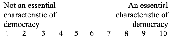
The World Values Survey asks a series of 9 questions about what democracy is. The interviewer asks, "Please tell me for each of the following things how essential you think it is as a characteristic of democracy. Use this scale where 1 means 'not at all an essential characteristic of democracy' and 10 means it definitely is 'an essential characteristic of democracy'."
While not asked, if the respondent instead volunteers that the characteristic is against democracy, that is coded as a 0.
The different characteristics asked about include:
- Governments tax the rich and subsidize the poor.
- Religious authorities ultimately interpret the laws.
- People choose their leaders in free elections.
- People receive state aid for unemployment.
- The army takes over when government is incompetent.
- Civil rights protect people from state oppression.
- The state makes people’s incomes equal.
- People obey their rulers.
- Women have the same rights as men.
These questions were asked to a representative sample of U.S. adults in 2017, and to residents of 90 other countries between 2017 and 2022.
To me it seems fairly obvious that democracy requires free elections. Do others agree? Was I socialized into this view as a U.S.-American and share it with most U.S.-Americans, or is this a more universal truth of what democracy means? We'll take a look in this chapter.
A. Levels of Measurement
Before we can answer our question, we need to learn about levels of measurement. Level of measurement will be an important concept throughout social statistics, because different techniques and measurements can only be used with variables at certain levels of measurement. There are different things you can do with variables depending on its level of measurement.
Level of measurement: a variable characteristic classifying the relationship among a variable's values
We will deal with four main levels of measurement: nominal, ordinal, ratio, and indicator.
Nominal: Nominal variables have values that are qualitative categories. They do not have any meaningful rank or order.
Nominal comes from the Latin word "nomen," meaning "name." The values for nominal variables have names for their labels.
Some common nominal variables include: race and ethnicity, gender, religion, occupation, and geographic area.
For example, U.S. Census questions on race include White, Black or African American, American Indian or Alaska Native, Asian, and Native Hawaiian or Other Pacific Islander. These are categories that have name labels. Any "ordering" or "ranking" would be arbitrary. For example, if we coded White=1, Black/African American=2, American Indian/Alaska Native=3, Asian=4, Native Hawaiian or Other Pacific Islander=5, and then found a middle value of 2.3, what would that mean? It is not the middle of anything because there are not ordered categories.
Even nominal variables have codes, numbers assigned for each category. For example, for the above, the coding scheme could be White=1, Black or African American=2, American Indian or Alaska Native=3, Asian=4, Native Hawaiian or Other Pacific Islander=5, multi-racial=6. However, just because the codes are still numbers does not mean the labels aren't categories. Each category could be assigned any number and the variable would still have the same meaning. And just because numbers are ordered does not mean the categories are ordered (e.g., Asian is not lower or higher than multiracial).
Ordinal: Ordinal variables have values that are qualitative categories. They do have a meaningful rank or order.
Ordinal comes from the Latin word "ordo," meaning "order." Ordinal variables have named categories, like nominal variables, but the categories can be rank-ordered.
Some common ordinal variables include social class, ideology, and Likert scale variables that ask for the level of agreement/disagreement with a particular statement.
For example, the General Social Survey (GSS) has a variable spanking with the question, "Do you strongly agree, agree, disagree, or strongly disagree that it is sometimes necessary to discipline a child with a good, hard spanking?" The categorical responses and their coding are 1 strongly agree, 2 agree, 3 disagree, and 4 strongly disagree. These answers are still categories, not numbers, but here they are ordered from most agreement to least agreement, which makes the variable ordinal. (If you're curious, 434 respondents strongly agreed, 887 agreed, 634 disagreed, and 389 strongly disagreed. While a minority, 44%, disagreed or strongly disagreed, when this question was first on the GSS in 1986 only 16% of respondents disagreed or strongly disagreed.)
Ordinal variables are often treated like numeric ratio-level variables. While this has limitations to its validity, it usually gives us some insights and a better picture than if we did not do this. The more categories an ordinal-level variable has, the more ratio-like it is. (Generally you want at least 5 categories, and if you have at least 10 you can usually confidently proceed with using the variable as ratio-like.) Furthermore, to make an ordinal variable ratio-like, it can be useful to re-code it to approximate equal distance. For the spanking variable, it could be re-coded as -2 strongly disagree, -1 disagree, 1 agree, and 2 strongly agree. This more closely approximates equal distancing because each unit is one movement towards agreement, with 0 being neutral / neither agree nor disagree, even though there are no cases with that answer. (Actually, in 2022 there were 23 respondents who volunteered that they could not choose or did not know, so those respondents could be re-coded as neutral). Centering on zero also makes interpretation easier---anything negative leans towards disagreeing, and anything positive leans towards agreeing.
Ratio: Ratio-level variables have values that are numeric. They have a true zero point, meaningful ratios, consistent intervals between them, and the numbers function arithmetically.
Income (in dollars) and age (in years) are common ratio-level variables.
Let's elaborate on the criteria, using age as an example.
- Numeric: When expressed in years, the values are numbers. They do not need separate coding. 10 means 10 years old. 60 means 60 years old.
- True zero point: Zero years old is the lack or absence of any years of age (birth). (For weight this would be weightless, for salary it would mean $0).
- Meaningful ratios and arithmetically functional: Someone who is 20 is twice as old as someone who is 10 and half as old as someone who is 40. Someone who is 5 years older than 20 will be 25 years old. Someone who is 5 years younger than 20 will be 15 years old.
- Consistent intervals: Each unit is one year apart. 15 is one year from 16 is one year from 17, etc. (Note: Technically the age in years variable in the General Social Survey is ratio-like and not ratio-level, because the top age is 89+, which violates the consistent intervals criterion.)
Interval: Interval-level variables have equal intervals between values, but do not meet all the criteria to be classified as ratio-level variables. Some definitions of interval-level variables require interval-level variables to have numeric values.
We will not be discussing interval-level variables further in this book because they are somewhat rare in the social sciences, and for the purposes of the statistical techniques in this book, all interval variables are ratio-like, meaning they share enough in common with ratio-level variables to be used for the same statistical procedures.
A common example of an interval-level variable is temperature in degrees Fahrenheit. Degrees is numeric (e.g., 60 means 60°F; it is not a code for something else). There is an equal distance between each degree (one degree each), but there is no absolute 0 (0°F does not indicate lack of temperature, lack of warmth, or the like) and temperatures do not have meaningful ratios (50°F is not twice as warm as 25°F or half as warm as 100°F). Another example are standardized tests like the ACT and SAT. The ACT goes from 1-36 and the SAT goes from 200-800. There are no meaningful zeros.
Indicator: Indicator variables, also called dummy variables, are dichotomous/binary, meaning they only have two categories, and these two values are coded as 0 and 1.
Dichotomous variables are those with only two options. The word comes from the Greek words "dikho" for "in two" and "temnein" for "to cut.
Often we would think of dichotomous variables as nominal (e.g., do you prefer Skittles or M&Ms; are you married or not married, agree/disagree or yes/no questions), but sometimes they could be considered ordinal (e.g., student vs. alum; secondary school vs. postsecondary school). Regardless, we separate them out here because when dichotomous variables are coded as 0 and 1, they have special properties that will be revisited throughout this book.
What is the level of measurement for job satisfaction, when the responses include: very satisfied, somewhat satisfied, indifferent, somewhat unsatisfied, very unsatisfied?
Is it a nominal, ordinal, ratio, or indicator variable?
- Answer
-
These are categories, and they are rank-ordered from most to least satisfied. This makes it ordinal.
What is the level of measurement for trees, when the responses include types of trees like: redwood, sequoia, fir, pine, birch, spruce, oak, and maple?
Is it a nominal, ordinal, ratio, or indicator variable?
Answer
-
These are un-ranked names. This makes it nominal.
What is the level of measurement for number of children in home, where the respondent writes how many children are in their home?
- Answer
-
Number of children is numeric. It has an absolute zero (0 means the absence of children in the home). 4 children is double 2 children and half of 8 children, and each unit increase is one more child. This makes it ratio.
What is the level of measurement for a survey question asking how old someone is, when the options are age groups such as 0-7, 8-15, 16-19, 20-23, 24-27, 28-31, 32-35, 36-39, etc.?
- Answer
-
While the answers have numbers in them, the attribute labels are actually categories, not numeric. They are age groups, not actual ages in years. They are ordered from youngest to oldest. This makes the variable ordinal. Note that there is not consistent intervals/distance between each category. The first two have an 8-year span, whereas the rest have a 4-year span. Before using this variable as ratio-like, it should be re-coded so that they are all in consistent 8-year spans (e.g., combine together 16-19 and 20-23 into 16-23, combine together 24-27 and 28-31 into 24-31, etc.).
What is the level of measurement for a survey question asking for a respondent's political ideology, if the options and coding are: 1: very conservative, 2: somewhat conservative, 3: moderate, 4: somewhat liberal, 5: very liberal, 6: I don't know.
- Answer
-
The answers are named categories, not numeric. At first it appears that the variable is ordinal, because it is ordered (the higher the code, the less conservative/more liberal the respondent). However, the addition of "don't know" makes this variable nominal.
What is the level of measurement for a survey question asking individuals how they felt about the year 2022 on a scale of 0 to 10, with 0 being awful, 5 being neutral/mixed, and 10 being awesome?
- Answer
-
While the answer the respondents give is a number, don't get fooled. These numbers are actually categories. One respondent's 8 could mean something different than another respondent's 8. There is not equal distance between the numbers. One respondent could say a 3, another a 1, and yet they could both actually have the same feelings about 2022. Also, it is not ratio-level: a 10 means awesome, not double neutral/mixed (double 5). Because these are ordered categories, the variable is ordinal.
The same construct can have different levels of measurement depending on its coding.
The General Social Survey (GSS) has a series of questions asking about different problems facing the country, and asks respondents whether they think "we're spending too much money on it, too little money, or about the right amount."
This variable's original coding below is nominal --- these are categories and they are not ordered. The ordinal coding below shows how I re-coded the variable to be ordinal, as now as the coded numbers increase, the values go from the respondent thinking we spend too little to too much. The indicator coding below is an indicator variable, a dichotomous variable coded with 0 and 1, where those who responded "too little" are classified as supporting more spending on the problem, while those who said we either spend "about right" or "too much" are classified as not supporting spending more on the problem.
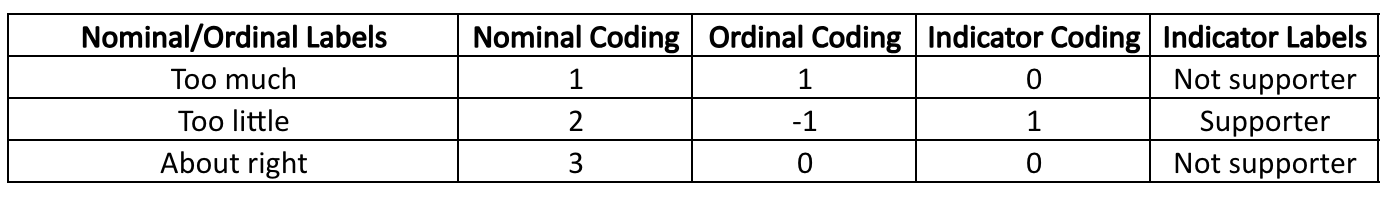
Recoding is the process of changing a variable's number-attribute assignments so that it has new/different coding.
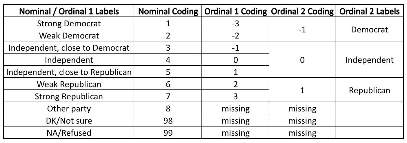
Another GSS variable, partyID, is based on the question, "Generally speaking, do you usually think of yourself as a Republican, Democrat, Independent, or what?" The original coding is nominal, because the "other party," "don't know," and "refused" responses do not follow the rest of the values that are ordered from more Democrat to more Republican. For the first ordinal-level variable ("Ordinal 1 Coding" below), these three values were re-coded as missing, removed from the variable, making it rank-ordered. In the second ordinal-level variable ("Ordinal 2 Coding"), the Ordinal 1 coding is collapsed to make three categories, classifying respondents either as Democrat, Independent, or Republican. In Chapter 13, you'll learn how this second ordinal variable can be re-coded into a a reference group set made up of indicator variables.
While ratio-level variables are often the most desired, sometimes your interests may lead you to re-code a variable into a different level of measurement. Let's say I have a ratio-level variable of birth weight, with the coding being weight in pounds. I might be interested in re-coding birth weight into an ordinal-level variable to be able to differentiate between low, normal, and high birth weights and then research potential determinants into these categories.

Another type of variable you might come across is an index.
An index is when multiple variables are combined together into one construct.
An index is usually treated as a ratio-level variable.
There are many indexes that are used for real-life evaluation purposes, such as the Human Development Index, Consumer Confidence Index, and Global Peace Index.
- Human Development Index (HDI)
The United Nations (UN) introduced the HDI to measure a country's development based on people's capabilities, rather than past measures focused solely on economic growth. It takes into account five different variables that together form one summary measure of human development.
Currently the United States (0.921) is ranked 21st on the list of 191 countries, with Switzerland (0.962), Norway, Iceland, Hong Kong, and Australia taking the top 5 spots, and South Sudan (0.385), Chad, Niger, and the Central African Republic the bottom 5 spots.
The UN also has an inequality-adjusted HDI that takes each of the variables and adjusts them based on levels of inequality for those particular measures. The United States (0.819) is tied with Cyprus for 25th, while Iceland (0.915), Norway, Denmark, Switzerland, and Finland take the top 5 spots, and Central African Republic (0.404), South Sudan, Chad, Mali, and Niger take the bottom 5 spots.
- Global Peace Index (GPI)
The Institute for Economic and Peace's Vision of Humanity's GPI is based on 23 indicators, each weighted on a scale of 1 to 5, with 1 being the most peaceful. The 23 indicators include: perceived criminality in society, security officers and police, homicides, jailed population, access to weapons, organized internal conflict, violent demonstrations, violent crime, political instability, political terror, weapons imports, terrorist activity, deaths from internal conflicts, military expenditure, armed services personnel, UN peacekeeping funding, nuclear and heavy weapons, neighboring country relations, deaths from external conflicts, external conflicts fought, internal conflicts fought, domestic and international conflict, safety and security, and militarization.
For 2023, the United States ranked 131st (2.448), with the most peaceful countries being Iceland (1.124), Denmark, Ireland, New Zealand, and Austria, and the least peaceful countries being Afghanistan (3.448), Yemen, Syria, South Sudan, and the Democratic Republic of the Congo.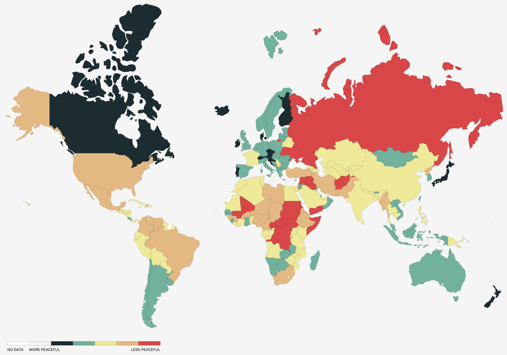
- Consumer Confidence Index (CCI)
The Organization for Economic Cooperation and Development (OECD)'s CCI is a composite of questions about one's expected financial situation, sentiment about the general economic situation, unemployment, and capability of savings. An index score above 100 signals positive consumer confidence toward the economic future, whereas under 100 signals a more pessimistic outlook. The CCI is intended to predict spending compared to saving.
The United States ranked 28th (based on its most recent July 2023 score of 97.42). The highest ranked countries were Mexico (103.78), Indonesia, Costa Rica, Lithuania, and Brazil. The lowest were Estonia (94.18), China, Columbia, New Zealand, and South Africa.
Cronbach's alpha, often notated with the Greek lowercase alpha letter 𝜶, is a common measure of index reliability.
A common measure of index reliability (from 0 unreliable to 1 perfect reliability).
Do the variables that make up the index all measure the same overall construct? You will likely come across Chronbach's alpha when you read quantitative academic studies, though it is much more frequently used in psychology statistics compared to sociology statistics. Overall, just know that 0 means not reliable, 1 means perfect reliability, and anything at 0.7 or higher is good enough.
There are two ways to re-code using SPSS.
Method #1: Recoding by listing old and new values
Menu method: In SPSS, go to Transform → Recode into Different Variables...
Choose this one instead of "Recode into Same Variables..." so that you are not overwriting the old variable, which can get confusing.
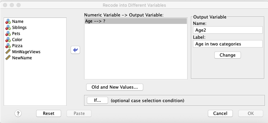
1. Put your original variable into the middle box. On the right side, where it says "Output Variable," give the variable you are creating (the re-coded variable) a name and a label/description. Make sure to click "Change"! This is especially important if you are re-coding multiple variables, because otherwise your new coding scheme will apply to whatever you had in there before, which is not the correct variable.
2. Click the "Old and New Values" button.
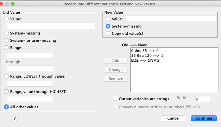
In the window that pops up, define what you want the new codes to be. On the left side, you select the old codes, and on the new side, you name what the new code will be. You can do this for one value at a time (e.g., you can state that a 1 should become a 5), or you can use the ranges to change multiple old codes at the same time into a new code (e.g., if you are collapsing a variable). In the example below, age was collapsed into an indicator variable, with 0 coded as those 35 and younger, and 1 coded as those 36 and older. (The last line, else=sysmis, said that if there were any values outside of 0 through 120, they would be coded as missing.) When you are done specifying how the old codes should be re-coded into new codes, click Continue, then in the original window, click OK.
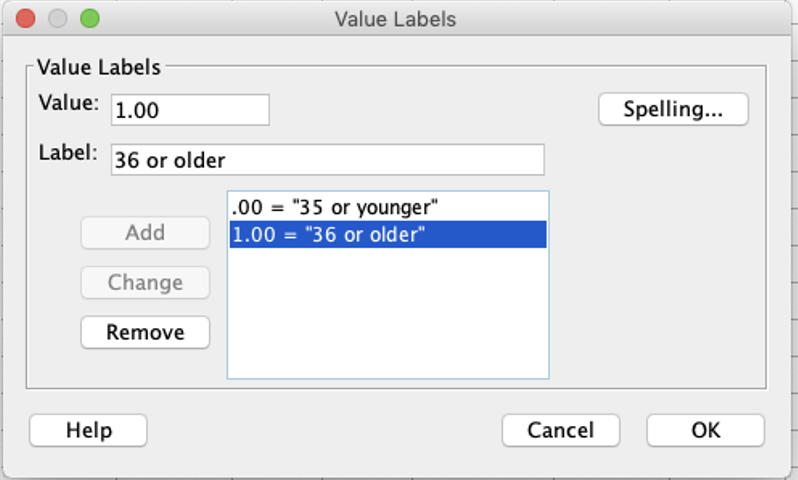
3. Go to the Variable view of the dataset, and add labels to define your coding scheme (as applicable).
4. Advanced/more complex recoding: In the original recoding window, there was also an "IF" button. This can be useful if you have more complicated re-codes. For example, you can recode values contingent on a different variable having a certain value (e.g., if Hispanic=2). If you are using this to combine multiple variables together, sometimes it is best to start by recoding into a different variable, and then using the "recode into same variables" drop-down so that you can keep making changes until you get to the coding you want for the new variable.
Syntax:
Edit the syntax below as applicable. You can see options for changing a range of variables into a new code or just changing them one-for-one. Add and delete as needed.
*First line RECODE old codes into new codes.
RECODE OriginalVariableName (1=0) (2=1) (3=3) (4 thru 6 = 2) (7 thru 9 = 3) (ELSE=SYSMIS) INTO NewVariableName.
VARIABLE LABELS NewVariableName 'Descriptive title for variable'.
VALUE LABELS NewVariableName 0 'Code description' 1 'Code description' 2 'Code description' 3 'Code description'.
Advanced/more complex recoding:
If you want to do contingent coding (like how you could select "IF" in the recoding window), use the syntax below to re-code into the same variable. Again, I would suggest re-coding into a different variable first, then editing and overwriting that newly created variable:
DO IF (VariableAName=#).
RECODE VariableBName (OldCode#=NewCode#).
END IF.
In practice, re-coding can be a multi-step practice if you are doing more complicated re-codes. I've included below an example of syntax for creating a four-category race variable for the 2022 General Social Survey dataset. While GSS provides a "race" variable (1=White, 2=Black, 3=Other), it is separate from the "hispanic" variable (0=No, 1=Yes). I wanted to combine these together into one variable.
*Recode Hispanic into Race4Cat.
*Not Hispanic becomes 2, Hispanic becomes 3, missing stays missing.
RECODE RaceACS16 (0=2) (1=3) (ELSE=SYSMIS) INTO Race4Cat.
VARIABLE LABELS Race4Cat 'Race in 4 categories'.
VALUE LABELS Race4Cat 0 'NH White only' 1 'NH Black only' 2 'NH Other/2+' 3 'Hispanic'.
EXECUTE.
*If NH white, change NH coding to 0.
DO IF (RaceACS1=1).
RECODE Race4Cat (2=0).
END IF.
*If NH black, change NH coding to 1.
DO IF (RaceACS2=1).
RECODE Race4Cat (2=1).
END IF.
*If black and white and NH, change coding to 2+.
DO IF (RaceACS1=1 & RaceACS2=1).
RECODE Race4Cat (0=2) (1=2).
END IF.
*If American Indian or Alaskan Native, and also white or black, and already coded as white only or black only, change to 2+.
DO IF (RaceACS3=1).
RECODE Race4Cat (0=2) (1=2).
END IF.
*If Asian Indian, and also white or black, and already coded as white only or black only, change to 2+.
DO IF (RaceACS4=1).
RECODE Race4Cat (0=2) (1=2).
END IF.
*Same as above for other racial categories that are not Hispanic or white or black.
DO IF (RaceACS5=1).
RECODE Race4Cat (0=2) (1=2).
END IF.
DO IF (RaceACS6=1).
RECODE Race4Cat (0=2) (1=2).
END IF.
DO IF (RaceACS7=1).
RECODE Race4Cat (0=2) (1=2).
END IF.
DO IF (RaceACS8=1).
RECODE Race4Cat (0=2) (1=2).
END IF.
DO IF (RaceACS9=1).
RECODE Race4Cat (0=2) (1=2).
END IF.
DO IF (RaceACS10=1).
RECODE Race4Cat (0=2) (1=2).
END IF.
DO IF (RaceACS11=1).
RECODE Race4Cat (0=2) (1=2).
END IF.
DO IF (RaceACS12=1).
RECODE Race4Cat (0=2) (1=2).
END IF.
DO IF (RaceACS13=1).
RECODE Race4Cat (0=2) (1=2).
END IF.
DO IF (RaceACS14=1).
RECODE Race4Cat (0=2) (1=2).
END IF.
DO IF (RaceACS15=1).
RECODE Race4Cat (0=2) (1=2).
END IF.
Method #2: Recoding using formulas (compute)
Depending on the re-code, I may also be able to use Compute, which allows me to use arithmetical formulas to change variables. This is especially useful for indexes (where we generally add variables together) and interactions (where we multiply variables together). It can also be used for some simple re-codes. For example, in GSS, the variable "sex" is coded as 1=male, 2=female. While I could use Method #1 and re-code the variable (1=0) (2=1), the other option is just to change the coding by subtracting one.
Menu:
In SPSS, go to Transform → Compute Variable.
In "Target Variable," write the name you want for your new re-coded variable.
In the "Numeric Expression" box, type the equation that should be used to re-code the variable, including the name(s) of the old variables you are using for the re-code (type them in or find them in the box on the left and click the blue arrow to put them into the Numeric Expression box). Note that there are specific symbols you need to use (e.g., * for multiplying, / for dividing), so if you're not sure on which symbol to use, you can just use the buttons.
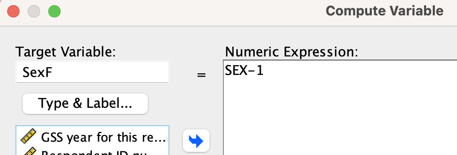
Here you can see I am creating a new variable "SexF" (F to designate that in the indicator variable, female is coded as 1). The "numeric expression" is to take the old codes for "SEX" and subtract 1, so 2 would be 2-1=1 and 1 would be 1-1=0. 2 becomes 1 and 1 becomes 0, making it an indicator variable.
After using compute, go into the Variable View on the dataset and add your variable description and coding labels as appropriate.
Syntax:
Below is just one example. The Numeric Expression below is where it says "VariableOne+VariableTwo" which would be if you were adding two variables together. Change this based on whatever you want to do, e.g., above I would have typed "sex-1". Make sure to leave the period at the end of the line.
COMPUTE NewVariableName=VariableOne+VariableTwo.
VARIABLE LABELS NewVariableName 'Descriptive title for variable'.
VALUE LABELS NewVariableName 0 'Code description' 1 'Code description' 2 'Code description' 3 'Code description'.
B. Splitting Data into Quarters (5 Point Summary)

In this section we will go through a few methods to split data into four ordered quartiles, where an ordered distribution is split into four equal groups.
As previously noted, different things can be done with variables with different levels of measurement.
Nominal: Nominal-level variables cannot be split into ordered quartiles, because they are not ordered.
Ordinal & Ratio: Ordinal-level and ratio-level variables can be split into ordered quartiles.
Indicator: While indicator variables can be split into ordered quartiles, doing so is not very useful. If you already know what percentage of cases are at each of the two values, splitting the data into quarters does not give you additional useful information.
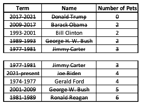
Did you know that President Teddy Roosevelt had dozens of pets in the White House, including a bear and a hyena, and President Calvin Coolidge had a lion and bobcat? Only three presidents have had no pets with them while they were in the White House.
1. Order and group or cross-out method
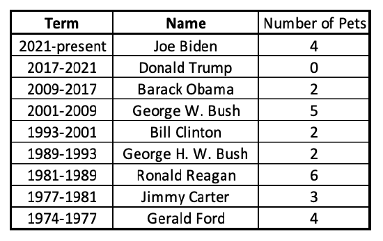
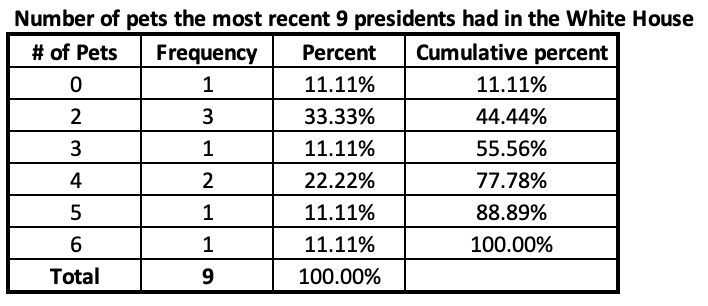
Let's take a look at the number of pets the 8 most recent presidents have had in the White House, and divide the number of presidents into quartiles.
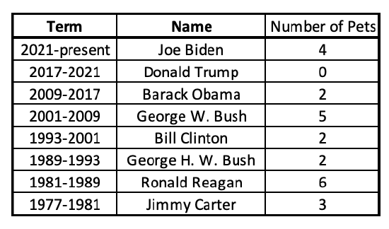
The first step is to make this an ordered list.

Next this list can be separated into equal quarters. With 8 total presidents, each quarter will have 2 presidents in it.
A 5-point summary consists of the lowest value (minimum), value that is higher than 1/4 and lower than 3/4 of values (lower quartile), middle value that is higher than 2/4 or 1/2 and lower than 2/4 or 1/2 of values (median), value that is higher than 3/4 and lower than 1/4 of values (upper quartile), and the highest value (maximum).
For the data above, separated into quarters, the lowest value is 0 and the highest is 6. The middle value is more complicated, as both 2 and 3 straddle the middle. In this case, find their average or midpoint, adding the two numbers together and dividing by two (2+3=5, 5/2=2.5). The lower quartile is 2. The upper quartile is between 4 and 5, so 4.5.
Now my data is separated into quarters along these five points: 0, 2, 2.5, 4.5, 5.
While this data separated evenly into four quarters, what happens if your dataset does not have an even multiple of 4?
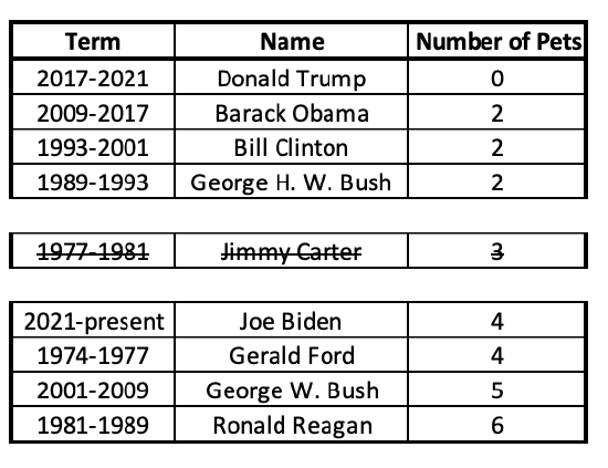
Let's try adding the 9th most recent president to the dataset and find out. President Gerald Ford (1974-1977) had 4 pets in the White House.
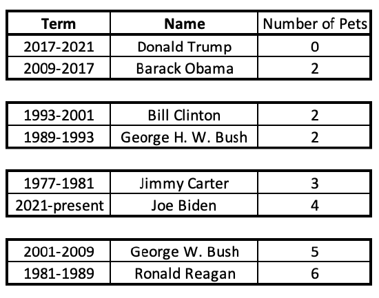
Again, the first step is to put these in order.
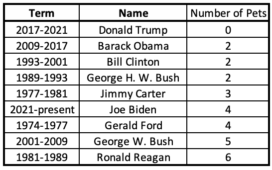
I can see that the lowest number is 0 and the highest number is 6.
Next, I cross out an equal number of cases from both sides.
Here I can see my middle number (median) is 3. To separate the data into quarters, I will find the middle number for the bottom half, and the middle number for the bottom half.
Unlike when the data split evenly into two halves, with an odd number of cases we have to either exclude or include the median from the two halves. Excluding tends to be more common, but both are acceptable methods (which will sometimes produce different results).
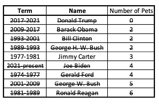
Inclusive method:
Here, the middle case (President Carter, with 3 pets) is included in both the lower half and upper half.
Now I can find the middle case for each of these halves:
Now my data is separated into quarters along these five points: 0, 2, 3, 4, and 6.
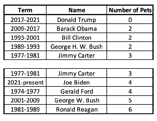
Exclusive method:
Here, the middle case (President Carter, with 3 pets) is excluded from both the lower half and upper half.
Now I can find the middle case for each of these halves:
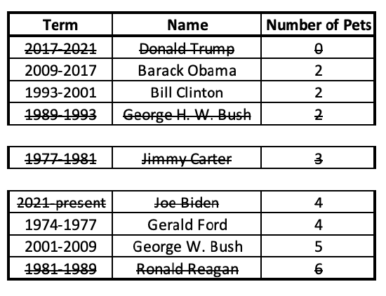
With each half, I crossed out an equal number of cases from both sides. Because there were two middle numbers, their average or midpoint gives me the lower and upper quartiles. For the lower half, the middle number is 2. For the upper half, it's the midpoint/average of 4 and 5, which is 4.5.
Now my data is separated into quarters along these five points: 0, 2, 3, 4.5, and 6.
2. Percentiles
Percentile: The proportion of data that falls below a given value. The nth percentile is the value below which n% of observations fall.
Just like we have been splitting data into four parts, percentiles split data into 100 parts (since "percent" means "out of 100"). In addition to the minimum and maximum values, to split data into quarters we find the 25th, 50th, and 75th percentiles.
Let's return to our ordered list of White House pets from the most recent eight presidents.

- One way to calculate percentiles is to use the formula p%*(n+1) to figure out which case number the percentile is. This will tell you which case is greater than p% of other cases.
For the 25th percentile this would be 25%*(n+1), for the 50th percentile 50%*(n+1), and for the 75th percentile 75%*(n+1). Since there are 8 cases (presidents), n+1=9.
25%*9=2.25 The 2nd case is 2 and the 3rd case is 2, so the 2.25 case must also be 2. The 25th percentile is 2.
50%*9=4.5 The 4th case is 2 and the 5th case is 3, so the 4.5 case is in between, estimated at 2.5. The 50th percentile is 2.5.
75%*9=6.75 The 6th case is 4 and the 7th case is 5, so the 6.75 case is estimated at 4.75. The 75th percentile is 4.75.
Now my data is separated into quarters along these five points: 0, 2, 2.5, 4.75, and 6.
Here is the same technique again, but with the 9 most recent presidents (n+1=9+1=10):
25%*10=2.5 The 2nd case is 2 and the 3rd case is 2, so the 2.5 case must also be 2. The 25th percentile is 2.
50%*10=5 The 5th case is 3. The 50th percentile is 3.
75%*10=7.5 The 7th case is 4 and the 8th case is 5, so the 7.5 case is estimated at 4.5. The 75th percentile is 4.5.
Now my data is separated into quarters along these five points: 0, 2, 3, 4.5, and 6.
- Another way to calculate percentiles is from a frequency table. In addition to identifying the minimum and maximum values that have cases, here we can look at the cumulative percentage column to find the 25th percentile, 50th percentile, and 75th percentile.
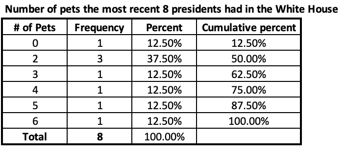
Here the first 12.5% of cases are at 0 pets. The next 37.5% of cases are all at 2, which crosses the point where 25% of cases are below it and 75% above it. We can see that 2 pets gets to a cumulative percentage of 50%, so 50% of the presidents were at 2 or fewer and 50% were at 3 or more. Since the 50th percentile means it needs to be more than half the cases and less than half the cases, the 50th percentile is between 2 and 3. Similarly, we can see that from 0 to 4 encompasses 75% of cases, meaning 5 to 6 encompasses 25% of cases. Therefore the 75th percentile has to be between 4 and 5.
The exact number of pets for the 50th and 75th percentiles is theoretical. The former is somewhere between 2 and 3 and the latter somewhere between 4 and 5. There are different ways to calculate percentiles; SPSS actually has 5 different ways it calculates/estimates percentiles.
Returning to our example with the 9 most recent presidents provides more concrete quartiles.
Here the 25%, 50%, and 75% thresholds are all crossed at a particular value. For example, at 3 pets the cumulative percentage goes from less than 50% to more than 50%, indicating that 3 pets is both greater than half of the cases and less than half of the cases. Here the 5-number summary is: 0, 2, 3, 4, 6.
Now let's take a look at an example with a much larger number of cases. We'll return to the question of how people define democracy, and here focus on U.S.-American adults.
1. Percentiles
Here is a weighted frequency distribution. Weighting is covered in Chapter 4, but for now just note that the analysis is slightly adjusted to more accurately reflect the U.S. adult population. You can weight using syntax (the weight variable's name was W_WEIGHT and my syntax was "WEIGHT BY W_WEIGHT") or by using the drop-down menus (Data → Weight Cases. Click "Weight cases by," put the variable in the box, and click OK).
Next, I either use the drop-down menu to run a frequency table or I use the following syntax (the variable name is Q243).
FREQUENCIES VARIABLES=Q243
/ORDER=ANALYSIS.
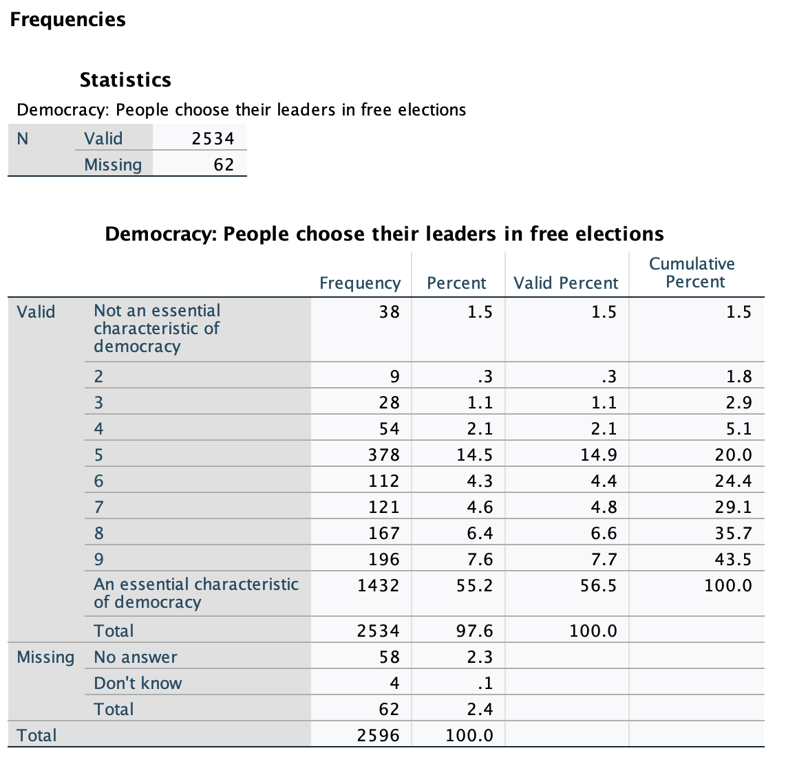
The minimum here is clearly 1 and the maximum 10. I could still use the above formula to figure out which cases are at the 25th, 50th, and 75th percentile. (For example, 25%*(n+1) = 25%*2535 = the 633.75th case).
However, just looking at the frequencies I can tell that the 25% cumulative percent threshold gets crossed at 7, the 50% at 10, and the 75% at 10.
Now my data is separated into quarters along these five points: 1, 7, 10, 10, and 10.
Among the U.S. respondents, the lowest quarter were between evaluating free elections as not an essential characteristic of democracy to leaning towards it being essential, the next quarter were between leaning towards it being essential and evaluating it as essential, and then over half of respondents evaluated free elections as essential for democracy.
I can also have SPSS figure out the five-point summary for me.
Menu:
I start just like I am going to create a frequency table, going to Analyze → Descriptive Statistics → Frequencies. However, this time I do not need the frequency table checked (unless I want to make one). Instead I click the "Statistics..." box in the upper-right corner. In the pop-up labeled "Frequencies: Statistics," I make sure to check minimum, maximum, and quartiles.
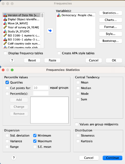
For the syntax, I substitute VariableName with the variable name, in this case Q243.
FREQUENCIES VARIABLES=VariableName
/FORMAT=NOTABLE
/NTILES=4
/STATISTICS=MINIMUM MAXIMUM
/ORDER=ANALYSIS.
Output:
Here is what the result looks like:
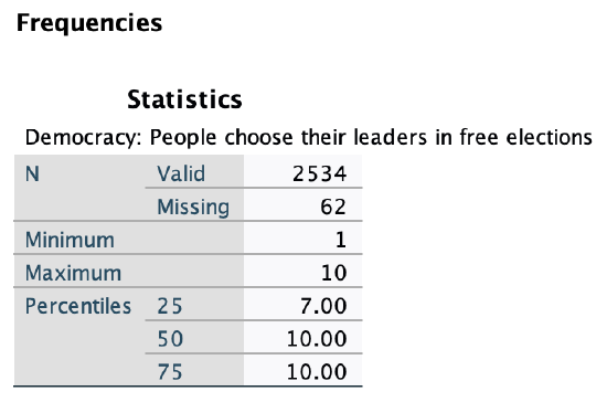
Here is how to translate that into a five point summary: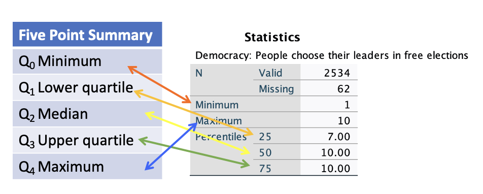
Now my data is separated into quarters along these five points: 1, 7, 10, 10, and 10.
C. Box and Whisker Plots
Box and whisker plots, or box plots, are a graph that visualize the distribution of ordered data split into four equal quarters on a number line. They show both central tendency and spread; what is typical and what variation there is.
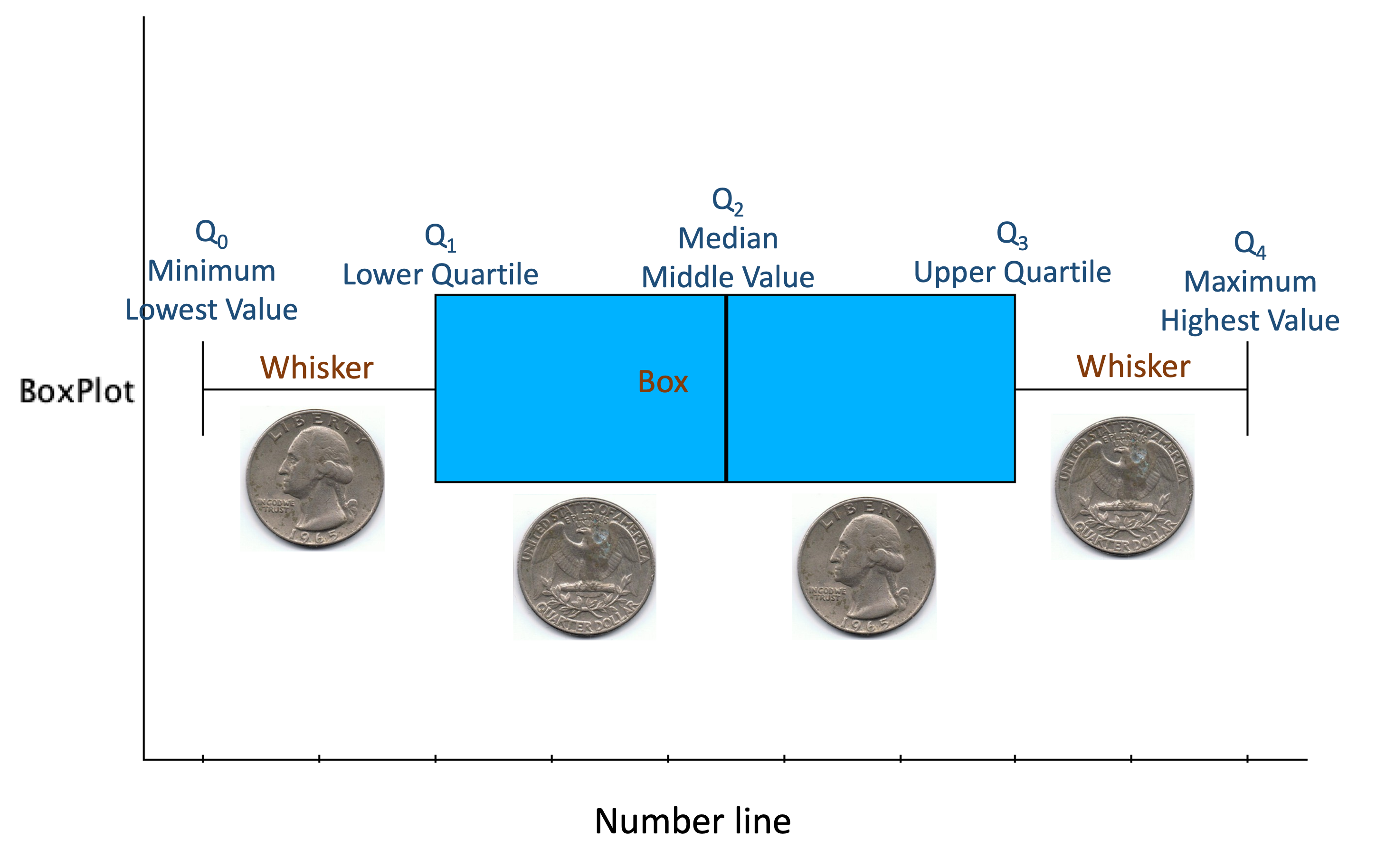
The five points from the five point summary are placed on a number line. Each whisker contains 1/4 of the data, and each portion of the box (separated by a vertical line for the median) contains 1/4 of the data.
In SPSS, the default is for box plots to also show outliers, and then for the box and whiskers to contain all the data except for the outliers.
Outlier: An extreme value; a case with a value that substantively differs from most other values.
The box plot below shows two outliers. Circles are closer to the rest of the data, while stars/asterisks are "extreme outliers" that are further away.
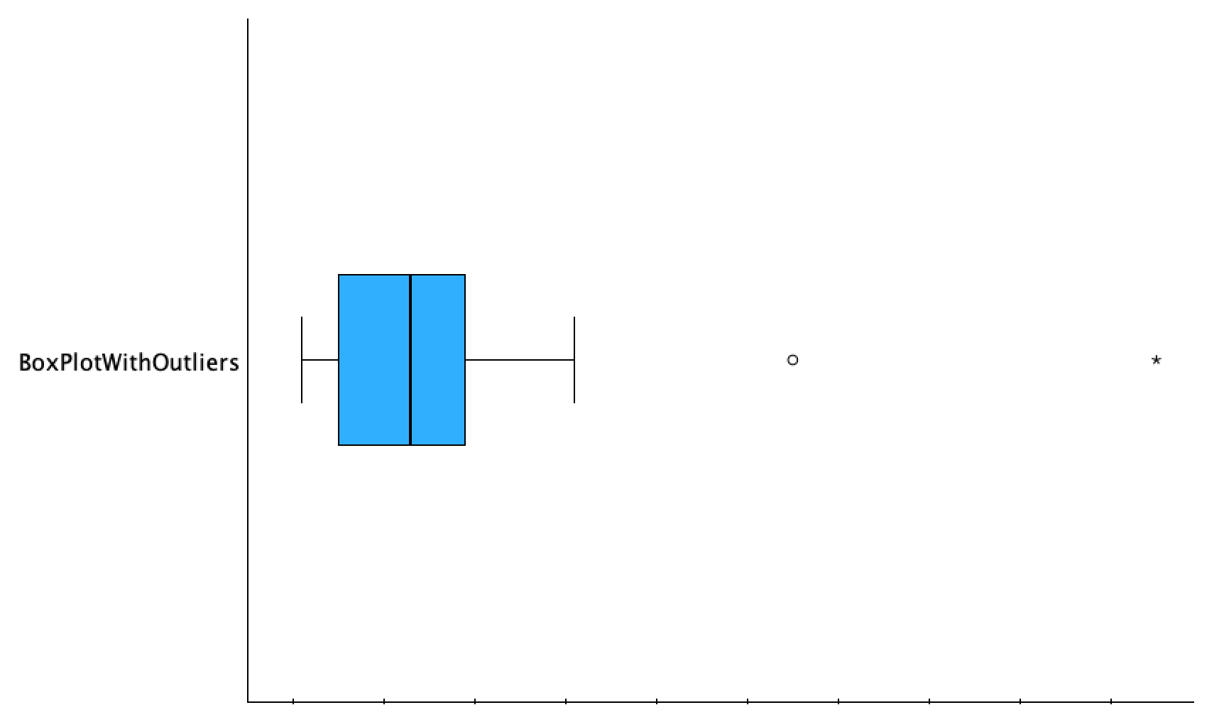
There are multiple ways to determine if a case/value is an outlier. You can evaluate if a case is qualitatively different (e.g., if everyone in your dataset has at least one sibling and one person is an only child, you might consider them an outlier, even though 0 is not that different from 1 numerically). You can eyeball it, meaning look to see if a particular value seems far away from others. Is it in the same ballpark as the rest of the data? There are also two systematic ways to evaluate if there are outliers. One way involves the interquartile range, the middle 50% of the data, which is the span of the box. An outlier is any number that is 150% of the IQR less than the lower quartile or more than the upper quartile, and an outlier that is 300% of the IQR less than the lower quartile or more than the upper quartile is considered an extreme outlier. In the box plot below the red line on the bottom show the span of the middle 50%, the blue line half of it, and those two combined for 150% of the IQR. The red and blue lines on the top show 1.5*IQR away from Q1 and Q3. The green and purple lines are the same span as the red line, so the line on top that is red, green, and purple shows 300% of the IQR from the upper quartile. You can see that the circle is an outlier (it is at least 1.5 IQRs above Q3) and the asterisk is an extreme outlier (it is at least 3 IQRs above Q3).

The other systematic way to determine outliers, which will sometimes give you different results, is discussed in Chapter 3. It is useful for box plots to show outliers, because within any box portion or whisker, one does not know where the data is concentrated, just that there is at least one case on either edge. By separating out outliers, you not only know about outlier values, but the whiskers better show the distribution of the outer quarters of the rest of the data.
The figure below is the same box plot as above but how SPSS displays it without any editing.
The default for SPSS box plots are for them to be vertical, though you can choose to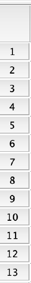 transpose them if you prefer them horizontal. The outliers here have labels attached with numbers. As you can see from the number line, these numbers are not the values of the cases. Instead they are the case numbers. If you go to the dataset's Data View in SPSS, you will see a column all the way on the left with numbers for each row/case (see image to right). These are the numbers that are referred to. This can let you look up the outliers in the dataset to see which cases they are. This is useful for knowing about these cases, but this can also be useful to doublecheck that the outliers are not there due to bad data entry such as a typo with a misplaced decimal point or extra zero. These case numbers will not mean anything to someone without your dataset, so are confusing to your audience. When you double-click the box plot to edit the graph, you can then click on these numbers and click delete/backspace, and they will disappear.
The box plot below, from the National Crime Victimization Survey's School Crime Supplement, shows the responses of the 3.7% of students who responded that they have been in at least one physical fight at school during the school year.
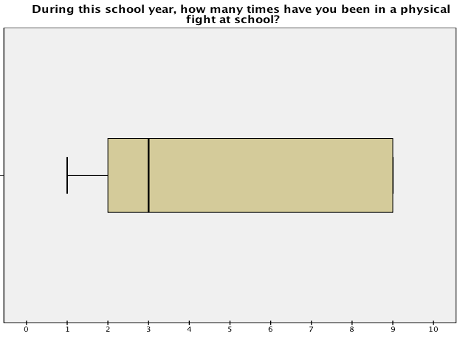
Do you see an upper tail? If you look closely, you can see the vertical line marking the edge of the whisker right on top of the upper edge of the box. This is because both the upper quartile and the maximum value are 9.
Let's return to the question of how people define democracy, and whether it requires free elections. First, I need to generate a box plot in SPSS.
Menu:
Go to Graphs → Boxplot → Click Simple and click "Summaries of separate variables," unless you are trying to break it down by category and then click Define. Put your variable in the box/window labeled "Boxes Represent:" and then click OK.

I put all 9 of the defining democracy variables into Boxes Represent, and so have 9 side-by-side box plots. These are for U.S. respondents.
*This is the Boxplot syntax for one or more variables.
*If you only have one variable then erase VariableName2.
*If you have multiple variables you can keep adding them with a space between each.
EXAMINE VARIABLES=VariableName1 VariableName2
/COMPARE VARIABLE
/PLOT=BOXPLOT
/STATISTICS=NONE
/NOTOTAL
/MISSING=LISTWISE.
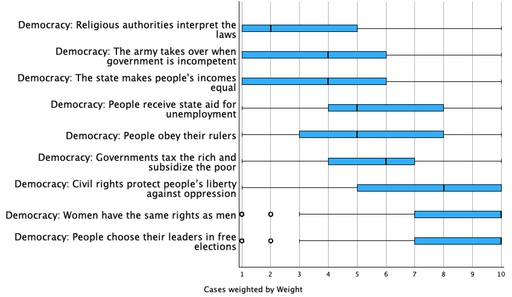
While there is variation, we can see that the majority of U.S. respondents felt that people choosing their leaders in free elections is more an essential characteristic of democracy than not, as well as women having the same rights as men. We'll explore how this compares to other countries below. Overall, U.S. respondents especially disagreed that religious authorities interpreting the law and the army taking over when the government is incompetent are essential characteristics of democracy.
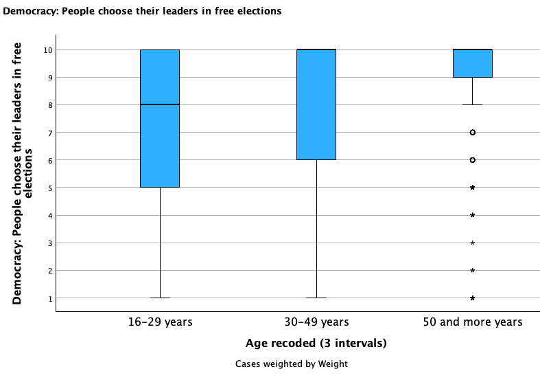
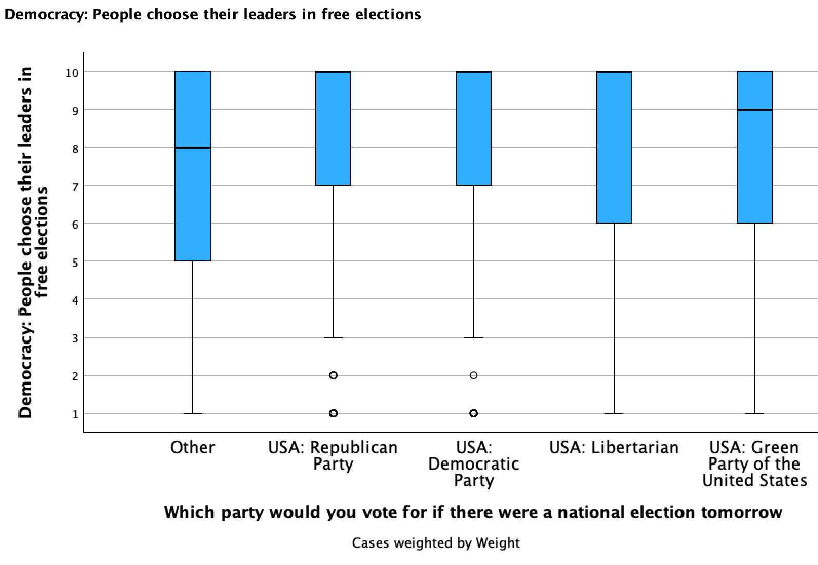
You can also make box plots in SPSS where your primary variable is broken down / categorized by another variable.
Menu:
Go to Graphs → Boxplot → Click Simple, but this time click "Summaries for separate groups of cases." Put your primary variable in the box/window labeled "Boxes Represent:" and the variable you want to break it down by in "Category Axis:" and then click OK.
*This is the syntax for boxplots categorizing a variable by another one.
EXAMINE VARIABLES=PrimaryVariableName BY CategorizingVariableName
/PLOT=BOXPLOT
/STATISTICS=NONE
/NOTOTAL.
Check out the broken down box plots below and compare/contrast the groups:
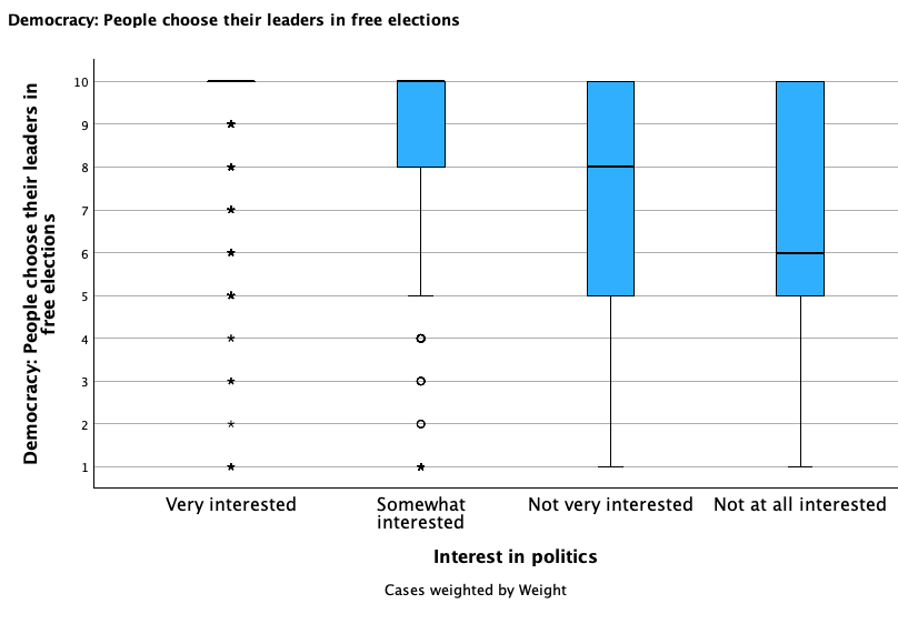
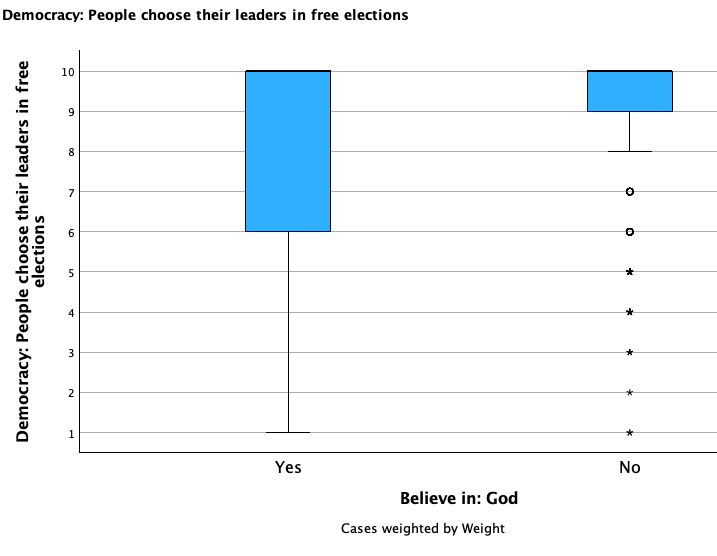

D. Five Point Summary
Let’s map out each of the 5 points of the 5 point summary, what they are/mean, and how to interpret them.
The five points are:
- Q0: Minimum / Lower extreme
- Q1: First / Lower quartile
- Q2: Median
- Q3: Third / Upper quartile
- Q4: Maximum / Upper extreme
Qx means the value is greater than x quarters of the data.
1. Median
Median is a measure of center. It is one type of average (though colloquially average is often used synonymously with mean, see Chapter 3).
Median: The middle number in a group of ordered numbers.
Median = Middle

The median is the 50th percentile. It is greater than 50% of the data and less than 50% of the data.
(As Q2, the median is greater than two quarters, or one-half, or 50%, of the data.)
We'll revisit this next chapter when we compare the median to the mean, a different measure of central tendency. However, note that when you calculate the median, it does not matter if the minimum and maximum values are closer or further away from the middle. That does not change the middle. Because of this, the median is not sensitive to extreme values, which makes it a statistic often used for things like typical housing price or typical income earnings.
General template: Half of respondents/cases had [median value] or fewer [label]; half of respondents/cases had [median value] or more [label].
For example, if we surveyed people and the median age was 53, we could write:
"Half of respondents were 53 years or younger; half of respondents were 53 years or older."
While this is a specific interpretation of the median, you could provide more context by bringing other data in like the minimum and maximum. Let's say the survey was only of adults, and that the minimum age was 18 and the maximum age was 89. Then you could write,
"Half of respondents were between 18 and 53 years old; the other half were between 53 and 89 years old."
If your median is the mean/midpoint of two middle values, then no cases actually have those values. Let's say that in the above example, no one was 53 years old, and that the two middle numbers were 51 and 55. You could provide a more contextual description, writing, "Half of respondents were between 18 and 51 years old; the other half were between 55 and 89 years old." If you wanted to ground this in the median, since you know no respondents were 53, you could also write, "Half of respondents were younger than 53; the other half were older than 53."
Writing: "The median is 53." tells your audience nothing. You need to give them context and tell the story of your statistic. Put it in real-life context.
2. Minimum, Maximum, and Range
Q0, the minimum, is the lowest value. Q4, the maximum, is the highest value.
Q0 is greater than zero quarters of the data; it is the minimum value that has at least one case. Q4 is greater than four quarters / all the rest of the data; it is the maximum value that has at least one case.
General Template:
Q0 Minimum: The fewest/lowest/least [label] is [minimum value].
Q4 Maximum: The fewest/lowest/least [label] is [minimum value].
Or, when the minimum is the lowest possible response and the maximum is the highest possible response:
Q0 Minimum: At least one respondent/case has [minimum value] [label].
Q4 Maximum: At least one respondent/case has [maximum value] [label].
Examples:
Q0 Minimum: The fewest number of pets someone has is 1 pet.
Q4 Maximum: The greatest number of pets someone has is 9 pets.
Or,
Q0 Minimum: At least one classmate has no pets.
Q4 Maximum: At least one classmate has 5 or more pets.
At least one classmate has 9 pets. No one has more than 9 pets.
Range
The range is the distance between the minimum and maximum values.
General Template: Among our respondents/cases, there is a difference of [range value] between the respondent/case with the most [label] and the respondent/case with the least/fewest [label] (ranging from [minimum value] to [maximum value]).
Example: Among the survey takers, there is a difference of 8 pets from the person with the most pets to the person with the fewest pets (ranging from 1 pet to 9 pets).
While the range is only the difference of the minimum and maximum, providing those values as well gives context that otherwise leaves your audience without knowing where to place the range. For example, a range of 8 pets could have been from a minimum and maximum of 0 to 8, 1 to 9, 25 to 33, or something else.
Finding the range with SPSS:
1. You can find the range when you run frequencies like you were doing for the five point summary.
Menu:
Make sure to also check the box for range in the bottom left of the statistics window.
*Add RANGE to the STATISTICS line to include a calculation of range.
FREQUENCIES VARIABLES=VariableName
/NTILES=4
/STATISTICS=RANGE MINIMUM MAXIMUM
/ORDER=ANALYSIS.
Output:
The row labeled range gives you the range (e.g., here it is 9, 10-1=9):

2. You can find the range with Examine/Explore. However, with the menu drop-down it requires an extra step to include the lower or upper quartiles.
Menu:
Go to Analyze → Descriptive Statistics → Explore. Put your variable into the Dependent List window/box. At the bottom where it says "Display," make sure you either have "Both" or "Statistics" checked (Plots will only give you graphs/figures).
If you want to include the lower and upper quartiles, click on the Statistics button, check the Percentiles box, check the Quartiles box, then click Continue. Click OK to run the Explore command.
*This will generate the range, five point summary, a box plot, and a histogram.
EXAMINE VARIABLES=VariableName
/PLOT BOXPLOT HISTOGRAM
/PERCENTILES(25,50,75) HAVERAGE
/STATISTICS DESCRIPTIVES
/CINTERVAL 95
/MISSING LISTWISE
/NOTOTAL.
3. Lower Quartile, Upper Quartile, and Interquartile Range
Q1, the lower quartile, is the median of the lower half of the data. It is the 25th percentile, greater than 1/4 or 25% of the data (and less than 3/4 or 75% of the data).
Q3, the upper quartile, is the median of the upper half of the data. It is the 75th percentile, greater than 3/4 or 75% of the data (and less than 1/4 or 25% of the data).
Template:
Q1: 25% (1/4) of the respondents/cases had [quartile value] or fewer [label]. 75% (3/4) of the respondents/cases had [quartile value] or more [label].
Q3: 75% (3/4) of the respondents/cases had [quartile value] or fewer [label]. 25% (1/4) of the respondents/cases had [quartile value] or more [label].
Example:
Q1: 25% (1/4) of the parents had 4 or fewer pets. 75% (3/4) of the parents had 4 or more pets.
Q3: 75% (3/4) of the parents had 6 or fewer pets. 25% (1/4) of the respondents/cases had 6 or more pets.
Again, you can be more specific by incorporating the minimum and maximum into your interpretation, even though it goes beyond the quartile statistic, e.g., "25% (1/4) of the parents had between 1 and 4 pets; 75% (3/4) had between 4 and 8 pets."
If Q1 is also the minimum or Q3 is also the maximum, you do not need to say [value] or [lower/more]. For example, if Q1 is 0 pets, you could say, "At least 1/4 of parents did not have any pets." You would not want to add, "3/4 of parents had 0 or more pets" since that does not add any useful information.
You can also look at your data to provide more accurate descriptions. What if Q3 is 4.75? Assuming no one has 4.75 pets, but that there are people with 4 pets and people with 5 pets, you could write, "75% (3/4) of the parents had between 1 and 4 pets; 25% (1/4) of the parents had between 5 and 8 pets." If you want to give the actual statistic, clarify in parentheses, e.g., "75% (3/4) of the parents had 4.75 or fewer (between 1 and 4) pets; 25% (1/4) of the parents had 4.75 or more (between 5 and 8) pets."
Interquartile Range (IQR)
Interquartile range (IQR): The inter-quartile range (IQR) is the distance spanning the middle 50% of data, the distance between the lower and upper quartile values.
Template: The middle 50% of the data ranges from individuals/cases with [Q1 value] [label] to individuals/cases with [Q3 value] [label]. There is a range of [IQR value] [label] within the middle 50% of the data from the individual/case with the least to the individual/case with the most [label].
Example: The middle 50% of the data ranges from individuals with 1 pet to individuals with 4 pets. There is a range of 3 pets within the middle 50% of data from the person with the least to the person with the most pets.
Using SPSS, the frequencies command will not give you an IQR. However, if you run frequencies to get your lower and upper quartile, you can do your own math: Q3-Q1=IQR.
If you run Explore (menu) or Examine (syntax), as long as you have statistics checked / included, you will get a row with the Interquartile Range in your Descriptives output. You do not need to add the quartiles to the drop-down menu in order to generate an interquartile range.
Just like we broke down box plots above by a second variable, you can do this using the Explore/Examine command, generating statistics (as well as a box plot) broken down by the categorical variable.
Menu:
When in the Explore window, put the categorical variable into the "Factor list:" box.
EXAMINE VARIABLES=PrimaryVariableName BY CategoricalVariable2Name
/PLOT BOXPLOT
/COMPARE GROUPS
/PERCENTILES(25,50,75) HAVERAGE
/STATISTICS DESCRIPTIVES
/CINTERVAL 95
/MISSING LISTWISE
/NOTOTAL.
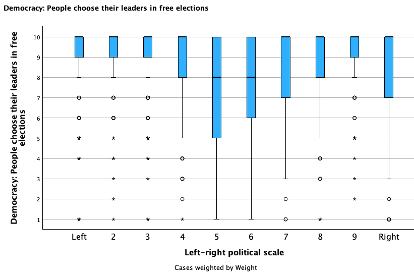
E. Synthesis Application: Cross-Country Comparison
My perception that free elections is a crucial component of democracy was similar to most U.S.-Americans. However, is this just my U.S. sensibilities? Or is this a univeral understanding of democracy? Let's compare this variable across different countries.
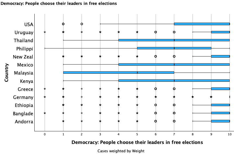
The median is 10 in 27 countries, 9 in 13 countries, 8.5 in 1 country, 8 in 17 countries, 7 in 5 countries, and 5 in 1 country. In all but one of the over 60 countries surveyed, a majority of respondents feel that free elections is an essential component or democracy or lean in that direction. However, not all countries are in as much agreement as the United States internally that it is an essential characteristic. There are also some countries where there is more agreement compared to the United States. The box plots below show the United States as well as a select group of other countries that have either comparatively high or low agreement that free elections are an essential component of democracy.
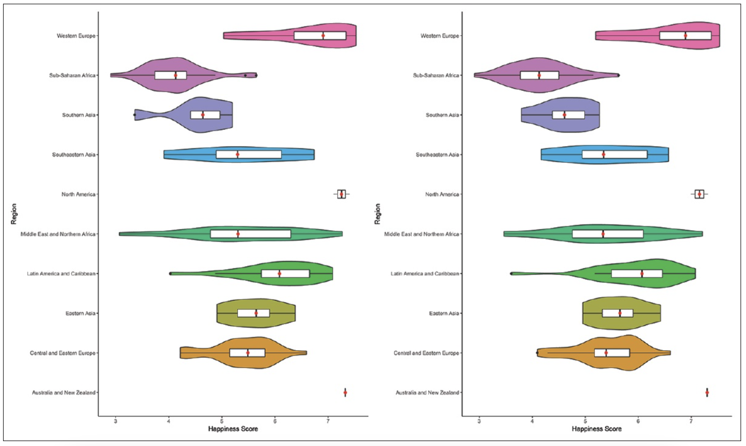
Box and whisker plots are a great way to quickly get a summary of the distribution of data for a particular variable. Another plot, the violin plot, is similar to a box plot, but it also shows density distribution --- you get to see where the data is within each quartile.
Here is an example of a series of violin plots from a 2020 journal article by Vidushi Jaswal et al., in the Journal of Family Medicine and Primary Care. The left side is showing 2016 data and the right side is showing 2017 data. Each row has a violin plot for a different region. The violin plots show happiness scores from a Gallup World Poll.