
11.6: Designing and Structuring Online Content
- Last updated
- Save as PDF
- Page ID
- 88210

Design and Structure
Don’t throw away your art supplies!
One of the most common misconceptions about accessible web design is that in order for a site to be accessible, it must have a simple, plain design with few or no images. Another myth is that an adequate, accessible site can be made by providing a “text-only” version of an existing website. This is a nuisance to maintain, as it requires you to keep not one but two versions of every single page.
Remember, not all disabled students are blind! People with mobility or hearing issues and even poor eyesight will certainly appreciate a well-thought-out, aesthetically pleasing website as much as anyone. As you’ll see, many of your accessibility changes will be tucked away in the code of your pages, where they will be a benefit to disabled users without detracting from your site in any way.
Structuring Your Content
Before you begin to write a single line of HTML or even start writing your course content, you should think about how your course is going to be structured. Will you have a lot of material to read, or just a little? Will there be many pages or subpages?
The easier you can make it for students to find and read your course material, the easier it will be for them to learn.
Menus and Navigation
The way you plan your site’s navigation will affect your site’s usability for your entire audience. A good approach is to write down the different categories that apply to each of your pages, and then group the pages into these categories. The key is to find an intuitive balance between overwhelming the user with too many options, and burying important information too deep in the site.
For example, if your site is made up of these pages, you are running the risk of creating a very cluttered and busy navigation:
- Course Content
- Guidelines
- Syllabus
- Schedule
- Messageboard
- Chat
- Submit Assignments
- Assignment #1
- Assignment #2
- Assignment #3
- Assignment #4
- Grading
- Help
You could try grouping your pages into these categories, and create subcategories within this structure:
- About the Course—clicking reveals Guidelines, Syllabus, Schedule
- Course Content
- Assignments—clicking reveals Assignments #1–4, Grading, Submit Assignments
- Communicate—clicking reveals Messageboard, Chat, Mail
- Help
Now your students only have to sort through five links instead of fourteen.
Use common sense when defining categories—there may be some links that a student might use several times a day, so you might want them to sit on the top level for quick and easy access. Be careful when making exceptions to your rules, though—if you do this too many times, everything becomes an exception, and you have got a cluttered site again!
When you are designing your site, and choosing where to place your navigation, keep these questions in mind:
- Are the links grouped together in one place, where they can be easily found?
- Are there so many links on the page that it becomes confusing?
Writing for The Web
Typically, users viewing websites do not read text as thoroughly as they do when reading printed text. Monitors have a lower resolution than printed material, which makes it less comfortable to stare at for long periods of time. Most online readers develop the habit of skimming the screen looking for key points rather than studying in detail. If it is necessary to read lengthy, wordy passages or papers, many users will print out the information to read it in comfort offline.
You can make it easier for readers to find what they need by:
- Keeping your paragraphs short—one idea per paragraph
- Using headers to announce and reinforce new themes
- Using bulleted lists to group ideas into a simple, easy-to-read format
Writing for Learning-disabled Students
Being learning disabled doesn’t mean a student can’t learn—it may just mean that traditional learning methods are particularly difficult for that individual. Some students with difficulty reading may learn the same material just as well upon hearing it, or after seeing a graphic that explains the concept. For this reason, it can be helpful to explain key ideas in multiple different ways: text and a graphic or video that reinforces what is being taught.
The same principle applies to how you ask your students to express their understanding. For many students, the choice of whether to write a paper or give an oral presentation can make a huge difference in their ability to communicate what they have learned.
One of the biggest difficulties encountered by learning-disabled students is in interpreting academic demands and expectations. This can often be addressed by building checkpoints into assignments, such as “Submit a plan describing how you will approach this project.” This allows the instructor to assess whether the student has understood what is expected of them, before the student has invested too much time into a project that may be on the wrong track.
Clear, explicit instructions are of course vital, but they alone are not the solution—the student must actively engage and interpret the tasks and requirements themselves.
Additional Considerations
Some students with disabilities may require additional time to complete tasks such as self-tests and quizzes. A student using an alternative keyboard may not be able to type as fast as his classmates. Extend the allotted time for that student, or remove the time requirement.
Chat rooms are often inaccessible to users reading screen readers. Make sure that chat room participation is not a course requirement, or make arrangements for a disabled student to participate using other means such as a discussion room.
Using Correct Code: XHTML and CSS
HTML (Hypertext Markup Language) is the code used to describe web pages so they can be rendered in a browser. When HTML was created many years ago, no one could have predicted the sorts of dynamic, interactive pages that they would eventually be used to create. While HTML was easy to learn and fairly flexible, it had some significant limitations: for example, objects could not be placed anywhere on a page, but had to flow in a linear fashion, one item before the next. Creative designers found ways around these limitations: the TABLE tag was manipulated to allow precise placement of text and graphics.
But these clever fixes came with their own set of problems. Redesigning a website meant rewriting and rebuilding every single page of HTML on the site. Visually simple designs often required complex, bloated HTML. If code was written inaccurately, the web browser had to interpret the code as well as it could, slowing down the rendering of the page.
Note
- Intermediate users: We recommend using Macromedia Dreamweaver to assist you in writing accessible code.
- Novice users: If you’re not comfortable writing HTML code at all, we suggest Course Genie, a package from Horizon Wimba, which allows you to convert a Word document into a well-coded, accessible website that can be uploaded to WebCT.
To address these issues, HTML was given a fresh start by rewriting it using another language—XML, or eXtensible Markup Language. The result is called XHTML. Superficially, XHTML is not terribly different from HTML: the syntax is stricter, and some tags and attributes have been removed, but much of it is the same. The key is in the “extensible”. XHTML essentially lets you define new classes of objects.
What does this mean? Suppose you need all news-related images (but no others!) to be surrounded by a five-pixel blue border. Using old-style HTML, you would do this by wrapping every news image in a table tag.
Example \(\PageIndex{1}\)
<table border=“5” border color=“blue”>
<tr>
<td>
<img src=“images/news.jpg” width=“200” height=“100” alt=“Top story: man bites dog”>
</td>
</tr>
</table>
Every single image that needs a border would have to be treated this way.
Using XHTML saves you time and space. First define a class called “news” as having a five-pixel blue border.
Example \(\PageIndex{2}\)
.news {
border: 5px solid blue;
}
Then add an attribute to any image tag that needs to be in class “news”.
Example \(\PageIndex{3}\)
<img src=“images/news.jpg” width=“200” height=“100” alt=“Top story: man bites dog” class=“news”/>
How does this work? The classes are defined within Cascading Stylesheets (CSS)—stylesheets, because they define the style of a page; cascading, because you can apply multiple stylesheets. You can define any style once and apply it throughout your entire site.
Tip A site that may help you visualize this process is CSS Zen Garden (http://www.csszengarden.com). Every design on the site uses the same XHTML code to define the different areas of the page. By swapping out only the stylesheet, the appearance of the site changes dramatically.
So with a single CSS file, you can now define the look and feel of an entire website consisting of hundreds of pages.
Why Can't I Do Things The Old Way?
Feel free to skip this section if you are new to building web pages or are already familiar with XHTML and CSS.
Tables Aren't Meant for Layout
If you ever built a website before CSS became widely accepted, chances are you built it using tables. You probably took a large image and chopped it up in an image editing program, then placed each chunk of the image into a borderless table to lay it out exactly where you wanted.
The first reason to avoid tables is that it’ll make redesigning your site much easier in the future. You won’t have to chop up new designs and recreate every page of your site any more—you can do it all with one change of your CSS sheet and maybe a few changes to the HTML.
But the main reason is that it simply isn’t all that accessible. Screen readers approach tables in a linear fashion; that is, they read out each column, left to right, and each row, top to bottom. If your table-based layout doesn’t correspond to this model, blind users may not receive the information in the order you intended it. They may hear the menu read out in pieces, in between parts of your main content, and as you can imagine, it is very confusing to navigate a page like this.
Many Old Tags Have Been Deprecated
XHTML no longer contains several tags that address the appearance of a site. The FONT tag, which used to be the only way to set the font appearance on a page, has been removed from HTML. This is because fonts can be much more efficiently defined and updated using CSS. Similarly, the CENTER tag has gone away, to be replaced by CSS formatting.
Note
There are many excellent resources, both online and offline, for learning XHTML and CSS. Here are some tutorials to get you started:
- Introduction to CSS http://www.w3schools.com/css
- Introduction to XHTML www.w3schools.com/xhtml
Accessibility in XHTML
For the rest of this section, we will use XHTML and HTML interchangeably; the basic principles are the same, and most of the differences are in the accuracy and consistency of the code.
Text
Text makes the World Wide Web go ’round. The greatest amount of content on the Web is basic, plain text. Text is the most accessible media format there is—it is easy for all browsers and screen readers to handle.
There is one big thing you need to be most careful of, and that is the visibility of your text. Aging users, people with poor vision, or even people using a small monitor may not see your site’s text with the same clarity that you do. They may need to enlarge the size of the text to be able to read it better.
There are a few ways to do this. A screen magnifier, such as ZoomText, will make a screen behave much as if a giant magnifying glass has been placed between the screen and the user. An even simpler way is to use the text size settings in the browser to increase the font size on the page.
When you define the appearance of your text in CSS, you have a choice between absolute or relative font sizes.
- Absolute font sizes (pixels, points) should appear at the exact same size in every browser and every configuration. Text that is set to “12px” will appear as 12 pixels high. Designers often prefer absolute font sizes because they have greater control over the appearance of the text, and can dictate how much space a given block of text will occupy.
- Relative font sizes (percentages, “em”) appear at a size relative to the user’s font settings. Text that is set to “90%” will appear at 90 percent of the current text size. If the user changes their font size to “larger”, the size of the text on the page will increase.
What is the implication here? Use relative font sizes at all times. Some browsers will allow absolute font sizes to scale up with the user settings, but not all. Your eyesight may be much better than that of some of your users, and what looks fine to you might cause problems for someone else. Make sure you give them the control of their screen.
Example
Example \(\PageIndex{4}\)
body, p {
font-family: Arial, Helvetica, sans-serif;
font-size: 0.9em;
color: #333333;
}
This will make the text for a page 0.9 em, or 90 percent, of its default size.
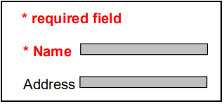
Be careful with the contrast and colours of your text. Whether your text is light on a dark background or dark on a light background, you need to make sure there is enough contrast between the text and the background for users with weaker vision to distinguish clearly. Additionally, if any information is conveyed by colour alone, reinforce the information with another method. In the example shown in Figure \(\PageIndex{2}\), the required fields are marked not only by a change in colour, but by bold text and an asterisk.
Images
Alt text
There is a very simple, built-in way to make sure your images are accessible: use ALT text. Figure 11.5 would be coded as follows:
<img src=“images/horse.jpg” width=“240” height=“180” alt=“Racehorse warming up at track”/>
When a screen reader encounters an alt attribute, it substitutes the text for the image, reading the text out loud. In order to make this as useful as possible for your users, you should choose text that is appropriately descriptive of the image. Include any details that are necessary to make the image make sense; don’t bother with trivial descriptions if they don’t add useful information.

Empty descriptions
There are some cases where an image does not require a description at all, or where a description would clutter the audio reading of the page.
Spacer (or transparent) images are typically 1x1 transparent images that are used to control the layout of a table-based website by pushing elements of the site into place. If your site is entirely CSS-based, you won’t really need these. If you are working on an older site, though, you may still be using them.
Decorative bullet graphics are often used in lists to illustrate a point.
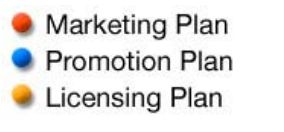
Figure \(\PageIndex{4}\) shows three decorative bullets, which many people would mistakenly code as follows:
<img src=“bullet.gif” width=“5” height=“5” alt=“Red bullet” /> Marketing plan<br />
<img src=“bullet.gif” width=“5” height=“5” alt=“Blue bullet” /> Promotion plan<br />
<img src=“bullet.gif” width=“5” height=“5” alt=“Yellow bullet” /> Licensing plan<br />
With code like this, a screen reader user will hear: “red bullet marketing plan blue bullet promotion plan yellow bullet licensing plan”.
Even though you don’t want screen readers to attempt to describe these images, you still need to define their alt text, or the screen reader will read out the filename instead. The alt text on a spacer image or a decorative graphic should be empty, i.e., alt=“ ”.
Tip Visually impaired users aren’t the only ones to benefit from ALT text—you will too! By describing your images, you’ll make it easier for search engines such as Google to index your content, and it’ll be easier for other users to find the content on your site.
Long descriptions
Alt text is good for a short sentence, but sometimes a complicated diagram or graph cannot be thoroughly described in one line of text. When this happens, use the ALT attribute for a quick summary, and the LONGDESC attribute:
<img src=“images/chart1.jpg” width=“350” height=“150” alt=“Increase in readership over past 5 years” longdesc=“chart1.html” />
The longdesc attribute is the URL for another web page, which should contain a complete description of the image in question.
Imagemaps
Imagemaps are just as easy to make accessible: add the alt text to the AREA tag for each clickable area within the map.
Links
We have already talked about menus and navigation and the importance of thinking about links. Here are a few additional considerations:
- Link size: If the images are graphic links, are they big enough so that users can easily click on them, even if they have poor motor control in their hands?
- Descriptive link text: If your link text is taken out of context, will it make sense? Many screen readers allow the user to pop up a list of only the links from the page. This is a useful way for a blind reader to navigate—unless your link text says “Click here”! Make sure your link includes enough text to clearly define the link, such as “Click here for the full schedule” or even “Full schedule”.
- Unique link names: Similarly, if your link text is taken out of context, will a user see the same link text multiple times? Ten links that all say “Click here”, but point to different pages, would be frustrating.
- Link separators: Link in a menu should be separated by more than just whitespace, for visually impaired users to better distinguish links from each other. Additionally, some older screen readers incorrectly read adjacent links as the same link.
Note
On the Web, links are usually underlined. Most web users are accustomed to clicking on underlined links. To this end, it is best not to underline anything that is not a link unless conventional style requires it.
<a href=“about.html”>About</a> <a href=“bio.html”>Bio</a> <a href=“contact.html”>Contact</a>
This can be done by using a separator:
<a href=“about.html”>About</a> | <a href=“bio.html”>Bio</a> |<a href=“contact.html”>Contact</a>
Another alternative is to make each link into an item in an unordered list, and then use CSS to style the links. A screenreader will pause between list items, making the links more “listenable”.
To do this, you will need this CSS:
ul {
list-style: none;
}
ul li {
display: inline;
padding-right: 10px;
}
and this HTML:
<ul>
<li><a href=“about.html”>About</a></li>
<li><a href=“bio.html”>Bio</a></li>
<li><a href=“contact.html”>Contact</a></li>
</ul>
Setting list-style to “none” will remove the bullets that are displayed by default before each list item, and setting display to “inline” will place all the list items on the same line. You can continue to style the list items with margin and padding settings as needed.
The Title Attribute
Similar to ALT text for images, the TITLE attribute can be used to make a link URL clearer. A person using a screen reader can set an option to read TITLE texts out loud instead of the link text. Most browsers display the TITLE text as a “tooltip”, or small popup, that appears for a few seconds when the link is moused over.
The TITLE attribute can actually be validly applied to most HTML elements, but is best supported in the A (hyperlink) tag.
Javascript and DHTML
Many people are fond of “drop-down” or rollout menus, which appear when the user moves the cursor over a top-level category. For many users, they are a quick way to jump straight to the page they need.
Many of these menus create accessibility issues. Some are very sensitive to mouse movement and will “roll up” the instant the mouse drifts outside the box—which can be a serious problem for users whose hands cannot control the mouse precisely. In addition, some of the Javascript and Dynamic HTML (DHTML) code needed to generate these menus is not understood by screen readers, and will be ignored. This can prevent many users from using the menus at all!
This doesn’t mean you can’t use Javascript or DHTML, but if you are using it for important functions like navigation, be sure that you have a fallback plan for browsers without Javascript. You can usually test this yourself by turning Javascript off in your browser.
Popup Windows
Popup windows have their purposes:
- displaying extra information without making the user lose their place on the page
- letting the user open a link to another site that they can look at later
- advertising (often unwelcome)
Consider what happens when a screen reader encounters a new window. It will first announce that the new window has opened, and then shift focus to that window, reading out the new content. A blind user cannot quickly glance at the new window and put it aside for later; they must hear the content, decide whether or not it is relevant, and choose which window to continue reading.
Unexpected popups can also be a problem for users with learning disabilities, as the sudden appearance of a new window can be distracting and make them lose their place on the previous page.
As a general rule, warn the user if a link will open a new pop-up window. Additionally, consider whether the pop-up window is absolutely necessary. Traditionally, links to external sites were opened in new browser windows. This is preferred by many, but it is better to let the user choose: nearly all browsers let you right-click (or Control-click, if you are a Mac user) a link to open it in a new window.
Data Tables
We have established that you shouldn’t use tables for graphic layout, but that doesn’t mean you can’t use tables at all. Tables are indispensable for their original intended purpose: displaying tabular data in an organized and legible format.
Sighted users can easily glance at a data table, see where the row and column headers are, and find the piece of data they are seeking. But when a screen reader encounters a table, it reads it out in a linear fashion: row by row, each cell in order. If the table is very large, it is easy to lose track of which column you are listening to. And if the table is very complex, with merged cells that overlap multiple rows or columns, it may not make much sense when read out loud.
Figure \(\PageIndex{5}\) gives an example.
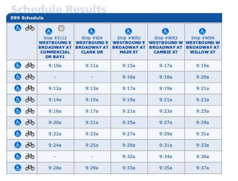
Table Headers
Every table should have clearly labelled table headers. Often developers have done this just by colouring the background of the header cells or making the text bold, but as we know, this visual information will be lost when run through a screen reader.
So how can we tell the browser itself where the table headers are? This can be done with the <th> tag, which works exactly like the <td> tag except it makes the distinction that the cell is a header. Plus, you can still style the <th> tag using CSS to make the headers look however you want.
Caption and Summary
The <caption> attribute gives all users a quick definition of the table. The <summary> attribute provides more detail for screen readers.
<table summary=“The schedule for the westbound 99 B-Line, with stops at Commercial, Clark, Main, Cambie, Willow, Granville, Macdonald, Alma, Sasamat, and UBC.”>
<caption>Schedule for the 99 B-Line</caption>
<thead>
<tr>
<th> …
Scope
The <scope> attribute goes into a table header to tell the browser which header is associated with a given row or column. This helps remove ambiguity and allows the screen reader to provide the user more information about the given table. Two of the options are scope=“row” or scope=“col”.
| Graduation year | GPA | |
|---|---|---|
| Bob Smith | 2002 | 3.4 |
| Sara Miller | 2004 | 3.8 |
This would be written as follows:
<table summary=“Graduation year and GPA for each student enrolled in the program.”>
<caption>Table 1: Student graduation data</caption>
<tr>
<td></td>
<th scope=“col”>Graduation year</th>
<th scope=“col”>GPA</th>
</tr>
<tr>
<th scope=“row”>Bob Smith</th>
<td>2002</td>
<td>3.4</td>
</tr>
<tr>
<th scope=“row”>Sara Miller</th>
<td>2004</td>
<td>3.8</td>
</tr>
</table>
Complex Tables
Tables with multiple layers of headers and categories can become quite complicated. XHTML does allow for further description of complex tables, including grouping sets of rows and associating cells with headings. These ideas may be of interest if you have many data tables. Here are some resources for complex tables:
Accessibility Features
Most of the changes we have talked about will improve your site’s accessibility without changing its functionality in any way. Now we are going to discuss a few things you can add to your site that will be of extra benefit to disabled users.
Skip to Content
While many experienced screen reader users listen to websites at very high speeds, there is still no audio equivalent to skimming the page. Sighted users can easily ignore any part of a website that is of no interest to them, or something they have seen before, such as the navigation.
One feature that will improve your website’s usability is a skip to content option. This is a link, coded to appear invisible to sighted users, that screen reader users can click to skip any navigation menus that they have already encountered and don’t need right now.
There are three steps to creating a skip navigation option.
- Add an anchor link just before your main content starts:
<a name=“maincontent”></a>
- Add a new class in your CSS:
.skiplink {display:none}
Now, anything that you assign to class “skiplink” will not be displayed in the browser.
- Add this link right after the <body> declaration of your page:
<a class=“skiplink” href=“#startcontent”>Skip over navigation</a>
Keyboard Shortcuts
The accesskey attribute allows you to predefine keyboard shortcuts to specific pages or form fields on your website. This is especially beneficial to anyone who navigates your site using only a keyboard, or whose use of a mouse is limited. Accesskeys are triggered by the user holding down ALT and pressing the specified key.
Simply define the key within an existing link to that page:
<a href=“about.html” accesskey=“1”>About This Site</a>
Be careful not to override existing browser keyboard shortcuts that appear in the browser toolbar, such as F (File), E (Edit), V (View). To be certain, use only numbers as access keys; you are less likely to conflict with existing shortcut definitions. There is no automatic listing of what access keys are defined on a site, so you will have to list the keys that you have defined either on a separate page of your site or next to the appropriate links.
There are a few conventional shortcuts:
- ALT-1: Home page
- ALT-2: Skip to main content
- ALT-9: Feedback
Not all browsers support accesskey yet, but those that don’t will simply ignore the attribute.