
21.3: Media and Motivation
- Last updated
- Save as PDF
- Page ID
- 88279

\( \newcommand{\vecs}[1]{\overset { \scriptstyle \rightharpoonup} {\mathbf{#1}} } \)
\( \newcommand{\vecd}[1]{\overset{-\!-\!\rightharpoonup}{\vphantom{a}\smash {#1}}} \)
\( \newcommand{\id}{\mathrm{id}}\) \( \newcommand{\Span}{\mathrm{span}}\)
( \newcommand{\kernel}{\mathrm{null}\,}\) \( \newcommand{\range}{\mathrm{range}\,}\)
\( \newcommand{\RealPart}{\mathrm{Re}}\) \( \newcommand{\ImaginaryPart}{\mathrm{Im}}\)
\( \newcommand{\Argument}{\mathrm{Arg}}\) \( \newcommand{\norm}[1]{\| #1 \|}\)
\( \newcommand{\inner}[2]{\langle #1, #2 \rangle}\)
\( \newcommand{\Span}{\mathrm{span}}\)
\( \newcommand{\id}{\mathrm{id}}\)
\( \newcommand{\Span}{\mathrm{span}}\)
\( \newcommand{\kernel}{\mathrm{null}\,}\)
\( \newcommand{\range}{\mathrm{range}\,}\)
\( \newcommand{\RealPart}{\mathrm{Re}}\)
\( \newcommand{\ImaginaryPart}{\mathrm{Im}}\)
\( \newcommand{\Argument}{\mathrm{Arg}}\)
\( \newcommand{\norm}[1]{\| #1 \|}\)
\( \newcommand{\inner}[2]{\langle #1, #2 \rangle}\)
\( \newcommand{\Span}{\mathrm{span}}\) \( \newcommand{\AA}{\unicode[.8,0]{x212B}}\)
\( \newcommand{\vectorA}[1]{\vec{#1}} % arrow\)
\( \newcommand{\vectorAt}[1]{\vec{\text{#1}}} % arrow\)
\( \newcommand{\vectorB}[1]{\overset { \scriptstyle \rightharpoonup} {\mathbf{#1}} } \)
\( \newcommand{\vectorC}[1]{\textbf{#1}} \)
\( \newcommand{\vectorD}[1]{\overrightarrow{#1}} \)
\( \newcommand{\vectorDt}[1]{\overrightarrow{\text{#1}}} \)
\( \newcommand{\vectE}[1]{\overset{-\!-\!\rightharpoonup}{\vphantom{a}\smash{\mathbf {#1}}}} \)
\( \newcommand{\vecs}[1]{\overset { \scriptstyle \rightharpoonup} {\mathbf{#1}} } \)
\( \newcommand{\vecd}[1]{\overset{-\!-\!\rightharpoonup}{\vphantom{a}\smash {#1}}} \)
Consider a student’s experience with each medium. For example, if the students have typically struggled in text-based programs, then consider using other media. Students must have expectations of success with the selected media and have the skills to extract information and learn from the media. This is not always a safe assumption. For example, many learners are used to watching video passively and do not know how to focus their learning or take effective notes while watching video.
Depending on a student’s learning preferences or learning style, the media you choose could be liked or disliked. If the selected media are not preferred, enhance motivation through:
- explaining how the material will fulfill the student’s needs;
- illustrating how the material is important; and
- reminding students that the test will be based on the material.
Text
You can use text to teach many skills (most verbal information and intellectual skills, and some psychomotor skills and attitudes) unless the target audience has a poor reading ability or low motivation. However, text alone cannot adequately represent the richness of the world and, for instructional effectiveness, you will often need to combine text with other media.
Note
Remember that students may later want to refer to notes. Ideally, they should be able to print content and summaries.
Text is better than video and audio when the topic is complex (e.g., forecasting economic trends), abstract (e.g., balancing chemical equations), or has structure (e.g., solving word problems). Text is especially effective for verbal skills such as describing, listing, and naming. With proficient readers, verbal information can usually be learned faster with text than with other media. For higher-level skills, remember that practice and feedback are particularly critical. Text is often a major component of effective practice and feedback.
Guidelines for creating text
Text often forms the foundation of online courses. For your course to be effective, the text has to be written well. Use the following guidelines for creating effective text:
- Make text understandable.
- Minimize reading.
- Develop a good writing style.
- Follow the basic rules of writing.
As with many generalizations, there are exceptions to the following guidelines. For example, a writing or communications course where rich prose is encouraged should not be done as suggested below.
Make text understandable
It is particularly important for you to make text understandable when students are learning at a distance. Make text understandable by ensuring there is message clarity, keeping wording to a minimum, and keeping sentences and paragraphs short. Most subject-matter experts need support in writing materials in this way. Consider using a professional writer if it is not too expensive.
Keep the text clear and concise. Message clarity is critical for effective and efficient learning. Simple words help ensure that the message remains clear. Use simple words such as “pay” rather than “compensation” or “begin” instead of “initiate”. Do not try to impress with a difficult vocabulary as this can lead to failure. Similarly, unnecessary and complex jargon can also cause comprehension problems. Also, keep sentences short. As a rule, as sentence length increases, comprehension decreases.
Note
Text should be short, clear, concise, and simple.
Keep paragraphs short enough to break up large chunks of information into manageable pieces. This is also useful for enabling the material to fit onto computer screens. Short paragraphs also help learners who are choosing to skim the material. Short paragraphs also increase the amount of white space.
Minimize reading
It is important for you to minimize reading since it is generally more tiring and time-consuming to read from computer screens than printed material. People tend to read printed material 20 to 30 percent faster than the same content on a computer screen. Minimizing reading also helps students with weak reading abilities and those with disabilities. Minimizing reading makes writing for computer screens fundamentally different from writing for printed materials. Be sure that you have this skill or that it is available on the team.
There are a number of ways you can minimize reading:
- Use simple and clear wording.
- Students with better reading abilities usually do not find simple clear writing offending. They simply read it faster.
- Highlight key words. This makes important information easy to find.
- Ensure smoothness.
- Read the text aloud to hear if it flows smoothly.
- Be consistent.
- Keep screens predictable and regular to minimize searching. There should be a clear underlying structure. Facilitate this with organizational landmarks such as headings.
- Use a standardized and consistent “template” to format your pages.
- Use tables to organize information.
- This makes the information easy to find and understand.
- Use lists instead of paragraphs.
- This makes the information easy to find and understand.
- List items should follow the same grammatical structure.
- Highlight lists with bullets or dashes.
- Make lists clear by creating logical groupings.
- Use flow charts and diagrams where possible to illustrate your points.
Develop a good writing style
Your writing style should follow these guidelines:
- Use active verbs, and eliminate unnecessary words.
- For example, write “Your software choice will affect your efficiency” rather than “Your efficiency will be impacted by your choice of software”. Similarly, write “text colour”, not “colour of the text”.
- Keep your writing natural and conversational. Address your reader directly by using the second-person voice (e.g., “you”).
- Vary sentence lengths. Note that this page has a variety of sentence lengths.
- Begin sentences in a number of different ways.
- Use effective connecting techniques. For example, start succeeding sentences with “However” or “Similarly” or include key words of the preceding sentence.
- Use many common one or two syllable words.
- Include colloquial and idiomatic expressions (but be sure the audience will understand them).
- Use a minimal amount of abbreviations, proper nouns, and numerals.
- Use the second person (i.e., you rather than we).
- Be unbiased.
- Eliminate sexist, stereotypic, ethnic, and lifestyle comments (see Chapter 4, Addressing Diversity).
Follow the basic rules of writing
You need to follow many rules of effective writing. Some of these rules include:
- Use correct writing mechanics (e.g., spelling, grammar, and punctuation).
- Errors affect credibility, lead students to take the material less seriously, and can teach poor writing habits.
- Use a spell-check program but remember that spell-checkers might not consider sentence context and meaning.
- Avoid hyphenating words at the end of lines.
- Hyphenated text is harder to read.
- Define all acronyms on first usage.
- For the first instance, write the full term and then put the initialism in brackets. For example, write Computer-based Training (CBT). Repeat the full term if it has not been used for several pages.
- Minimize punctuation. For example, in acronyms use CBT not C.B.T.
- Use upper and lower case letters.
- Sentences written in upper case letters take longer to read. Reading speed increases when learners can recognize word shapes.
- Most students find that text written only with capital letters is hard and somewhat uncomfortable to read.
- THINK ABOUT WHAT IT FEELS LIKE TO READ THIS SENTENCE. Does it bother you? Compare it to other sentences. Imagine a whole page written in capital letters.
- Only use symbols every reader understands (e.g., $ for dollar).
Spacing
The spacing you use can greatly affect the “look and feel” of your product. As a guideline:
- Use lots of white space.
- Crowding reduces readability and can make a screen “feel” unpleasant. If in doubt, use more screens and less text per screen but try to keep complete “thoughts” on one screen. Remember that on computers, extra screens are essentially “free”.
- Since screens should only contain a limited amount of text, take special care to make smooth transitions between related screens.
- It is easy to find and focus on text that is isolated by white space. Note that white space can be overdone. If there is too much white space (i.e., too little text on each screen) then the learner will spend too much time moving from screen to screen. As a guideline, squint at the screen. Determine whether you focus on the message or the space.
- Single line spacing can work well but separate paragraphs with a blank line.
- Keep the top and left margins for text locations constant.
- This reduces searching time.
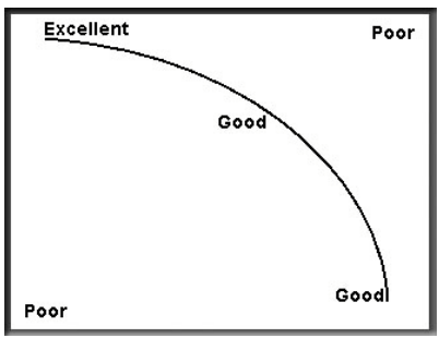
People read English from left to right and top to bottom. Since people tend to focus on a curved path along the screen, you should try to place key points along the curve. The best location for a key point, such as a formula, is the screen’s upper left area. Poor areas for key points are the screen’s top right and bottom left. Place non-critical or unimportant information in the top right and bottom left. These areas are illustrated in Figure \(\PageIndex{1}\).
There are cases where this curve cannot be used. For example, this can happen if a visual occupies the top half of the screen and supporting text fills the bottom half.
Justification
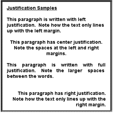
For the best readability, you should left justify paragraphs. Some materials are written with full justification in order to keep the right margin neatly aligned. Full justification is where spaces are added between words so that the text starts on the left margin and ends at the right margin. In general, you should avoid full justification. Full justification is harder to read than left-justified text. With full justification, a reader’s eyes move more because of the large spacing between words.
Note
Left justify text.
Centre-justified paragraphs are also hard to read. Right-justified paragraphs are mainly useful for aligning numbers. The various types of justification are shown in Figure \(\PageIndex{2}\).
Fonts
Most systems have an adequate selection of fonts. It is safest for you to use standard system fonts like ‘Arial’ that are available on every machine running Windows. If you use an uncommon font then the user’s computer could substitute a font that may not be appropriate. If you do not use a system font, determine whether there is copyright clearance for distributing the font with the software. A fee or royalty may need to be paid in order to distribute the font. If there is any doubt, use the system fonts. It can be time-consuming but you could create a unique font if the supplied fonts do not meet your needs.
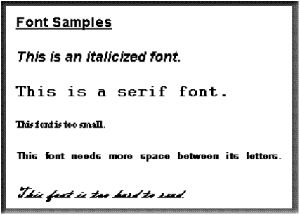
Choose a font that is clear and easily readable such as Arial, Helvetica, or Times New Roman. Although some people may call these fonts “boring” or “unattractive”, readability is critical for online applications — especially when students will read text for longer time periods. Italic, serif, sans serif (non-serif), script, decorative, and small fonts (see Figure \(\PageIndex{3}\)) can be hard to read depending on their size and the monitor’s clarity. Some people prefer serif over sans serif fonts since the “feet” of serif fonts helps the eye move horizontally. People tend to read faster with serif fonts than with sans serif fonts. Regardless of what font you use, it is impossible to please everybody.
Be sure that you keep the font constant. If a second font must be used, choose one that appears similar to the first. Too many fonts can be distracting, confuse the learner, and reduce the reading speed. This sentence with only three different fonts proves the point.
Note
Use an easy-to-read system font and keep the font constant.
You can use font sizes to organize information, such as in headings, and to indicate importance. Headings should be in upper and lower case letters as uppercase text is less legible. Headings can also help learners quickly find pertinent information, especially when the headings make sense on their own. You can use a slighter smaller font size for labels.
Use larger font sizes for children and seniors. For other audiences, the font size used should not allow for more than 60 characters on a 6-inch (15 cm) line. This helps increase readability, decrease fatigue, and maintain a student’s patience and attention. As a proportional guideline, use a 14-point bold Arial font for the main text given an 800 by 600 screen size. This is only a starting guideline since readability is affected by the screen size and font used. If there is any doubt, ask typical learners for their opinion.
Variable spacing
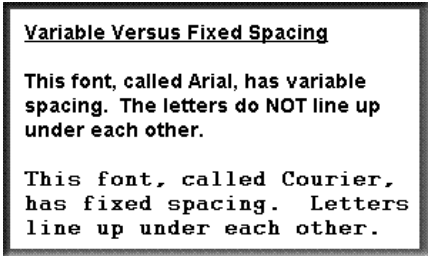
Variable spacing (see Figure \(\PageIndex{4}\)) reduces the space between letters. This is especially noticed with the letters “i” and “l”. Variable spacing allows you more characters per line but is not as “neat” as fixed spacing (see figure \(\PageIndex{4}\)) where all letters use the same amount of horizontal space and consequently line up vertically.
For practical reasons, such as screen size limitations and a faster reading speed, you should use fonts that have variable spacing, such as Arial. Note that if the letter spacing is too tight, the letters can be hard to distinguish from each other. Spacing that is too wide can prevent learners from grouping letters into meaningful forms and consequently decrease reading speed.
Note
Use fonts that have variable spacing.
Scrolling
Scrolling adds new text lines to the bottom of the display while the top lines disappear. User-controlled scrolling text boxes are time-consuming and cumbersome for students to use. Many readers find scrolling frustrating. Where appropriate and possible, do not force students to scroll text in order to read all of the material. Rather than using scrolling, you should use more screens to show the text or allow learners to click on buttons to instantly see previous or subsequent information. Another reason to avoid scrolling is that some viewers only read to the point where scrolling is required.
Hypertext and hypermedia
Hypertext is text that is linked to other information. Hypertext allows learners to quickly get more information by activating, such as by clicking a mouse over highlighted parts of the screen. Highlighted active words are sometimes called “Hot words”. Hypermedia goes beyond hypertext by providing access to a variety of media. Since links often lead to other links, the links are like a three-dimensional web.
Hypertext and hypermedia are useful for Internet-based research projects in that they allow learners to access information in which they are interested, pursue unique ideas, and learn in unplanned ways. Hypertext and hypermedia can also be used for simple information retrieval such as searching an encyclopedia, creative writing projects including a hyper-novel or hyper-report, and specialized reference materials like automobile repair procedures that require a variety of media.
In general, hypertext and hypermedia applications simply provide access to information rather than teaching specified learning outcomes. There are a number of reasons why hypertext and hypermedia can be weak from an instructional perspective. Students may not:
- learn effectively if there is no interaction that requires them to think about the material
- be able to differentiate between accurate and inaccurate information (both of which are found on the Internet)
- know how to find needed information if it is not obviously presented
- choose important linked information
- understand the logic or links used to organize the material
- have the spatial visualization ability needed to effectively navigate through the content
- be capable of choosing their own paths to acquire specific knowledge
- have the cognitive capacity to deal with the content, especially if there is poor screen design
- If the learner thinks too much about too many fonts and font sizes, objects, navigation aids, and screen layouts, the learner may not be able to mentally process the content.
- see important information
- Learners are more likely to miss information if scrolling is needed to find the information or if the information is “deeper” than they searched.
- prevent themselves from getting lost
- prevent themselves from accessing more information than they can mentally process
- spend much time on the content, as learners tend to skim material that they find on the Internet rather than reflect on the material
Note
Do not assume that a hypertext or hypermedia application will result in effective learning. In other words, for learning to occur in hypertext and hypermedia environments, learning should be specifically planned and guided. Follow the principles of instructional design.