Learning Objectives
By the end of this section, you will be able to:
- Identify different types of graphs
- Explain the measures of central tendency, including mode, median, and mean
- Understand measures of dispersion, including deviation, variance, and standard deviation
In political science research, some scholars are primarily interested in describing the world while others are interested in explaining a particular phenomenon in the world. In other words, political science research involves dual goals of description and explanation. It is important to note that the craft of describing and explaining are interactive in nature, and they often feed to each other. However, in most cases, we first have to know something about the world before embarking on the task of explaining something that happens in that world. In this section, we will explore the various techniques for summarizing the data.
Whether one is collecting original data or compiling a dataset based on existing data sources, the first step is to organize the raw data into a more manageable format. Johnson, Reynolds, and Mycoff (2020) suggest first convert raw data into a data matrix where each row represents a unique entry and each column represents different variables (see Table 8-2). While this format of data organization allows researchers to clearly see information about each observation and compare a few observations, it is not the most suitable format for summarizing the data so that the researcher can grasp on to the general information about the world she is interested in. So, what is the correct format in presenting numerical data to describe the information that a researcher is interested in? It all depends on the level of measurement of the variables (i.e., nominal, ordinal, interval, and ratio) that your dataset includes.
Table 8.1
| County |
Unemployment Rate |
Life Expectancy |
Average High Temperature(Celsius) |
Most Common Language |
|
Belgium
|
7 |
81 |
6 |
Dutch |
| France |
10 |
82 |
7 |
French |
| Ireland |
6 |
81 |
8 |
English |
| Luxembourg |
6 |
82 |
2 |
Luxembourgish |
| Monaco |
2 |
89 |
13 |
French |
| Netherlands |
5 |
81 |
6 |
Dutch |
| United Kingdom |
4 |
81 |
8 |
English |
It is important to note that representing data in a table format in itself was not the shortcomings of Table 8-2. It was the type of information included in the table was the issue here in the purpose of the table was to present summary information about the observed data here. Often, we refer to this as descriptive statistics, or the numerical representation of certain characteristics and properties of the entire collected data. The goal of the descriptive statistics table is to simply present numbers that describe the cases, or that the basic features of the data in the study. Take a look at Table 8-3 below. This is an example of a frequency table that includes frequency, proportion, percentage and cumulative percentage of a particular observation. Even in this table, some are more useful in terms of understanding one particular observation relative to the rest in the world one is interested in describing and explaining. Proportion and percentage (measures of relative frequency) allow us to easily make a comparison between different observations of the same variable.
Table 8.2: Frequency Distribution: Airport in Western European Countries
| County |
Frequency |
Proportion |
Percentage |
Cumulative Percentage |
| Belgium |
41 |
0.04 |
4 |
4 |
| France |
464 |
0.45 |
45 |
49 |
| Ireland |
40 |
0.04 |
4 |
53 |
| Luxembourg |
2 |
0.00 |
0 |
53 |
| Monaco |
0 |
0.00 |
0 |
53 |
| Netherlands |
29 |
0.03 |
3 |
56 |
| United Kingdom |
460 |
0.44 |
44 |
100 |
| Total |
1036 |
1.00 |
100 |
|
Source: Johnson, Reynolds and Mycoff(2015)020)
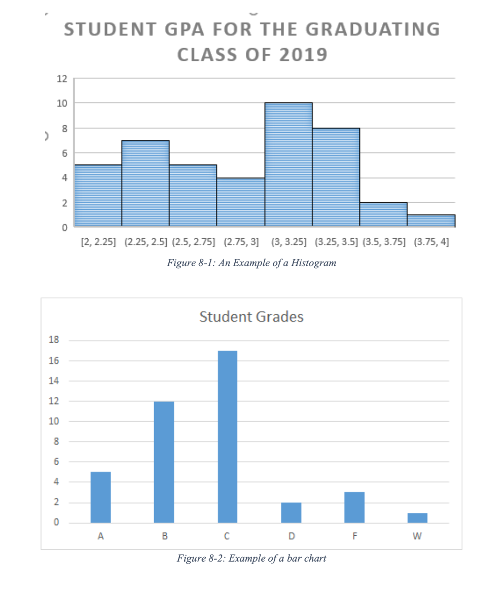
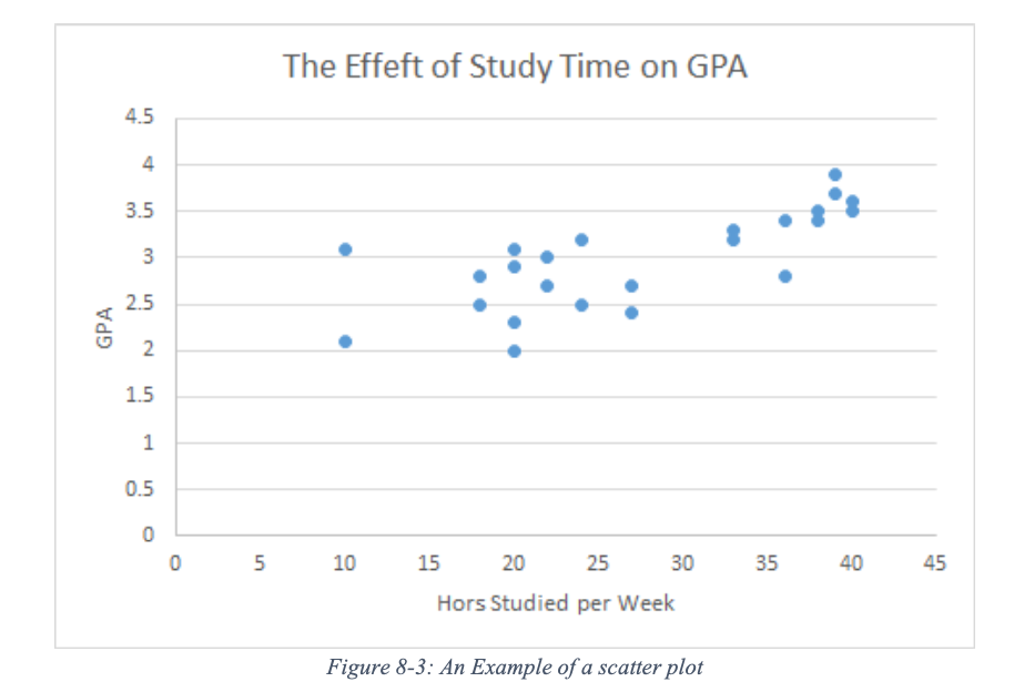
A frequency distribution for a quantitative variable could be presented in a graph format called histogram. This is a type of graph here the height and area of the bars are proportionate to the frequencies in each category of a variable. A histogram can be used for interval or ratio variable with a relatively large number of cases. For categorical variables (ordinal or nominal), a researcher can display the date in a similar fashion with a bar graph. A bar graph is a visual representation of the data, usually drawn using rectangular bars to show how sizable each value is. The bars can be vertical or horizontal. Given the nature of ordinal or nominal data, a bar graph deals with a much smaller number of categories than its histogram cousin which deals with interval or ratio data.
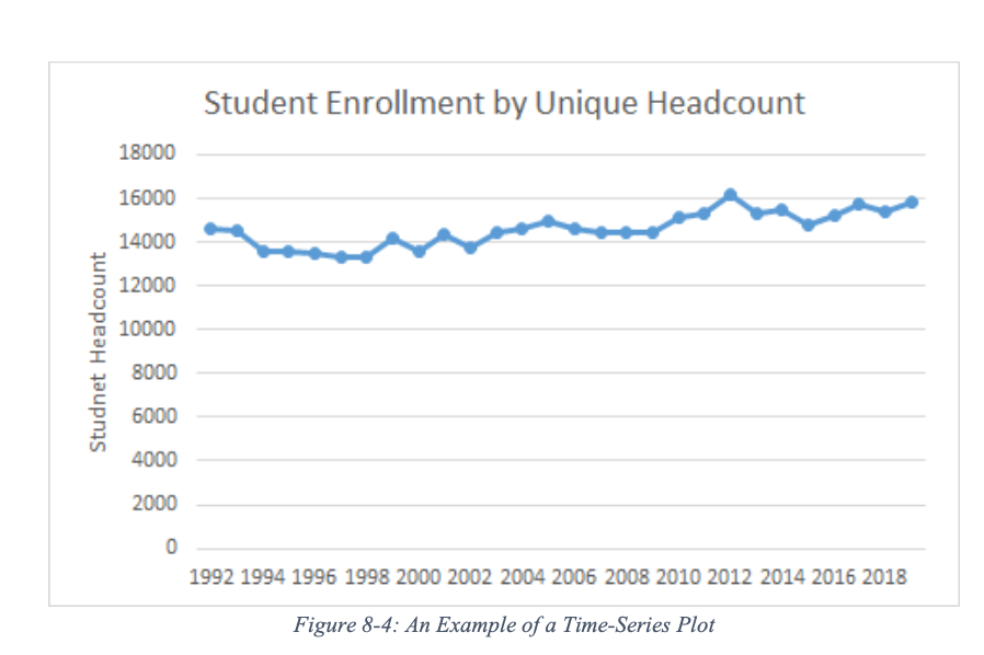
If a researcher is interested in presenting a relationship between two variables in a graphic format, a scatterplot would be an excellent choice. This form of graph uses Cartesian coordinates (i.e., a plane that consists of x-axis and y-axis) to display values for two variables from a dataset to display how one variable may influence the other variable.
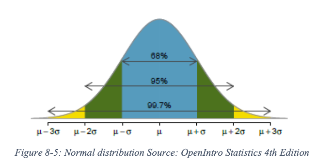
Social scientists, in general, and political scientists and economists are often interested in the trend of a variable over time. A time-series plot can be used to display the changes in the values of a variable measured at a different point in history. For this graph, the x-axis represents the time variable (e.g., months, year, etc.) and the y-axis represents the variable of interest. Unlike the scatterplot, each dot (observation) is connected to each other to display the changes in the value of the variable of interest. We can, for instance, display the number of proposed constitutional amendments in the United State since its finding or the number of women in the U.S. Congress over the years. For the latter example, we can use two lines to differentiate the presence of female representatives in the House of Representatives and the Senate by using two separate lines on the same graphics plane.
As mentioned above, researchers can describe the data by relying on descriptive statistics. Descriptive statistics are the numerical representation of certain characteristics and properties of the entire collected data. One of the primary purposes of descriptive statistics is to “explore the data and to reduce them to simpler and more understandable terms without distorting or losing much of the available information”. (Agresti and Finlay 1997). The most frequently used descriptive statistics are information that locates the center or middle of data distribution and information about how data are distributed relative to the located center.
Measures of central tendency - the mode, median, and the mean - locate the center of a distribution of a particular data set. In other words, a measure of central tendency identifies “the most typical case” in that data distribution. First, the mode is the category with the highest frequency. Second, the median is the point in the distribution that splits the observations into two equal parts. It is the middle point of the data distribution when the observations are ordered by their numerical values. If there are odd numbers of observations in the data, the single measurement in the middle is the median. In the case of even numbers of observations, the average value of the two middle measurements is the median. Finally, the mean or the average is perhaps the most common way of identifying the center of a distribution. It is the sum of the observed value of each subject divided by the number of subjects. It can be expressed more formally:
\[Y_underbar = \dfrac{ΣY_i}{n} \label{8.1}\]
where \(Y_underbar\) represents the mean (the average), \(Σ\) means \(Y_1 + Y_2 + ... Y_n\) (\(Y\)s are measurements of each observation, and \(n\) represents the number of observations. For example, if there are 5 students with midterm exam scores of 80, 77, 91, 62, and 85, n = 5, and = 395 (add all the test score). The mean score for this midterm exam is 395÷5, which is 79.
In addition to the measures of central tendencies, researchers often rely on the measure of data variability to fully understand the data being utilized in their research. Perhaps the simplest measurement of data variation is the range. The range is the difference in the value between the maximum and minimum value. For example, if the highest midterm test score for a class was 100 and the lowest score was 70, the range for this particular dataset is 100 - 70 = 30. Another related measurement of variability is called the interquartile range or IQR. The IQR is the difference between the 75th percentile (where 75% of values are located under that point) and the 25th percentile (where 25% of observations are below this point). In other words, the IQR is the range where the maximum values it the third quartile (Q3) and the minimum values is the first quartile (Q1) This measurement tells us how spread the middle 50% of the observations are. Some scholars use a boxplot to graphically display, quartiles and the median
Another way of measuring the dispersion of data is by examining how distant the included observations are from the mean. The distance of an observation from the mean is called the deviation. Variance is simply defined as the average of the squared deviation. To calculate variance, you first measure the distance of each observation from the mean and square them. Add all the squared deviations and divide it by the number of observations (for population variance) or divide it by the number of observations minus one (for sample variance). We denote variance by using σ2 (pronounced sigma squared).
Population Variance:
\[σ^2 = \dfrac{Σ(Y_i - μ)^2}{N} \label{8.2}\]
Sample Variance:
\[σ^2= \dfrac{ΣY_i Y_underbar}{n-1} \label{8.3}\]
In Equation \ref{8.2}, μ(pronounced mu) is the population mean (or average) of a variable \(Y\) and \(Y_i\) represents each observation. The equation is slightly different for the sample variance (Equation \ref{8.3}). Doing this by hand is rather tedious for data with a large population or sample. As a result of many researchers rely on various statistical analysis software or spreadsheets like Excel.
The standard deviation is the square root of the variance. It represents the typical deviation of observation as opposed to the average squared distance from the mean.
Population Variance:
\[σ^2 = \dfrac{Σ(Y_i - μ)^2}{N} \label{8.4}\]
Sample Variance:
\[σ^2= \dfrac{ΣY_i Y_underbar}{n-1} \label{8.5}\]
The standard deviation is useful in further interpreting the data at hand. Typically, about 68% of observations fall within the first deviation from the mean. What does that mean? Well, let us consider the following example. Your political science professor tells you that the average/mean score for an exam you just took was 85 with the standard deviation of 5. It means that the scores of 68% of the students fall between 80 - the mean of 85 minus the standard deviation of 5 - and 90 - the mean of 85 plus the standard deviation of 5. It is important to note that an observation deviates from the mean in both positive and negative directions.
As Figure 8.1 shows, about 95% of the data falls within the second standard deviation. It means then that 95% of the exam scores should falls between 75 and 95. So if you have scored 96 on this exam, what can we say about your score? Well, you could say that you did very well since your score is beyond the second deviation, which means there are only less than 5% of people who scored higher than you. Differently put, there are about 95% of your peers who scored lower than your score.
In the next section, we will build on the content of this section and explore the means of testing relationship.

