
1.3: Maps- Place, Power, and Representation
- Page ID
- 147497
- Describe cartography, map types, and how geospatial technologies aid contemporary map-making.
- Critique the appropriateness of map scales, projections, and orientations for various purposes.
- Explain and exemplify maps as tools and representations of power.
- Describe countermapping and participatory making and their various applications.
- Imagine cartography from non-conventional and Indigenous perspectives.
Cartography
The use of maps to illustrate, explain, and analyze spatial phenomena is a distinguishing characteristic of the discipline of geography. Maps as we know them are a result of thousands of years of humans seeking to understand the Earth. Early geographical endeavors were often centered around cartography, the art and science of mapmaking. Many early geographers practiced a form of Earth writing through maps. A map attempts to represent human knowledge of the Earth's lands and peoples, and mapping continues to be a central element of the geography discipline.
Given the importance of spatial awareness in human history, it is difficult to attribute the beginning of geography or cartography to one founding figure or document. Geographical knowledge has been an essential part of the story of humans, a species that over thousands of years migrated out of Africa to occupy most corners of the world. Humans have always had the need and desire to explore and understand their surroundings, expand their influence over new lands (in ways ranging from life-affirming to destructive), and then to communicate and represent knowledge, whether in maps or stories (or both). Humanity’s geographical knowledge is both ancient and diverse, and certainly not entirely understood or represented in academic geography today. With that in mind, the historical maps and documents that survive provide us with a sense of early geographical explorations that can help us appreciate the beginnings of geography as an academic discipline.
The earliest known world map was inscribed in clay tablets by the Babylonians more than two thousand years ago. It centers Babylon (in modern-day Iraq) bisected by the Euphrates River and includes descriptive text in cuneiform, the earliest known writing system. The Babylonians were also the first to divide a map into quadrants, indicating a coordinate system (East/West/North/South). Many academic geographers, especially in the West, attribute the beginnings of the discipline of geography to the Greeks. In their maps we find detailed geographical knowledge and important improvements in the accuracy of geographical depictions of the Earth. Crates created the first globe (200 BCE), still the most accurate way to represent the Earth. It was Eratosthenes (ca. 285-205 BC), however, who likely coined the term “geographia” to describe the field of study. Eratosthenes was the first to calculate the Earth's circumference (with remarkable accuracy) and his publication Geographika maps over four hundred places in the world, connecting them through a system of parallels and meridians and scaled distances[1] [2]. Other important achievements include that of Arab-Islamic geographers, notably Muhammad al-Idrisi (circa 1100–66) who was commissioned by King Roger II of Sicily to produce a highly regarded historical map, Tabula Rogeriana. This map stood as a valuable reference of geographical knowledge for hundreds of years. Its inclusion of detailed geographical knowledge was crowdsourced, meaning that al-Idrisi interviewed merchants and travelers to compile detailed information from the major population centers of the known world.[3]

Map Types
Reference maps: where we are
A reference map helps us learn where we are. Reference maps are used as navigational tools, as a reference for the absolute and relative locations of human and physical features. Developing an understanding of the Earth sufficient enough to create an accurate representation of it challenged cartographers for centuries. The early years of the discipline of geography were dedicated to understanding the shape, size, and distances of continents, a strenuous task before the development of geo-spatial tools such as GPS, remote sensing, and GIS. Today, technological innovations enable us to access zoomable and detailed reference maps on our smartphones that allow us to locate places and navigate the world. When you open your map app for navigation, you are accessing (and contributing data to) a reference map.
Thematic maps: who we are
A political map of the world emphasizes political borders that divide territories. They tell us very little about the world, except for the territorial delineations of countries, a reference map of where countries are in relation to other places. Political maps do not tell you where people live, the characteristics of places, or how people and places are connected. We need thematic maps for that. Thematic maps communicate information that help us learn who we are. These are maps that help us understand what places might be like. For example, a map of global transportation and communications shifts the emphasis from how we divide the world to how we use the world, showing us functional lines (like cables and rails) that dissolve political borders and connect us daily. A global map of biomes and topography gives us a greater sense of the natural world. A population density map conveys the number of people per area (often in square kilometers or square miles) and gives us a sense of patterns of human settlement. There is limitless information that thematic maps can communicate. Using maps as communication devices is a key element of contemporary geography, as thematic maps serve as visualizations and analytical tools for presenting and understanding geographical patterns.

Geospatial Technologies
The ability to connect maps to data has revolutionized many facets of decision-making in our society. Spatial data, also called geospatial data, are data directly related to a specific location on Earth. Non-spatial data are data that cannot be traced to a specific location, like the number of people enrolled in an online course. Non-spatial data can easily become spatial data if they can be linked in some way to a location, like the address of each student enrolled in that course. Geospatial technology specialists have a method called geocoding they use to place non-spatial data at a particular geographic location (latitude and longitude). Once data become associated with a location, we can ask more complex questions. For example, at Fullerton College, geographers mapped the student population to better understand the geographical contexts of students amidst the covid-19 pandemic. The study showed that most students enrolled in online classes still lived within the vicinity of the college, and that despite distance education, students were choosing their colleges based on geographical proximity. More significantly, the study revealed that thousands of students lived in neighborhoods with poor access to green spaces and fresh foods, a specially challenging geographical context given the loss of access to campus resources due to the covid-19 state of emergency closures. This enhanced geographical understanding broadened the support for students’ basic needs in various areas of institutional planning.
Imagine, for example, levels of air pollution being collected at multiple stations - these data can then be mapped, and therefore help decision-makers understand disproportionate concentrations of pollution. When combining various data in layers of information about places, cartographers can identify populations most vulnerable to high levels of toxicity and what factors they have in common. The California Environmental Protection Agency has created a tool called EnviroScreen which does just that: it compiles a multilayer map that helps decision-makers correlate pollution to other demographic information such as income and race and ethnicity. Most commonly, we find that in California (and elsewhere in the US) low income and ethnic/racial minorities are disproportionately exposed to high levels of pollution. California knows this only because of the geospatial data it collects at various points throughout the state.
The efforts by the California Environmental Protection Agency to identify these areas of disproportionate impact rely on important technological innovations in cartography. Geographic Information Systems (GIS) is a combination of computer hardware and software that captures, stores, queries, and displays geospatial data. GIS has revolutionized mapmaking for its ability to produce maps that layer various data sets, thus revealing important correlations (such as the correlation between pollution, race, and income). Nearly all cartography today is done using GIS and its uses are limitless: Firefighters use GIS to monitor wildfires and to establish and communicate evacuation zones, conservation biologists to establish high priority areas for conservation, public health professionals to determine areas of high risk for infectious diseases, and insurance companies to identify proximities to geographical risks such as flooding and earthquakes. Given the heavy lifting potential of GIS to store, display, and analyze big spatial data for various purposes, the job prospects for GIS analysts continue to grow.
Geographers have developed a variety of ways to gather images and other data related to the Earth. One prominent technique is remote sensing, the collection of data about an object from a distance, usually done with the help of mechanical devices known as remote sensors which may be placed in planes or satellites. These sensors receive and record information about places/objects by measuring the transmission of electromagnetic energy from reflecting and radiating surfaces. These devices allow tropical ecologists to investigate the rainforest floor from half a world away, oceanographers to research the depths of the ocean, and students to count the trees in their backyards, all without leaving their desks. Remotely sensed images allow geographers to identify, understand, or explain a particular landscape, determine land use, and otherwise research places across the Earth. Remotely sensed images often serve as important components in the cartographic (map-making) process and can provide the means to examine and analyze changes on the earth’s surface caused by natural or human forces. Google Earth is an excellent example of a freely available online tool that collects and organizes remotely sensed images of the Earth. It now covers images for over 97 percent of the world’s surface, effectively compressing an interactive world map that fits in our phones.
Maps Are Not Mirrors
Maps are depictions of the Earth’s surface or a portion of it. They are not a reflection of the world but representations of it. All maps are imperfect representations, and the map is not the territory. What makes a "good map” varies depending upon its ability to fulfill an intended purpose. As noted above, a map designed for navigation might not tell us anything about the characteristics of places. Similarly, a map designed to communicate the population density of East Asia may also be useless for finding specific locations in Asia. Cartographers, or mapmakers, first and foremost consider what the map will be used for prior to designing it, then make important decisions to produce maps to fulfill that purpose. After determining the purpose of a map, cartographers face important decisions to convey geospatial data as objectively, accurately, and clearly as possible. Let’s explore some of these decisions.
Zoom In or Zoom Out?
Scale is the relationship of distance in the map versus the distance in the real world. A 1:1000 scale map, for example, would mean that 1 meter on the map equals 1000 meters, or 1 kilometer, on Earth’s surface. Scale can sometimes be a confusing concept, so it’s important to remember that it refers to a ratio. “Large” scale and “small” scale refer to the ratio, not to the size of the landmass on the map. 1 divided by 5,000 is 0.0002, which is a larger number than 1 divided by 50,000,000 (which is 0.00000002). Thus, a 1:5,000 scale map is considered “large” scale while 1:50,000,000 is considered “small” scale. In other words, small scale maps depict larger areas (ex: a world map) and large-scale maps smaller areas (ex: a map of your neighborhood).
Decisions pertaining to scale are important because geographic patterns vary depending on the scale of the map. Typically, as scale decreases (or as you zoom out), so too does the number of different features and the detail with which they are represented. Not only printed maps, but also digital geographic data sets that cover extensive areas, tend to be more generalized than datasets that cover limited areas. The scale of a map can be used to omit or reveal detail, depending on the message it intends to convey. Scale choices can significantly alter what the maps communicate.
A Distorted View
Maps turn a three-dimensional spherical Earth into a flat representation of it. This makes it inevitable that all maps are inaccurate in one way or another as ‘flattening the Earth’ always involves some form(s) of distortion. A map projection, how the spherical Earth is laid out on a flat plane, always distorts at least one these four properties: area, shape, distance, and direction. Some projections preserve as many as three of these properties while significantly distorting another. Other projections might distort all properties but to a smaller degree. In other words, cartographers make difficult compromises in mapmaking, giving up accuracy of some properties over others. See the video below:
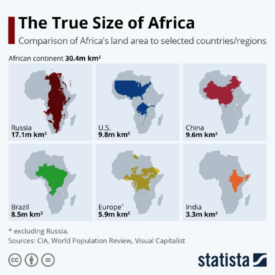
Some familiar maps are distorted in ways that help perpetuate erroneous conceptions about the world. As the video discussed above, the wide adoption of the Mercator projection, which is used in Google maps and most other websites and online mapping platforms, materialized a common mental map that exaggerates the size of Europe in relation to Africa and other tropical and sub-tropical territories. Since humans often associate larger landmasses with prominence, such distortions may contribute to a mental map of the world that diminishes many of the territories formerly colonized by Europeans. Given the extensive ways in which European colonialism carved up and remade the world, it is essential to deconstruct maps and expose their biased geographic conceptions if we are to seek a greater understanding of the world.
Flipping the Map
Throughout history, cartographers have made maps with varying orientation, meaning the map’s directionality or relationship to the four directions of the compass. Historically, the North of the map was rarely oriented to the top of the page. Recall the Tabula Rogeriana by Muslim cartographer Muhammad Al-Idrisi (Figure 1.3.1). The orientation of the total map places Mecca, the center of the Musim world in modern Saudi Arabia, at the center of the map, and with the South at the top of the page. Why did Al-Idrisi orient a map that remained the world’s most accurate map for three hundred years with South facing up? Well, why not? Most Westerners are conditioned by the last 500 years of cartography when most of the maps, produced mainly in North America and Europe, have been oriented with the North at the top. The perspective of North American and European cartographers emphasized the geography of the Northern Hemisphere while placing other continents “at the bottom” of the page, an arbitrary political decision that has casually become the norm.
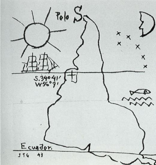
The orientation of a map does not affect its accuracy (Arabic, Farsi, Hebrew, and Urdu are read from right to left). There is no scientific reason for a magnetic north to be perceived as the top of the world. Keep in mind that the Earth is an oblate spheroid spinning through space; there is no accurate “up” or “down.” Where the magnetic north should be represented depends on the cartographer’s relative position—from where they draw the map and to where they imagine distant places. What is North to the Inuit people of the Arctic looking out to the world, when everywhere is South in relation to their communities? What is a map of the world's continents for Polynesian cultures rooted in Pacific Islands? By diversifying map orientations to center the Southern Hemisphere, the Polar worlds, or the Pacific Ocean, for example, cartographers challenge (often Eurocentric) conventions and help better represent the kaleidoscopic geographical perspectives of the world – flipping the script by flipping the map. Take for example América Invertida (1929) by Uruguayan cartographer Joaquín Torres, illustrated below. The map is a cartographic manifesto: “Our North is the South.” Like all maps, this depiction carries and conveys political and social messages.
Maps and Power
“Cartography has a troubled history as a technology of power. The production and distribution of maps, often understood to be ideological representations that support the interests of their developers, have served as tools of colonization, imperialism, and global development, advancing Western notions of space and place at the expense of Indigenous peoples and other marginalized communities.” – Bjørn Sletoo[4]
“As a political technology, mapping has long played a key role in the world-making practices of colonialism through the appropriation, demarcation, naming, and partitioning of territory as part of the process of colonization and assertion of imperial rule over peoples and places.” - Rose-Rosewood et al[5]
Maps and colonization
How do you think about maps? Even though many of us think of maps as impartial documents that reflect the objective reality of the world, maps are instead subjective political projects that actively reimagine and remake the world. As introduced in the section above, political maps of the world hanging in most geography classrooms (in North America and elsewhere) are filled with an array of arbitrary decisions based on Western biases: they display an orientation that centers Europe, a projection (Mercator) that distorts the relative size of dispossessed territories, and political borders and place names superimposed by colonizers. These not-so-subtle cues make a familiar world map Eurocentric.
Our most familiar maps have evolved as tools and representations of power.[6] Throughout the rise and fall of so many empires, elites have cultivated the art and science of cartography – like the religious rulers of dynastic Egypt and Christian medieval Europe, the Greek and Roman philosophers, the Sultans of the Ottoman Empire, and India’s Mogul emperors. From the 16th Century on, cartography as we know it had become closely intertwined with European imperialism, insomuch that the processes of colonialism and mapmaking each reinforced the other.[7] Take for example Gerardus Mercator (1512–94) whose widely influential projection we discussed earlier. Mercator also produced earlier remarkable works in cartography, including one of the first European maps of the Americas and the first to name it as such. His early map depicts the earth in two heart-shaped spheres as seen from the North and South poles. This spherical representation was an attempt to mediate distortions and provide a picture-like representation of the Earth. However, this type of map was impractical for navigational purposes and eventually led Mercator to create a different projection. The 1569 Mercator map of the world provided a squared grid that could be used for navigation, maintaining accuracy in distance and direction around the equator, regions Europeans were actively colonizing. Mercator thus adapted his cartography to facilitate European (con)quests. Despite its distortions of the size of landmasses moving away from the Equator, his 1569 map, actually a navigational chart, remains one of the most influential.


But maps were not only mere navigational tools for exploration. Like arms, germs, and ships, maps were a weapon of colonization as they allowed invaders to expropriate territories and displace Indigenous communities with arbitrary lines drawn on paper.[8] Take for example the 1494 Tordesillas Treaty, an agreement between the monarchs of Spain and Portugal that aimed to settle their squabbles over claims to foreign lands. By placing a line on a map through what was thought to be the middle of the Atlantic Ocean, but what was actually eastern South America, the treaty declared territories to its West for the Spanish and territories to its East for the Portuguese (see Figure 1.3.6). Imposed by distant monarchs, this line fundamentally shaped European colonialism in the Americas and remade the world. Even though European navigators had no means to accurately calculate longitude and thus locate the treaty's line. Still, maps based on the Line of Tordesillas documented European claims to lands across the Earth and set in motion processes of expropriation and colonization that unfolded over the next several centuries. The accidental placement of the Line of Tordesillas led the Portuguese to colonize the lands that became Brazil, Goa in India, and Macau in East Asia. Meanwhile, the Spanish received authority to colonize the Americas and the Caribbean west of Portuguese America. As such, these maps became weapons of power and plunder that divided and reproduced the world into territories of European expansion.[9]

From the 16th to 20th centuries, the materialization of colonial political borders from paper to reality continued to carve the world into European spheres of influence. Created by colonizers in support of their own interests, these colonial borders continue to shape contemporary geographies. The so-called “Scramble for Africa” is probably the most well-known example of how cartographic strokes have fragmented Indigenous homelands and their political organizations and environments. This legacy of colonial cartography and its arbitrary lines continues to sever African peoples and lands in problematic ways (discussed in Chapter 3). The 1947 British partitioning of India serves as another example of colonial impositions, leading to one of the greatest forced migrations and displacements in history and determining life and death for millions of people in the Indian subcontinent (discussed in Chapter 7). To this day, the border between India and Pakistan is marked by violence and military tension, creating one of the most dangerous political borders in the world. Similarly, the colonial legacy of the partition is the root cause for tensions and violence along the eastern Indian border with neighboring Bangladesh.
The United States is no exception as we can point to many historical (and ongoing) examples of the many ways that maps wield power, helping to perpetuate systemic racism and the disenfranchisement of Black, Indigenous, and other communities of color. For example, “redlining” maps funded by the US government prevented African Americans and immigrants from getting mortgages to buy homes and helped to solidify the racially segregated and inequitable cities that continue to plague the country (explained in Chapter 10). Similarly, electoral maps and voting district boundaries have been drawn and redrawn with the intent to diminish electoral power and representation of Black and Latinx voters – a type of cartographic manipulation known as gerrymandering. Even in the creation of US national parks, famously referred to as “America’s Best Idea,” territorial delineation for conservation dispossessed and displaced Indigenous peoples from their ancestral lands, imposing exclusionary ecological museums and institutionalizing Western conceptions of wilderness, an inaccurate way of seeing the natural world as disconnected from Indigenous communities and histories. All over the world, the making and remaking of territories begins on, and takes shape through, maps and cartography.
Guerilla Cartography
Powerful organizations and companies are far from the only groups that wield power with maps and cartography. Maps are also used as tools to convey and carve our world from the ground up, by people from all backgrounds and social classes. They can be venues for performance, expression, memory, and art. They can be imaginary and visionary. And, most importantly, mapping need not to be exclusionary. As mentioned in the opening of this chapter, every single one of us is enveloped in geographic experience. Representing, imagining, and envisioning our worlds in cartographic forms is something we all do; it could never be restricted to academics or elites. Maps today are more accessible than ever before. Even without formal training, producing and publishing paper or digital maps is easier today than ever before. Individuals and communities can engage in mapmaking for a cause, for art, for fun, for recollection, for navigation, for representation, and so much more.
Cartography is one way to critique, disrupt, and reclaim power. We can use maps as important visual communicators to confront injustice, demarcate and protect Indigenous territories, share placed-based community experience, and rename places, to name just a few examples. Many contemporary cartographers, artists, and activists use maps to challenge power and promote “bottom-up” approaches to mapmaking, in their own terms. This is because maps can be powerful tools for marginalized peoples to reimagine and reconstruct their worlds in avoidance of, or resistance to, the structures of authority. This is called countermapping, or a political practice of mapping back. It is mapping against tradition or prevailing power or knowledge systems, guerilla style. Much of countermapping is done via participatory mapmaking, a practice of co-creating maps with or by the communities most closely associated with the places or territories being mapped. In other words, participatory map-making is a method for collective cartography that allows community members to become mappers rather than passive subjects of maps.
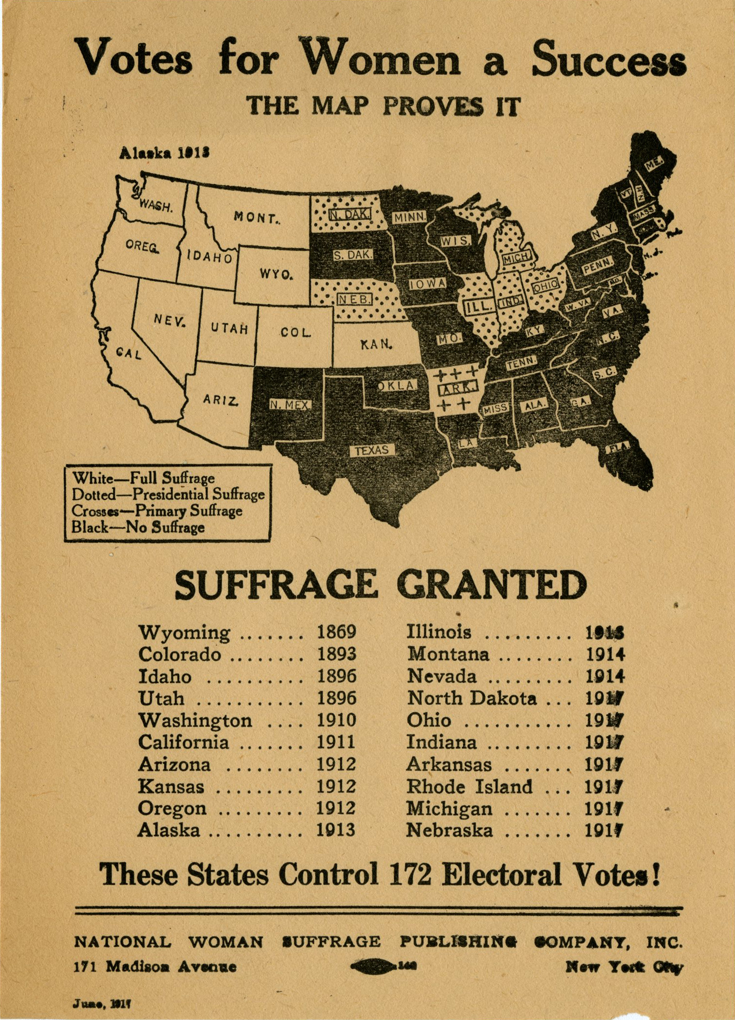
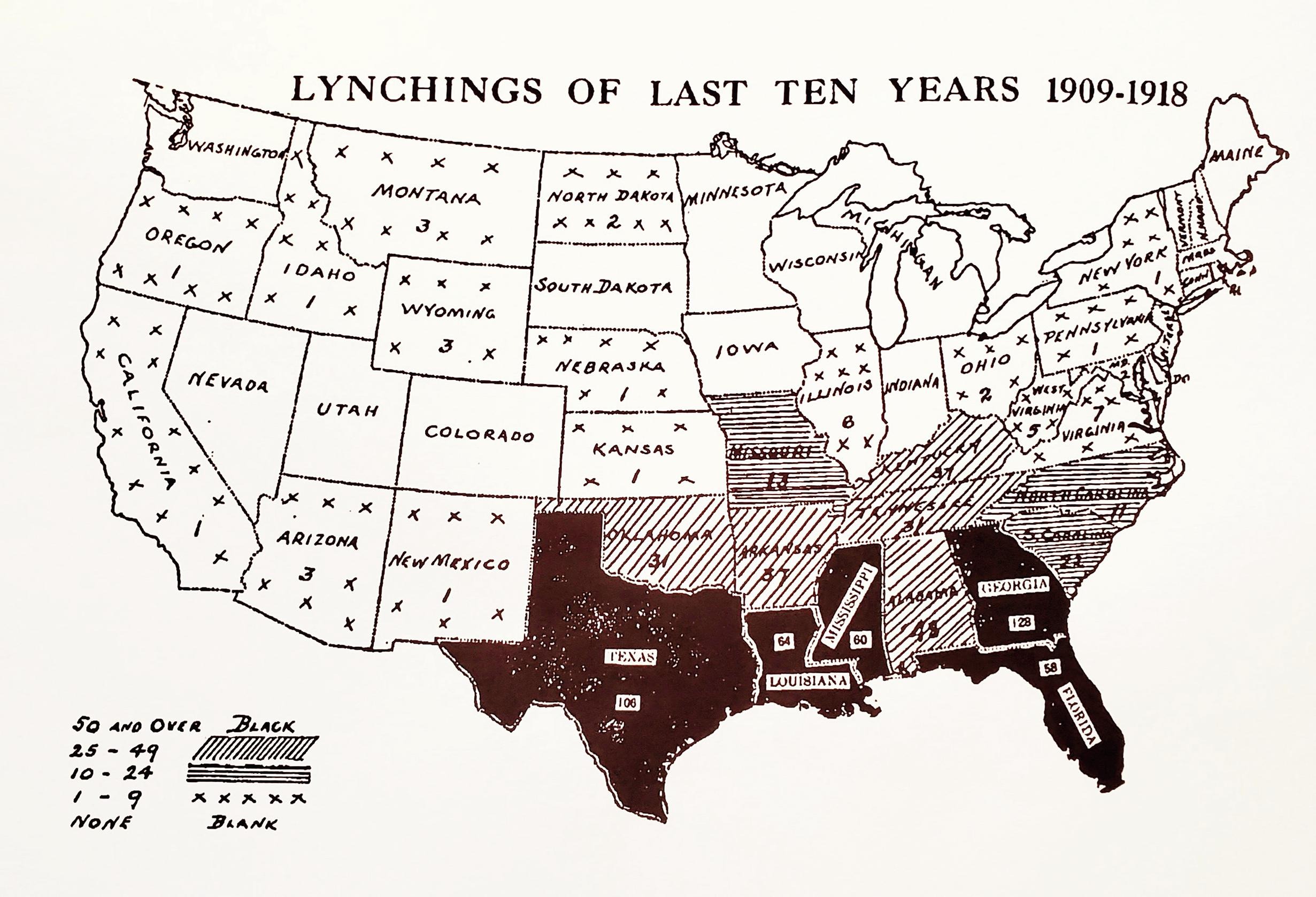
Countermapping is rooted in self-determination and resistance. It can be traced back to the struggles of First Nations political organizations in Canada and Alaska in the 1970s and has played a crucial part in the First Nations campaigns for autonomy in North America. The maps created from these foundational struggles eventually led to the establishment of Nunavut, a self-governed Inuit territory of two million square kilometers in northern Canada. This success initiated the spread of Indigenous countermapping all over the world. Countermapping has also been an important part of the African American struggle for freedom. Civil rights leader W.E.B Du Bois, for example, prepared a variety of maps to deconstruct racist stereotypes and highlight Black cultural and economic achievements. Civil rights activists also utilized maps to record, tabulate, and map lynchings throughout the United States as a form of gathering and displaying scientific information to promote anti-lynching legislation. Activists of the women’s suffrage movement of the 20th Century, too, used suffrage maps in flyers and pamphlets as a persuasive tool on the struggle for the right to vote.
These few examples illustrate how cartography can be a practice for equality, liberation, and world-making. Today people everywhere participate in countermapping. This Is Not an Atlas compiles many powerful examples of counter-cartographies from all over the world illustrating the deep connections between maps and political struggle. In a related venture, mapmakers with Guerilla Cartography promote “decentralized mapping” that combine diverse methodologies, perspectives, and expressive forms to create innovative thematic maps on topics such as water, shelter, food, and migration. Decolonial Atlas publishes maps that challenge our conceptions of mapmaking and our relationships to lands, people, and the state. Each of these cartographic repositories help us expand our perspectives through the power of maps.
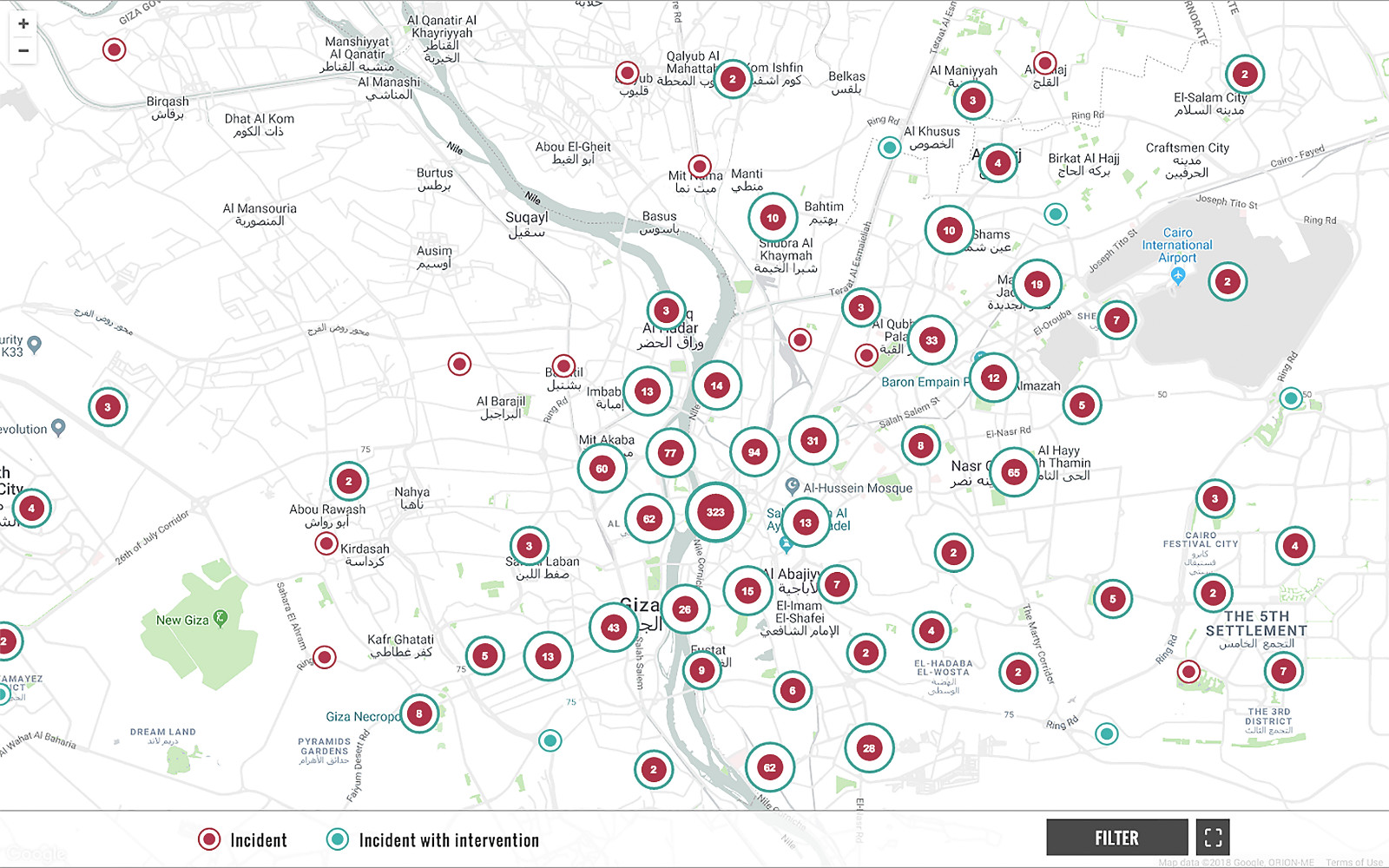
Sexual harassment is misunderstood and underreported all over the world. Stigma and shame prevent many women from talking about it or reporting it, and data on the problem is scarce. New web and mobile technologies have, however, opened new possibilities to overcome some of the barriers to documentation and data collection. HarassMap.com offers an innovative tool for reporting and generating data on sexual harassment, and has enhanced debates and discussions around the issue in Egypt and worldwide.
HarassMap uses web and mobile technologies to crowdsource and map incidents of sexual harassment from all over Egypt. Anyone who experiences or witnesses sexual harassment can anonymously submit a report through the web interface (or through Facebook and Twitter). Reports that include basic geographical information (location and date/time of the incident) are automatically mapped using Google Maps and made publicly available on the HarassMap website. Each report appears as a red dot on the map that, when clicked, displays the full information of the report in its original language (Arabic or English). Besides the location and the date/time, each report also includes a narrative description of the incident, the type(s) of sexual harassment (for example comments, stalking, or following). Each report receives a response with information on how to access free legal services and psychological counseling.
HarassMap has gathered information that can be used to tailor advocacy campaigns and educational programs and serves as an important tool for motivating the public to report and stand up against sexual harassment. Immediately after launching the map in 2010, HarassMap received a large number of reports of sexual harassment, and over the years the crowdsourced data has helped to reformulate the discussion on sexual harassment in Egypt. It has also helped to challenge stereotypes and misinformation about the issue.
“Writing versus Righting”
“In essence, maps are images designed to represent spatial relationships, connecting land to other beings in one way or another... Maps are storytelling devices" – Annita Lucchesi
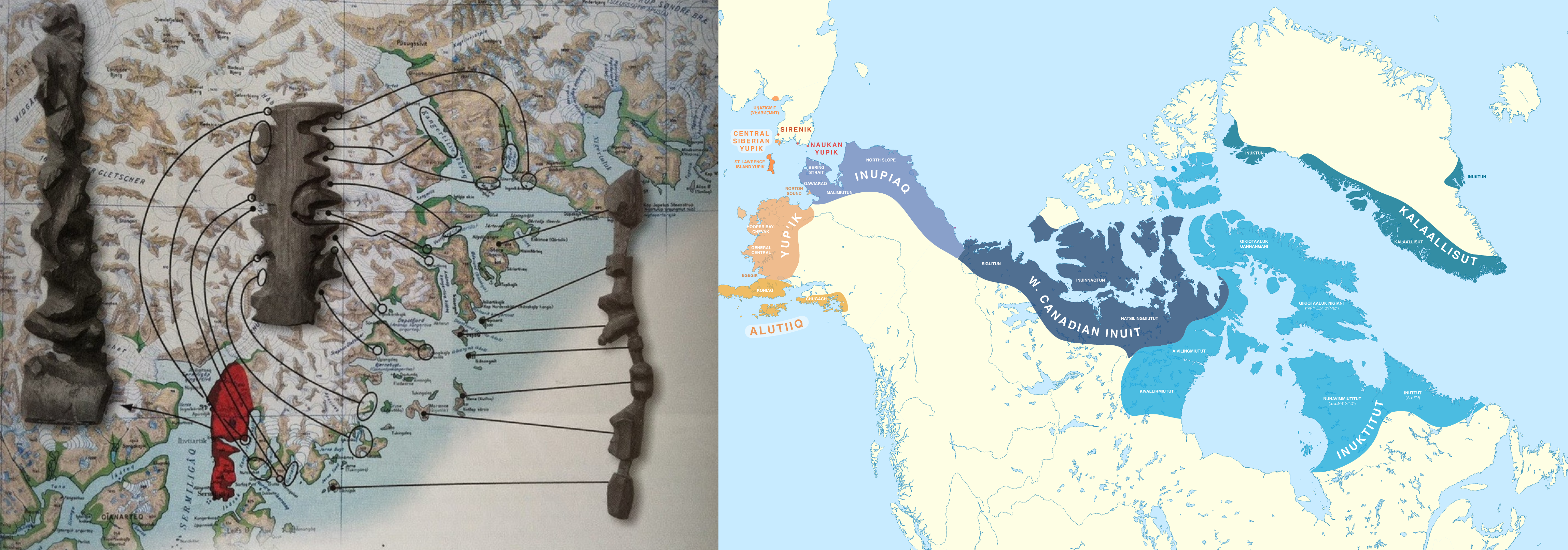
Cartography is an ancestral practice, well-rooted in Indigenous traditions all over the world. Consider the rich Mayan libraries containing many complex astronomical charts and maps, many of which were burned down by Spanish intruders. Or consider the Polynesian wayfinders who navigated one quarter of the Earth’s surface without instruments or Western-style maps, well before Europeans managed to cross the Atlantic. Over several centuries in Kaallit Nunaat (an Indigenous name for Greenland), Inuit peoples carved portable maps into driftwood to aid in navigating the rugged Arctic coastlines. These and countless other cases of Indigenous cartographic wisdom challenge the Western canon of geographical knowledge and its relatively narrow perceptions of maps.[11] They help us understand cartography as ancestral, dynamic, communal, and multi-dimensional.
These examples also help us reflect on the notion of a map as more than writing, or even the physical inscription of symbols. Most of the world’s languages are unwritten. Yet, everywhere in the world humans convey and build on geographic knowledge. History, traditions, and wisdom have been transmitted orally for thousands of years. Similarly, the practices of and possibilities for “writing the Earth” extend far beyond the illustrated map. Communities represent their relationships to land and navigation in an astounding variety of ways, each of them valid and valuable in their own ways. Indigenous languages, both with and without writing systems, often convey land and its uses orally, describing territory as a living fabric that weaves communities to their environments, free of definite borders. Indigenous scholar and organizer Maquiades Cruz describes Zapotec traditions of sharing of spatial knowledge in oral maps in Mexico’s Ricon de la Sierra Norte region:
“The story that the elders tell is a history they know from memory. It is not an object that can be tucked away in a museum like any old artifact. It is an oral map that circulates by word of mouth, contrasting with textual maps that circulate from hand to hand, eye to eye… Language allows us to relate people and things, weaving a fabric from their relations… The semiotic relationship between textile, fabric, and text (textile, tejido y texto) helps us reflect on the webs of knowledge and exchange that we try to make when we weave things together through contact, collaboration, knowledge, experience, sources, production, and circulation, creating the fabric of community.”[12]
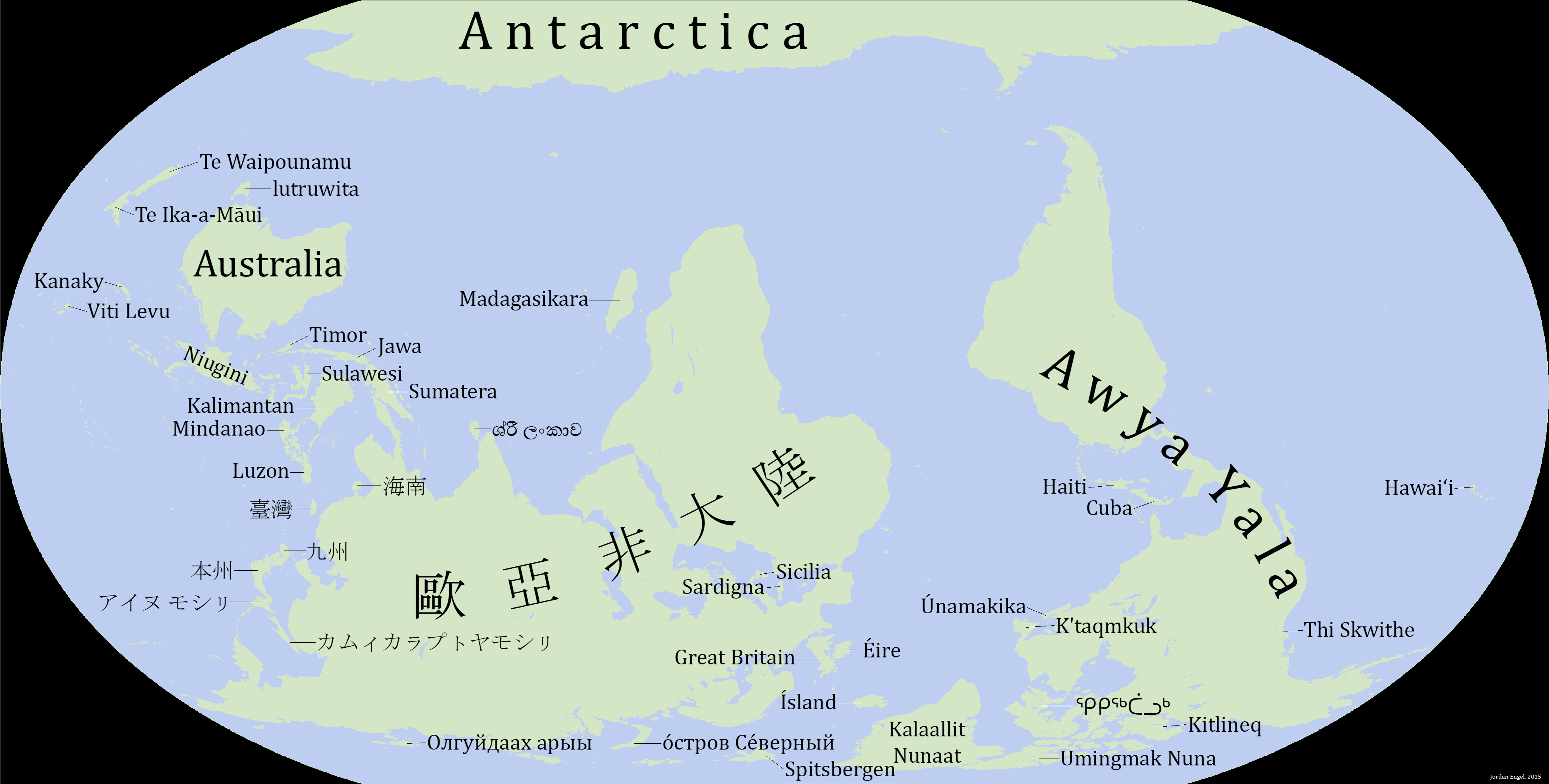
These community-land weavings embody Indigenous traditions and ancestral wisdom through toponyms, or place names. Toponyms vary depending on perspective. An endonym is the name ascribed to a place by the people who live there. Endonyms reflect the language and cultural traditions of places. In contrast, exonyms are place names superimposed by outsiders. For example, “America” is an exonym placed on a landmass by a German cartographer, Martin Waldseemüller, who had never been there, and who named it for another European cartographer, Amerigo Vespucci. There are, however, many endonyms for “America,” including Turtle Island (See Figure 1.3.11).
Many efforts have been made to restore and reclaim Indigenous place names as a way of combating the invisibility of Indigenous communities and their knowledge, an endeavor some researchers refer to as “decolonizing the map.” As part of this effort, Native-Land.ca, an Indigenous-led non-profit organization, offers an interactive participatory map displaying various Indigenous claims to North American lands, as defined by the Indigenous groups themselves. The depth of oral traditions, however, means that the mere attribution of Indigenous place names remains insufficient because it lacks the interpretive storytelling content and practices necessary to convey the meaning and the history attached to places. To address this shortcoming of two-dimensional maps, some groups are creating multimedia “Indigital story maps” to accompany the conventional graphic map with narratives and other forms of storytelling, allowing Indigenous communities to incorporate their own voices, languages, toponyms, and stories.[13]
Perhaps in a geography course you could expect a long-winded lesson about maps. In this book, we accept maps to be neither impartial nor standard. They are valuable visuals that can be construed from diverse perspectives and for diverse purposes. We encourage you to apply critical scrutiny when examining maps, evaluating not only their technical features and functions but also their perspectives and contributions that might deepen our understanding of the world. Throughout the book, we have curated maps from the creative commons and public domain, meaning those we are permitted to publish in an open textbook. For example, you might notice that many of our images come from Wikimedia Commons or from Flickr. These are common publication venues not only for cartographers wishing to share their work freely but also national and international governmental agencies that share professional cartography with the public. We made an effort to source reliable and effective maps, examining their sources, perspectives, and their ability to communicate valid and valuable geographic information. In curating images, we embraced the power of maps as visual supplements to the topics discussed throughout the book. Still, all maps are limited and exclusive, some more than others, and even in ways that the authors may have missed. Read the maps in this book, and everywhere else, with care and critical appraisal.
References:
[1] ROLLER, D. W. (2010). Eratosthenes’ “Geography.” Princeton University Press.
[2] White, J. (2017). Geography and Empire.
[3] Pastuch, L. 2022. Al-Idrisi’s Masterpiece of Medieval Geography. Library of Congress.
[4] Sletto, B., Bryan, J., Wagner, A., and Hale, C., (eds). 2020. Radical Cartographies: Participatory Mapmaking from Latin America. Austin: University of Texas Press.
[6] White, J. (2017). Geography and Empire.
[7] Harley, B. 1988. Maps, Knowledge, and Power. In: D. Cosgrove and S. Daniels (Eds), The Iconography of Landscape. Cambridge: Cambridge University Press, 1988, pp. 277–312
[8] Harley, B. 1988. Maps, Knowledge, and Power. In: D. Cosgrove and S. Daniels (Eds), The Iconography of Landscape. Cambridge: Cambridge University Press, 1988, pp. 277–312
[9] Based on ideas of Pickles about maps preceding and forming territories, not just being representations of territory. As discussed on the literature review presented by Kitchin, R. and Dodge, R. 2007. Rethinking Maps. Progress in Human Geography 31(3), pp. 331-344.
[10] Alderman, D., Inwood, J. and Bottone, E. 2021. The mapping behind the movement: On recovering the critical cartographies of the African American Freedom Struggle. Geoforum, volume 120, pp. 67-78.
[11] Lucchesi, A. 2018. “Indians Don’t Make Maps”: Indigenous Cartographic Traditions and Innovations. American Indian Culture and Research Journal. 2018. Also recommended: Simpson, L. 2014. Land As Pedagogy: Nishnaabeg intelligence and rebellious transformation. Decolonization: Indigeneity, Education & Society 3 (3), pp 1-25.
[12] Maquiades (Kiado), C. 2020. Oral Narratives in the Ricon Zapoteco (pp. 22 & 26). In: Sletto, B., Bryan, J., Wagner, A., and Hale, C., (eds). 2020. Radical Cartographies: Participatory Mapmaking from Latin America. Austin: University of Texas Press.
Attributions:
“The Spatial Perspective” by Caitlin Finlayson, CC BY-NC-SA 4.0.
“Map and Scale Accuracy” by David DiBiase & John A Dutton, CC BY-NC-SA 4.0.
“Sub-fields of geography” and "Geospatial Technologies" is adapted from “Introduction to Geographic Science” by Darstrup via, Open Geography Education, CC-BY-4.0.
This is Not An Atlas, editorial by Severin Halder and Boris Michael and "Mapping Sexual Harassment in Egypt" by HarassMap, CC-BY-4.0.